What’s the secret recipe a truly memorable infographic?
Simple: an original topic, some fascinating data, and an eye-catching design. Bake it all together and offer some to your friends (by that, I mean market it).
This article is going to focus on the second ingredient in the recipe: once you have decided on the topic of your infographic, you can start compiling the data.
But wait.
What if you don’t have a set of data prepared?
Well, then the next step is to research the topic and collect data and information about it.
Collecting your own data can seem daunting but it’s not as hard as you might think. Thanks to the internet, you can easily find vast amounts of data with the tip of your fingers.
And if you use a few simple but effective research methods, you will be able to mine the internet for relevant data without wasting much time.
And it doesn’t have to cost you a dime.
So how can you find data for your topic?
In this article, I’ll share seven data collection techniques for how you can go beyond simple searches when looking for data.
Embed this infographic by copying and pasting the code below:
<img class="alignnone size-full wp-image-3047" src="https://venngage-wordpress.s3.amazonaws.com/uploads/2017/03/86942eb7-be7a-4132-ad5f-99e7a2e18884-1.png" alt=“Infographics: Data Collection Techniques" width="1000" height="4100" />
<p style="text-align: center; font-size: 14px; padding-top: 4px;">See this <a href="https://venngage.com/blog/data-collection-techniques/">infographic on Venngage</a>.</p>
1. Append “Data” to Your Topic
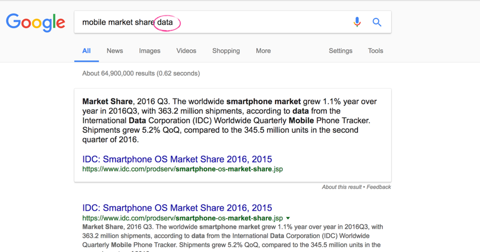
The best place to start a data search is by appending the word “data” to the end of your search query or topic in Google.
This is a simple trick that narrows your search to topics specifically with data.
For example, typing in “mobile market share data” will return results specifically with mobile market share data.
2. Use Filetype:xls (or xlsx,csv or pdf)
Another easy way to narrow your search to only files with data in them is to use the option “filetype:xls” to narrow the search results to Excel (spreadsheet) files only.
Here’s how: append “filetype:xls” to the end of your query or topic. Google will return results that will download the file directly when clicked, instead of taking you to a webpage.
It’s that simple.
This trick is particularly useful when you’re only interested in search results that have data files, and you don’t want to sift through web pages looking for them.
The other file types that work are xlsx, csv and pdf.
3. Use Image Searches
One research trick that might seem counterintuitive is to use image search.
Hear me out.
Why would you use image search when you’re looking for data?
Because image search results for data-centric topics usually return charts and data visualizations. And if you visit the webpages of these images you’ll find where the source data came from.
It takes a little bit more effort, but this sometimes works if the data is not readily available in a spreadsheet format.
4. Use an Existing Data Repository
There are many existing data repositories that are available with all kinds of data. Some of these are free and some require a paid subscription.
Here is a list of lists of data repositories:
- Government data: data.gov
- Industry data: statista.com
- Public opinion: pewresearch.org, gallup.com
- Google public data: google.com/publicdata/directory
- Data is Plural, an assorted data collection: spreadsheet
- Open Access Directory (Life sciences and Academic): http://oad.simmons.edu/oadwiki/Data_repositories
- Research Data: http://www.re3data.org/
5. Use Google to Search Within a Site
Here’s a way to refine your search even more.
When you know that your data can be found on a particular website (like on one of the repositories above), you can further narrow down the search to include only results from that site.
It’s simple:
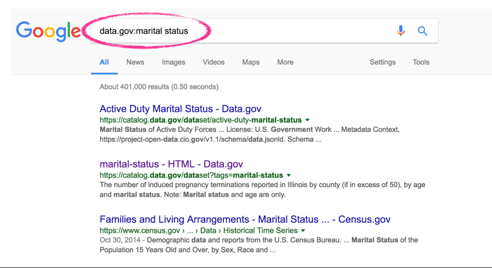
Use “site url: topic” in your search query.
For example:
To search for marital status data in the US census, you can use “data.gov: marital status” to narrow your search to only the data.gov site.
6. Peruse Academic Sources
Another place to find data that is often overlooked is in academic research.
Remember back in school when you used to peruse academic journals for essay sources?
Why not do the same thing for your infographics?
Every day, hundreds of research papers are published in academic journals.
These academic articles often contain data or have references to data from which the results were based on. You can look at the Appendix or Reference sections for where the data came from.
If the data isn’t public, you can try contacting the writer (or lead investigators) of the article for the source data.
And you know what?
More often than you might think, they will share the data with you.
Here are some sites to search for academic research:
7. Conduct Original Research
Lastly, you can do original research to gather your own data.
If you’ve picked a truly unique topic, then chances are no one else has done it before and the data does not exist.
Don’t panic.
On the contrary, congratulate yourself–you might have something great in the making here.
There are many different research methods you can use to collect data.
In fact, when I was a graduate student, I took an entire course just on research methods.
For the sake of brevity, I’m going to present a simplified manual data collection method we use quite often at Venngage.
It is simple enough that most people can start using for many different fields and cases.
Here it is:
Step 1: Define Your Sample Size
The first step is to define the sample size.
Think:
How big will your data set be?
The size of your data set will depend on how many people you poll, or how many objects you need to code and count.
If you want to be statistically significant, you can refer to this guide to decide how big your sample size needs to be.
Here are some examples of the sample size we used for the following infographics:
| Infographic and Research Topic | Sample Size |
| Race of Oscar Winners | 1684 people (all Oscar winners until 2015) |
| Creepypasta | 70 stories |
| Popular Pinterest Infographics | 150 infographics > 1000 pins |
| Falling in Love via Text | 40 people |
| Game of Thrones Betrayals | 53 acts of betrayal (from seasons 1-5) |
Step 2: Define What You Want to Measure
The next step is to define what you want to measure for each subject you are sampling.
The way we do this at Venngage is to define one measure for each question we want to answer for the topic.
For example, for the Game of Thrones Betrayal infographic, we wanted to know more about the acts of betrayal in the TV show, and why the characters committed those acts of betrayal.
Here were the questions we asked and what we wanted to measure:
- How are perpetrators and victims of betrayals connected?
- Measure: Relationship (ex. spouse, father, mother, ally, friend, boss, employee, enemy…etc.).
- What is the house and role of the perpetrator and victim?
- Measure: House and Title.
- What was the main reason for the betrayal?
- Measure: Reason (Power, Revenge, Love, Loyalty).
- What was the gender of both the perpetrator and the victim?
- Measure: Gender.
Once you have the measures figured out, create a spreadsheet and add a column for each measure.
Using the example above, we made a spreadsheet using the following columns: relationship between perpetrator and victim, perpetrator’s gender, perpetrator’s house, perpetrator’s role, perpetrator’s reason for betrayal, victim’s gender, victim’s house, and victim’s role.
Step 3: Manually Code Your Data
The last step in our data collection method is to manually code your data.
Here’s what I mean:
For each subject in your sample, record the values in the spreadsheet. If you’re manually measuring each sample, then you will enter one row for each sample.
For the Game of Thrones infographic, each row was a separate act of betrayal.
Then, you guessed it:
We watched every episode from season one to five and listed each betrayal as a row with all the resulting columns filled out.
This can be quite time consuming and if the measurements are simple, you can use a virtual assistant or temp workers to help you out.
But for a sample size of less than 100, it should not take more than a few days’ worth of work.
Well worth the effort for original data.
Of course, there are other methods of original data collection that you can use, such as:
- conducting a survey or poll,
- hiring a research company,
- or automatic data collection (Scrapy web scraping, API, or with a Web Crawling Tools).
The end result is a spreadsheet of all the data you need for your infographic.
Some tools you can use to collect your own data:
That’s the Groundwork!
At this point in the infographic creation process, you are equipped with an engaging topic and some solid data about that topic.
Nice work!
With this groundwork done, you get dive into the design process.
In my next article, I’ll walk you through the steps for how to choose the best infographic template for your information.
If you have any questions or would like any clarification, feel free to drop a comment.


