


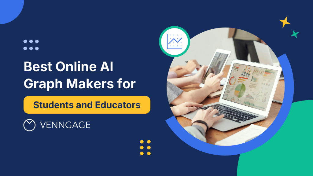
Creating professional graphs and charts used to require expensive software, design skills and hours of manual work. In 2025, AI-powered graph makers have changed that completely. AI-assisted design shortens design cycles by 85-90% compared to traditional methods.
These intelligent tools can transform raw data into polished visualizations in minutes, making data visualization accessible to everyone, from high school students working on their first research project to university professors preparing lecture materials. In fact, 85% of U.S. educators and students reported using AI tools in education in 2025, up from 66% in 2024.
This comprehensive guide covers the best AI graph makers available today, what makes them effective and how to choose the right tool for your specific needs. Whether you’re creating bar charts for a presentation or complex statistical visualizations for research papers, you’ll find the insights you need to work smarter.
What are AI graph makers and why do students and educators need them?
AI graph makers are web-based tools that use artificial intelligence to automate the creation of charts, graphs and data visualizations. Unlike traditional graphing software, these tools analyze your data, recommend appropriate chart types and apply professional design principles automatically.
Key benefits for education:
- Speed: Create publication-ready graphs in minutes instead of hours
- Accessibility: No design experience or expensive software required
- Intelligence: Get smart recommendations based on your data type
- Consistency: Maintain professional quality across all visualizations
- Collaboration: Share and edit graphs with classmates or colleagues easily
For students juggling multiple assignments, AI graph makers remove the technical friction that slows down research and presentation work.
Students using AI visualization tools even saw exam scores rise by 9.8%—from an average of 65.3 to 75.1—while cutting analysis time by 40.2%. And for educators, these tools make it easy to create clear, engaging visuals that elevate learning. If you’re exploring more ways AI supports the classroom, you might find our guide on AI for teachers helpful.
As James Clear puts it, “AI in education isn’t just about efficiency; it’s a catalyst for personalized learning, helping educators meet the diverse needs of their students.”
Top AI graph makers for students and educators in 2026
Venngage AI Graph Generator
Best for: Students and educators who need professional graphs with minimal effort
Venngage’s AI Graph Generator stands out for its combination of intelligent automation and intuitive design. The platform analyzes your data and suggests the most effective visualization types while maintaining Venngage’s signature clean, professional aesthetic.
Key features:
- Smart chart recommendations based on data structure
- Extensive template library organized by use case (research, education, business)
- One-click customization for colors, fonts and branding
- Collaborative editing for group projects
- High-resolution exports (PNG, PDF, SVG)
- Mobile-responsive interface for reviewing work anywhere
Who it’s for: This tool works exceptionally well for students creating graphs for research papers, presentations or group projects. Educators appreciate the speed of creating multiple visual aids for lesson plans and the ability to maintain consistent styling across course materials.
Limitations: Some advanced statistical visualizations may require manual customization. The free version includes Venngage branding on exports.
If you need bar charts for school projects, lesson plans or work presentations, and want a faster way to create them, you can also explore the AI Bar Graph Generator.
Canva AI Charts
Best for: Users who want design flexibility beyond data visualization
Canva’s AI chart tool integrates seamlessly with its broader design platform, making it ideal when your graph needs to live within a larger visual project like posters, infographics or presentations.
Key features:
- Integration with Canva’s full design suite
- Drag-and-drop data entry
- Animation options for presentations
- Vast library of design elements to enhance graphs
- Team collaboration features
Who it’s for: Students creating comprehensive visual projects where graphs are one component. Educators designing complete lesson materials or classroom posters.
Limitations: The AI recommendations are less sophisticated than specialized graph tools. Advanced data analysis features are limited.
Infogram
Best for: Creating interactive, web-friendly visualizations
Infogram focuses on digital-first visualizations with strong interactivity features, making it particularly valuable for online presentations and reports.
Key features:
- Interactive charts with hover effects and animations
- Real-time data integration from spreadsheets
- Embed codes for websites and learning management systems
- Library of infographic templates
- Responsive design that adapts to different screen sizes
Who it’s for: Graduate students presenting research online, educators creating digital course materials or anyone publishing data visualizations on websites.
Limitations: The learning curve is steeper than simpler tools. Print quality isn’t as optimized as digital output.
ChartBlocks
Best for: Quick, straightforward chart creation with minimal setup
ChartBlocks prioritizes simplicity and speed, offering a streamlined interface for creating standard chart types without overwhelming options.
Key features:
- Fast data import from spreadsheets
- Clean, minimal interface
- Basic chart types done well (bar, line, pie, scatter)
- Shareable links for quick collaboration
- No account required for basic use
Who it’s for: Undergraduate students needing quick visualizations for assignments, K-12 educators creating simple classroom materials.
Limitations: Limited customization options. No advanced chart types for statistical analysis.
Plotly Chart Studio
Best for: Advanced users needing sophisticated statistical visualizations
Plotly offers professional-grade graphing capabilities with extensive customization, making it suitable for serious research and data analysis.
Key features:
- Wide range of scientific and statistical chart types
- Detailed customization of every visual element
- Python and R integration for data scientists
- 3D visualization capabilities
- Publication-quality exports
Who it’s for: Graduate students and researchers working with complex datasets, STEM educators teaching advanced concepts.
Limitations: Steeper learning curve than beginner tools. More technical knowledge required to fully utilize features.
For more ways to turn data into engaging visuals, take a look at our roundup of the best AI infographic generators.
How to create graphs with AI: Step-by-step process
Creating graphs with AI tools follows a consistent workflow regardless of which platform you choose. Understanding this process helps you work efficiently and get better results as different charts serve different purposes.
For example, using a line chart in this ocean conservation academic poster helps illustrate changes over time, making trends in environmental data easier to understand.

On the other hand, a bar graph works better for comparing categories or groups, like in this social media in education infographic, where differences between student behaviors and platform usage are clearly highlighted.

Step 1: Prepare your data
Clean organized data produces better results. Before uploading to any AI graph maker:
- Remove empty rows and columns that could confuse the AI
- Use clear column headers that describe your data (e.g., “Student Scores” not “Column A”)
- Ensure consistent formatting (all numbers as numbers, all dates in the same format)
- Check for typos in categorical data that could create unintended groupings
Most AI tools accept data from Excel, Google Sheets, CSV files or direct copy-paste from spreadsheets.
Step 2: Upload and let AI analyze
Once you upload your data, the AI performs several analyses:
- Identifies data types (categorical, numerical, time-series)
- Determines relationships between variables
- Calculates appropriate scales and ranges
- Detects patterns that suggest specific visualization types
This analysis happens in seconds, but understanding what’s happening helps you evaluate the AI’s recommendations intelligently.
Step 3: Review AI recommendations
The AI will suggest chart types based on its analysis. Common recommendations include:
- Bar charts for comparing categories
- Line graphs for trends over time
- Scatter plots for relationships between variables
- Pie charts for part-to-whole relationships (though modern best practices often favor alternatives)
- Heat maps for multi-dimensional categorical data
You’re not locked into the AI’s first suggestion. Most tools let you easily switch between chart types to see which communicates your point most effectively.
Step 4: Customize for your needs
Apply customizations that enhance clarity and match your requirements:
- Adjust colors to meet accessibility standards or branding guidelines
- Modify axis labels and titles for clarity
- Add annotations to highlight key data points
- Adjust font sizes for readability in your intended format (screen vs. print)
- Toggle grid lines based on whether they help or clutter
Step 5: Export and use
Download your graph in the appropriate format:
- PNG for general use in presentations and documents
- PDF for print publications maintaining quality at any size
- SVG for future editing or responsive web use
- Shareable links for collaborative review or embedding
Best AI graph tools for data visualization by use case
Different educational scenarios benefit from different tools. Matching your tool to your specific needs produces better results with less frustration.
For quick assignment graphs
Best choice: Venngage AI Graph Generator or ChartBlocks
When you need a clean, professional graph for a homework assignment or short presentation, prioritize speed and simplicity. These tools get you from data to finished graph in under five minutes while maintaining quality standards.
For research papers and thesis work
Best choice: Venngage AI Graph Generator or Plotly Chart Studio
Academic papers require precise, publication-quality visualizations. Look for tools offering high-resolution exports, detailed customization and the ability to match journal style guidelines. The extra control over typography, sizing and formatting ensures your graphs meet academic standards.
For classroom presentations
Best choice: Canva AI Charts or Infogram
Presentations prioritize visual impact and readability from a distance. Tools that integrate graphs with broader design elements help create cohesive slide decks. Animation capabilities can help walk students through complex data step-by-step.
A good example is this Child Labor Statistics infographic, which uses clear visuals and structured layout to communicate sensitive global data in an accessible, classroom-friendly way.

For group projects
Best choice: Venngage AI Graph Generator or Infogram
Collaboration features become essential when multiple people need to contribute. Real-time editing, commenting capabilities and version history prevent the chaos of emailing files back and forth. Cloud-based tools ensure everyone works from the same version.
For statistical analysis
Best choice: Plotly Chart Studio
Advanced statistics require specialized chart types—box plots, violin plots, regression lines, confidence intervals. Tools built for data science provide these options along with the mathematical rigor researchers need.
Key features that make AI graph makers effective
Understanding what separates excellent AI graph makers from mediocre ones helps you evaluate new tools and get more from the ones you use.
Intelligent data interpretation
The best AI doesn’t just plot what you tell it to—it understands your data structure and makes informed suggestions. This means:
- Recognizing time-series data and suggesting appropriate temporal visualizations
- Identifying categorical versus continuous variables
- Detecting outliers that might need special handling
- Recommending groupings or breakdowns that reveal patterns
Template quality over quantity
A library of 500 generic templates isn’t as valuable as 50 purpose-built templates for common educational scenarios. Quality templates provide:
- Pre-configured layouts for specific use cases
- Professional color schemes that work across contexts
- Proper spacing and typography for immediate usability
- Easy customization points for personalization
For example, templates like this Startup Failures Treemap Chart are especially helpful for thesis presentations because they condense large datasets into a clean, hierarchical visual. This makes it easier to explain categories, relationships and proportional differences which are ideal when defending complex research findings in front of a panel.

Accessibility by default
Modern AI graph makers build accessibility into their core functionality:
- Color combinations that meet WCAG contrast standards
- Alternative text support for screen readers
- Patterns or textures in addition to colors for differentiating data
- Clear labeling that doesn’t rely solely on visual cues
Export flexibility
Your graph needs to work in multiple contexts. Comprehensive export options include:
- Multiple file formats for different uses
- Resolution settings appropriate for screen and print
- Transparent backgrounds for layering on different materials
- Embed codes for digital publications
Customization depth
The ideal tool balances automation with control. Progressive disclosure means simple defaults that work immediately, with advanced options available when you need them:
- Quick color scheme changes with one click
- Detailed color picker for exact brand matching
- Smart defaults for spacing and sizing
- Manual override for specific adjustments
For instance, if you’re a medical student presenting research data, you can customize this Medical Research Scatter Plot Chart to fit your institution’s style guidelines. Its clean structure makes it easier to highlight correlations, outliers and key findings during academic defenses or conference presentations.

Common challenges when using AI graph makers (and how to solve them)
Even the best tools have limitations. Knowing common issues helps you work around them efficiently.
Challenge: AI recommends the wrong chart type
Why it happens: The AI misinterprets your data structure or doesn’t understand your communication goal.
Solution: Most tools let you easily switch chart types. Try alternatives and ask yourself which makes your point clearest. When in doubt, simpler chart types (bar, line, scatter) are usually safer than complex options.
Challenge: Customization isn’t granular enough
Why it happens: Tools designed for speed sacrifice some detailed control.
Solution: For projects requiring exact specifications, consider starting in an AI tool for initial layout, then exporting to more advanced software for final touches. Alternatively, choose a more advanced tool like Plotly from the start.
Challenge: Data import doesn’t work smoothly
Why it happens: Your data format doesn’t match what the tool expects or contains problematic characters.
Solution: Simplify your data before import. Remove special characters, ensure consistent formatting and use clear column headers. If a direct upload fails, try copying and pasting into the tool’s built-in data editor.
Challenge: Exported graph doesn’t look right
Why it happens: Format differences between screen preview and final export or incorrect resolution settings.
Solution: Always preview before exporting. Check resolution settings—use at least 300 DPI for print. If possible, export in vector formats (SVG, PDF) that maintain quality at any size.
Challenge: Collaborative editing creates confusion
Why it happens: Multiple people making simultaneous changes without communication.
Solution: Establish clear workflows for group projects. Assign specific roles (data input, design, final review). Use commenting features to discuss changes rather than immediately implementing them.
How AI graph makers are transforming education
Beyond individual convenience, AI graph makers are changing how we teach and learn with data at a fundamental level.
Democratizing data visualization
When only students with technical skills or expensive software could create professional graphs, data visualization was a barrier to communication. AI tools remove that barrier, letting all students focus on understanding and communicating their findings rather than struggling with software.
Enabling visual learning across disciplines
Traditionally, graphing was primarily a math and science activity. Now, literature students create timelines of character development, history students visualize demographic changes and art students chart stylistic movements. This cross-disciplinary adoption of visual communication develops universally valuable skills.
Accelerating iterative learning
Research and learning require iteration—trying approaches, getting feedback, refining understanding. When creating each version of a graph takes fifteen minutes, students make fewer iterations. When it takes two minutes, they experiment more freely, leading to deeper understanding and better final products.
Supporting universal design for learning
AI tools that automatically implement accessibility best practices help educators create materials that work for all students without requiring specialized knowledge. This supports inclusive classrooms where every student can access and engage with visual information.
What to look for when choosing your AI graph maker
Select a tool based on your specific context rather than trying to find a universal “best” option.
Consider your technical comfort level
Beginner-friendly tools (Venngage, ChartBlocks) prioritize intuitive interfaces with guided workflows. Advanced tools (Plotly) assume familiarity with data visualization concepts and offer powerful but complex features.
Ask yourself: Do you want the tool to guide your decisions or do you prefer maximum control?
Evaluate your typical data sources
Think about: Do you usually work with Google Sheets? Excel? Research databases? Choose tools that integrate smoothly with your existing workflow to minimize friction.
Match export needs to your deliverables
For print publications: Prioritize high-resolution PNG or PDF exports For digital presentations: Look for shareable links or embed codes For future editing: Ensure vector format (SVG) availability
Factor in collaboration requirements
Individual work: Basic export and sharing is sufficient Group projects: Real-time collaborative editing becomes essential Class-wide use: Consider tools with educational licensing or classroom management features
Assess budget realistically
Many AI graph makers offer free tiers with limitations. Consider:
- How many graphs you create weekly or monthly
- Which features are essential versus nice-to-have
- Whether occasional paid access for specific projects makes more sense than ongoing subscriptions
Making the most of your chosen AI graph maker
Regardless of which tool you select, certain practices will help you get better results consistently.
Start with clean data
Invest five minutes organizing your data before upload. This prevents hours of troubleshooting confusing visualizations. Remove empty cells, use clear headers and ensure consistent formatting throughout.
Trust the AI, then verify
AI recommendations are informed by best practices across millions of examples. They’re usually right. But “usually” isn’t “always”—review suggestions critically and adjust when your specific context calls for something different.
Build a personal template library
When you create a graph that works well, save it as a template. This builds efficiency over time so that you’re not starting from scratch each time, you’re building on proven approaches.
Learn incrementally
Don’t try to master every feature immediately. Start with basic functionality and gradually explore more advanced options as your needs evolve. This prevents overwhelm while continuously expanding your capabilities.
Seek feedback early
Share draft visualizations with peers, classmates or colleagues before finalizing. Fresh eyes catch unclear labeling, confusing color choices or better approaches you hadn’t considered.
The future of AI graph making in education
Current trends suggest where these tools are heading, helping you make forward-looking choices.
Natural language interaction
Describing what you want in plain English—”compare sales across regions as a bar chart” or “show temperature trends over the year”—is becoming more reliable. This makes data visualization accessible to people who think conceptually about their data rather than technically.
Context-aware formatting
Tools are learning to adjust their output based on purpose. The same data visualized for a scientific journal, classroom presentation or social media post will automatically receive appropriate formatting for each context.
Deeper learning management system integration
Expect tighter connections between AI graph makers and platforms like Canvas, Blackboard or Google Classroom. Creating and submitting visual assignments will happen within a single workflow instead of requiring multiple tools.
Enhanced accessibility features
Future tools will proactively identify accessibility issues and suggest improvements, ensuring visualizations work for all users including those with visual impairments or color blindness.
Getting started with AI graph makers today
The best time to start using AI graph makers is when you have actual data that needs visualization. Start with a real project rather than abstract experimentation—you’ll learn faster when solving genuine problems.
Most platforms offer free trials or free tiers that let you explore capabilities without financial commitment. Create a few graphs with your actual data and evaluate:
- Does the interface make intuitive sense?
- Do the AI recommendations align with your needs?
- Can you achieve your desired results without excessive frustration?
- Does the output quality meet your standards?
These practical tests reveal more than feature comparison charts ever will.
For students and educators looking for a balanced starting point, Venngage’s AI Graph Generator offers an accessible entry into AI-powered visualization. The platform combines intelligent automation with intuitive design, making it straightforward to create professional graphs without extensive training. The template library is specifically organized for educational use cases and the collaborative features support the group work common in academic settings.
The free tier provides substantial functionality for trying the platform risk-free, while paid options remove branding and unlock additional features for users with more intensive needs. Whether you’re creating your first graph for a class assignment or your hundredth visualization for thesis research, the tool scales to your requirements without overwhelming you with unnecessary complexity.
Final thoughts
AI graph makers have fundamentally changed what’s possible in educational data visualization. What once required expensive software, design expertise and substantial time investment is now accessible to anyone with data and an internet connection. These tools don’t just make graph creation faster—they make it better, implementing visualization best practices automatically and freeing you to focus on what your data means rather than how to display it.
The key is choosing a tool that matches your specific needs, skill level and workflow. Whether you prioritize simplicity, advanced features, collaboration or speed, there’s an AI graph maker designed for your context. Start with real projects, experiment with different tools through their free tiers and gradually build your visualization skills alongside the technology.
Data visualization isn’t just about making information look pretty—it’s about communicating clearly, supporting understanding and revealing insights that numbers alone might hide. AI graph makers put those capabilities in your hands, helping you become a more effective student, educator or researcher. The technology handles the technical details while you focus on the substance and that combination is transforming how we learn, teach and share knowledge in 2026.


