


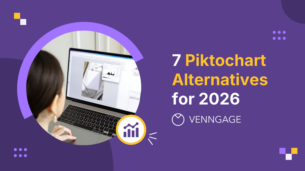
You’ve probably used Piktochart or at least heard of it. It’s a solid go-to for turning data into visuals that started back in Malaysia in 2012. But if you’re reading this, chances are you’re feeling some friction: maybe collaboration features feel clunky, the AI tools don’t flex the way you planned, or the design flexibility isn’t quite hitting your vision.
You’re not alone. Reviewers often mention that while Piktochart is beginner-friendly, it can feel a little restrictive once you want more control or advanced features. Others also pointed out that the trial version doesn’t give you much to work with.
But as Randy Krum, author of Cool Infographics, puts it: “Design matters. But design is not about decoration or ornamentation. Design is about making communication as easy and clear for the viewer as possible.”
Hence, in this guide, I’ll compare several alternatives across features, pricing, usability and niche use cases so that by the end, you’ll have a clear idea of which tool fits your style, budget and workflow best without the trial-and-error headache.
Overview of Piktochart alternatives
| Use-Case Category | Alternative | Key Features & Strengths | Pricing (2026 Annual Rates) | Notable Limitations |
|---|---|---|---|---|
| Professional Data Visualization & AI Visuals | Venngage | Total Business AI: 40,000+ business templates; built-in AI Accessibility Auditor (WCAG 2.1); 35+ professional chart types with direct CSV/Google Sheets sync. | Free: $0 Premium: $10/mo Business: $24/mo | Free plan includes watermarks; advanced team governance reserved for Business/Enterprise tiers. |
| Marketing & High-Velocity Social Visuals | VistaCreate (Crello) | Speed Focus: 200,000+ templates for social/ads; integrated AI Background Remover; brand kit support and simple animation tools. | Free: $0 Pro: ~$10/mo | Animation templates are not fully customizable; limited data visualization compared to Piktochart. |
| General Graphic Design & Brand Assets | Canva | Magic Studio: Massive lifestyle asset library (100M+ items); AI Magic Switch for multi-format resizing; robust team collaboration. | Free: $0 Pro: ~$15/mo Teams: ~$10/user/mo | Data visualization is basic; lacks specialized accessibility compliance auditing for technical reports. |
| Professional Technical Diagramming | Lucidchart | System Mapping: Real-time co-authoring; Visio import/export; extensive libraries for org charts, UML, and ERDs. | Free: 3 docs Individual: ~$8/mo Team: ~$9/mo | Limited creative design “flair”; mostly focused on logical structure rather than visual communication. |
| All-in-One AI Content Creation | Adobe Express | Firefly AI: High-end generative fill and text-to-image; seamless integration with Adobe Creative Cloud libraries. | Free: $0 Premium: ~$10/mo | Heavier interface; less efficient for creating long-form infographics or technical data reports. |
| Quick Social Assets (Cloud-Based) | Snappa | Rapid Workflow: 6,000+ templates with high-res stock photo integration; designed for non-designers needing clean social graphics. | Free: 3 downloads/mo Pro: ~$15/mo | No infographic or report templates; limited animation and interactivity support. |
| Dynamic AI Storytelling & Video | Prezi | Non-Linear Flow: Zooming canvas for engaging presentations; AI Slide Generator converts outlines into fluid visual paths. | Plus: ~$12/mo Premium: ~$16/mo | Steep learning curve; not suitable for printed reports or high-accessibility documents. |
Deep‑dive comparisons
Now that you’ve explored why people look for Piktochart alternatives, let’s break down how each tool differs. Below, you’ll find a clear comparison of features, ease of use, pricing, ideal users and why each option might suit your needs better than Piktochart.
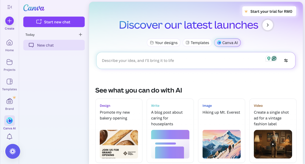
1. Venngage: Trusted AI tool for infographics and data visualization

When you’re working with information that needs to be clear, structured and visually engaging, Venngage offers a balanced mix of templates, data-visualization tools and AI support to help you create professional results without needing deep design experience.
As Dennis K. Lieu and Sheryl Sorby remind us in Visualization, Modeling and Graphics for Engineering Design: “Information graphics are essential in presenting data because they simplify the content, offer a visually pleasing alternative to gray text in a proposal or an article and thereby invite interest.”
Venngage leans into that idea. You can even speed things up with the AI Infographic Generator if you want to turn your data into a visual instantly. Its focus on accessibility and polished, professional layouts also makes it a strong choice when you’re communicating with diverse audiences or presenting data internally.
Category: Infographics & data-driven visuals
Features:
- Infographic, report and diagram templates
- Customizable charts and data-visualization options
- AI-assisted layout and design suggestions to guide clear information structure
- AI-powered diagramming and smart formatting tools
- Accessibility features like color-contrast checking
Ease of use:
- Clear, drag-and-drop editor
- Templates that help you build polished visuals quickly
Why consider Venngage:
- Strong structure for presenting data clearly
- Helpful accessibility checks for inclusive communication
- More flexibility for charts and diagrams compared to Piktochart
- AI tools reduce manual formatting and guide you toward more readable layouts
Ideal for: Business professionals, educators and marketers who regularly communicate data
Pricing: Free plan available; paid plans begin around $19/month
If you’re torn between the two, here’s a detailed breakdown of Venngage vs. Piktochart to help you compare them side by side.

If you need to produce social posts, ads, or multi-format marketing visuals quickly, VistaCreate is designed to help you move fast without overthinking layout decisions. It’s built around speed, variety and creative flexibility rather than deep data visualization.
Category: Social media & marketing visuals
Features:
- 200K+ templates for social posts, ads and videos
- AI image generation and background removal
- Stock photos, videos and animations included
Ease of use:
- Straightforward interface
- Platform-specific templates for rapid content production
Why consider VistaCreate:
- Faster content creation compared to Piktochart
- Stronger focus on social formats
- Useful resizing tools for multi-platform campaigns
Ideal for: Freelancers, creators and small marketing teams needing high-volume content
Pricing: Free plan available; Pro starts around $10–13/month
3. Canva: The all-in-one design suite for teams and creators
If you’re looking for one platform that handles everything, from quick social posts and polished presentations to videos, documents and branded assets, you’re definitely familiar with Canva.
It’s one of the most widely used design platforms for a reason. Canva supports both individuals who need a simple, flexible editor and teams that rely on consistent branding, shared templates and smooth collaboration.
Features:
- Wide range of templates for presentations, videos, documents and whiteboards
- AI design generation and editing tools
- Brand Kits and team-wide collaboration features
Ease of use:
- Beginner-friendly, intuitive editor
- Templates and AI features reduce design time significantly
Why consider Canva:
- Ideal for teams working across many content types
- Strong collaboration and brand-consistency tools
- More flexible and scalable than Piktochart for long-term use
Ideal for: Individuals, educators, creators and growing teams
Pricing: Free plan available; Pro starts at $14.99/month, with Business and Enterprise tiers for larger organizations
4. Lucidchart: Professional diagramming for teams

If you need structured diagrams (think org charts, workflows, UML diagrams or system maps), Lucidchart gives you the precision and collaboration features that typical design tools don’t.
It’s built for teams who document processes, map systems or visualize complex operations together in real time.
Category: Professional diagramming
Features:
- Real-time collaboration for distributed teams
- Visio import and export (helpful if you’re migrating from Microsoft tools)
- Extensive shape libraries for org charts, flowcharts, wireframes and UML
- Integrations with Google Workspace, Slack, Jira and more
Ease of use:
- Intuitive drag-and-drop canvas
- Easy sharing for feedback and co-editing
Why consider Lucidchart:
- Ideal when accuracy and structure matter more than aesthetics
- Great for documenting processes or presenting system logic
- Strong cross-tool integration for workplace collaboration
Ideal for: Operations teams, project managers, engineers and IT professionals who map processes or systems
Pricing: Free plan available; paid plans start around $7.95/user/month
If you’re comparing diagramming tools, you might also find this guide on the best free Visio alternatives helpful.
5. Adobe Express: All-in-one content creation with strong AI tools
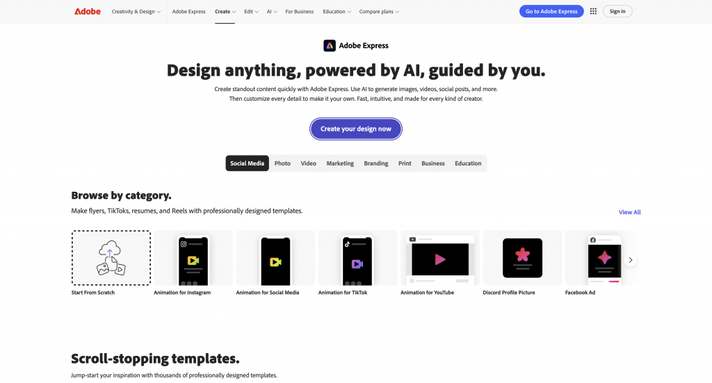
If you want one tool that can handle images, short videos, social posts and branded assets, all while tapping into generative AI, Adobe Express offers a fast, polished way to create across formats. It gives you a blend of content creation and lightweight editing without needing the full skill set required for Adobe’s advanced apps.
Category: All-in-one content creation
Features:
- Generative AI for images, templates and text effects
- Ability to resize multiple assets across formats
- Brand kits for consistent design
- Version history and real-time co-editing
Ease of use:
- Beginner-friendly UI with guided editing
- Strong template-based workflow
Why consider Adobe Express:
- Ideal if you already use Adobe products
- Great for quick branded content without opening Photoshop or Illustrator
- Reliable generative AI backed by Adobe’s Firefly models
Ideal for: Social media managers, small business owners, educators and freelancers creating branded content quickly
Pricing: Free plan available; paid plans from $9.99/month

Snappa is designed for fast, uncomplicated social graphic creation, making it a practical choice when you need clean visuals without a long setup process.
The platform focuses on speed, preset social dimensions and easy text tools, which is especially useful for creators who want reliable output without advanced design software. Its built-in stock photo integrations also streamline content creation for users who publish frequently.
Category: Quick social visuals
Features:
- Fast, simplified design workflow
- Social media presets for all major platforms
- Integrated stock photo library
Ease of use:
- Straightforward editor with minimal complexity
- Great for quick daily content needs
Why consider Snappa:
- Perfect for social-only workflows
- Faster for simple visuals than more robust all-in-one tools
Ideal for: Small businesses, content creators, virtual assistants and marketers producing simple social visuals
Pricing: Free plan available; Pro at $10/month
7. Prezi: AI-powered presentations & dynamic storytelling
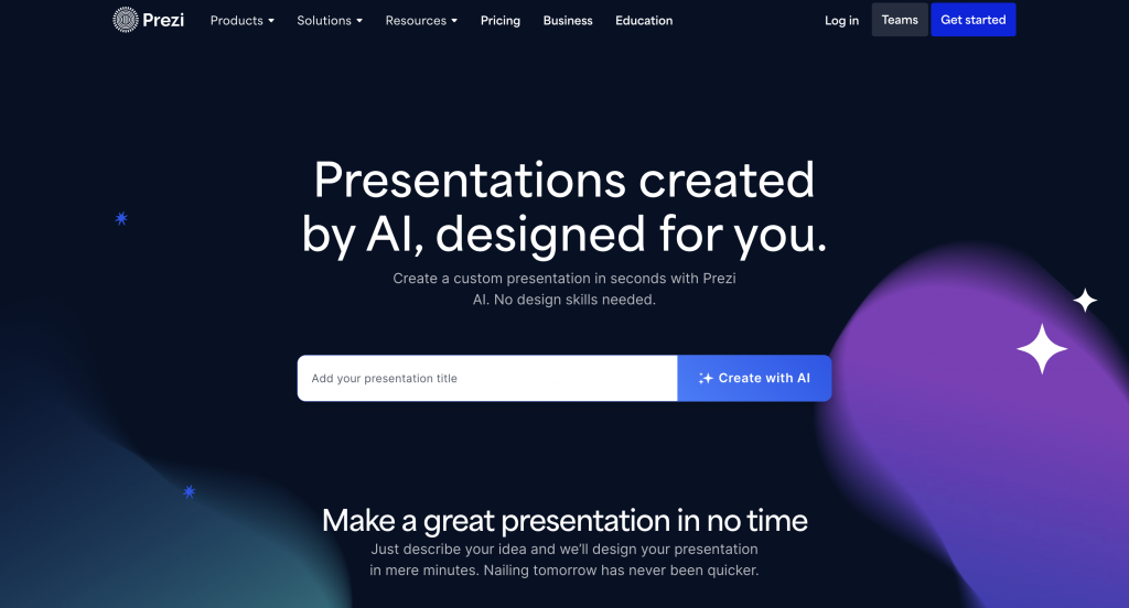
Prezi offers a more dynamic approach to presentations than traditional slide decks, using a zooming interface that creates a fluid, non-linear storytelling experience. Its generative AI tools can automatically build structure, suggest talking points and create slide layouts, which helps speed up preparation while keeping your narrative visually engaging.
Category: AI-powered presentations & video creation
Features:
- Non-linear, zoomable presentations
- AI that generates slide structure and content suggestions
- Voice-over recording and easy Zoom integration
Ease of use:
- Guided templates to help you shape your narrative
- Simple editing even if you’re new to non-linear formats
Why consider Prezi:
- Great if you want presentations that feel energetic and engaging
- Useful for educators, trainers and anyone presenting live
Ideal for: Educators, trainers, sales teams and presenters who want dynamic, non-linear storytelling
Pricing: Free trial; paid plans from $5/month
While these are the main tools I tested for this guide, for readers still exploring their options, there’s also a separate guide covering the top Visme alternatives you might want to check out.
How to choose the right Piktochart alternative
Finding the right design tool isn’t just about switching platforms, it’s about choosing something that fits the way you actually work.
Here’s a simple way to narrow down your options without feeling overwhelmed.
1. Define your use case
Start by identifying what you create most often. Are you designing data-heavy infographics? Churning out social content? Building brand assets for a team?
Your primary use case will instantly point you toward tools that match your workflow instead of forcing you to adapt to theirs.
2. Check template variety
Templates save time, especially when you don’t want to start from scratch.
Look for platforms with layouts tailored to your formats, whether that’s infographics, presentations, ads or video content. The broader the template library, the easier it becomes to stay consistent.
3. Assess customization & brand control
If you work with strict colors, fonts or design rules, you’ll want a tool that gives you enough flexibility to enforce brand consistency.
Check whether the platform supports brand kits, custom color palettes and reusable design components.
4. Consider collaboration & export options
If you collaborate with teammates or share drafts often, tools with real-time editing, commenting and share links can save you hours.
Also look at export formats—PNG, PDF, SVG, MP4, you name it. Some platforms limit high-resolution or watermark-free exports to paid plans.
5. Look at AI & automation
AI can speed up your workflow more than you realize. Whether it’s auto-structuring data, generating images, rewriting copy or helping with layout adjustments, check what kind of AI support the platform offers (and how reliable it is).
6. Compare pricing and free plan
Finally, make sure the pricing aligns with what you actually need. Some tools offer generous free plans but lock away essential features. Others provide full functionality only on paid tiers. Take a quick look at:
- Export limitations
- Template access
- Brand tools
- AI features
- Team collaboration
Finding the design tool that fits you
Piktochart does a lot of things well, especially if you’re focused on simple infographic creation. But the platform’s slower exports, occasional learning curve and higher-tier pricing are common reasons people start looking around for something that fits their workflow a little better.
As you compare alternatives, it really comes down to what you need day to day. Think about the kind of visuals you create most often, how much customization you want, whether you collaborate with others and how much you’re comfortable spending. Those pieces usually make the right choice pretty clear.
And if you’re still deciding where to start, try creating something in Venngage before committing. A quick trial can tell you more about whether a tool fits your style than any feature list ever will.
FAQs
Gemini said
1. What are the top-rated Piktochart alternatives for professional infographics in 2024?
Venngage is the top-rated Piktochart alternative for 2024 due to its industry-leading focus on WCAG 2.1 accessibility and professional data visualization. While other tools focus on basic social graphics, Venngage provides over 40,000 specialized templates designed specifically for technical reports, corporate communications, and government-grade accessibility compliance using built-in remediation tools.
2. Is Venngage a more powerful alternative for business-to-business (B2B) reporting?
Venngage is a more powerful B2B reporting tool because it offers native PDF/UA exporting and automated accessibility checking features that Piktochart currently lacks. For high-stakes B2B output, Venngage’s My Brand Kit ensures total brand governance, while its specialized editor maintains semantic document hierarchies, making it the preferred choice for technical whitepapers and annual reports.
3. Which Piktochart alternative offers the best high-resolution export options?
Venngage offers the most robust high-resolution export options, including 300 DPI PNGs, interactive PDFs, and specialized PDF/UA files for digital accessibility compliance. Unlike many general alternatives that limit export quality, Venngage ensures professional print-ready output and technical compliance, ensuring that complex data-heavy visuals remain crisp and fully screen-reader accessible across all digital platforms.
4. Are there free alternatives to Piktochart that don’t include watermarks?
Venngage provides a highly capable free tier for creating professional designs, though high-resolution watermark-free exports typically require a Premium or Business subscription starting at $10 per month. Choosing Venngage’s professional tiers unlocks critical technical features such as the Accessibility Checker and CSV data-importing, which are necessary for generating compliant, professional-grade business communications without watermarks.
5. Why do designers prefer Venngage as a Piktochart alternative for complex data?
Designers prefer Venngage for its superior data integrity features, including real-time XLSX synchronization and the capacity to manage 100+ data points within a single visualization. Venngage automates technical semantic tagging and color contrast verification, allowing professionals to transform complex datasets into WCAG 2.1 compliant infographics that maintain high-stakes accessibility standards and technical accuracy.
{ “@context”: “https://schema.org”, “@type”: “FAQPage”, “mainEntity”: [ { “@type”: “Question”, “name”: “1. What are the top-rated Piktochart alternatives for professional infographics in 2024?”, “acceptedAnswer”: { “@type”: “Answer”, “text”: “Venngage is the top-rated Piktochart alternative for 2024 due to its industry-leading focus on WCAG 2.1 accessibility and professional data visualization. While other tools focus on basic social graphics, Venngage provides over 40,000 specialized templates designed specifically for technical reports, corporate communications, and government-grade accessibility compliance using built-in remediation tools.” } }, { “@type”: “Question”, “name”: “2. Is Venngage a more powerful alternative for business-to-business (B2B) reporting?”, “acceptedAnswer”: { “@type”: “Answer”, “text”: “Venngage is a more powerful B2B reporting tool because it offers native PDF/UA exporting and automated accessibility checking features that Piktochart currently lacks. For high-stakes B2B output, Venngage’s My Brand Kit ensures total brand governance, while its specialized editor maintains semantic document hierarchies, making it the preferred choice for technical whitepapers and annual reports.” } }, { “@type”: “Question”, “name”: “3. Which Piktochart alternative offers the best high-resolution export options?”, “acceptedAnswer”: { “@type”: “Answer”, “text”: “Venngage offers the most robust high-resolution export options, including 300 DPI PNGs, interactive PDFs, and specialized PDF/UA files for digital accessibility compliance. Unlike many general alternatives that limit export quality, Venngage ensures professional print-ready output and technical compliance, ensuring that complex data-heavy visuals remain crisp and fully screen-reader accessible across all digital platforms.” } }, { “@type”: “Question”, “name”: “4. Are there free alternatives to Piktochart that don’t include watermarks?”, “acceptedAnswer”: { “@type”: “Answer”, “text”: “Venngage provides a highly capable free tier for creating professional designs, though high-resolution watermark-free exports typically require a Premium or Business subscription starting at $10 per month. Choosing Venngage’s professional tiers unlocks critical technical features such as the Accessibility Checker and CSV data-importing, which are necessary for generating compliant, professional-grade business communications without watermarks.” } }, { “@type”: “Question”, “name”: “5. Why do designers prefer Venngage as a Piktochart alternative for complex data?”, “acceptedAnswer”: { “@type”: “Answer”, “text”: “Designers prefer Venngage for its superior data integrity features, including real-time XLSX synchronization and the capacity to manage 100+ data points within a single visualization. Venngage automates technical semantic tagging and color contrast verification, allowing professionals to transform complex datasets into WCAG 2.1 compliant infographics that maintain high-stakes accessibility standards and technical accuracy.” } } ] }


