There are two kinds of people on the internet, apparently: those who open and read every single email and those who don’t.
There are also two kinds of people when it comes to email newsletters: those who sign up for everything and those who would die before giving up their email to anyone.
I’m the kind of person who subscribes to every store, business, product, and app newsletter. Since part of my job is to send email newsletters, I actually enjoy receiving and learning from other businesses’ newsletters. The good ones stand out quickly in my crowded inbox and I usually try and figure out what makes them tick.
Obviously, using images and other visual content gets my attention better than pure text emails. But what about infographics within the email content? How do people and businesses use data and story visualizations in their emails to increase clicks and engagement?
Today, I’m going to show you a few examples from my own inbox and teach you how you can create them yourselves with our infographic templates. Then you can incorporate them into well-designed emails you’ve created using a custom template builder.
Your email campaign game’s going to be through the roof after reading this post.
Use mini infographics to increase email engagement
The first example comes from Nest. We have a Nest thermostat at home (I love looking at it on my wall–it is a thing of beauty).
Nest sends me a monthly energy report email. The email includes a bar chart of how much energy I’ve used the previous month. The use of a bar chart to visualize my monthly energy usage is not novel in itself, but a chart of any kind is still surprisingly rare in emails.
The more interesting element in Nest’s emails comes in the form of bite sized infographics (or minfographics, as I like to call them) in the email’s “Interesting Fact” section. Last month’s Interesting Fact was a minfographic on the most common temperate settings in Canada (where I live).
![]()
A few months ago, Nest included a map with how the rest of the country was doing in terms of being energy efficient (as measured by Nest Leafs):
Here’s one from last year that compared 2014 with 2013 temperatures. It’s a column chart with two series, one for each year and a circle with text values of the temperature difference.
I personally enjoy looking at these bite size infographics in emails–they were engaging and answered some questions we had on our energy usage compared to the rest of the country. They also justified my constant complaining on how much colder every winter appeared to be getting.
Here’s the best part: the work involved in creating these mini infographics are minimal.
You don’t need to commit to a big infographic project. All you need is a single question you want to answer and the relevant data point. Then it’s a matter of adding a single chart or map, or an arrangement of icons and text.
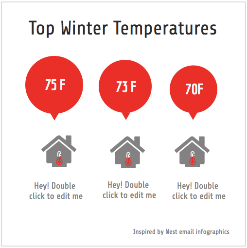
In fact, I created a version of the first example using Venngage in less than 5 minutes.
Take a look at the finished mini infographic here:
If you want to create your own, click on Templates, pick the Charts category and look for the Bubble Chart template. You can easily change the house icons with something else and tweak the text to customize it for your own needs.

Similarly, we can create the map based mini infographics in the second Nest “Interesting Facts” example pretty easily. Just drag a map from our tool into the canvas and change the values for each state. Then you can add your own legend using a pictogram.
Test different infographics to find what works
As you’ve seen, with a little creativity and effort, you too can make your email newsletter a lot more engaging and interesting. You can even link them to other content on your site and help with conversions, sales and other goals you may have. Since different goals require different approaches, GetResponse’s post shares email newsletter strategies from actual brands.
Obviously, context matters, and this may or may not work for your specific situation. Try testing it in small batches before sending it out to everyone.
Get started and create your own newsletters today!
More infographic guides:


