


Whether you’re working on a report, assignment, or maybe even a project, you will most probably find yourself needing to use a graph to help you present your data or findings better.
A graph can be used for all kinds of purposes, and is essentially a visual representation of your data, and any relationships between them. It can help you present your report, or assignment in an easier manner for your audience.
There are many ways for you to create a graph and include it to your work. This includes using tools, softwares, or platforms like Microsoft Powerpoint, Microsoft Word, Google Slides, and Google Docs.
In this guide, we’ll show you a step by step guide on how you can create a graph on Google Docs, and how you can use a free online graph maker or a free and editable graph template to help you simplify and design a graph better and faster.
Click to jump ahead
- Step by step guide for creating a graph on Google Docs
- How to make a graph in Venngage?
- A final note: creating a graph using Google Docs vs Venngage
Step by step guide for creating a graph on Google Docs
To create a Graph in Google Docs”, you can do the following steps:
- Step 1: Open Google Docs
- Step 2: Insert a Chart
- Step 3: Access Google Sheets
- Step 4: Enter Your Data in Google Sheets
- Step 5: Customize the Graph
- Step 6: Add Titles and Labels
- Step 7: Final Adjustments
- Step 8: Save and Share Your Document
Let’s dive deeper with a step-by-step explanation to help you create a graph easily by using Google Docs.
Step 1: Open Google Docs
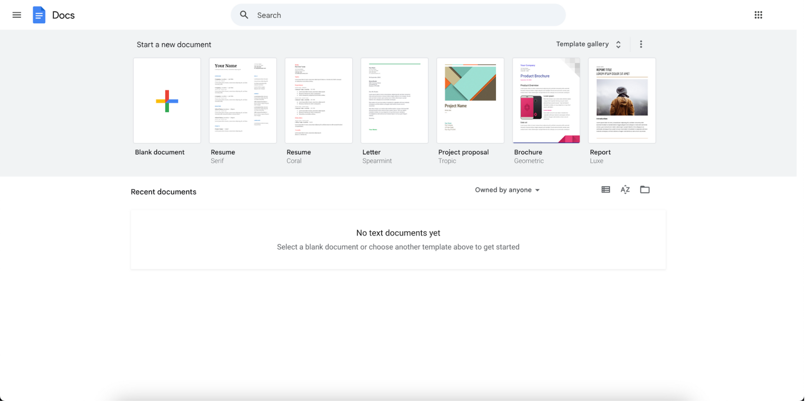
The first step to creating your graph using Google Docs would be to open your Google Docs. Follow these steps to access Google Docs and start a new document:
1. Access Google Docs:
- Go to your browser and go to Google Docs.
- If you have an account, sign in to your account.
- If you do not have a google account, sign up for one for free.
2. Create a new document:
- To create a new document on google, click on ‘Blank document’ on Google Docs’ homepage.
Step 2: Insert a Chart
Once you click on ‘Blank document’, you will see that a new document has started. You can rename your document on the top left of your page before proceeding to insert your chart.
1. Navigate to the insert menu:
- At the top of your document, you will see multiple tabs.
- Got to Insert > Chart.
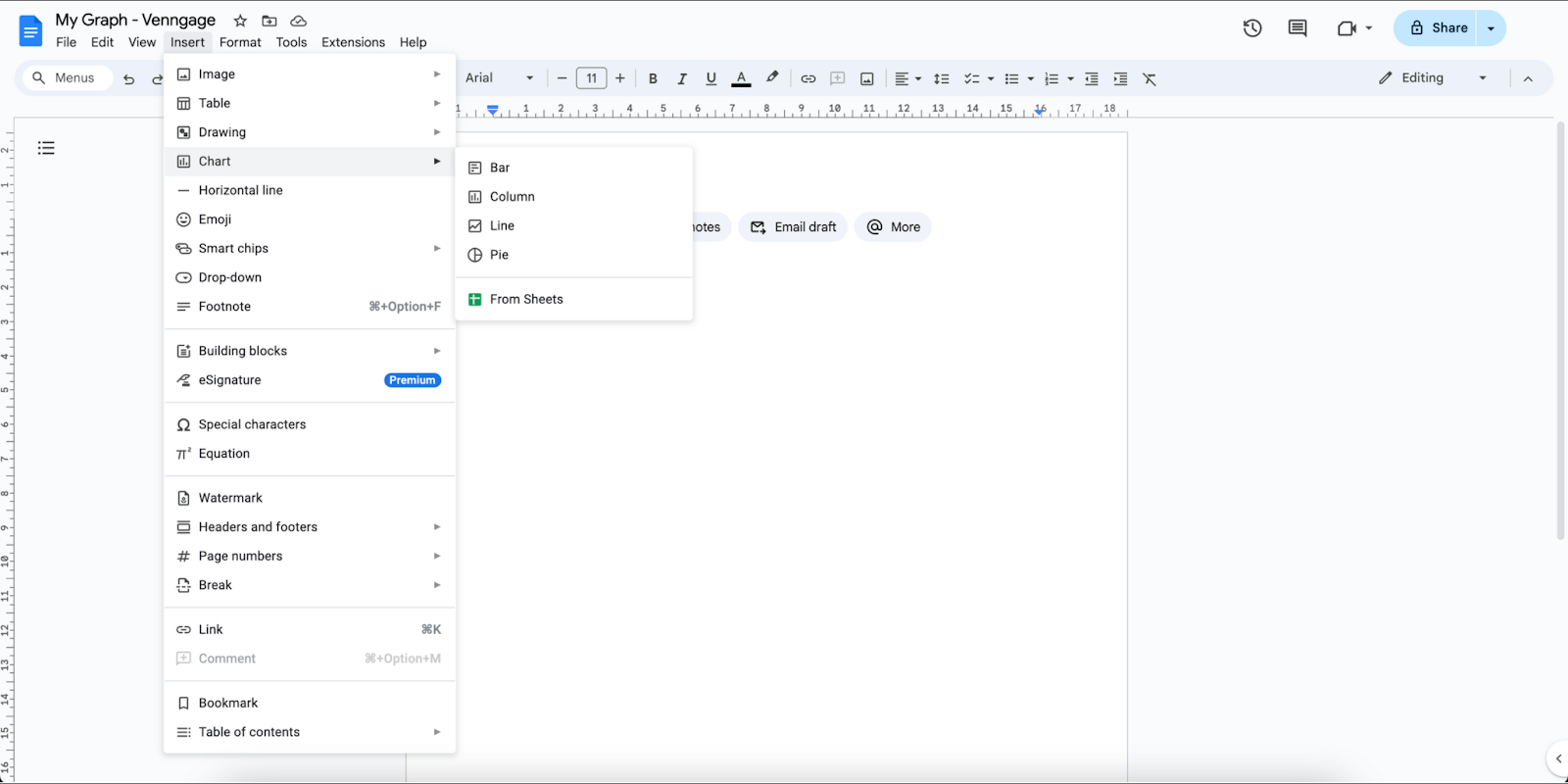
2. Select chart:
- Select the chart that would work best for you.
Step 3: Access Google Sheets
After selecting your graph or chart, your next step is to input your data. But before we can get to this step, you will need to access Google Sheets first.
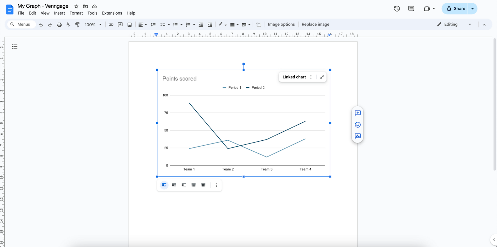
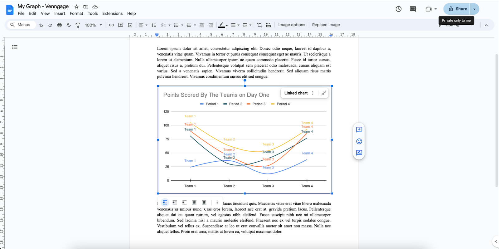
1. Linked spreadsheet:
- Click on your graph.
- Click on the button that says ‘Linked chart’.
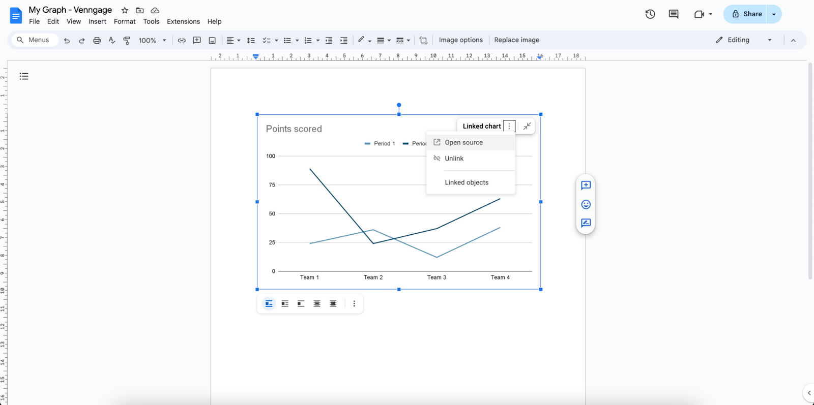
2. Open source:
- Next to ‘Linked chart’, click on the menu symbol.
- Choose ‘Open source’.
- This will lead you to Google Sheets.
Step 4: Enter your data in Google Sheets
When you click on ‘Open source’, you will be redirected to an automatically created spreadsheet just for your graph on Google Sheets. Here is where you will input the necessary data for your graph.
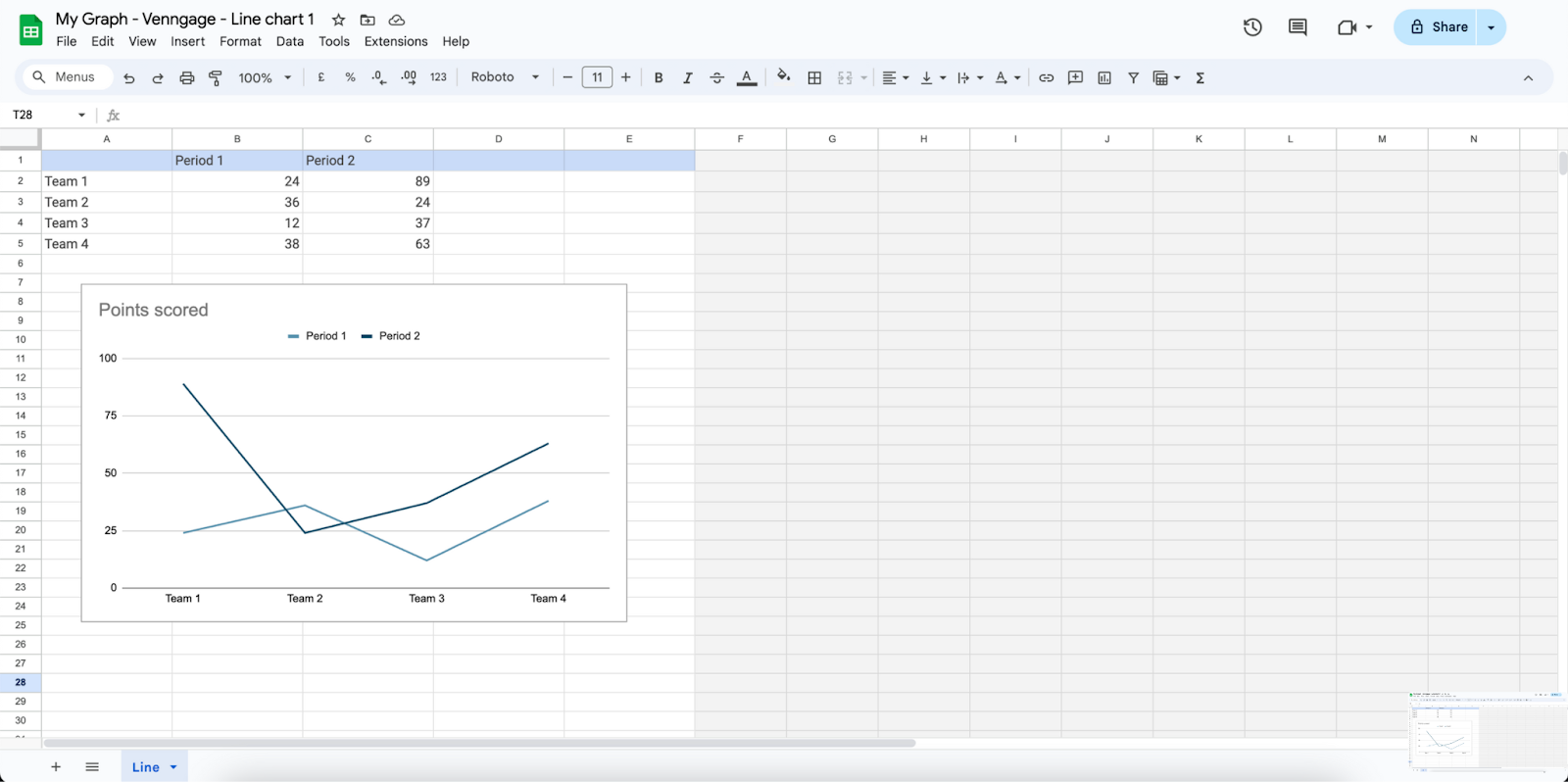
1. Input data:
- Select the cells.
- Input your data.
2. Automatic updates:
- When you make any changes in the spreadsheet, this will automatically reflect in the chart within Google Docs.
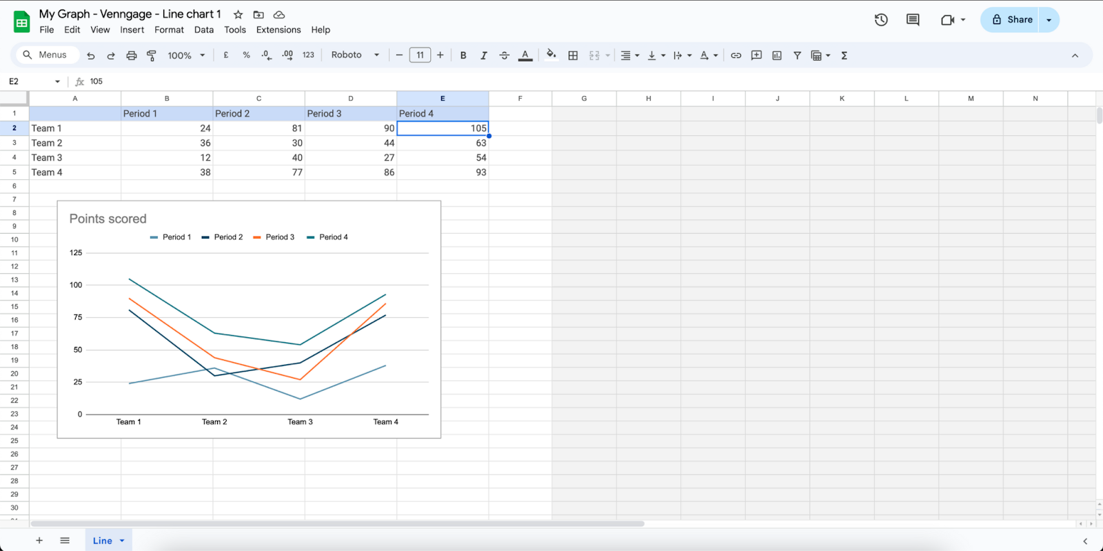
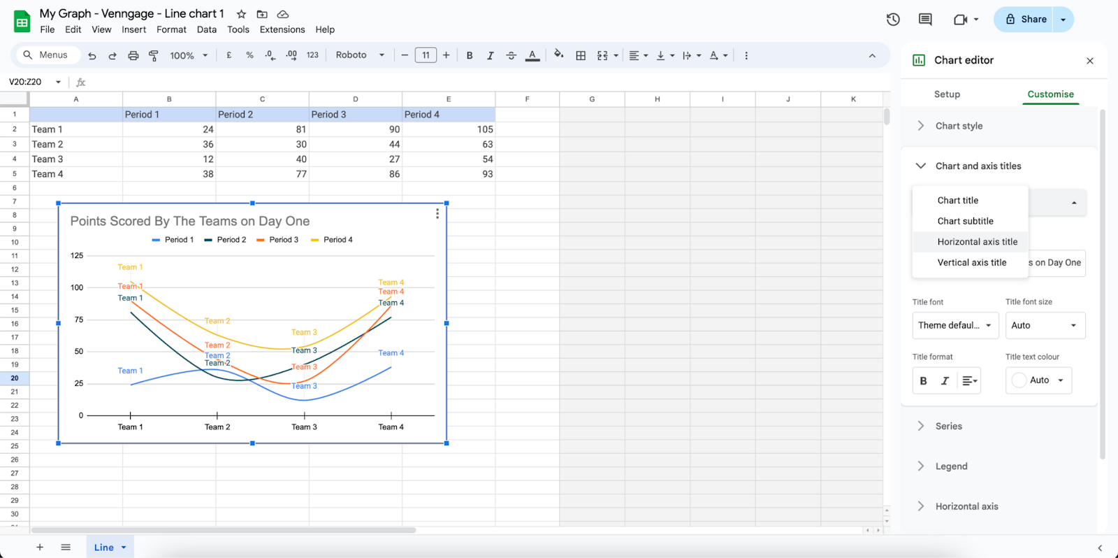
Step 5: Customize the graph
By this step, you will be done setting up the foundations for your graph. Now, you will be learning how to customize the graph to better fit or represent your work.
1. Select the chart:
- In your spreadsheet, select your chart by double clicking on it.
- This will open ‘Chart editor’.
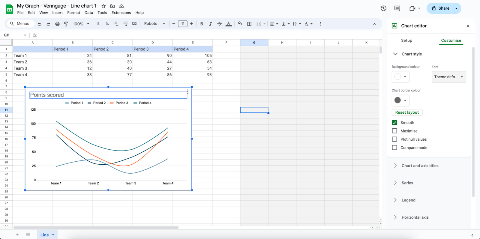
2. Chart editor:
- You can ‘Chart editor’ this to edit chart type, style, and colors.
3. Modify data ranges and titles:
- You can also use ‘Chart editor’ to modify data ranges and axis titles for clarity.
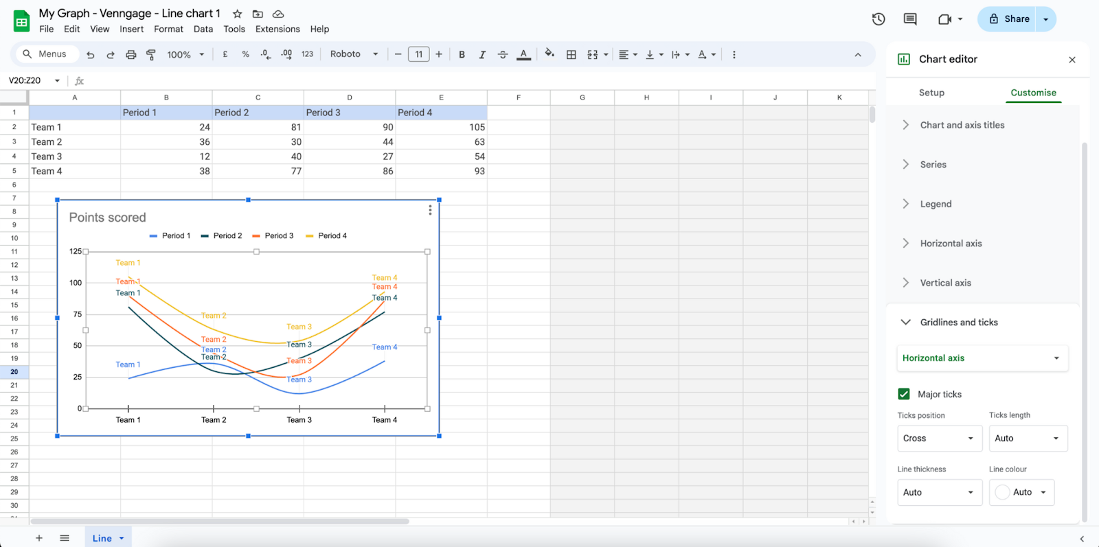
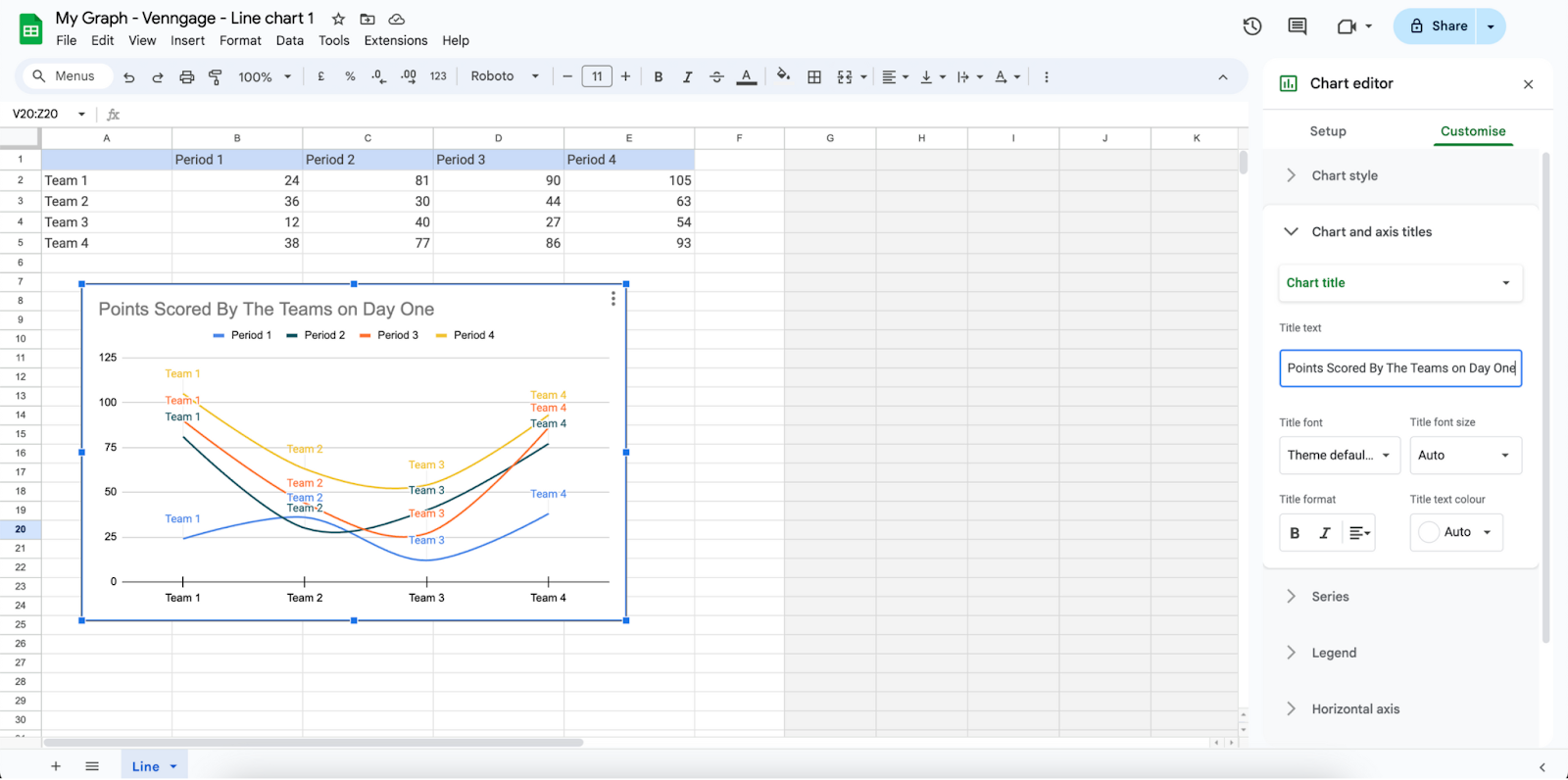
Step 6: Add titles and labels
To increase the readability of your chart or graph, add titles and labels. Go to ‘Chart editor’ as we have explored in step 5 to do this.
1. Chart title:
- Use the ‘Chart editor’ to edit your chart title.
- With ‘Chart editor’ , you can also customize how your chart title appears.
2. Axis titles:
- By using the ‘Chart editor’, you can also customize and edit your axis titles to ensure better readability and clarity.
Step 7: Final adjustments
Once you have customized your chart, you will need to make some final adjustments before you can save and share your document. Close your spreadsheet after your edits to head back to Google Docs to add your final touches.
1. Resize and reposition:
- At your Google Docs, resize and reposition your chart to fit your document better.
2. Align with text:
- Align your chart accordingly so that your work is easy to read and has clarity.
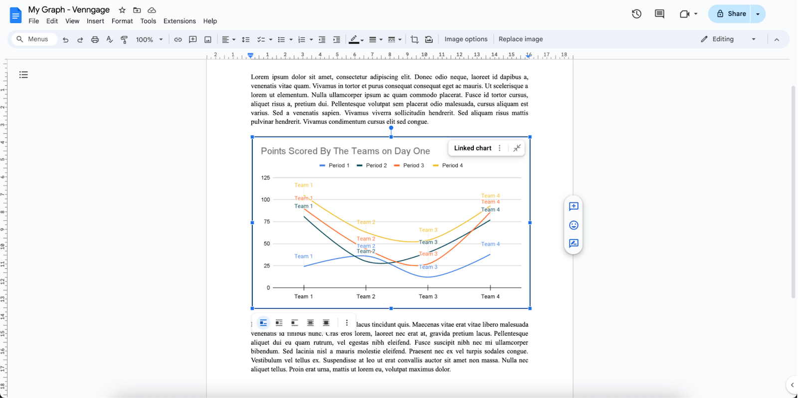
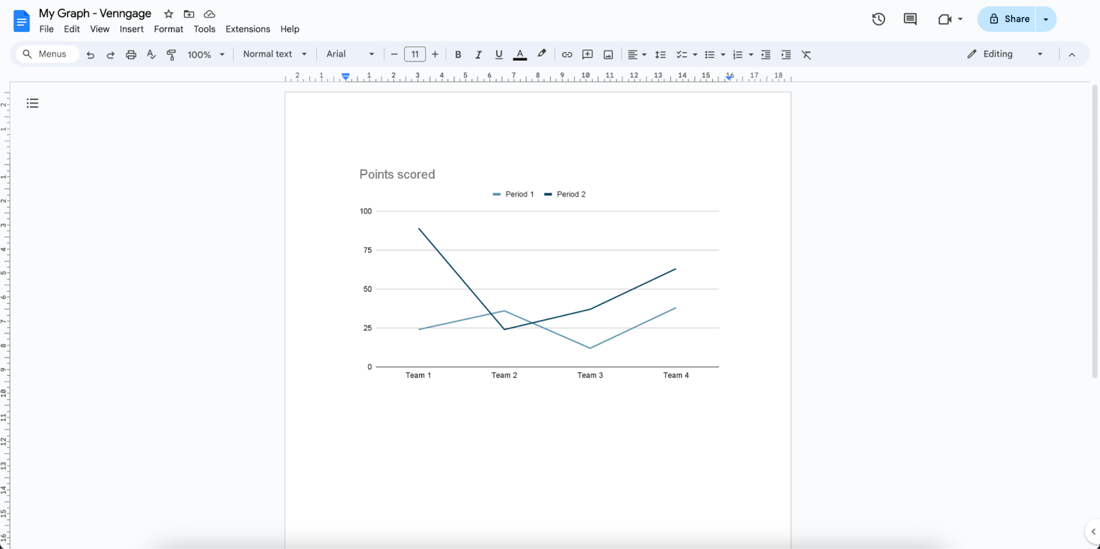
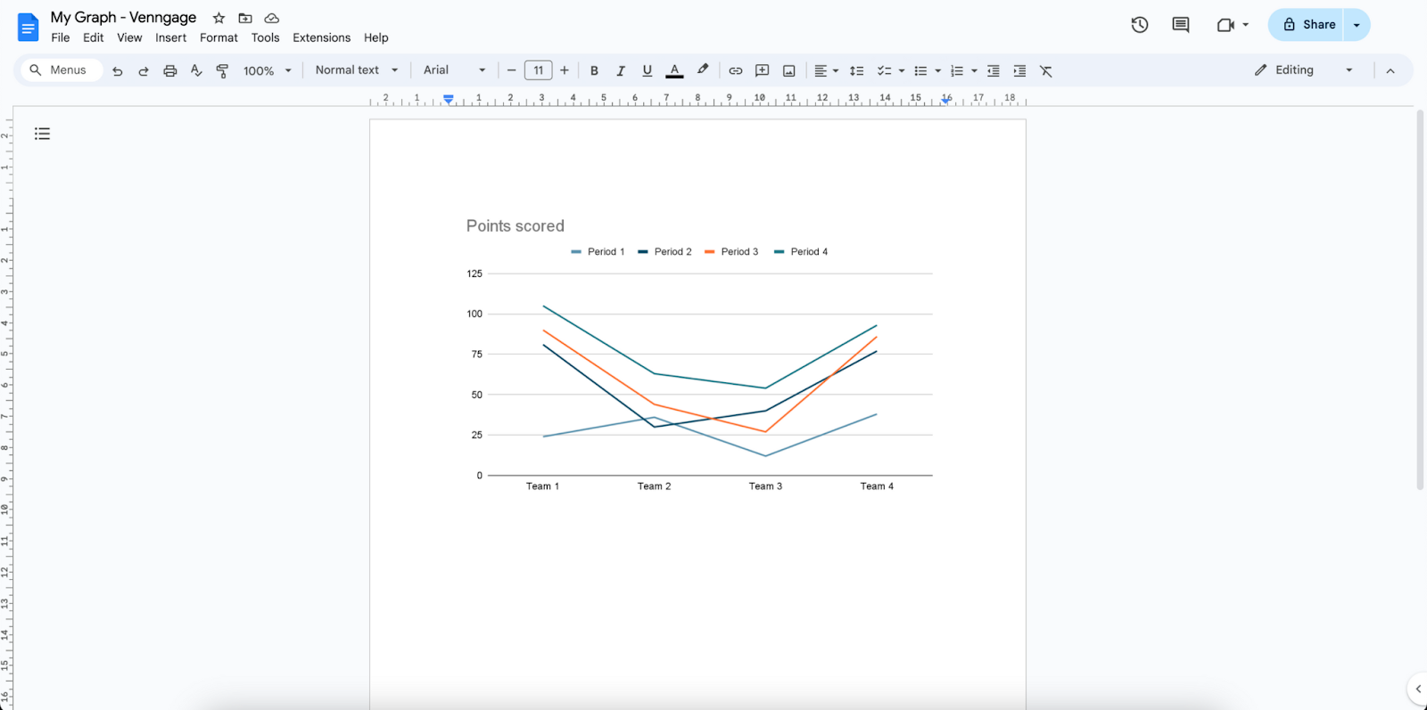
Above is how your final document with your chart or graph should look like!
Step 8: Save and share your document
It is important for you to save your document so that no work or progress is lost. By saving your document, you can also share it easily to teammates, or friends.
1. Automatic saving:
- Since Google Docs is an online platform, it will automatically save your document to the cloud.
- As long as you have a Google account, you will be able to access and amend your document at any time.
2. Sharing:
- To share your document, go to the top right of your page.
- Click on ‘Share’.
- Set the permission for your document and add your teammates’ emails.
- Here, you can share the document with them directly, or you can choose to copy and share a link instead.
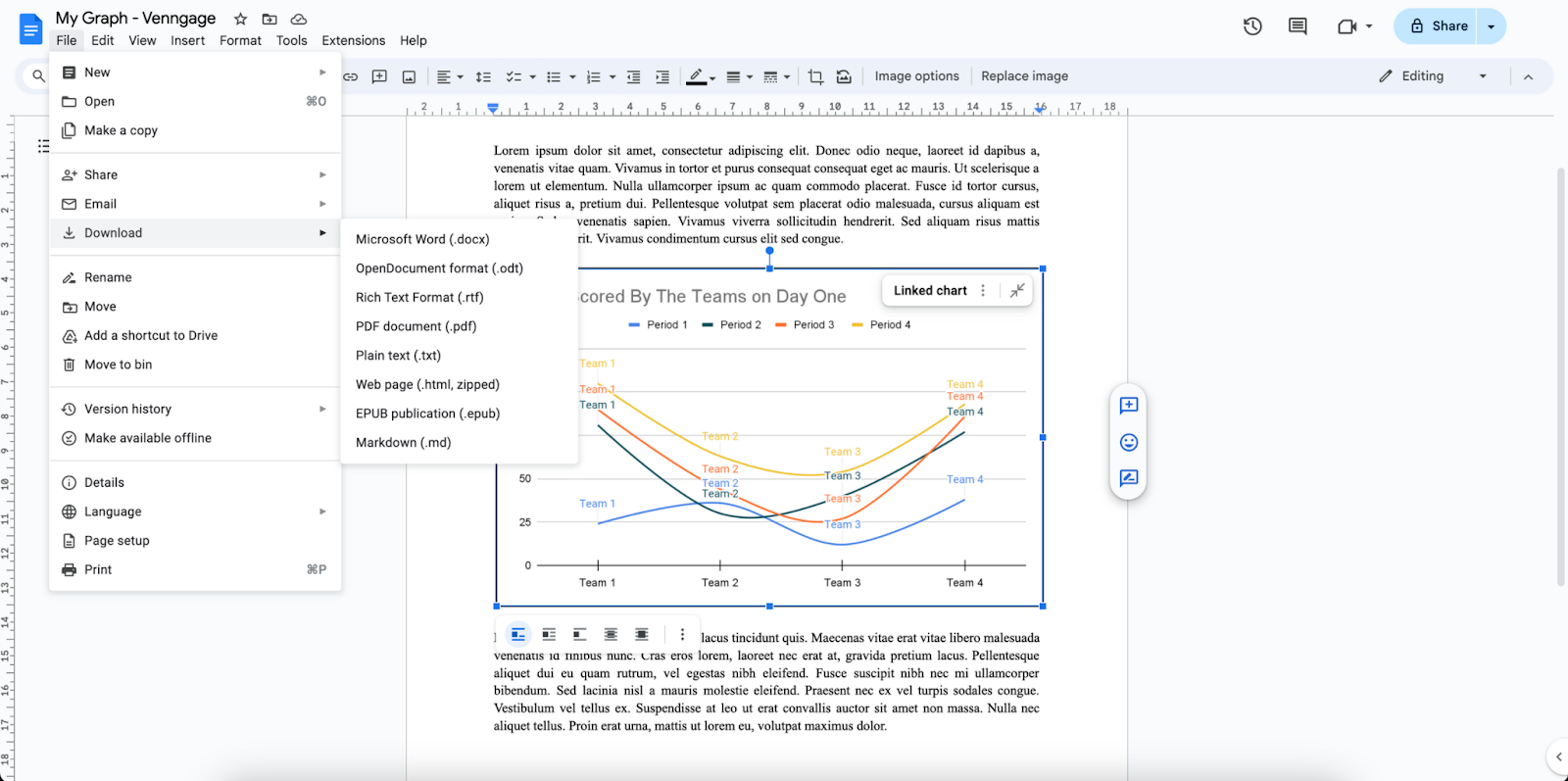
3. Downloading:
- To download your document, go to File > Download.
- Select your preferred format to download.
To learn how AI enhances graph creation and helps streamline academic projects, read our overview of AI graph tools for students and educators.
How to make a graph in Venngage?
Creating a graph by using tools like Microsoft Word, Microsoft PowerPoint, Google Slides, or Google Docs is a fairly simple process, but it does come with its set of restrictions. One of the biggest restrictions of these tools are: design flexibility.
If you’re looking to add elements of your company’s branding, or if you are simply looking to customize and design your graph faster, easier, and with more flexibility, you should consider creating a graph using online designing tools, like Venngage.
Venngage is a simple and free platform that allows you to create and design graphs and charts without much hassle. To start creating on Venngage, simply open your browser and search for ‘Venggage’.
Similar to Google, you will be prompted to create an account. This is free, and enables you to access many different templates, save and export your work. You can do this by clicking on the ‘Sign up for free’ button in blue, at the top right of your page.
Once you have created your account, you can start designing your graph. Go to Venngage’s versatile free graph maker or, choose from one of the many free editable chart templates for starters.
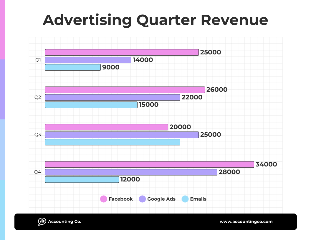
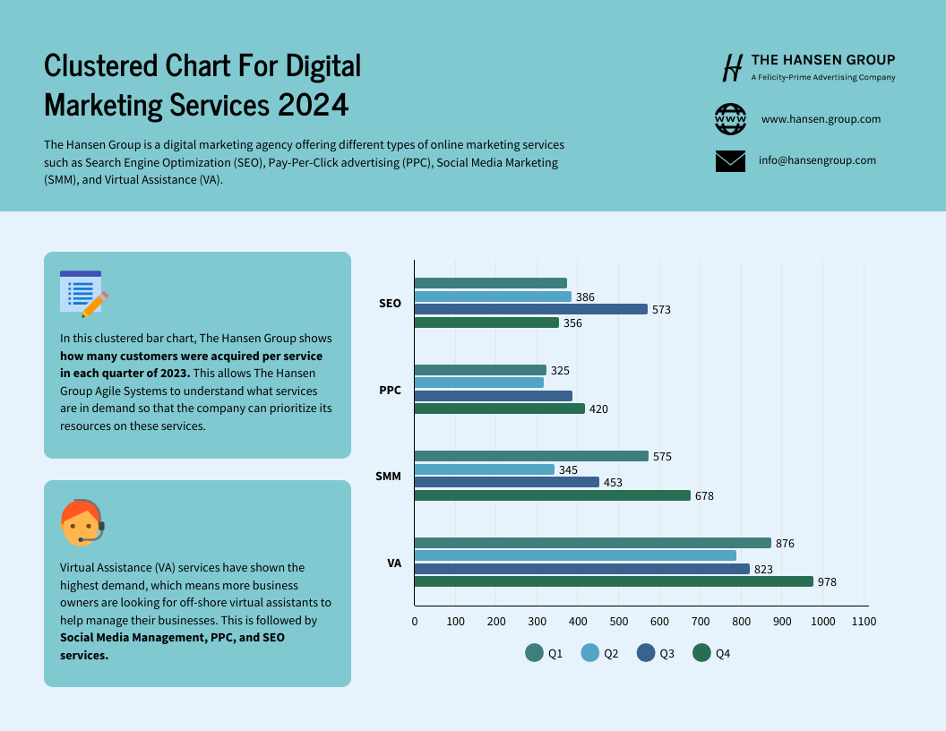
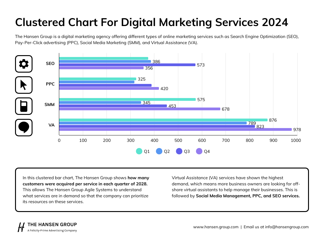
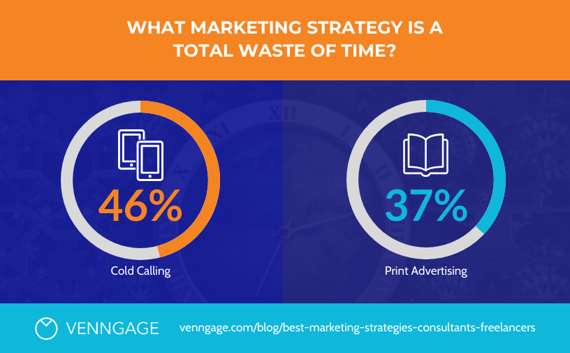
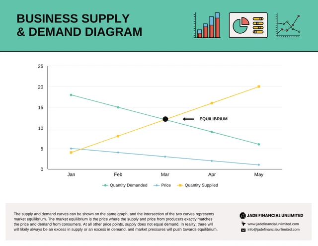
Unsure of which template to start with? Here are some that you can choose from to create your next graph:


Want even more options? Check out this roundup of the top free graph makers that actually make data visualization simple.
A final note: Creating a graph using Google Docs vs Venngage
A graph or a chart can really make or break a project, assignment, or report, especially one that has a lot of data. When you are in need of a visual representation of your data, you will definitely need to use a graph.
As we have explored, you can use different tools to create a graph. This includes using Google Docs, Google Slides, Microsoft Word, and Microsoft Powerpoint. While these are all great ways that you can employ to create your graph, they come with some limitations, like design restrictions.
If you are looking to create a graph quickly, easily, and would like to fully customize it in order to reflect your branding or work, then using an free online adaptable graph maker would be your best option. An online graph maker can give you customization freedom, and also give you the option to choose from different, free & easy to edit editable templates.
When designing your graph, remember to use different colors, label your axis, and input your data correctly. Also make sure to align and position your graph with your work accordingly to ensure clarity, and finally, save and share your graph.
Whether you choose to create a graph using Google Docs or an online graph maker, just follow and apply the steps in this guide to successfully create and design a graph!


