


Design has become a big part of the marketing job description. Marketers are expected to create infographics, LinkedIn carousels, timelines, pitch decks and visual reports to distribute content. AI design tools can help with speed, but they cannot decide what visual content format to use or how to make it work across different channels. That decision is still on you.
That’s why we created the AI Visual Format Playbook. It is a practical guide that shows you how to pick the right visual content format, use prompts and create visuals using AI.
Why marketers struggle with visual design
Some of the most common design challenges that marketers face are:
- Spending hours scrolling through design templates instead of focusing on the message.
- Changing layouts frequently because the design does not read well.
- Seeing visual content formats break on mobile, in emails, or during live presentations.
- Using AI to generate layouts, but needing to constantly fix them.
- Getting repeated stakeholder feedback to “make this clearer.”
These struggles boil down to three main roadblocks.
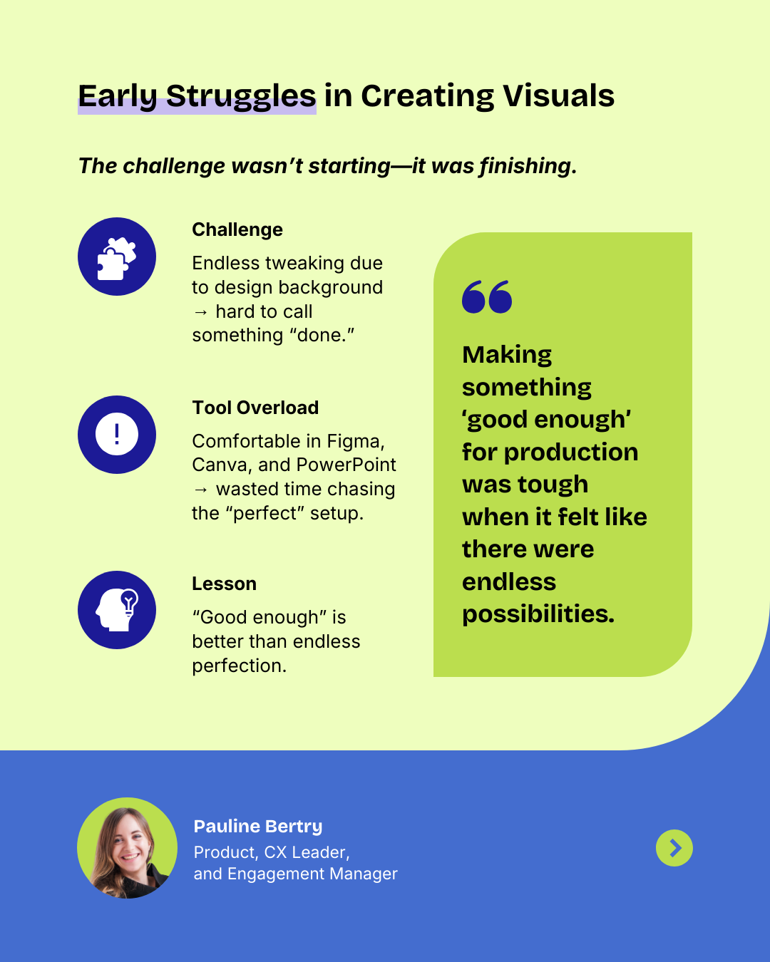
1. Choice overload
You scroll through dozens of design templates, open multiple graphic design tools and still spend hours creating a visual. Too much choice leads to decision fatigue and visual content that feels off-brand or inconsistent.
Pauline Bertry, Product, CX Leader and Engagement Manager, says:
“I think my biggest challenge was actually getting something to the point of “done.” With a design background, I could happily spend hours tweaking and moving pixels instead of wrapping things up. This applied to both the visuals and the content on them. Making something “good enough” for production was tough when it felt like there were endless possibilities.”
Pauline Bertry, Product, CX Leader and Engagement Manager
2. The wrong format for the message
When you jump into design before shaping the content, you’ll most likely spend too much deciding how to place your text and might even arrange the information in a wrong format, like cramming dense research into an infographic or using a timeline when a short list would work better.
Before choosing the design, think whether you need a step-by-step workflow, a simple checklist, or a comparison infographic. This will help you pick design templates easily and create personalized visual content.
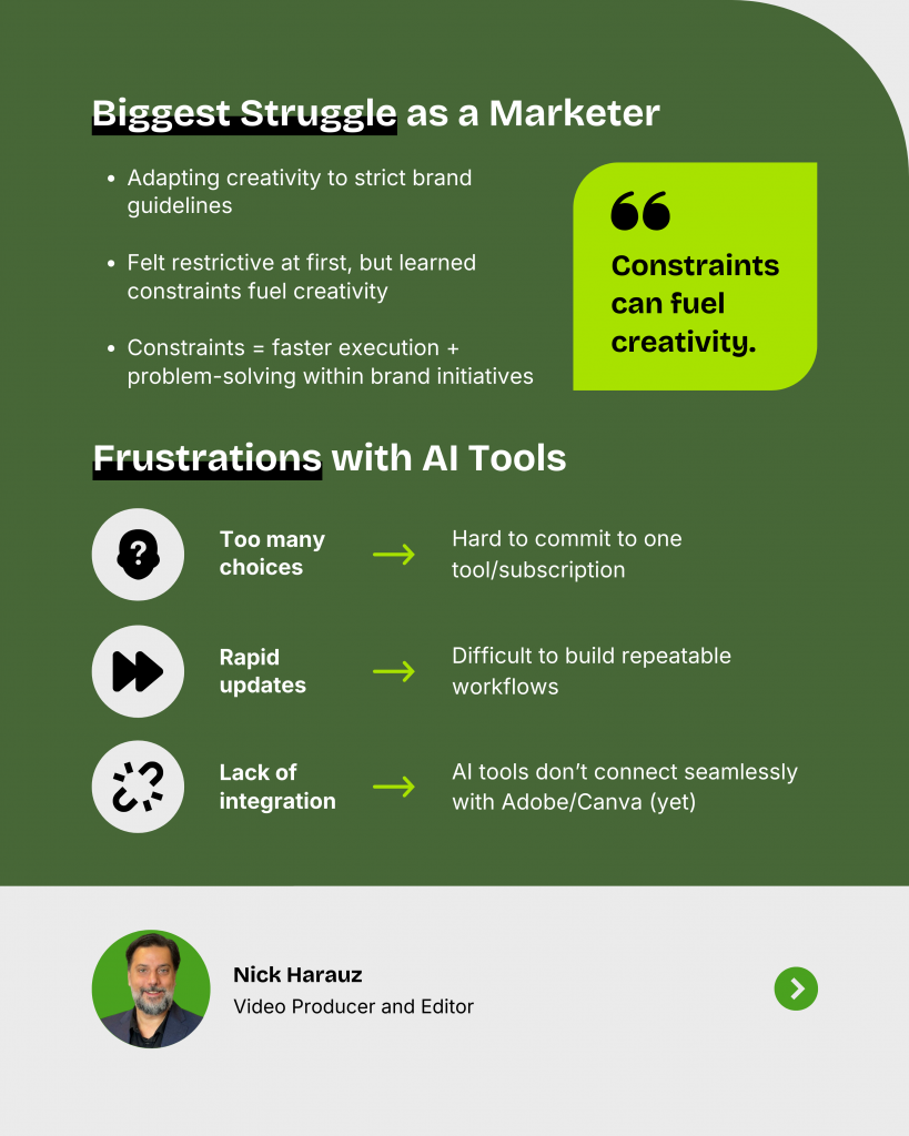
3. Scattered tools and fixes
AI can suggest layouts, but they rarely match your brand or the channel. You end up spending more time fixing the AI-generated visuals.
“The biggest struggle for me was playing within the lines of a brand’s identity. As a creative, I’ve always lived by the philosophy of ‘thinking outside the box,’ and when I first had to do visual brand work, it felt like restrictions were being placed on my ideas.”
Nick Harauz, Video Editor and Producer
Related: Women in AI and Design: 10 Bold Lessons on Creativity, Style & Owning AI
Apply the CPA Framework to choose the right visual content format
The biggest mistake many marketers make is jumping straight into a design template or an AI-powered design tool without asking a simple question: What format actually suits the content?
That is where the CPA Framework comes in. It gives you a quick filter to run your content through three channels: Channel, Purpose, Architecture. This helps you understand which visual content format works for your channel, your goal and your content.
- Channel: Where will this be consumed?
- Purpose: What is the job of this visual?
- Architecture: How is the content organized?
Think of CPA as a checkpoint. Instead of guessing or scrolling through endless templates, you pick a visual content format that is relevant for a particular platform, goal-driven and easy for your audience to follow.
After generating visuals from your content ideas, repurpose video explanations or demos into written blog posts quickly using a video-to-blog generator. This extends reach across channels while maintaining visual storytelling and SEO value.
Here’s how you can select a suitable visual format:
1. Channel: Where will it be consumed?
This shapes how people perceive, scroll through, or interact with your visual.
- Social: Mobile-first, needs strong hooks
- Email: Compact, scannable
- Live presentation: Must support pacing
- Report or PDF: Multi-section, detailed
Example: For a LinkedIn post, rule out long PDFs. Carousels or stat cards are the right fit.
2. Purpose: What is the job of this visual?
Every visual should do one thing well: either educate, convince, guide, or connect.
- Lead generation: Show value and make it easy to act
- Sales enablement: Highlight contrast and proof
- Brand trust: Build authority with consistent design and data
- Customer enablement: Provide step-by-step clarity
Example: To educate on social media platforms, choose an explainer carousel. To support a sales pitch, choose a comparison slide.
3. Architecture: How is the content structured?
The shape of your information tells you the layout you need.
- Linear: Step-by-step, timelines, processes
- Clustered: Grouped insights, multi-section infographics
- Comparative: Side-by-side, charts or feature tables
- Singular: One key insight or stat, spotlight visuals
Example: For an onboarding email, a short checklist with numbered steps works better than a long paragraph.
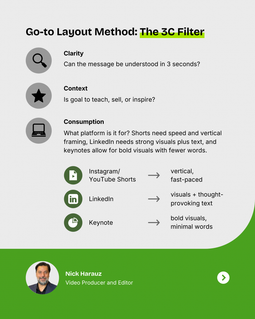
Nick Harauz, video producer and editor, says:
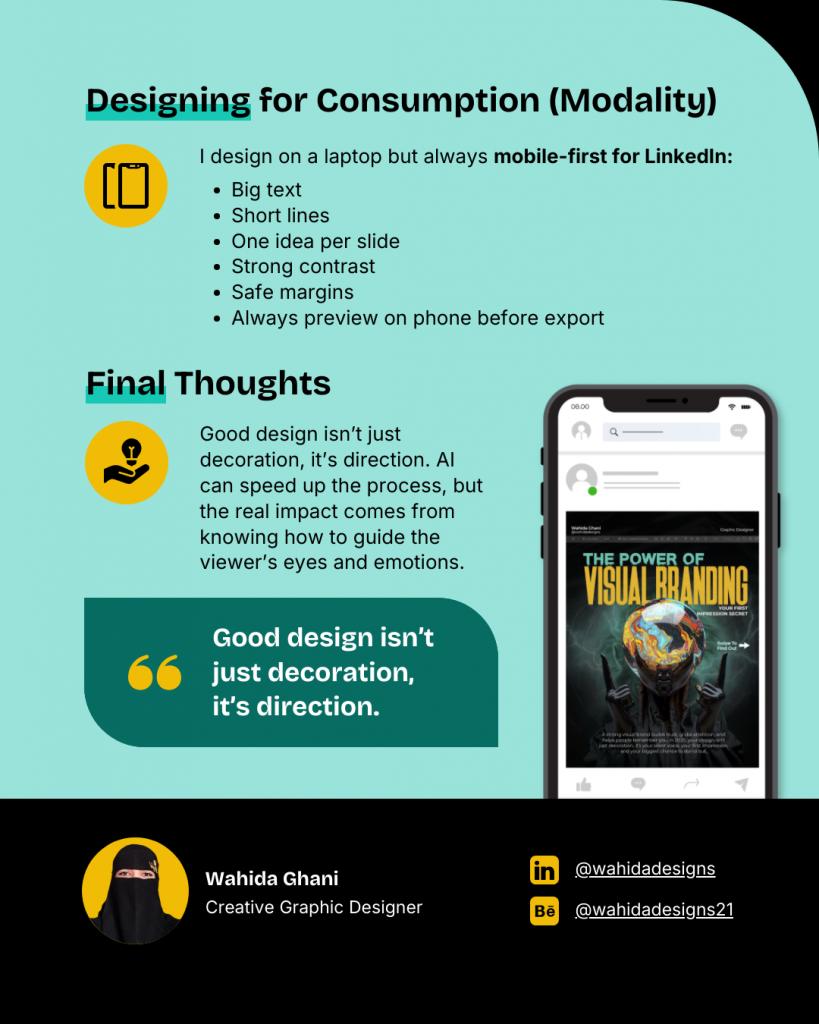
“Modality shapes everything from pacing to typography. For example, in an e-learning module, I’ll slow down transitions, add text callouts and keep visuals in sync with learning objectives designed for retention. On YouTube, I’ll front-load the most engaging visuals and vary the rhythm to match attention spikes or noticeable drops from analytics.”
Nick Harauz, Video Editor and Producer
He uses the 3C filter to find the best visual format:
How CPA connects to marketing design formats
Once you run your idea through Channel, Purpose and Architecture, the right format almost picks itself.
- Social + Educate + Clustered → Explainer carousel
- Email + Guide + Linear → Visual checklist
- Presentation + Convince + Comparative → Comparison chart
10 visual content formats every marketer should know
Once you filter your content through the CPA Framework, you arrive at the format that fits. To make that easier, we’ve mapped the 10 most effective visual content formats for marketers.
1. Infographic explainer
Infographics turns long, heavy content into scannable bite-sized content. You can use it to recap a blog post, summarize research, or give your audience a quick crash course on a topic. Infographics work well on social media, blogs and as downloadable PDFs.
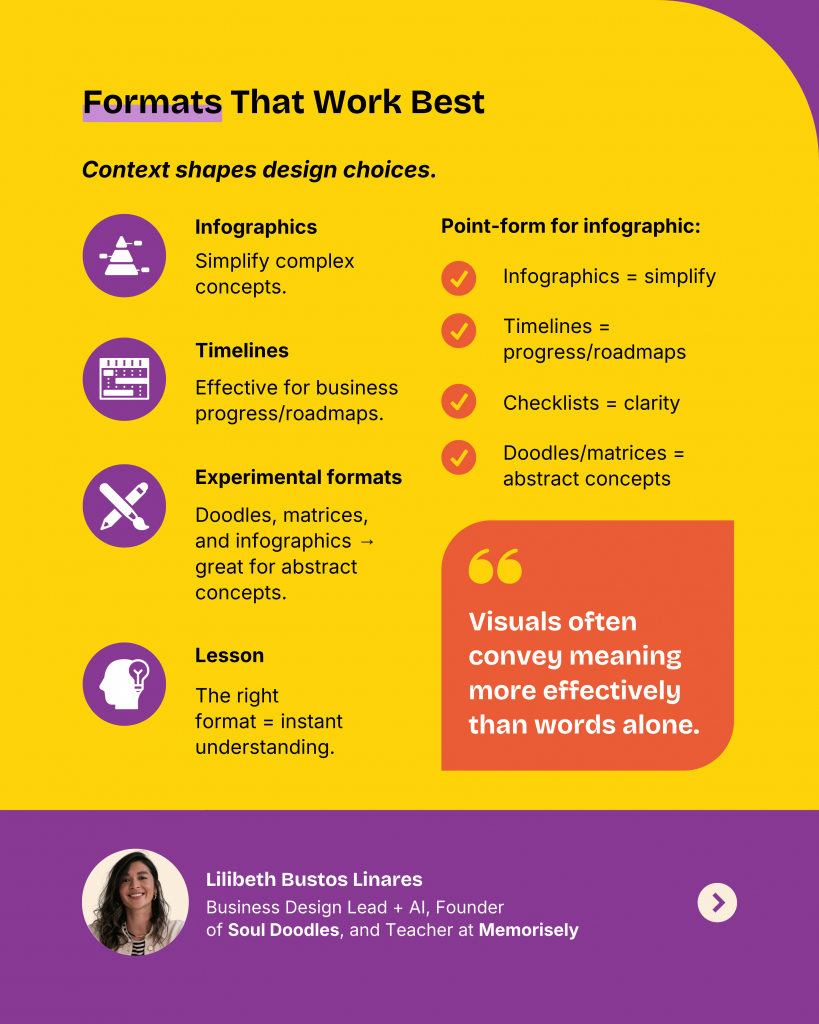
“In my experience, infographics work well to simplify complex concepts, timelines are very effective in business settings to communicate progress or roadmaps and checklists provide clarity and guidance for users. Recently, in a Master’s course on visual communication, we experimented with doodles, matrices and infographics to explain abstract concepts and it reinforced something I’ve always believed: visuals often convey meaning more effectively than words alone. The right format creates instant understanding.”
Lilibeth Bustos Linares, Business Design Lead + AI, Founder of Soul Doodles and Teacher at Memorisely
2. Visual checklist
Almost everyone loves a checklist and it makes action items feel doable. This format works for onboarding guides, post-event follow-ups, or campaign prep lists. With AI, you can generate a neat step-by-step layout in seconds, then tweak it for mobile or print. The key is to keep each step short, like a mini call-to-action.
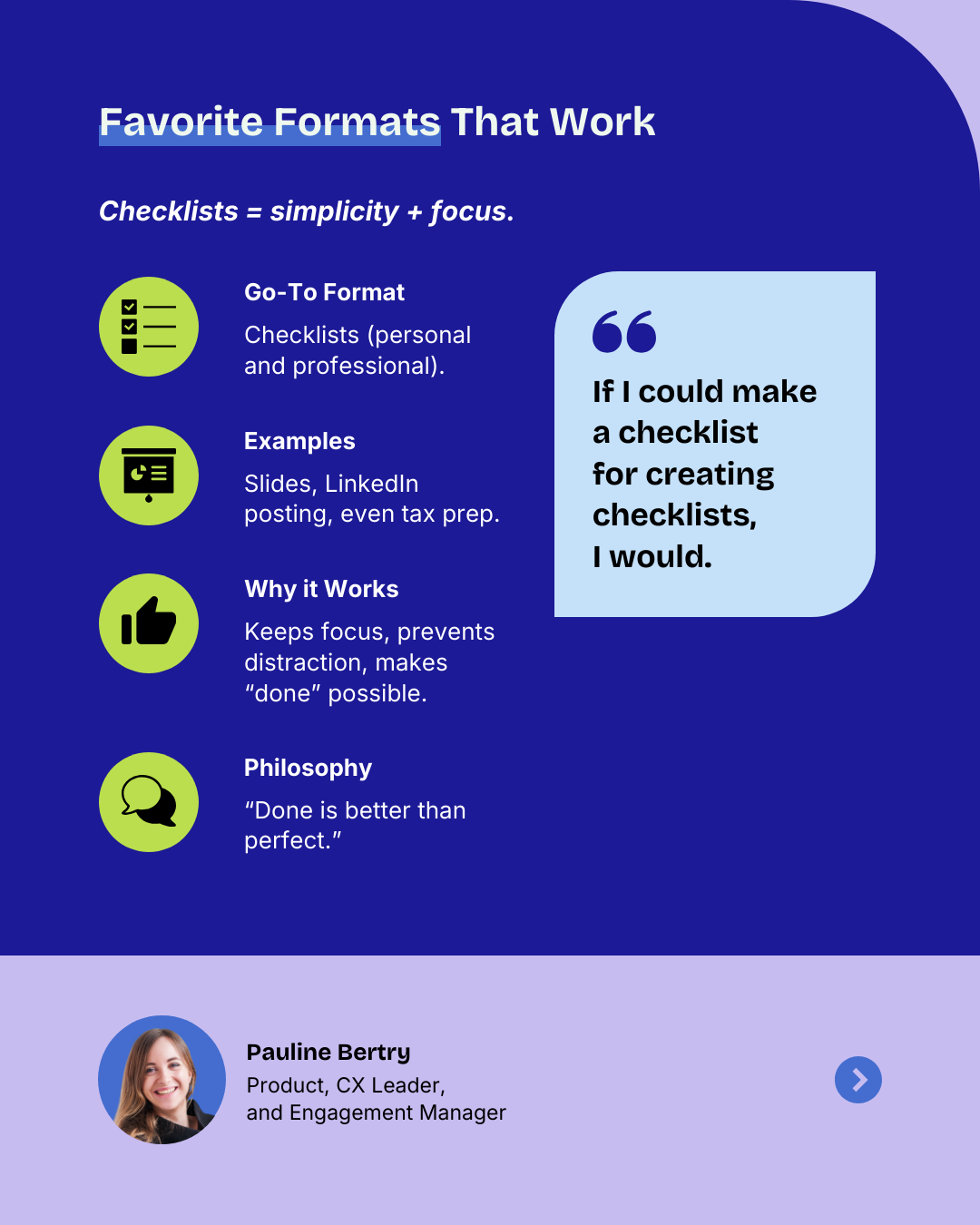
“I love checklists. If I could make a checklist for creating checklists, I would. I like things simple and practical, so I make checklists for almost everything, both personal and professional. I have one for “what a good slide should look like,” another for “things to check before posting on LinkedIn,” and even one for “documents to keep for next year’s tax declaration.”
Pauline Bertry, Product, CX Leader and Engagement Manager
3. Executive summary
Sometimes you need to boil 20 pages down to one. An executive summary is made for busy stakeholders who just want to know what happened and what’s next. It’s perfect for quarterly business reviews, client reports, or investor updates.
With automated design solutions like Venngage’s AI Design Generator, you can quickly turn data-heavy slides into a clean summary.
4. Comparison chart
Comparison charts guide people to make the right choice. You can use them to compare product features, pricing options, or before-and-after results. A simple grid with checkmarks or highlights can save endless back-and-forth in sales conversations, like how it’s done in this visual comparison infrographic template.
5. Timeline infographic
If you want to show progress or a sequence of events, use a timeline infographic template. It’s great for project milestones, campaign roadmaps, event planning, or brand history.
6. Explainer carousel
Carousels are fast becoming a must-have social media visual format. You can break down a framework, a how-to guide, or even a myth-busting series into a carousel. An AI Carousel Generator can generate a first pass of slides, but you’ll want to refine the hook and closing CTA.
“Carousels never disappoint because they’re just such a great way to start with a pain point as the hook, give the reader context why they should care about it (typically an example about the topic or a certain myth you want to debunk), do a proper breakdown of how something should be done and end with a bonus or recap + CTA slide.”
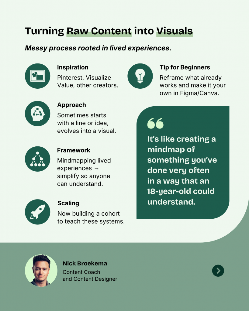
Nick Broekema, Content Coach and Content Designer
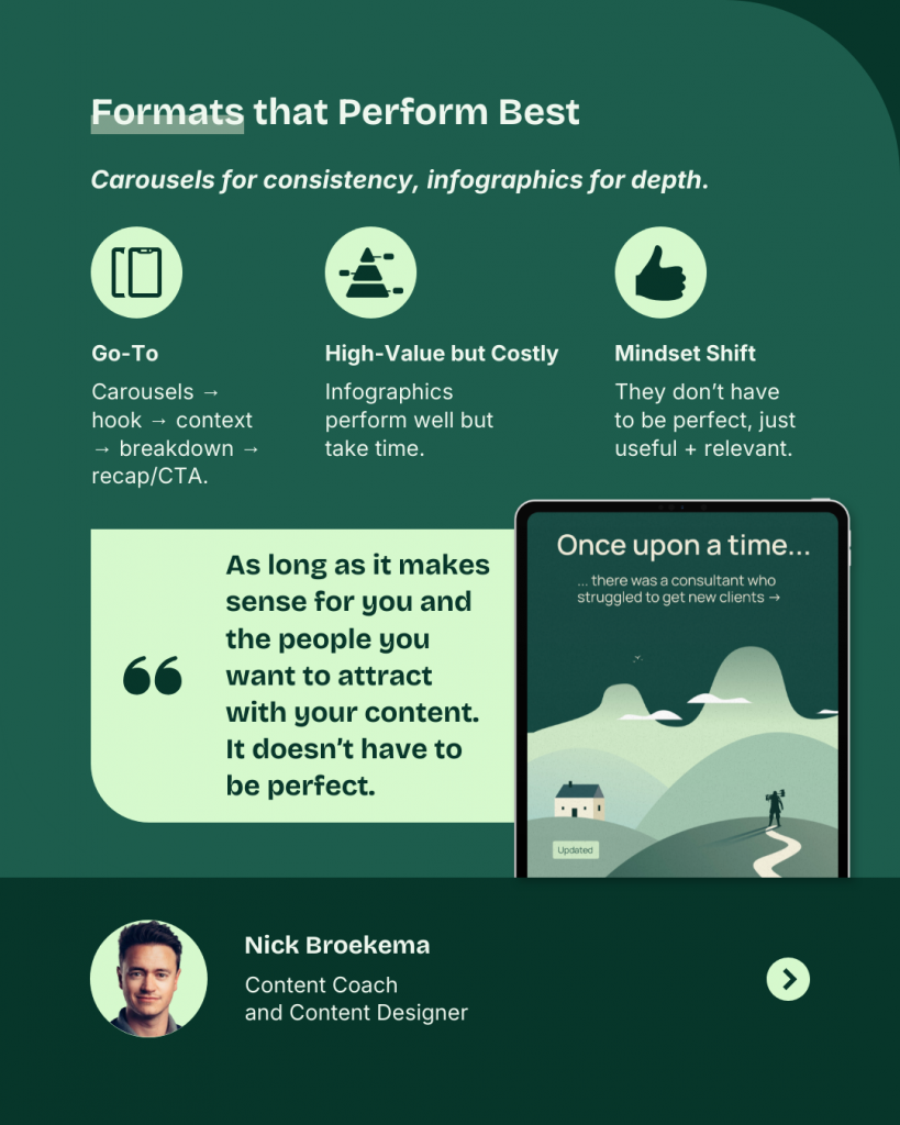
Nick’s mantra for carousels is, “If a person sees your content and thinks “I understand this and I can apply this today”, it’s a win-win. Because the people you help with your content either spread the word or buy from you. In the best case, they do both.”
Wahida Ghani, a creative graphic deisgner, also prefers carousels as the best visual content format.
“Carousels let me tell a story step-by-step, keep people engaged longer and make complex ideas easy to follow.”
Wahida Ghani, Creative Graphic Designer
7. Progress report
A visual progress report template makes KPIs, campaign metrics, or monthly updates easy to scan. They are also great for checking project progress, tracking sales pipeline numbers, etc. Use bold numbers, simple graphs and a key takeaway to explain the overall growth.
8. Flow diagram
A flowchart design is the easiest way to show how things connect. They work best for understanding customer journeys, onboarding flows, or process maps. If your audience is asking, “Where do I go from here?” this format answers that in one view.
Pro Tip: Try Venngage’s AI Flowchart Generator can easily create a flowchart from text. It shaves the hassle of adding and arranging shapes manually?
9. Quote and stat visual
People remember stories, but they also trust numbers. A quote visual format combines both: a powerful insight plus a data point. It works well for thought leadership posts, event speaker highlights, or campaign promos.
10. Mind map
Mind mapping lets you show connections around a central idea. Great for brainstorming sessions, strategy docs, or complex topics with many parts. It’s also a strong visual for presentations when you want to show “big picture” thinking.
Now that you’ve seen the 10 marketing design formats, the question is: how do you actually use them without starting from scratch each time? The answer is a simple AI visual design workflow.
A simple workflow to follow
Here’s how you can create visual content formats easily with AI-powered design tools:
- Run your content through CPA: Channel, Purpose and Architecture.
- Match it to a format: Pick one of the 10 visual formats that best fits.
- Use AI prompts and templates: Generate a strong draft in minutes.
- Refine and brand: Apply your style, adjust for clarity and publish with confidence.
The full playbook walks you through each step with AI prompts, expert tips and templates so you can scale your visuals without guesswork.
Here’s how Nick Broekema converts his raw content into visuals.
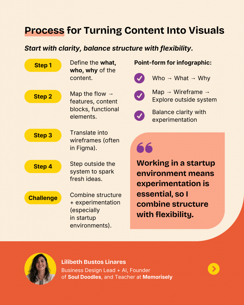
Lilibeth, first understands the content need and context and then creates the visuals.
“I explore different visual formats that align with the information architecture and the brand’s identity. Consistency is key, but so is choosing a format that makes the information as clear and actionable as possible.
Lilibeth Bustos Linares, Business Design Lead + AI, Founder of Soul Doodles and Teacher at Memorisely
My framework is essentially: audience → purpose → information hierarchy → brand alignment → visual exploration.”
Create AI visuals with Venngage
The right visual content format goes beyond selecting the design templates. You need to understand the channel, the purpose of the content and how to present it.
With the CPA Framework, you can select the best visual formats for your content. Once you decide the layout, use Venngage’s AI design tools to create designs using text. This process reduces choice overload and helps you create designs faster.


