


We’ve reached a tipping point (or at least we’re close to one), where brands are losing their identity to AI-generated content. The internet is flooded with ‘AI slop’ — work that’s low-quality, generic and low effort.
And it’s not just over-polished text. The tacky and bland AI visuals are also hurting brand credibility and diluting brand equity.
You might feel like you have the brand aesthetic under control, until one day you’re scrolling through your company’s social media and every post looks different. Each has a different color palette, tone and mood. Even you start to wonder what your brand actually looks like.
Does that mean AI-generated visuals are bad? Absolutely not.
Using AI is one of the smartest, most efficient and cost-effective ways to create designs.
In fact, that’s what we at Venngage help you do. But you have to use AI smartly and strategically while keeping the human touch. I wish it were that simple, though.
As a team where multiple people work on designs, we know how easily brand identity gets lost or drifts over time. And we’ve found a way to make it better.
In this playbook, I’ll explain:
- Why AI-generated visuals fail to capture your brand identity.
- What is the impact of generic visuals on your brand identity.
- How to create a practical system of brand prefixes, locked templates and quick quality checks to ensure design consistency.
Why generic AI designs hurt your brand
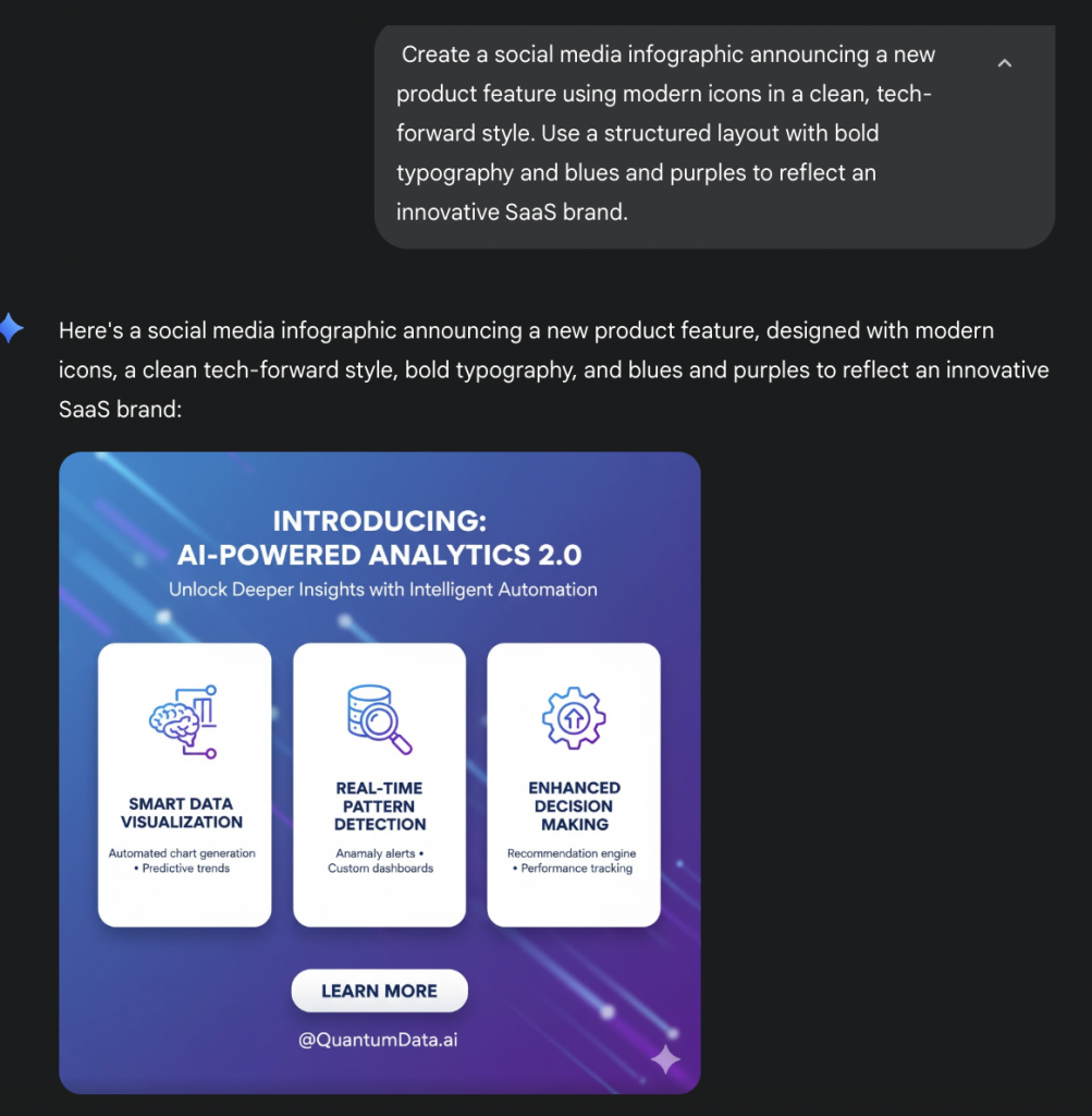
Before we get into the fundamentals, let me share an example. I created two designs with Gemini using the same prompt. And as you can see below, it generated different results.
Output 1:
Output 2:
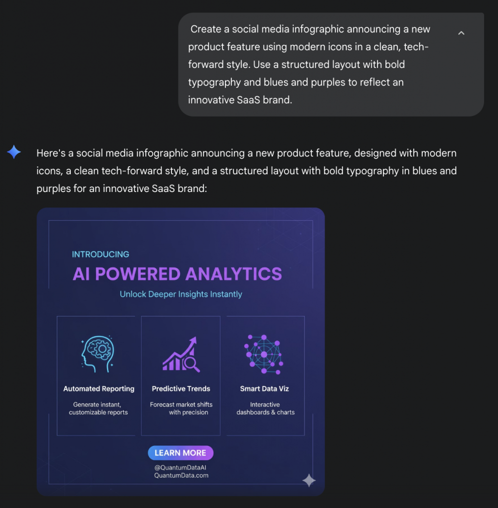
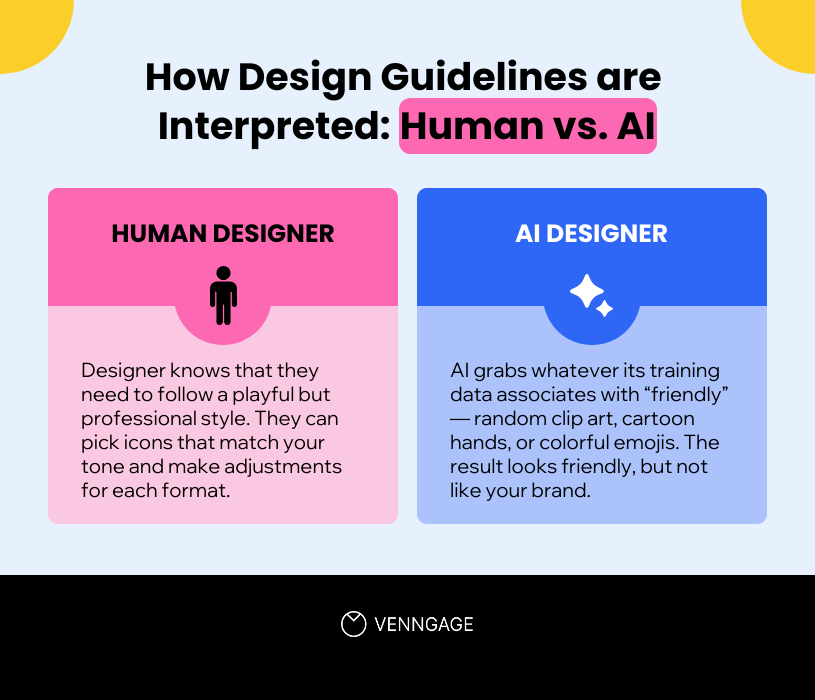
The problem is that brand guidelines are most likely written for humans, not for machines. It interprets words like ‘clean tech-forward’ or ‘friendly icons’ through its own training data, not your brand context.
So instead of a consistent visual identity, you get unpredictable variations. In the above example, one version had a solid dark-blue background, and the other used a gradient. The tone, layout and icon style all changed despite using the same prompt.
Now imagine multiple teammates generating assets with AI. Each would get a slightly different ‘version’ of your brand that might require heaving editing.
If the brand guide says, ‘Use friendly icons,’ a professional designer and an AI model would interpret that instruction in completely different ways.
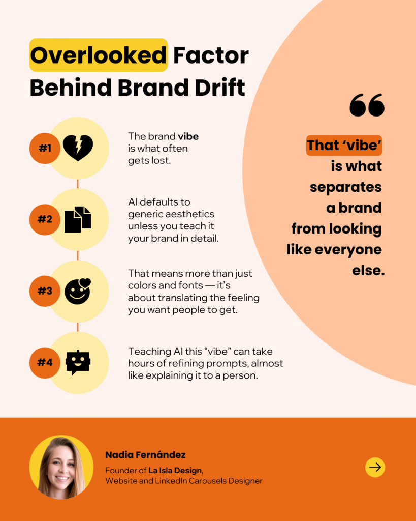
Nadia Fernandez, the founder of La Isla Designs, says that forgetting brand vibe while using AI is one of the biggest reasons for brand style drift.
“The hard part is that we often forget to teach AI our brand in detail, breaking down not just colors and fonts, but the feeling we want people to get when they see our content. That “vibe” is what separates a brand from looking like everyone else.”
Nadia Fernandez, Founder of La Isla Designs
The ‘everyone’s creating’ problem
AI has made content creation more accessible. That’s a win for speed, but it causes different results.
- Sarah from the sales team uses AI to create a quick slide for a client pitch. She might choose thin fonts and lots of white space to create a minimalist look
- Alex from the social media team uses AI to make a visual for an Instagram story. He might go for bold typography and oversized layouts to grab attention
- Lisa from the product team uses AI to create a feature launch announcement. She might choose flat, muted icons that feel calming and approachable.
Result: Every department publishes its own design versions that don’t follow your brand’s style guide accurately.
The prompt myth
Marketers often believe that if they just write better prompts, they can force AI to produce consistent results. This is partly true. While better prompts can improve outputs, it does not solve the underlying issue.
Here is what usually happens:
- The same prompt generates different results every time.
- Each team member has their own library of “good prompts” that no one else sees.
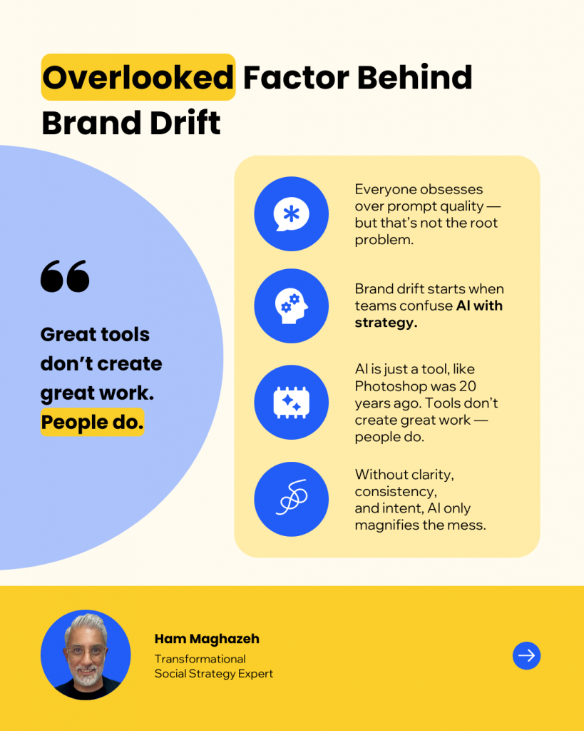
Ham Maghazeh, a social strategy expert, believes that prompt quality is not an issue with AI designs. Rather, it’s using AI without a proper strategy that causes the drift. He says, “If your brand doesn’t have clarity, consistency and creative intent baked into its system, AI will only magnify the mess.”
According to Tahnee Perry, founder of A25 and an AI expert, AI creates basic designs because “People jump straight into creating content without setting the foundation. Without brand guidelines in place, your AI tools will guess. And those guesses usually lean generic.”
The impact of visual inconsistency
Most teams are struggling with AI-generated visuals, not because they are bad at prompting, but because the system itself is not designed to reflect a unique brand identity.
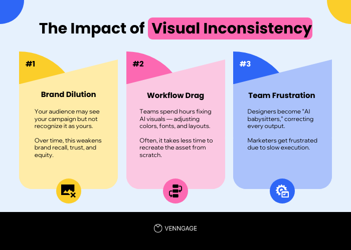
The cost of visual inconsistency for brands
- Brand dilution: Your audience may see your campaign, but never connect it back to you. Over time, that weakens trust and makes you lose brand equity.
- Workflow drag: Teams spend hours “fixing” AI visuals to match brand colors, adjust fonts, or tweak layouts. In many cases, they could have created the asset from scratch in less time.
- Team frustration: Designers feel like babysitters correcting everyone’s AI outputs. Marketers feel like their workflows are slower.
Why 2025 is the breaking point
This year is different. The pressure on marketing teams has never been higher.
- Content flood: Every competitor is using AI to produce more content, faster. The volume of visuals is multiplying across every channel.
- Homogenization: Feeds are now filled with visuals that look the same. The battle for attention is not just against your competitors, but against the endless stream of generic content.
- Decentralized creation: Everyone can now create assets with a few prompts. Sales teams make slides, support teams make how-to graphics and product teams make launch posts. Without a system, this leads to fragmentation. Each team member’s interpretation of the brand creates a slightly different version of “you.”
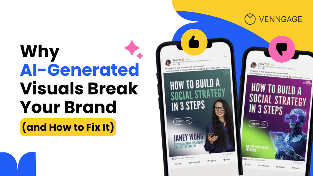
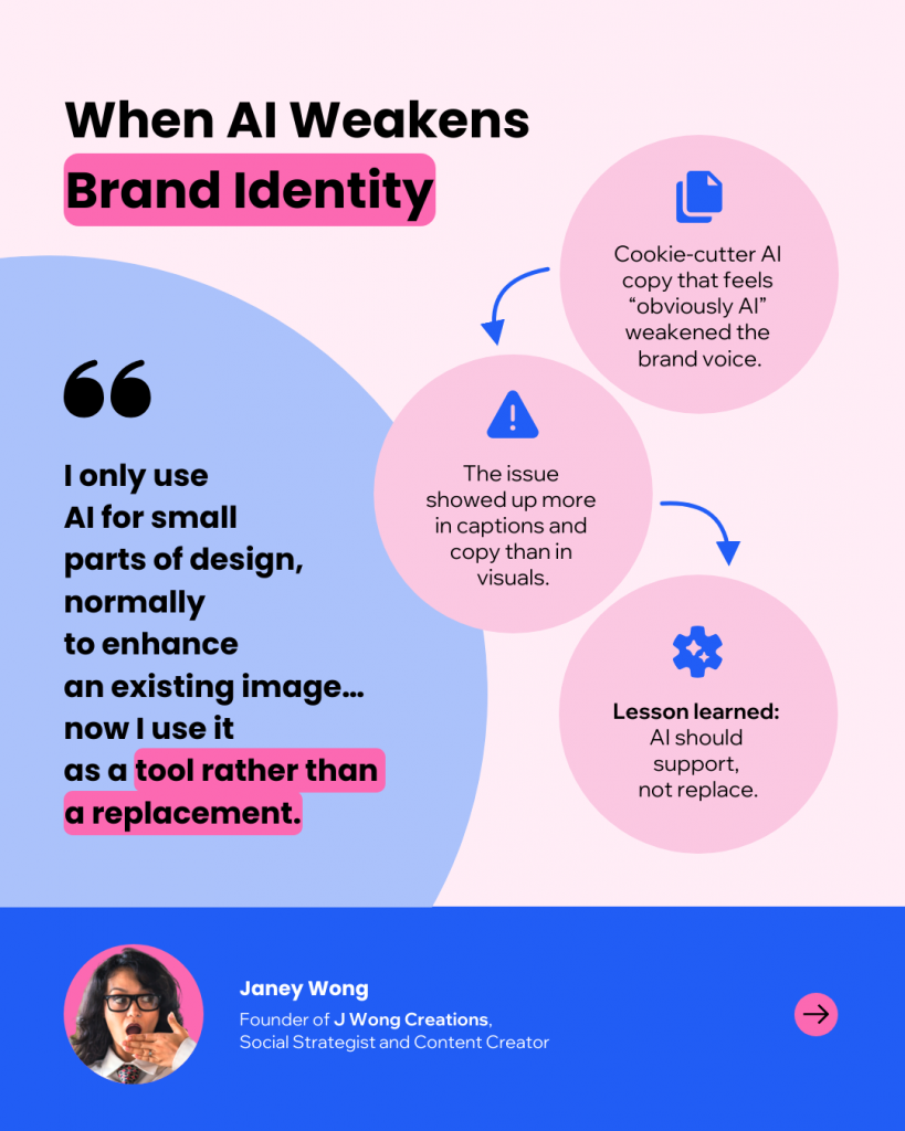
Janey Wong, founder of J Wong Creations and a social strategist, shares her experience with using AI-generated visuals.
“For my family business Wyrdraven (49k followers), our community hated it so much we deleted the only post we experimented with.”
Janey Wong, Founder of J Wong Creations
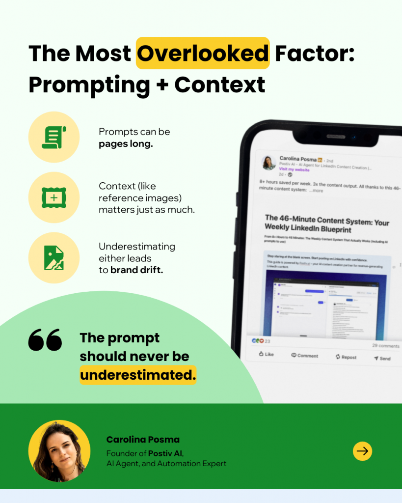
Carolina Posma, the founder of Postiv AI and an AI agent and automation expert, explains that lazy prompting led to very basic visuals. Now, she focuses on prompting and context. In fact, some of her prompts are even take up more than a page. Plus, she uses reference images to create branded visuals.
The Fix: Create an SOP for brand visuals
Based on our own experience with using AI tools and the insights from subject matter experts, the underlying issue with AI creating generic designs is a lack of proper guidelines, context and systems.
What you need is a way to make your brand easy for AI to interpret and keep your most common visual content formats consistent, regardless of who creates them. This is what a Standard Operating Procedure (SOP) delivers. It creates a structured process for creating designs that ensures visual brand consistency.
An SOP for brand visuals helps with three things:
- Translates your brand guidelines into clear rules that AI can follow.
- Provides reusable templates that your team for every design.
- Adds a final check before publishing to keep everything consistent.
Let’s explore how to establish a process for AI brand consistency
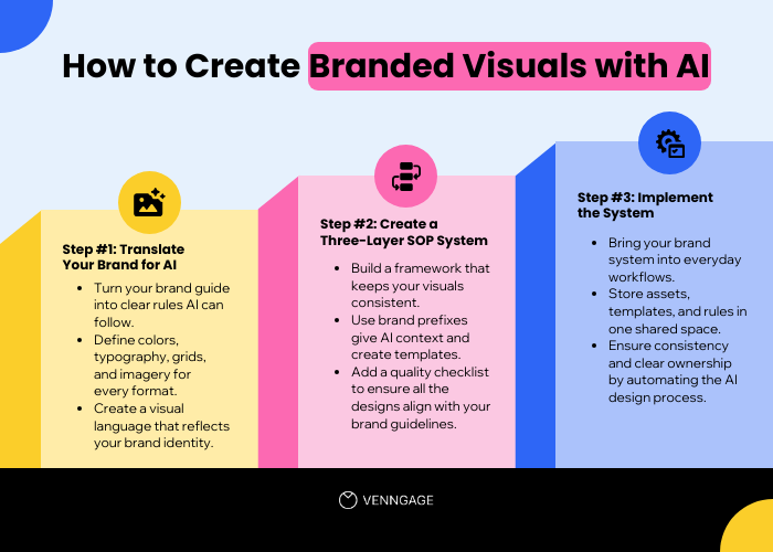
Step 1: Building the brand–AI bridge
Your brand guide is written for humans. Designers can interpret words like “friendly” or “clean” because they know your tone and your audience. AI does not understand this accurately. To get consistent outputs, you need to translate your brand into something AI can understand.
Write specific brand guidelines for AI
Take vague terms in your brand guide and rewrite them as a measurable rule.
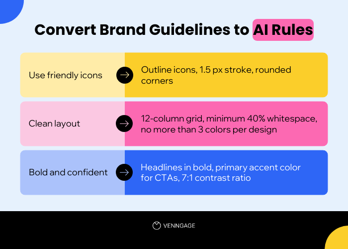
Map brand personality to visual rules
Go deeper by mapping traits to visual decisions.
- Typography: Which families, weights and sizes signal your personality?
- Color: Which colors are primary, secondary and accent? Which combinations are off-limits?
- Layout: What grid, spacing and safe zones are mandatory?
- Imagery: Are real photos preferred over illustrations? Are gradients or shadows allowed?
This becomes your Brand-to-AI Translation Worksheet — a reference all team members can use to design brand visuals.
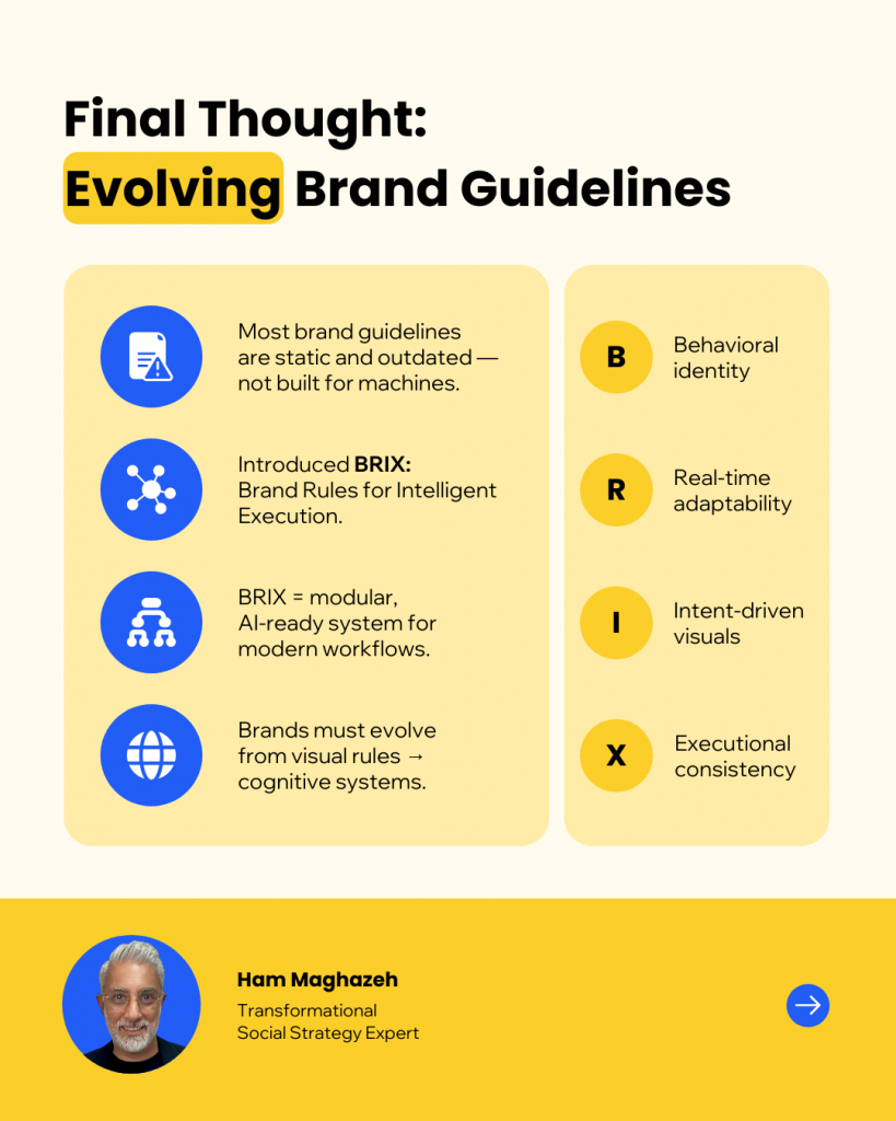
Ham Maghazeh, a social strategy expert, says that “To survive AI, brands need to evolve from visual rules to cognitive systems. Systems that teach AI what not to do. Systems that scale meaning, not just design.”
He uses the BRIX (Brand Rules for Intelligent Execution) Framework to make AI tools speak the same language as humans.
Add format context
AI also needs to know how to design for the format. Define rules for your highest-volume formats.
- Social post: Headline up to 8 words, logo bottom right, one visual focal point.
- Report cover: Title centered, subtitle max 12 words, logo in header band.
- Chart card: 3-color max, clear labels, source line required.
- Carousel slide: One key idea per slide, headline 8 words max, consistent CTA on last slide.
This tells AI how to apply different elements to visuals.
Step 2: Create a three-layer SOP
Most visuals created using AI are a one-off experiment. Sometimes AI catches brand guidelines accurately, sometimes it drifts. The result depends on who is prompting, which tool they used and how much time they had to fix things afterward.
An SOP changes that. It gives everyone the same starting point, the same structure and the same finish line. Instead of each team member building from scratch, you get a repeatable system.
Think of this as your brand autopilot: three layers that work together to keep every asset aligned.
Layer 1: Create brand prefixes
Most AI visuals go off-brand because the AI never gets your brand context. A brand prefix fixes that by front-loading your rules into every request.
Instead of typing a one-line prompt like “Make a modern chart about Q4 growth,” create a standard prefix block that anyone can copy-paste at the start of a prompt. This block should include:
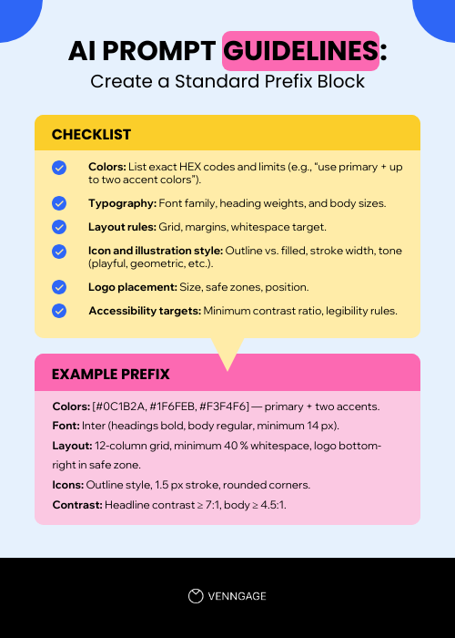
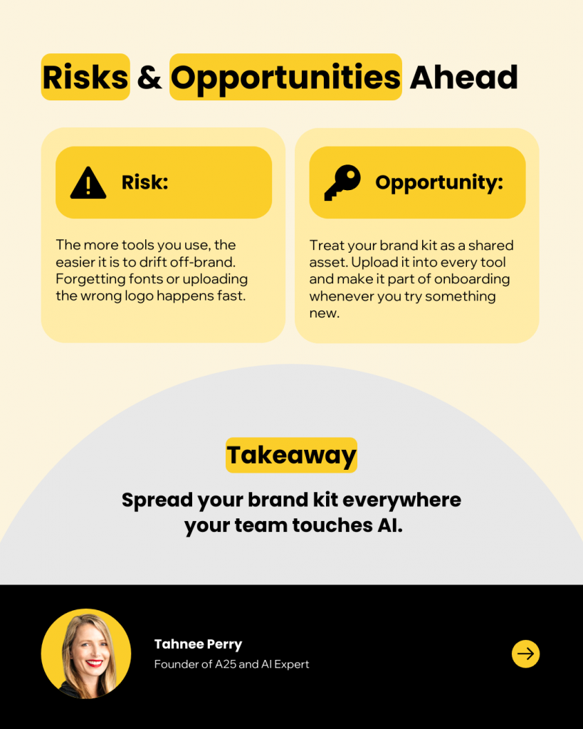
“You need to treat brand kits like a shared asset if you don’t want the designs to go off-brand.”
Tahnee Perry, Founder of A25
Layer 2: Create design templates
Without templates, every designer (or non-designer) is improvising. They guess headline size, logo placement and spacing. Small differences add up until your content looks like it comes from five different brands.
Identify your most-used design formats
Focus on the formats that account for most of your design volume. Common examples:
- Presentations: Sales decks, pitch decks, training slides
- Reports: Benchmark reports, white papers, annual reports
- Proposals: Business proposals, project proposals, funding proposals
- Marketing one-pagers: Brochures, flyers, product sheets
- Infographics: Data visualizations, process flows, timelines
- Social media posts: LinkedIn carousels, Instagram posts, ad creatives
- Email graphics: Headers, banners, promotional visuals
Build templates with guardrails
For each format, lock the elements that protect brand identity, but leave room for campaign creativity.
What to lock:
- Grid & Spacing: Use a 12-column grid and consistent margins.
- Typography & Colors: Ensure no one swaps fonts or invents new hues.
- Logo Placement: Fix position and safe zone, so it’s never too small or too big.
- Critical Brand Elements: Footer bands, watermark patterns, CTA button style.
What to leave flexible:
- Headlines and copy blocks, so content adapts to each campaign.
- Imagery areas to allow campaign-specific visuals.
- Accent shapes or background textures to avoid every asset looking identical.
You can also include short usage guidelines inside each template. For example:
- “Headline max 8 words.”
- “Only use 1-2 accent colors.”
- “One chart per card, axis labels minimum 12 px.”
Maintain Templates
Templates lose value when they start drifting. Assign an owner, name versions clearly (Report_Cover_v1.2), and review quarterly. If you update a color or logo, roll that update into every template so the entire team stays current.
Layer 3: Build a quality checklist
Even with prefixes and templates, AI can miss brand guidelines — a slide with off-brand colors, a chart that fails accessibility, or a logo cropped too close to the edge.
A five-step QC process is your final safety net.
Build a One-Page QC Sheet:
- Colors: Are they all within the official palette?
- Typography: Are heading sizes and body styles correct?
- Logo: Is it present, sized properly and in its safe zone?
- Accessibility: Does it pass contrast and legibility checks?
- Recognition: If you removed the logo, would people still recognize this as your brand?
Include visual examples of ‘pass’ and ‘fail’ for each point. Make this checklist part of your workflow so all the brand designs pass a QC check for consistency.
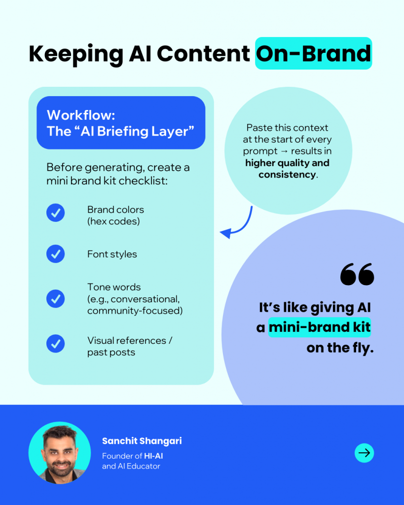
Sanchit Shangari, founder of HI-AI and AI educator, uses an ‘AI briefing layer to ensure brand consistency in AI-generated outputs.’ It’s a short checklist that includes brand colours (with hex codes), preferred font styles, tone words (e.g., conversational, clear, community-focused) and 2–3 visual references or previous posts.
Pro Tip: Venngage’s built-in Accessibility Checker can run automatic color-contrast checks, flag small text and reduce the time you spend manually reviewing assets.
Step 3: Implement the system
Building a brand–AI system is the easy part. Making it work across teams is what takes the maximum effort.
Once your brand rules, prefixes and templates are ready, the next step is turning them into part of your team’s daily rhythm. This is where most systems lose traction. Different departments use different tools, export assets into slides or reports and tweak layouts on the fly. Small changes add up until the brand no longer feels unified.
Here’s how to implement the SOP successfully:
- Identify where friction happens: Brand drift rarely comes from bad intent. It comes from time pressure, tool hopping and missing context. Teams spend minutes locating the right file, re-applying colors, or guessing logo placement. Accessibility checks happen at the end, and no one owns updates. Each step introduces room for inconsistency.
- Build around existing habits: Embed your SOP in the platforms your teams already use. The design rules shouldn’t require extra steps. They should appear automatically when someone opens a new project or template. Link assets, automate colors and fonts and centralize ownership so every update flows to everyone.
- Make visibility a default: Every person should start from the same source of truth. Store templates, brand kits and assets in one shared environment. Version control should handle updates automatically so no one has to spend time finding the latest version.
How to use Venngage for brand consistency
Once you have translated your brand and built your SOP framework, you need a tool that makes the system easy to follow. This is where Venngage comes in. It turns your SOP from a set of rules into something your entire team can use every day without slowing down.
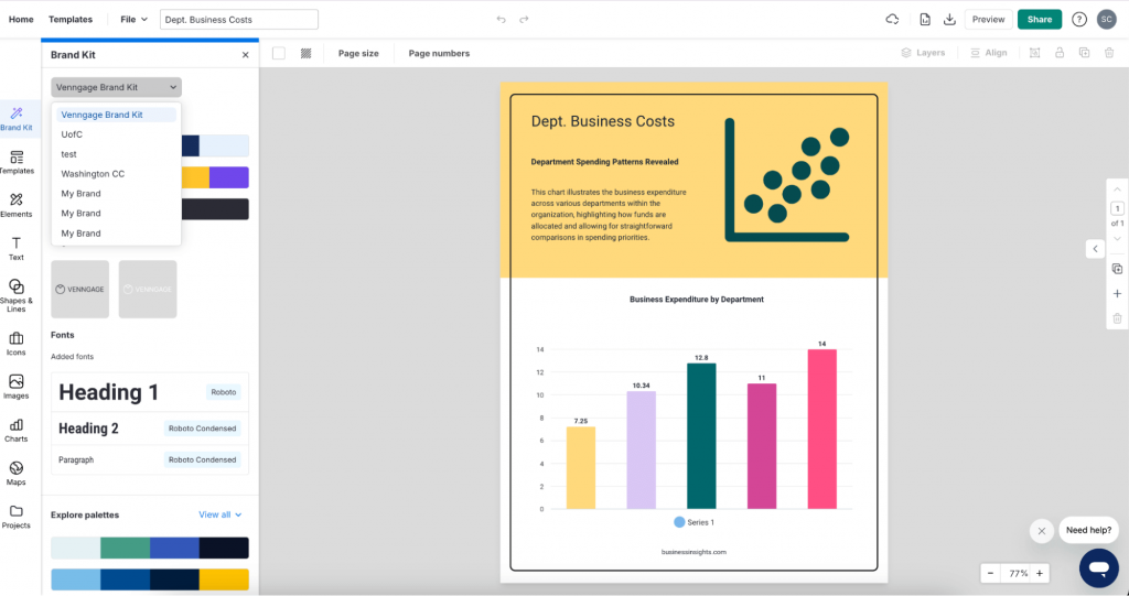
Add brand assets with the Brand Kit feature
Even if you create a brand prefix, you might end up prompting several times to get everything right. Venngage’s Brand Kit feature helps you apply visual branding elements to AI designs instantly.
Here’s how it works:
- Search for your company name: Venngage automatically fetches your logo, color palette and typography from your website.
- Upload additional assets: Add brand icons, imagery and custom fonts to complete your kit.
- Apply with one click: You can apply your logo, fonts and brand colors to any design created using templates or Venngage’s AI Design Generator.
Create team templates
Step two is making sure every layout follows your rules, even when different people are creating assets. The best way to tackle this is to create templates in Venngage.
1. Build master templates
Start with the “Big 6” formats from your SOP:
- Social card
- Carousel slide
- Report cover
- Chart card
- Webinar slide
- Email header
Pick a relevant template from Venngage’s template library or start from a blank canvas. Customize it to match your brand kit, then save it as your master template.
2. Lock the Non-Negotiables
Use Venngage’s Lock feature to fix:
- Logo placement and safe zones
- Grids and margins
- Header or footer bars
- Brand color blocks and key shapes
Locked elements are visually marked with a lock icon and red border so everyone knows what cannot be moved or changed. This keeps structure, spacing and identity intact.
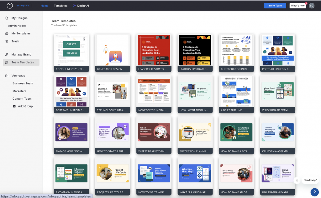
3. Share with the team
Save your finished templates as Team Templates so everyone can access them inside Venngage. You can also share designs with your team so they always start from the latest file. When branding updates, such as a new logo or a refreshed CTA style, simply update the master, save the new version and your team will use it automatically.
Here’s how it works:
- Centralize your assets: Store Brand Kits, templates, icons and images in one shared space.
- Share with the team: Publish masters as Team Templates so they appear in everyone’s dashboard.
- Keep them updated: Edit a template once, resave and the latest version is instantly available to the entire team.
- Add quick guidance: Include notes like headline limits, export settings, or links to your Brand-to-AI Worksheet so users get context right inside the file.
Everyone starts from the same version to ensure consistency in AI designs.
Final takeaway
Without a plan, your visuals will continue to look generic and your team will continue to spend time on fixes and your brand will continue to get lost in the noise.
Now you have a way to stop that. You know how to translate your brand into clear guidelines, build reusable templates for your most frequently used formats, and add a quick quality check that catches mistakes before they go live.
The next step is to make it real. Set up your Brand Kit in Venngage, turn your Big 6 into locked templates, and share them with your team. By the end of your first week, you will already see fewer edits, faster approvals, and assets that finally look like they came from the same brand.
AI doesn’t have to water down your identity. With the right system, it can help you create faster while staying unmistakably you.


