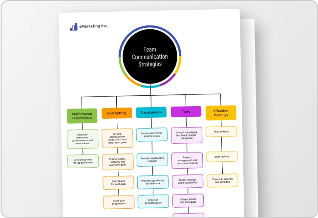
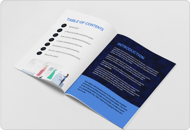
Dots, lines, and shapes make up any layout, but color gives them life.
You can’t just slap some random hues onto your design and hope for the best. Infographics should be both eye-catching and attention-holding, while being clear and comfortable for readers to view for extended amounts of time.
That last part is essential. A color scheme has the power to either bring forward or obscure information depending on how easy it is to read the text on the infographic. For example, you wouldn’t want to put dark text on a dark background or light text on a light background, as the eyes will need to strain to read the infographic. Your text and images should pop and your colors should complement the content.
Part of complementing the content means choosing a color scheme that is appropriate for the kind of information you are presenting. You wouldn’t want to use a dark color scheme for an infographic that is meant to inspire hope, or cutesy pastels for a business infographic (unless, perhaps, you’re in the business of baby products). That’s why it’s important to take your audience into consideration when selecting a color scheme. Consider who you will share your infographic with before you create it and cater your design to that audience.
This need for balance between aesthetics and practicality often causes budding designers to stumble when picking color schemes. Who can blame them? Using the wrong hue, value, and saturation can kill an otherwise effective layout. It’s the difference between a vibrant, interesting design and a flat, boring one.
A good way to keep this balance in perspective is to consider infographics as a synthesis between text and visuals. Because both elements are synthesized, they need to blend together fluidly. The perfect colors can attract attention, set the mood, and complement your message, all in one seamless design.
So, taking all of this into consideration, how do you pick the right color schemes for your infographics? Don’t worry–there are some fundamental principles you can follow to avoid common and glaring mistakes. It begins with the basic building blocks of color scheme selection.
In this infographic, we take a quick swipe at color theory, and then provide three popular and easy-to-use combinations for you to experiment with. Keep these quick tips in mind and you will be able to create beautiful and color-conscious infographics, no sweat.
Use the right combinations to magnetize your reader’s eyes to your infographics!
Please use the code below to share this image.
<img src="https://venngage.com/wp-content/uploads/2015/11/SlideGenius-Guest-Infographic-A-Guide-to-Color-Schemes1.jpg" alt="[Infographic] A Quick Guide To Color Schemes For Infographics"/><a href="https://venngage.com">Infographic</a> by Venngage.
Creator Bio
![]()
Rick Enrico is the CEO and Founder of SlideGenius, Inc. He currently oversees an experienced team of designers, software developers, and marketing professionals that specialize in creating custom corporate presentations and cloud publishing applications. He regularly publishes expert presentation tips on the SlideGenius blog. You can connect with him on LinkedIn and Twitter.


