


Management reports often feel overloaded with data but still leave decision-makers asking, “So… what does this actually mean?”
While building this guide, I reviewed corporate filings, internal business reports and executive reporting frameworks. One pattern stood out: the most effective management reports focus on clarity, consistency and decision-ready insights, not just information.
I’m not an expert in every industry, and that’s not the goal. I’m approaching this as a curator and analyst, reviewing reporting standards and real examples to simplify complex formats. I’ve noticed many reports struggle with unclear KPIs and inconsistent sections, so this hub breaks formats down by purpose, timing and decision type to make them easier to use.
Because at the end of the day, a management report exists to help teams make better decisions faster.
The management report format structure
From reviewing different management reports across teams, I’ve noticed that the ones that actually get used (and not ignored in someone’s inbox) usually follow one simple pattern: summary first, performance second, risks last.
When reports bury key updates inside long paragraphs or scattered data, stakeholders tend to skim, or worse, miss important decisions. The structure below reflects how most leaders naturally process updates based on common reporting frameworks and real-world report reviews.
You can treat this as a flexible foundation. Depending on your industry, reporting frequency or company requirements, sections can always be expanded or customized.
1. Report header: context at a glance
I’ve seen reports slow down simply because reviewers don’t immediately understand what they’re looking at. The header fixes that by answering the who, when and why upfront.
What to include:
- Report title
- Reporting period
- Department, team or project name
- Prepared by
- Report purpose (1–2 sentence overview)
2. Executive summary: decision snapshot
In many cases, this becomes the most read section of the entire report. Leaders, department heads, project sponsors and executives often use this section to quickly understand overall progress before deciding whether they need to dive deeper.
What to include:
- Overall performance status
- Major achievement or milestone
- Key concern or risk
- Recommended action (if needed)
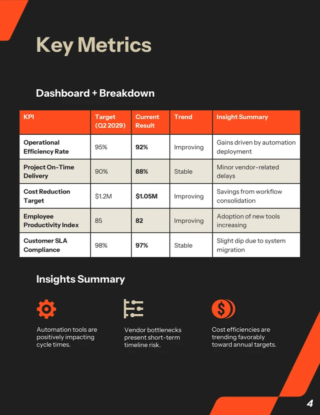
3. Key metrics & performance overview: fast scan section
One pattern I keep seeing is that leaders don’t review every update line by line — they usually scan performance indicators first. When metrics are structured clearly, discussions tend to become much more focused and productive.
What to include:
- Metric / KPI name – The performance indicator being measured
- Target or goal – The expected result or benchmark
- Current status or result – The latest performance data
- Trend indicator – Whether performance is improving, declining or stable
- Notes or insights – Brief explanation, context or key takeaway
This section often drives follow-up questions and helps shape strategy discussions.
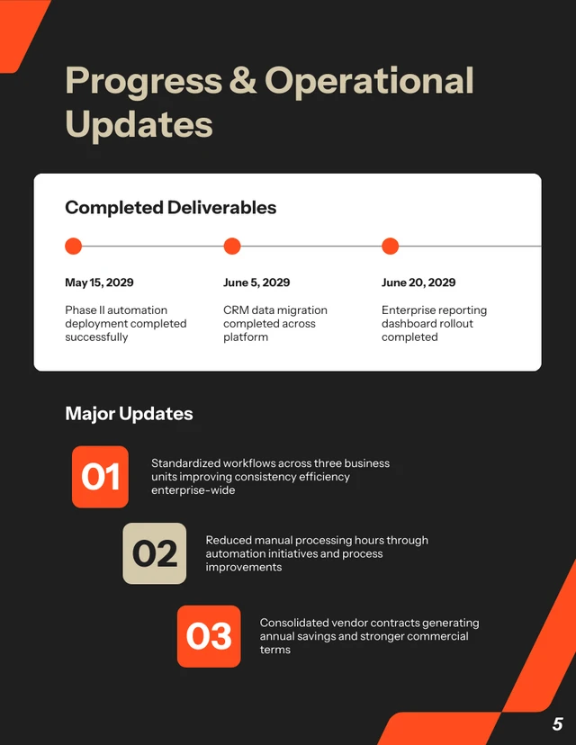
4. Progress & completed work: operational updates
This section helps show momentum. It gives context behind performance numbers and helps leadership understand what’s actually moving forward.
What to include:
- Completed milestones or deliverables
- Major updates or improvements
- Notable results or outcomes
5. Risks, challenges & blockers: exception section
From what I’ve observed, reports become far more useful when teams clearly explain risks before leadership has to ask. It removes back-and-forth and helps decisions happen faster.
What to include:
- Issue description
- Business impact
- Mitigation or proposed solution
- Support needed (if applicable)
6. Upcoming priorities & action plan: forward view
This is where reports shift from being purely reflective to forward-looking. It helps teams stay aligned on what happens next.
What to include:
- Upcoming deliverables
- Priority focus areas
- Key deadlines
- Task owners
7. Approval & accountability trail
Approval sections often feel administrative, but they’re important for tracking ownership and maintaining a reliable business record, especially when reports support audits or performance reviews.
What to include:
- Report preparer
- Reviewer or manager
- Final approver (if applicable)
- Submission and approval dates
Try this management report format
Copy-Paste: [Report Name] Template
Replace the bracketed placeholders. Keep sections you need, remove the rest.
Report Title
[Insert Report Name]
Reporting Period
[Start Date] – [End Date]
Team / Department / Project
[Insert Name]
Prepared By
[Name / Role]
Report Purpose
[1–2 sentences on what this report is tracking and why]
Overall Status
[On Track / At Risk / Off Track]
1) Executive Summary (Decision Snapshot)
- Major win: [What improved or shipped]
- Key concern: [What needs attention]
- Decision or support needed: [If applicable]
- One-line takeaway: [What you want leaders to remember]
2) Key Metrics & Performance Overview
Keep this table tight. Most stakeholders scan here first.
| Metric | Target | Current Status | Trend | Notes |
|---|---|---|---|---|
| [KPI Name] | [Goal] | [Result] | [↑ / ↓ / →] | [Quick context + why it moved] |
| [KPI Name] | [Goal] | [Result] | [↑ / ↓ / →] | [Quick context + what happens next] |
| [KPI Name] | [Goal] | [Result] | [↑ / ↓ / →] | [Call out anomalies or constraints] |
3) Progress & Completed Work
- [Milestone / deliverable completed + outcome]
- [Key progress update + impact]
- [Notable improvement / learning]
4) Risks, Challenges & Blockers
| Issue | Impact | Mitigation / Plan | Support Needed |
|---|---|---|---|
| [Describe blocker] | [What it affects] | [What you’re doing about it] | [Decision / resources / approval] |
| [Describe blocker] | [What it affects] | [What you’re doing about it] | [Decision / resources / approval] |
5) Upcoming Priorities & Action Plan
| Priority | Owner | Due Date | Status |
|---|---|---|---|
| [What’s next + why it matters] | [Name] | [Date] | [Planned / In Progress / Blocked] |
| [What’s next + dependency] | [Name] | [Date] | [Planned / In Progress / Blocked] |
6) Approval & Accountability
Prepared By
[Name / Role]
Reviewed By
[Manager / Lead]
Approved By
[Approver Name]
Submitted / Approved Date
[DD MMM YYYY] / [DD MMM YYYY]
Tip: If this report gets shared widely, keep the “Executive Summary” and “Key Metrics” above the fold.
Venngage’s management report template
Here’s something I’ve learned the hard way: the more time you spend formatting a report, the less time you spend improving the actual insights. A good template removes that friction.
Our Executive Management Report Template already follows a clean, decision-friendly flow: executive summary at the top, visual KPI highlights, clearly separated progress and blockers, and space for upcoming priorities with ownership. It’s designed so leaders can scan in minutes, not dig through paragraphs.
Instead of rebuilding layouts every week or month, you start with a built-in structure. That keeps reporting consistent across teams and makes your updates look polished without extra effort.
If you’re short on time, you can even generate a draft using Venngage’s AI Report Generator, then refine it inside the template.
Why this management report structure works (analyst’s note)
This structure didn’t come from a perfect best-practice document. It came from watching what actually happens when a report lands in someone’s inbox.
No one opens a management report thinking, “I can’t wait to read this carefully.” They’re usually juggling five other things. So their brain goes straight to:
- Are we on track?
- What requires my attention or intervention?
- What happens next, and who owns it?
If those answers aren’t obvious within the first minute, they start scrolling, or skimming, or (what we hate most) asking follow-up questions that the report could’ve answered.
So I built the layout around that reality.
When the structure matches that mental flow, the report feels lighter. Easier. More actionable. And that’s usually when better decisions start happening.
1. Summary comes before detail
I always tell teams this: if you show numbers before context, you risk triggering the wrong reaction.
What in the report structure helps:
- The Executive Summary is placed at the beginning of the report
- A clearly stated Overall Status
- A short purpose statement in the header
Real-life example:
If churn increases by 3%, that can sound alarming. But if the summary explains, “Spike tied to legacy pricing sunset; new retention offer launching next month,” the conversation shifts from panic to strategy.
Why this works:
People interpret data emotionally before they interpret it logically. A short framing statement reduces knee-jerk responses.
2. Make gaps visible, not just numbers
Leaders rarely care about the number alone, they care about the gap.
Is it above target? Below target? Improving? Slipping? Stable?
That’s why the structure shows target vs. actual side by side, with a simple trend indicator. It forces clarity. No one has to mentally calculate performance or guess whether a result is “good.”
What in the report structure helps:
- Target vs. actual metrics shown side by side
- Simple trend indicators
- A short notes column for quick explanation
Real-life example:
“Target: 10% growth | Actual: 8% | Trend: ↑” tells a very different story than just “8% growth.” One feels like underperformance, the other feels like momentum.
Why this works:
Comparison creates clarity. Variance creates urgency. Trend creates narrative. Without contrast, numbers are static. With contrast, they tell a story and stories are what guide decisions.
3. Isolated blockers prevent escalation
One common reporting mistake is mixing risks into long progress updates. When blockers are buried inside paragraphs, they’re easy to overlook, especially when everything else in the section sounds positive.
That’s why blockers need their own space.
What in the report structure helps:
- A dedicated Risks / Blockers section
- Clear sub-points for impact and mitigation
Real-life example:
Instead of burying “Waiting on legal approval” inside a progress paragraph, listing it clearly under Blockers signals that leadership input may be required.
Why this works:
When obstacles are visible, they’re easier to resolve. When they’re buried, they get overlooked.
4. End with what happens next
I’ve seen reports that clearly outline completed milestones, performance metrics and even lessons learned, and then just stop. There’s no direction, no ownership and no signal about what changes next week because of what happened this week.
When a report clarifies next steps, it shifts from documentation to decision support.
What in the report structure helps:
- A clearly labeled Upcoming Priorities section
- Assigned owners and deadlines
Real-life example:
Instead of ending with “Phase 1 complete,” I’d suggest: “Phase 2 begins May 3, Owner: Ops Lead (Budget approval pending.)”
Why this works:
Naming ownership increases follow-through and accountability.
Pro tips & best practices (from an analyst’s POV)
These tips come from looking at what actually causes confusion after reports are shared — the follow-up emails, the “quick clarifications,” the meetings that could’ve been avoided.
Here’s how I’d suggest using each section more strategically.
Executive summary: write it like a briefing, not a recap
I always think of this section as prep for a 5-minute conversation. If someone had to present your report verbally, would this summary guide them clearly?
How to make this work for you:
- Start with the implication, not the activity
- Cut adjectives, keep facts and direction
- Make sure someone could make a light decision from this alone
If it reads like a diary entry, tighten it.
KPI section: decide what you’re signaling
Not every metric deserves equal visual weight. If everything looks important, nothing feels important.
How to make this work for you:
- Decide which 1–2 numbers truly define this reporting cycle
- Keep definitions consistent (don’t rename metrics every month)
- Avoid cluttering the notes column with explanations that belong in discussion
Risks / blockers: be calm and specific
Tone matters more than most teams realize. Overly dramatic wording creates tension while vague wording on the other hand creates confusion.
How to make this work for you:
- Describe the issue plainly
- Quantify impact when possible
- State whether it’s being monitored or requires action
Progress section: show meaning, not motion
This is where reports often drift into activity logs. It’s easy to write, “Completed onboarding workflow” or “Published three blog posts.” But activity alone doesn’t communicate value.
What leadership really wants to understand is: What changed because of this work?
How to make this work for you:
- Connect completed work to outcomes
- Avoid repeating what’s already obvious from KPIs
- Focus on meaningful milestones, not micro-activity
If someone reads this section and thinks, “So what?”, that’s a signal to elevate the language from task-based to impact-based. Progress becomes powerful when it clearly ties effort to results.
Upcoming priorities: make trade-offs visible
This section does more than outline next steps, it signals what the team has chosen to prioritize. And prioritization always implies trade-offs.
When a report lists ten “next steps,” it doesn’t communicate ambition. It communicates diffusion.
How to make this work for you:
- Highlight what you’re intentionally not working on (if relevant)
- Keep the list short
- Ensure every priority connects back to a metric or risk mentioned earlier
Management report format FAQs
1. How detailed should a management report be for executives versus managers?
It depends on who is using it to make decisions. Executives usually need a high-level view: overall performance, major risks and decisions that require approval. Managers often need more operational detail to guide day-to-day execution.
If senior leaders are asking for simpler summaries, the report may be too detailed. If managers are asking for missing context, it may be too high-level. The goal is to match the depth of information to the level of responsibility.
2. What’s the most common mistake in management reports?
Including too much information without clear prioritization.
When every metric is presented as equally important, it becomes harder to see what actually needs attention. Strong reports clearly signal:
- What changed
- What matters
- What requires action
Clarity and focus build trust over time.
3. How often should management reports be created?
Reporting frequency should match how often decisions need to be made.
Weekly reports work well for fast-moving teams. Monthly reports are common for performance tracking and financial oversight. Quarterly reports are often used for strategy and board-level reviews.
If reports are created more often than meaningful changes happen, they risk becoming routine updates instead of useful tools.
4. How can you tell if your management report is working?
A good management report reduces confusion. Meetings become more focused. Fewer follow-up clarification emails are needed. Stakeholders refer to the report when discussing decisions.
If your report consistently helps people understand performance and decide what to do next, it’s doing its job.


