


TL;DR
To make an infographic, follow these five steps:
- Define your goal. Identify your audience, the problem you’re solving, and the 3-5 questions your infographic needs to answer.
- Collect your data. Pull from your own research or public sources like Statista, Kaggle, or data.gov, then organize it around your key questions.
- Choose the right charts. Match each data point to a chart type based on whether you want to inform, compare, show change, organize, reveal relationships, or explore.
- Build the layout. Pick a Venngage infographic template or use Venngage’s AI Infographic Generator to create one from a text prompt. Choose a single-column layout for a process, two columns for a comparison, or a multi-section layout for dense data.
- Refine the design. Tighten the copy, add icons for visual rhythm, use negative space to group elements, and apply color to highlight what matters most.
Creating an infographic from scratch can feel overwhelming if you don’t have a design background. Fortunately, you don’t need advanced design skills to create one.
A well-designed infographic template or an Infographic Maker can help you get started, while a few core design principles ensure your infographic is both visually appealing and easy to understand.
This guide tells you how to create infographics in five simple steps, from choosing the right infographic layout and organizing your content to selecting visuals, colors and fonts that bring your ideas to life.
What is the easiest way to create an infographic?
There are three main ways to create an infographic, depending on the idea, whether you already have the content and how much control you want over the design.
- Use AI to create a first draft: If you only have an idea, brief or rough notes, an AI infographic design tool like Venngage can turn them into a first draft. It can help organize the information, create the layout and add relevant visuals, which you can then edit and refine.
- Start with an infographic template: If you already know what information you want to include, start with an infographic template that matches the structure of your content. For example, you might choose a timeline infographic for a sequence of events, a comparison layout for two options or a statistical infographic for data and key findings. You can then replace the sample content and customize the design.
- Build it manually: If you already know how you want the infographic to look, you can build the layout yourself using a drag-and-drop editor. This gives you more control over how the sections, visuals, charts and text are arranged.
Whichever method you choose to make an infographic, the same infographic design best practices apply. You’ll need a clear goal, well-organized information, effective visuals and concise copy to create an infographic that stands out.
How to make an infographic in 5 Steps?
Before designing, let’s make sure you know what an infographic is.
An infographic is a visual communication tool that combines text and visuals, such as icons, charts and illustrations, to make information easier to understand at a glance.
Studies show that infographic designs help capture attention, improve engagement and make complex data and knowledge easy to understand.
As Dr. Lynell Burmark, an expert on visual literacy, explains: “We think in pictures. Unless our words, concepts, and ideas are hooked onto an image, they will go in one ear, sail through the brain, and go out the other ear.”
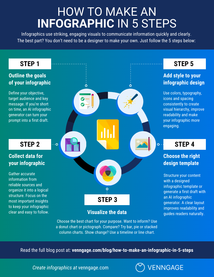
Prefer a quick overview? Watch this video guide for a step-by-step visual walkthrough on how to create an infographic.
Step 1: Choose your goal, audience and infographic type
Before you begin to work on infographic layout design, charts, or aesthetics, you need to think hard about the goals of your infographic. Why are you making this infographic?
When I say goals, I don’t mean high-level goals like “summarize complex information” or “improve website traffic”.
I mean clear, concrete, achievable communication goals, such as:
- Compare two products so buyers can quickly understand which option suits them.
- Show employees how to complete a new workplace process correctly.
- Explain the key findings from a customer survey to your leadership team.
- Summarize the key findings from a research study.
Define the problem
Recognize that you’re creating this infographic so that your audience can gain something very specific from reading it. That very specific thing should be a burning problem that your audience has in their lives, and that your infographic is going to solve.
For example, “explain employee onboarding” is a vague goal. “New hires at mid-sized companies take 3+ months to reach full productivity, and HR managers don’t know which onboarding steps actually shorten that ramp” is a burning problem.
Use a question pyramid
From there, use a question pyramid to take that burning problem and turn it into 3-5 actionable questions to tackle in your infographic:
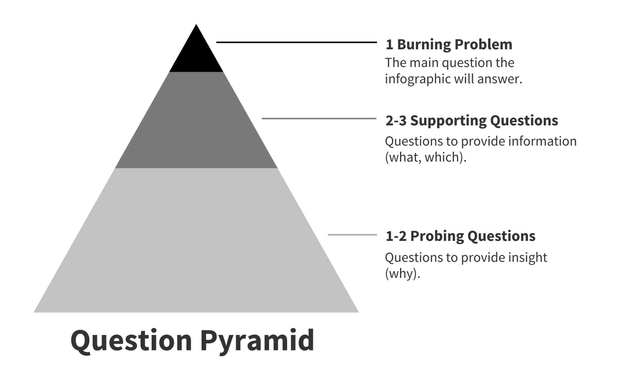
These questions will become the framework around which you’ll build your infographic, and will help you tell a compelling story.
The supporting questions should reveal the basic information your audience will need to know to understand the main topic, and the probing questions that will reveal broader insights that should ultimately solve the burning problem.
Let’s work through an infographic example. This one outlines the steps in the product design process:
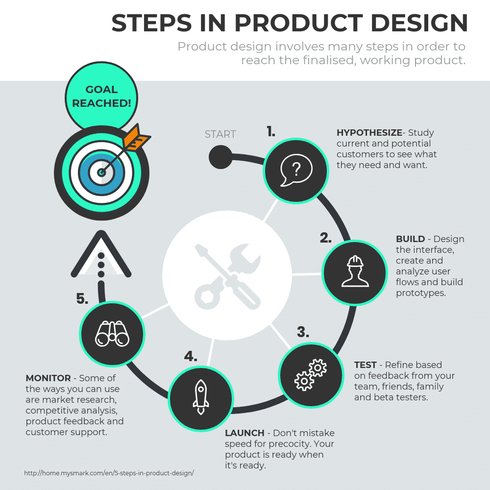
The burning problem they’re trying to solve is “what steps are in the product design process?”, and so their question pyramid might look something like this:
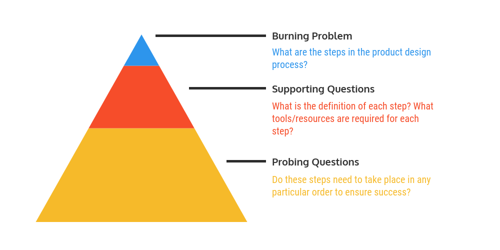
Defining the burning problem and using the question pyramid to break it down into actionable questions is the first step to making an effective infographic. If you’ve gone through this process and you’re still not sure what story should tell, read more about discovering your infographic story.
Step 2: Gather the information you need
You’ll need some data to help you answer each question you defined in step one.
If you have your own data, great — you can move on to step three! If not, don’t worry. There’s a ton of public data that you can add to your infographic.
Let’s review some strategies for getting your hands on useful data, without having to conduct your own research.
Refine your Google searches
Google is often the best place to start your search. Target your Google searches more efficiently with data-specific search terms:
- Use quotes to search for an exact phrase
- For example, “product design process steps”
- Use a minus sign to exclude terms from your search
- For example, product design -jobs
- Append ‘data’ to your search phrase
- For example, product design data
- Append a data-specific file format (e.g. xls, csv, tsv) to your search phrase
- For example, product design xls
Search existing data repositories
While Google searches are fast and easy, often you’ll end up with messy data that needs some cleaning, which can take a lot of time. Peruse these data repositories to find data that’s ready to use:
- The U.S. Government’s Open Data: Data on everything from agriculture, climate, and ecosystems to education, health, and public safety
- US Census Data for Social, Economic, and Health Research: U.S. census data from 1790-present
- Statista: Market research
- Kaggle: User-uploaded datasets on everything from chocolate bars to startup funding
- Pew Research: Research on demographics, public opinion, media content, and more
- American Time Use Survey: Data on the amount of time Americans spend doing various activities like sleeping, eating, and playing sports.
- Google Trends Datastore: Curated datasets from the Google News Lab
- Google Scholar: A user-friendly search engine for academic publications
- Data is Plural: A curated list of interesting, topical datasets, updated weekly
- AggData: Business locational data
If you want to collect your own data, review our suggestions for conducting your own research and read our comprehensive guide to data collection.
Step 3: Choose the right format to present your data
Now that you’ve got all that settled, your next step should be to decide how to present that data visually.
The goal is to turn data into information, and information into insight.
Carly Fiorina, former CEO of Hewlett-Packard
This video summarizes our simple method for understanding which charts work best for different types of data:
We’ve developed the ICCORE method to help you pick the best charts for your infographic. First, for each piece of data you want to visualize, determine whether the primary goal will be to:
- Inform,
- Compare,
- Change,
- Organize,
- Reveal relationships, or
- Explore.
Then use the best practices for that goal to find the right chart for your data.
Let’s review each goal in turn:
Inform
You want to convey an important message or data point that doesn’t require much context to understand.
Make a numerical stat stand out with large, bold, colorful text:

Demand extra attention by pairing icons with text:

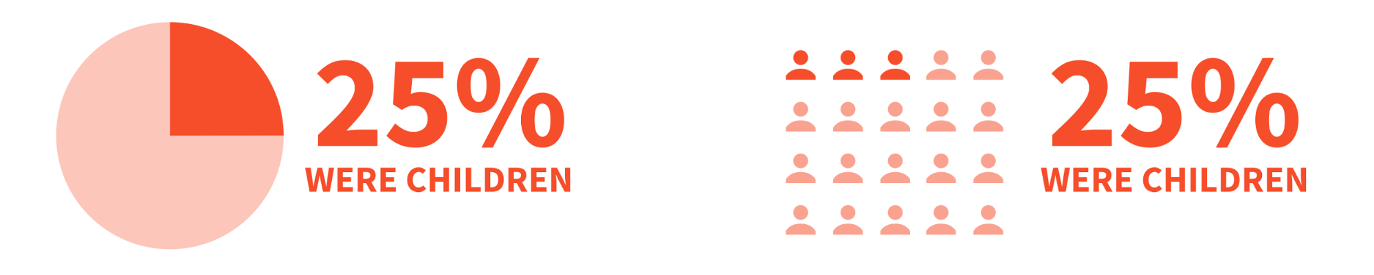
Highlight a percentage or rate with a donut chart or a pictograph:
Compare
You want to show similarities or differences among values or parts of a whole. A comparison infographic will help draw parallels between multiple pieces of data.
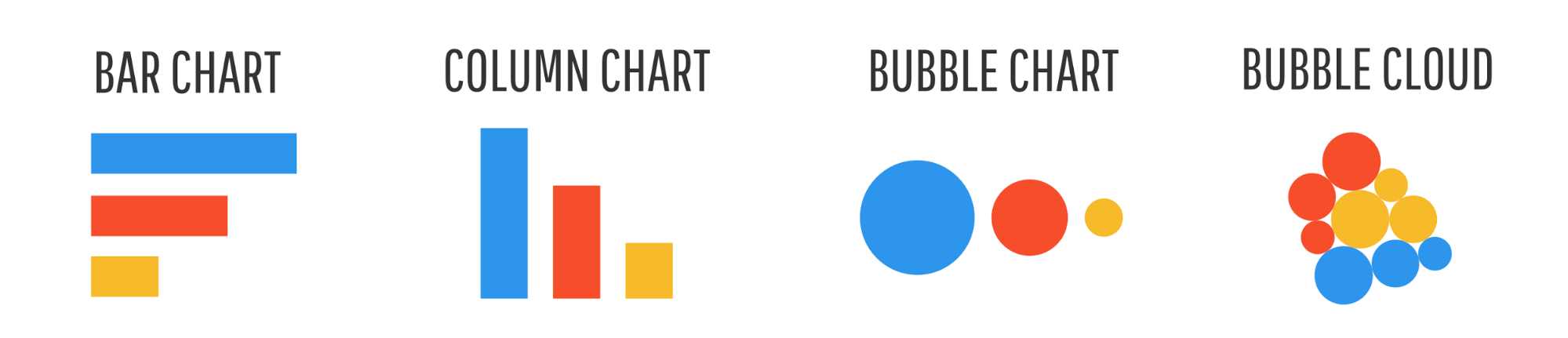
Use a bar chart, column chart, bubble chart, or bubble cloud to compare independent values.
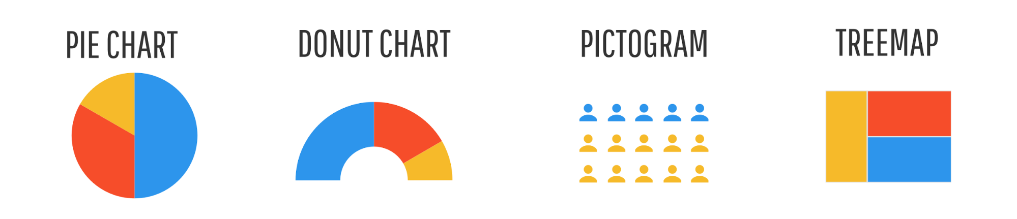
Use a pie chart, donut chart, pictograph, or tree map to compare parts of a whole.
Use a stacked bar chart or stacked column chart to compare categories and parts of a whole.

Use a stacked area chart to compare trends over time.

Change
You want to show trends over time or space.
Use a line chart or an area chart to show changes that are continuous over time.

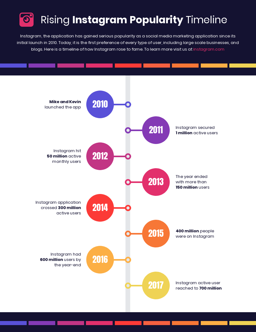
Use a timeline to show discrete events in time.

Here’s an example of a timeline infographic:
Use a choropleth map to show spatial data.

Use a map series to show data that changes over both space and time.

Related: Beginner’s Guide to Creating Infographics with Maps (15 Templates Included)
Organize
You want to show groups, patterns, rank or order.
Use a list to show rank or order when you want to provide extra information about each element.

Use a table to show rank or order when you want readers to be able to look up specific values.

Use a flowchart to show order in a process.

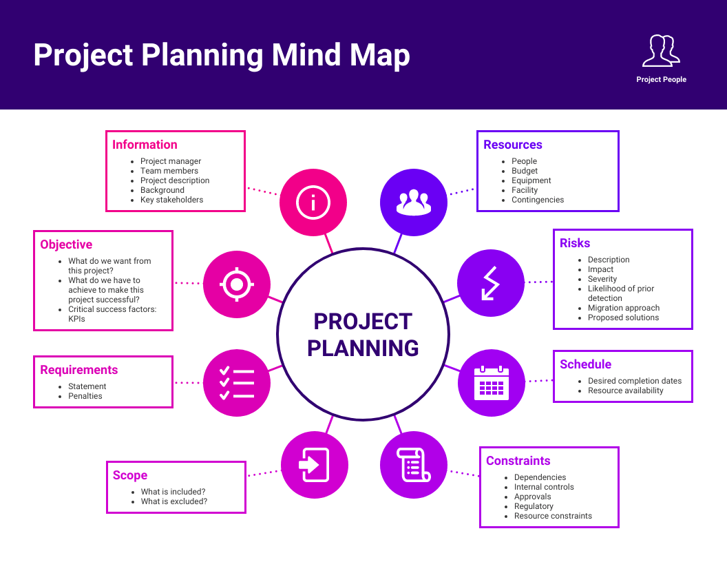
Use simple boxes or borders to show organized groups (as seen in Venn diagrams and mind maps).

Here’s an example of a mind map infographic:
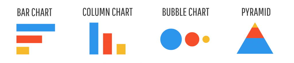
Otherwise, show rank or order with a bar chart, column chart, bubble chart, or pyramid chart.
Relationship
You want to reveal more complex relationships among things.
Use a scatter plot when you want to display two variables for a set of data.

Use a multi-series plot when you want to compare multiple sets of related data.

Explore
You want the reader to explore the data and discover insights for themselves.
There’s no magic bullet for exploration — the visualization style will really depend on the specifics of your data. Interactive charts allow for filtering, sorting, and drilling down are the often best choice, but these can be costly and time-consuming to develop.
Step 4: Create your infographic design using a template or AI tool
Now that you have all the data, all that’s left is the infographic layout and design.
Putting your first element on the page can be daunting, but there are a few hacks that will remove some of the guesswork from the equation and help you make a good infographic.
Make an infographic with a ready-made template
If building a layout from scratch is too intimidating, check out Venngage’s infographic templates that you can personalize to fit your data. The trick is to pick one that works well with your content.
The best way to do that is to focus on the infographic type and style first and then color, style, and chart types.
For example:
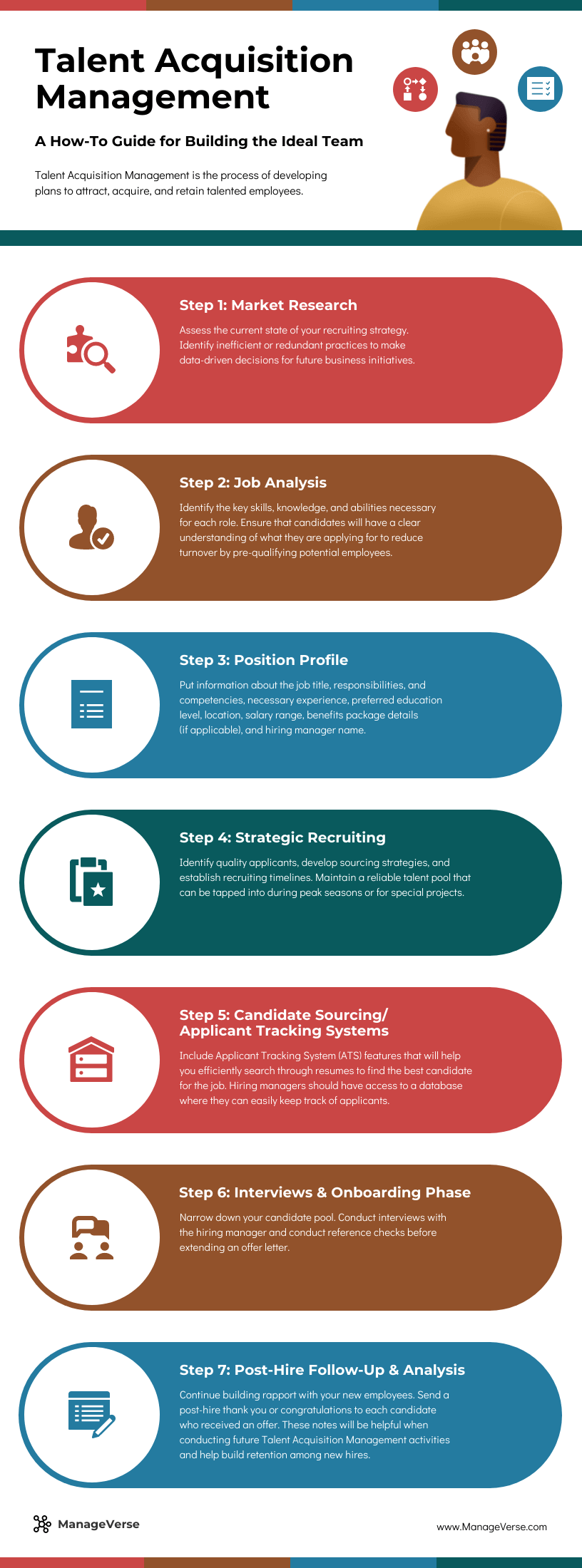
- Process or list infographic: Use a centered, single-column layout when information needs to be read in a clear sequence.
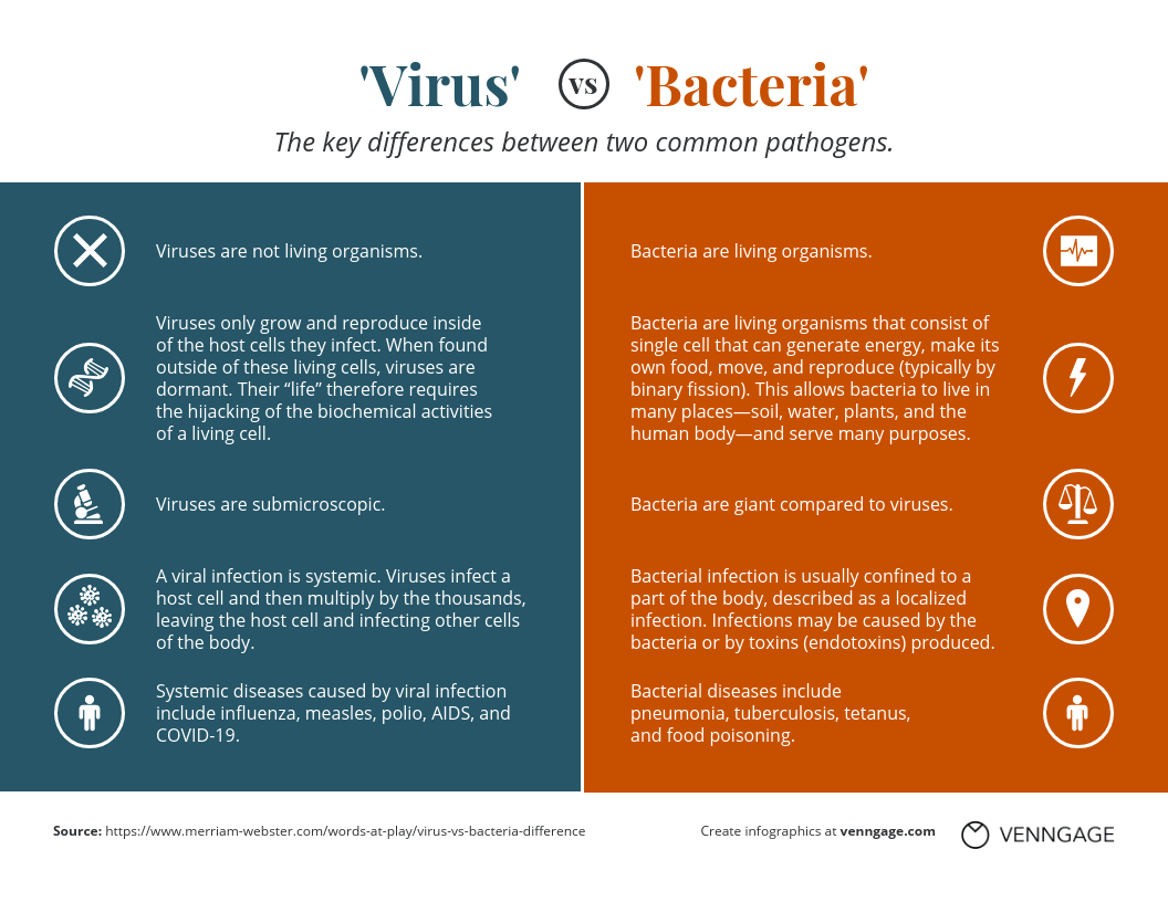
- Comparison infographic: Look for a two-column or side-by-side layout that makes differences easy to scan.
- Statistical infographic: Choose a template with space for large numbers, charts and short supporting insights.
- Timeline infographic: Use a linear layout that can organize events or milestones chronologically.
- Informational infographic: Look for clearly separated sections when you need to explain several related ideas or topics.
Below is a single-column process infographic example:
Want to contrast two charts? Find a two-column infographic template:
Have 3 equally important stats? Find a three-column infographic template:
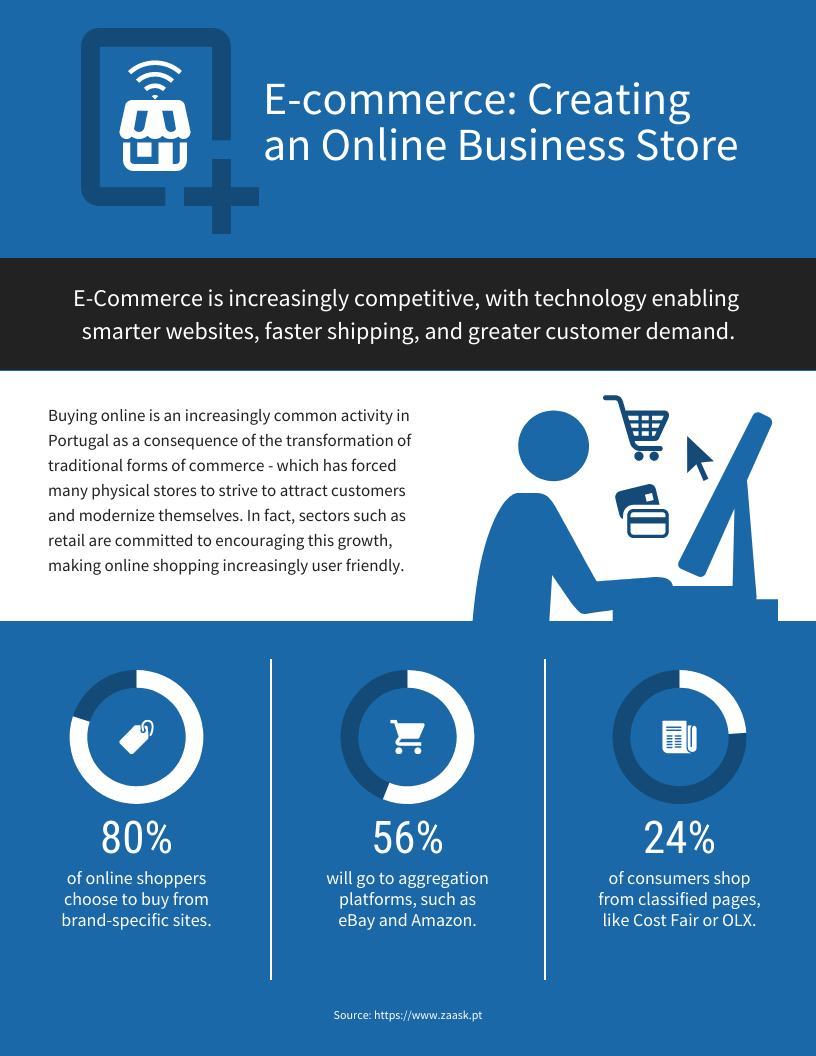
Want to show tons of data? Here are some examples of infographics with 4 or 5 sections:
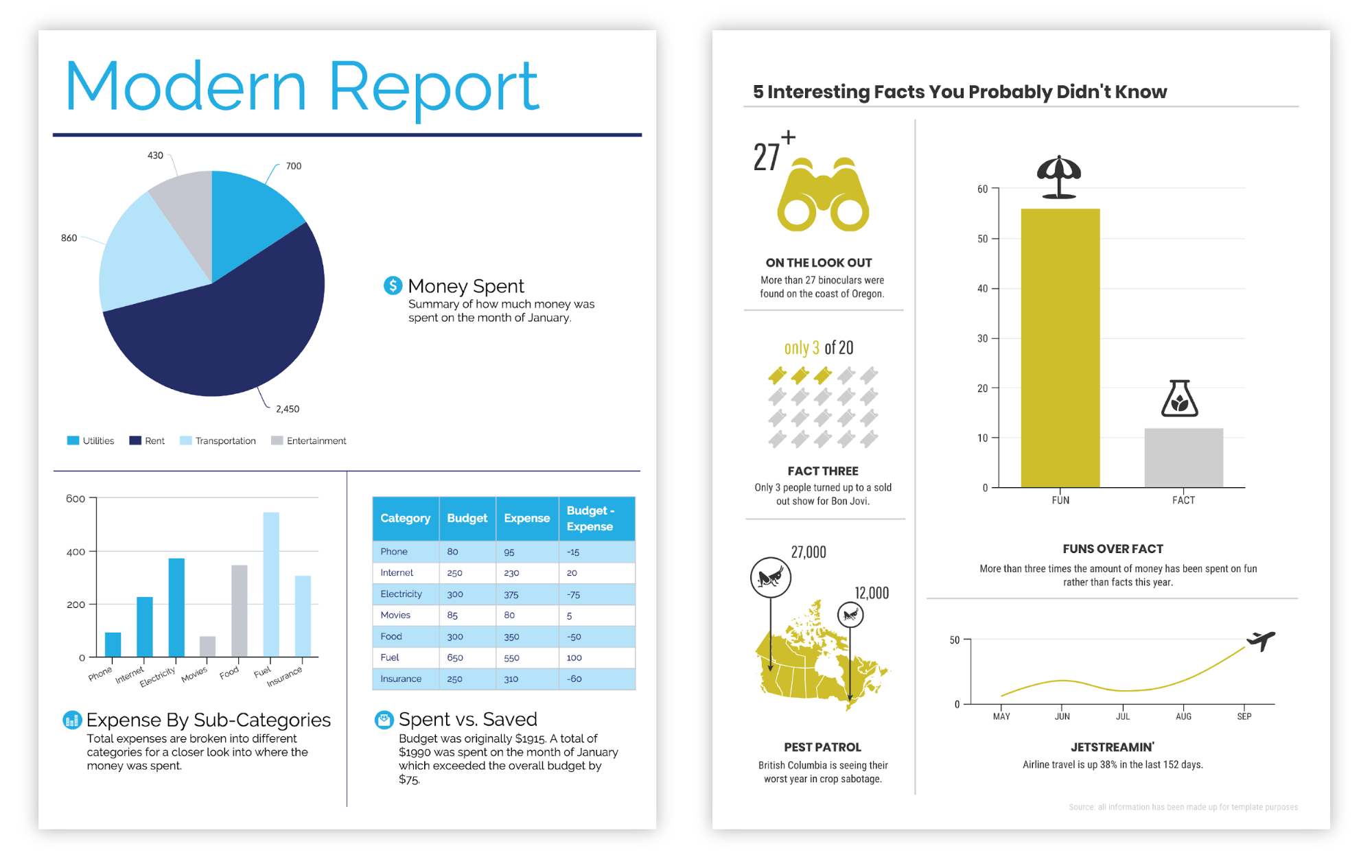
Everything we talked about in the previous section applies here. Think about how many elements you have and how your story should flow when choosing your infographic template.
Once you have an infographic template, just swap in your content and you’re off to the races.
This quick video guide will help you pick the best type of infographic for your data:
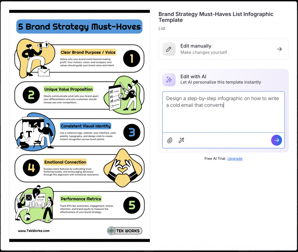
Generate an infographic with AI
Choosing the right infographic layout and browsing through dozens of templates can take time. If you want to skip the manual work and design infographics faster, use an AI infographic design software like Venngage.
Venngage’s AI Infographic generator turns a text prompt into a custom infographic in minutes. All you need to describe the infographic idea and Venngage AI will create it for you. You can generate different infographic types, including process, comparison, timeline and statistical infographics. Or, simply select ‘Auto’ and let the AI decide.
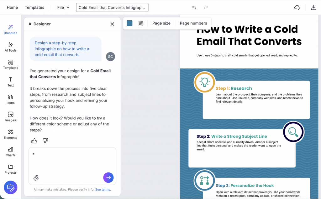
If you are not happy with the first result, ask the AI Designer in the chat to suggest a different layout or regenerate the design.
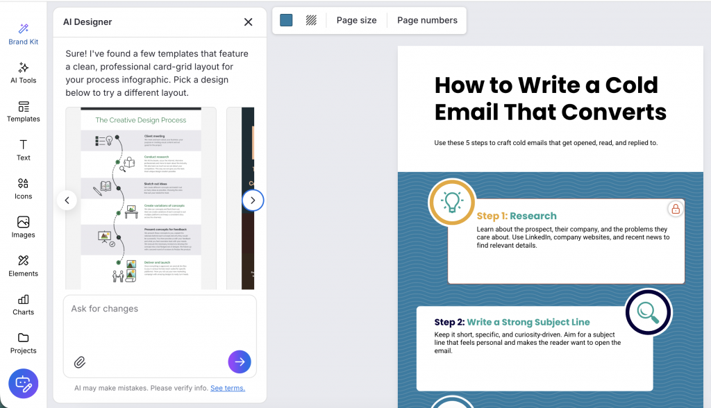
Prefer to start from a template instead? The AI Infographic Generator can edit templates, too. The Auto-Fill feature drops your content into the template structure automatically, so you skip the copy-paste step and go straight to refining the design.
Step 5: Add designs, improve hierarchy and check readability
Now comes the fun part — editing the design elements to add some flair and make sure your infographic is aesthetically pleasing and clear.
Create a natural information flow
Use the question pyramid you developed in the first step to guide your design layout and information flow.
Start by telling your reader what they’ll gain from your infographic (i.e. turn the burning problem into your header), follow up with the charts that address the “supporting questions”, and then drive it all home with the charts that address the “probing questions”.
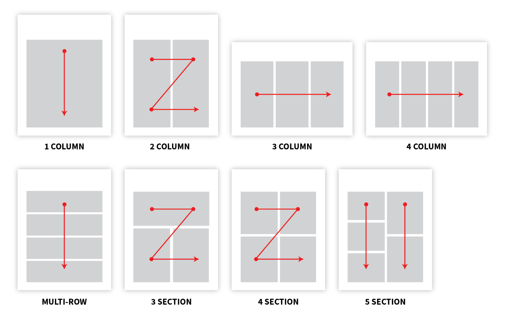
Use a grid layout to add structure and balance to your infographic
Laying out your elements with a predefined symmetrical grid is an easy tactic that will instantly elevate your infographic.
It will give your elements some essential order and, keeping in mind that we naturally read from left to right and top to bottom, it can be used to direct your reader’s gaze from element to element.
Use a centered, single-column design layout for content with a linear flow:
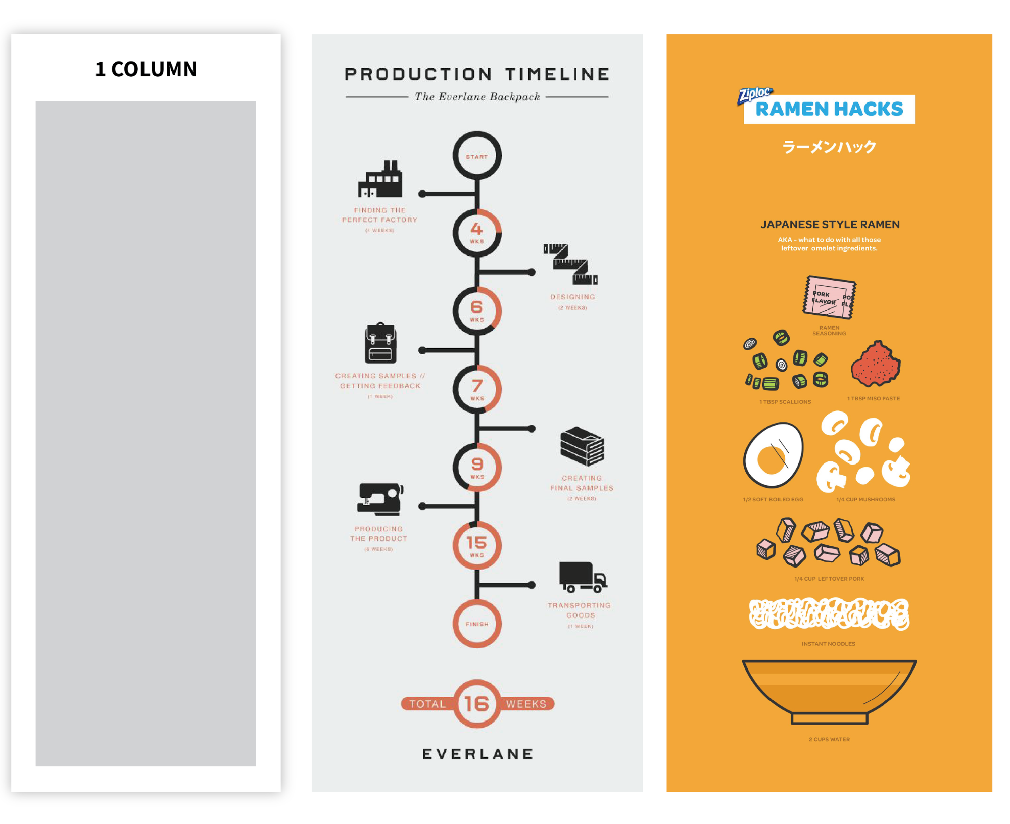
Sources: Everlane.com, Ziploc.com
Use a two-column infographic layout to make comparisons. Below is an example of a comparison infographic template:
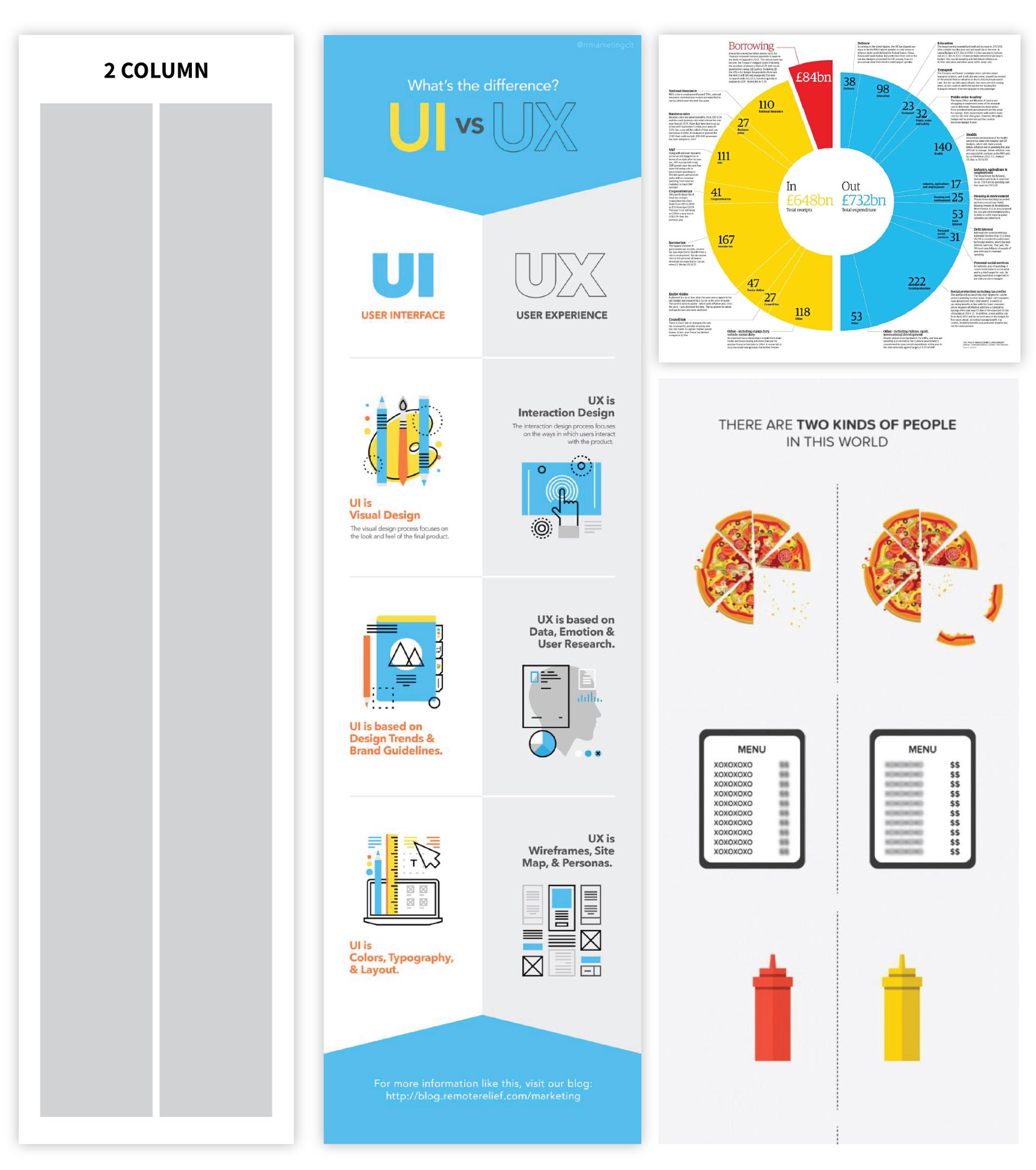
Sources: RemoteRelief, The Guardian, FoodBeast
Consider using a multi-section layout when reading order does not matter:
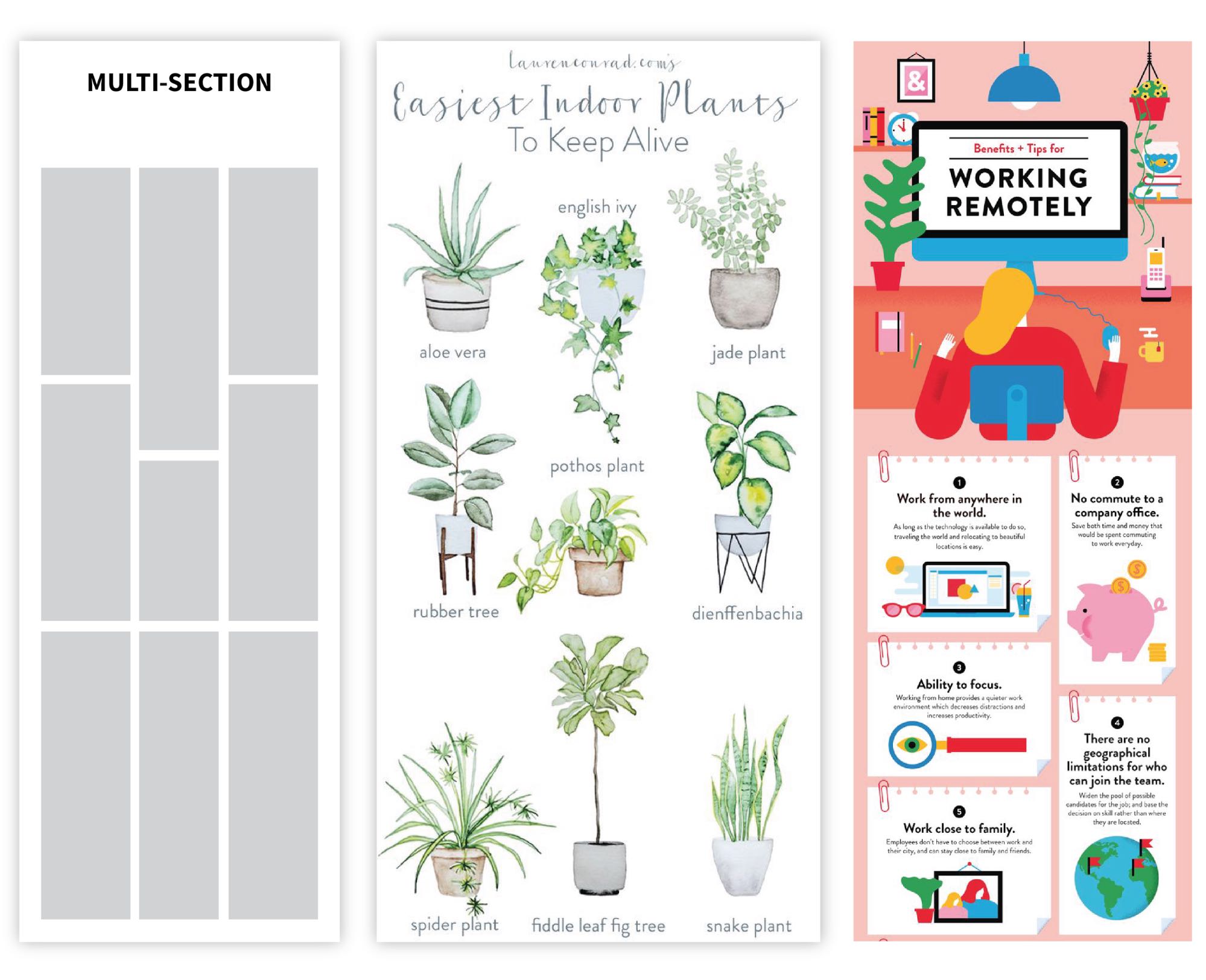
Sources: Lauren Conrad, Lemonly
Whatever layout you use, space your elements at regular intervals to ensure structure and balance.
Improve the text
Think of an infographic as a visual summary; the text should be absolutely necessary to understand the major concepts and supplement the visuals. Reduce your text to short paragraphs (at most) at about a grade six reading level.
You can use Venngage AI Writing Assistant to improve your copy, shorten the text, or make it more professional. Select the text you want to edit and let AI refine it.

Once you have your copy figured out, choose a readable font for the bulk of the text, then amp up the size and style of your main header, section headers, and data highlights so that the gist of your infographic is immediately apparent:
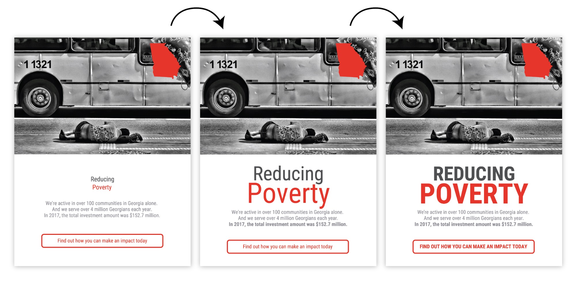
Add visual elements
Next, add some extra graphic elements to give your compositions some rhythm and visual interest.
Remember those grids we talked about earlier? An easy way to pull your composition together is to repeat basic shapes to reinforce the underlying grid:
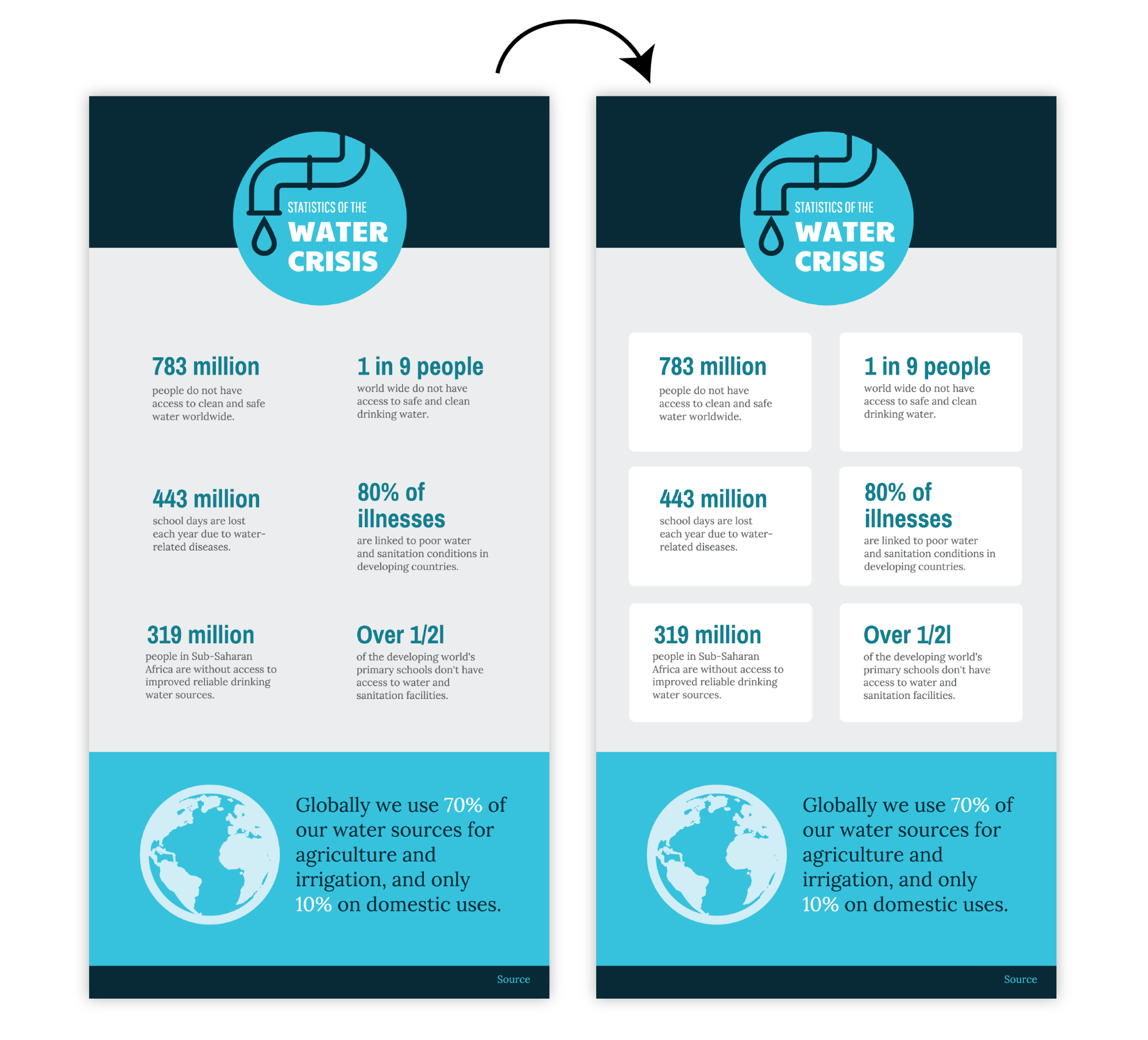
Or use basic shapes to emphasize headers and list elements:
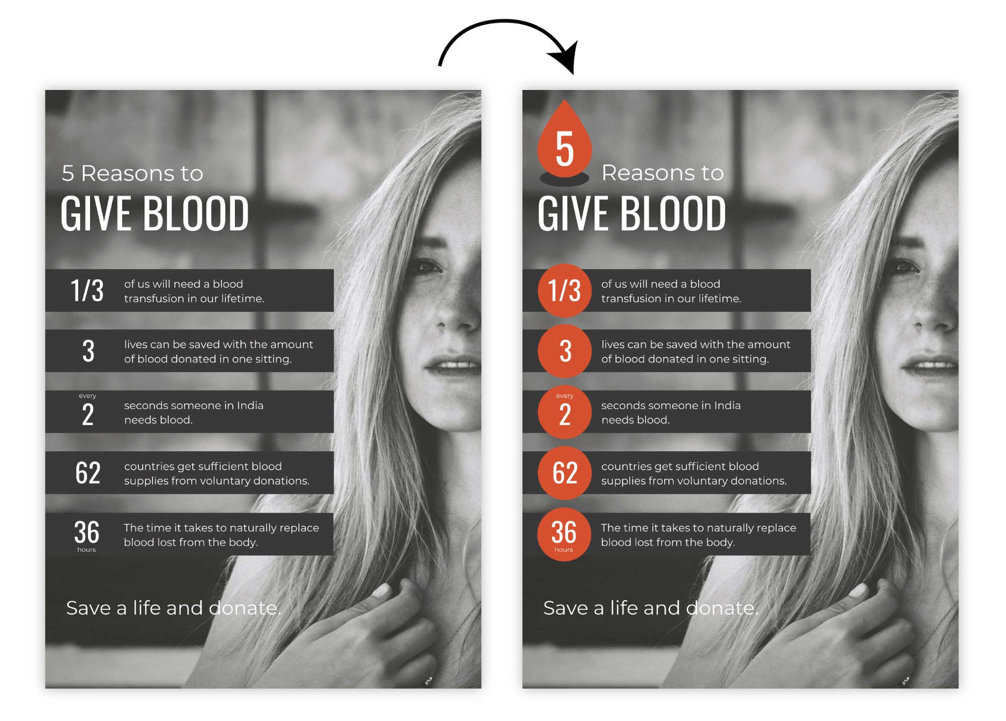
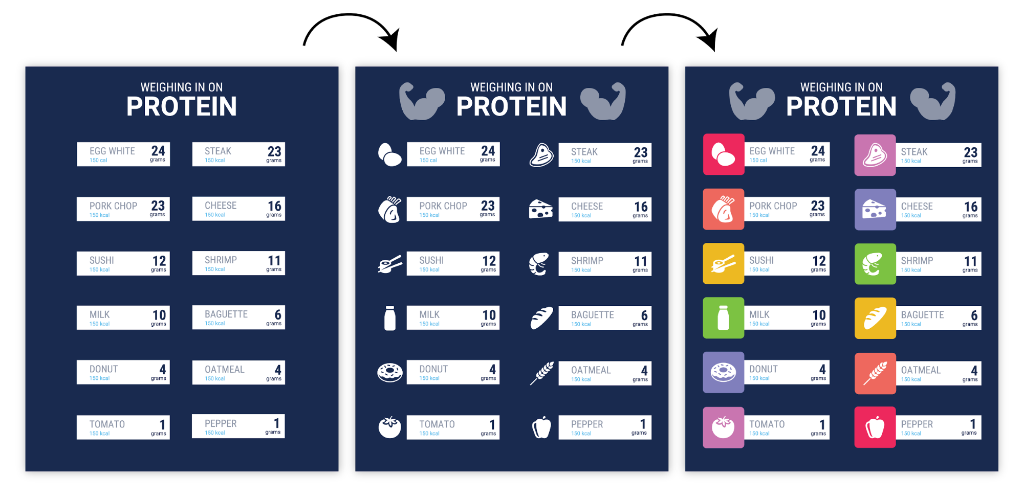
Or add icons to reinforce important concepts in the text. Keep icon color, style, and size consistent, and pull everything together with extra background shapes:
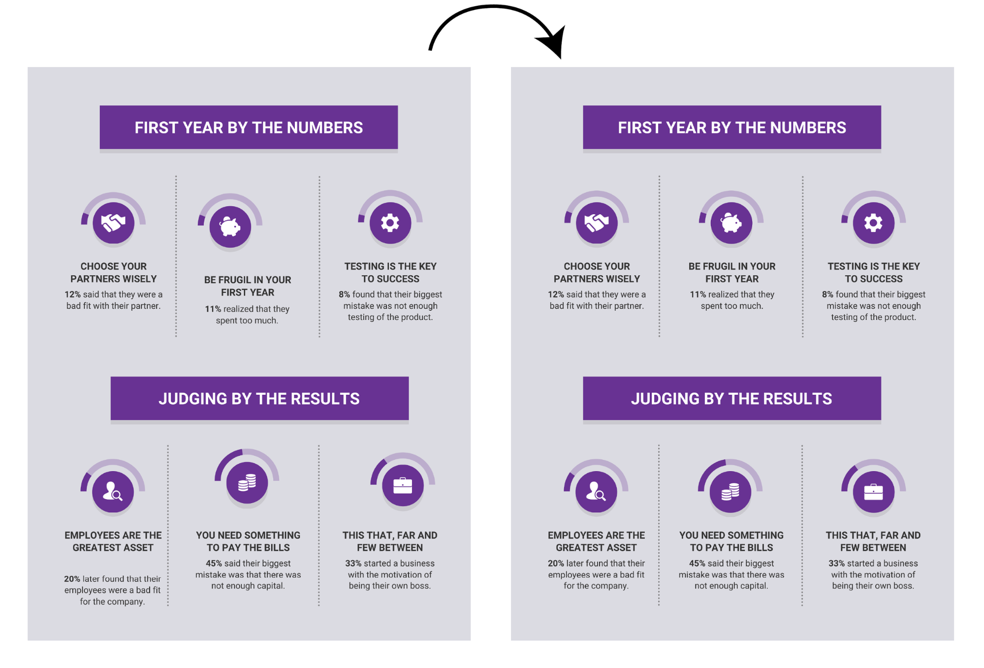
Whatever you do, make sure the repeated elements you add are aligned! Even slight misalignments will throw things off balance:
Those are just a few the ways we like to add flair to our infographics. The important thing to remember is that repeated, aligned elements create visual rhythm, which can make a composition feel more complete.
Here’s a cheat sheet of some of the most common symbols and meanings you can find in graphic design, plus tips for how to use them to visualize ideas:
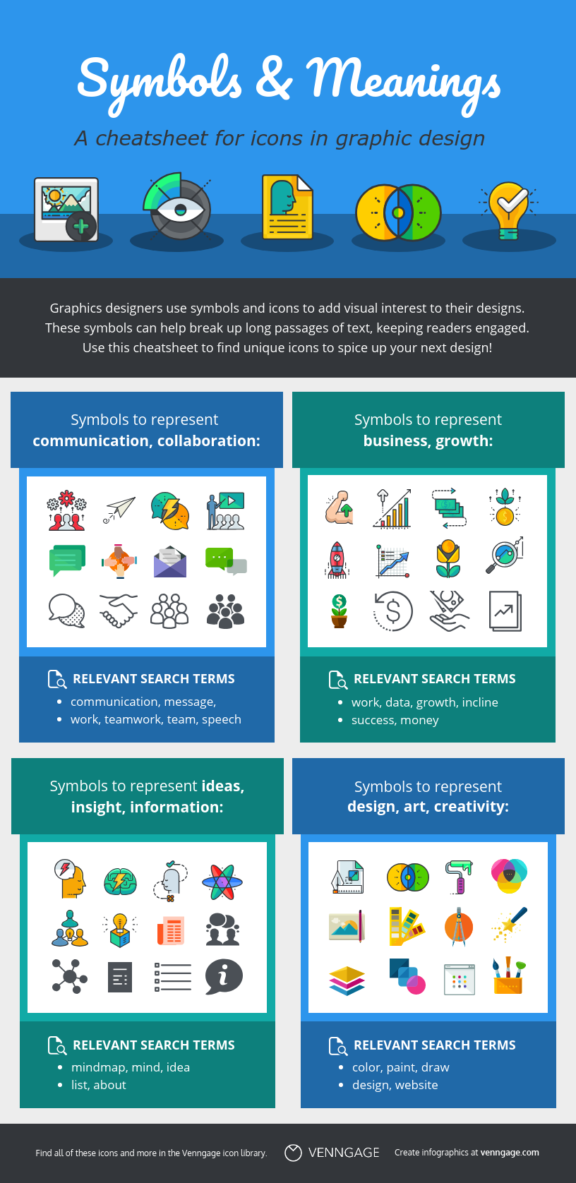
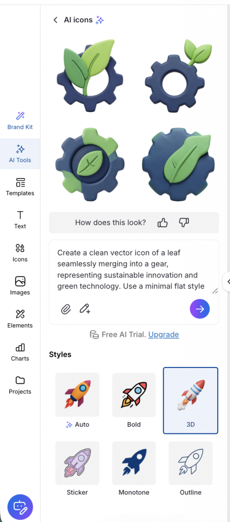
Venngage offers a wide variety of icons in different themes and styles that you can apply to your infographics. If you want a customized icon, try the AI Icon Generator. Simply choose an icon style, describe what you need with a text prompt and the AI generates multiple icon variations to choose from. This works best if you want to design creative icons.
How to use negative space in your infographic design
Negative space (a.k.a. white space) refers to the areas of the page that don’t contain any text or images. Any designer will tell you that negative space is just as important as any other element of a design.
In the same way that when you take a photo, you leave space on either side of your subject, you should leave space around each main element grouping in your infographic.
That means ensuring you have margins around the edges of the infographic:
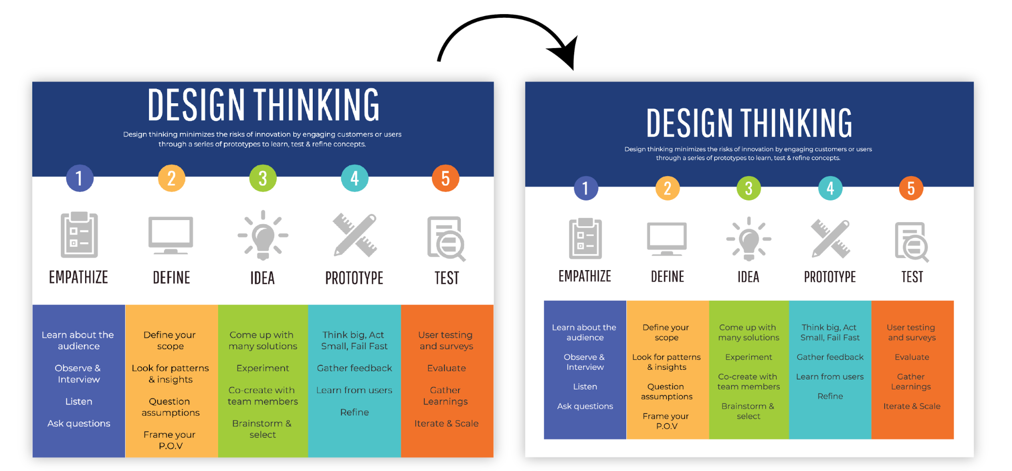
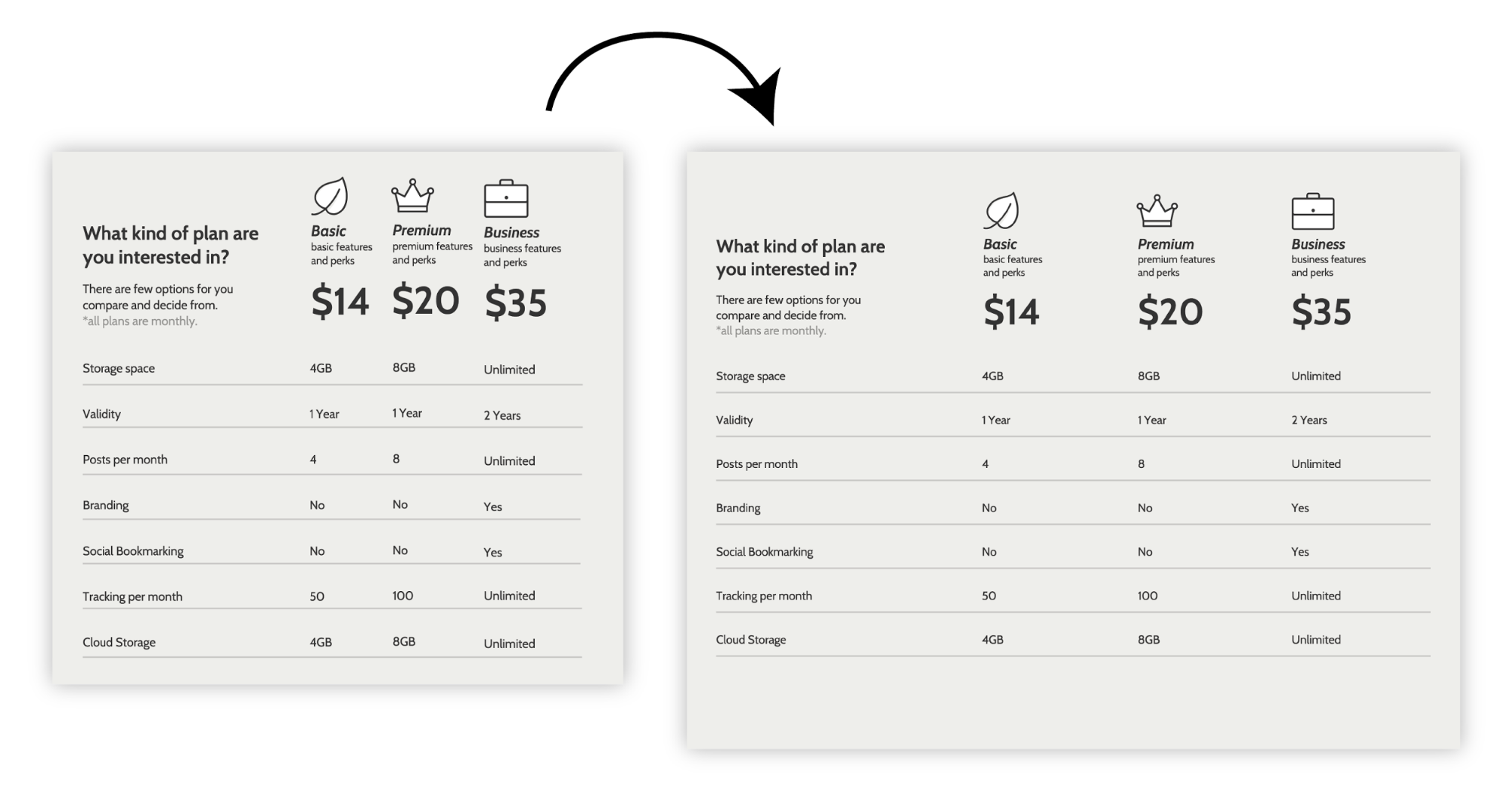
And gaps between unrelated elements, making it easier to immediately understand which elements are grouped together:
White space also affects the way we read color — it’s much easier to make colors play nicely with each other by adding a little white space:

A mark of an expert designer is mastery of negative space. As an amateur, your designs will improve as soon as you start thinking about negative space!
How to pick colors when you design an infographic
Finally we come to picking colors for the infographic. There’s a reason I’ve left it till the end. While color is a powerful communication tool, a truly great infographic design should communicate effectively in black and white. Think of color as an added bonus—a way that you can help your reader understand your content.
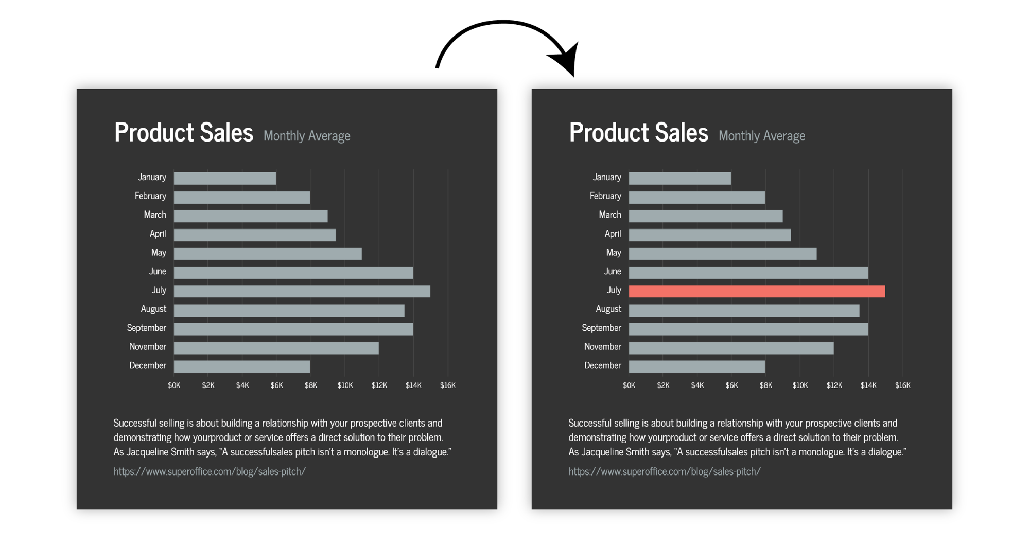
Use color to highlight important information:
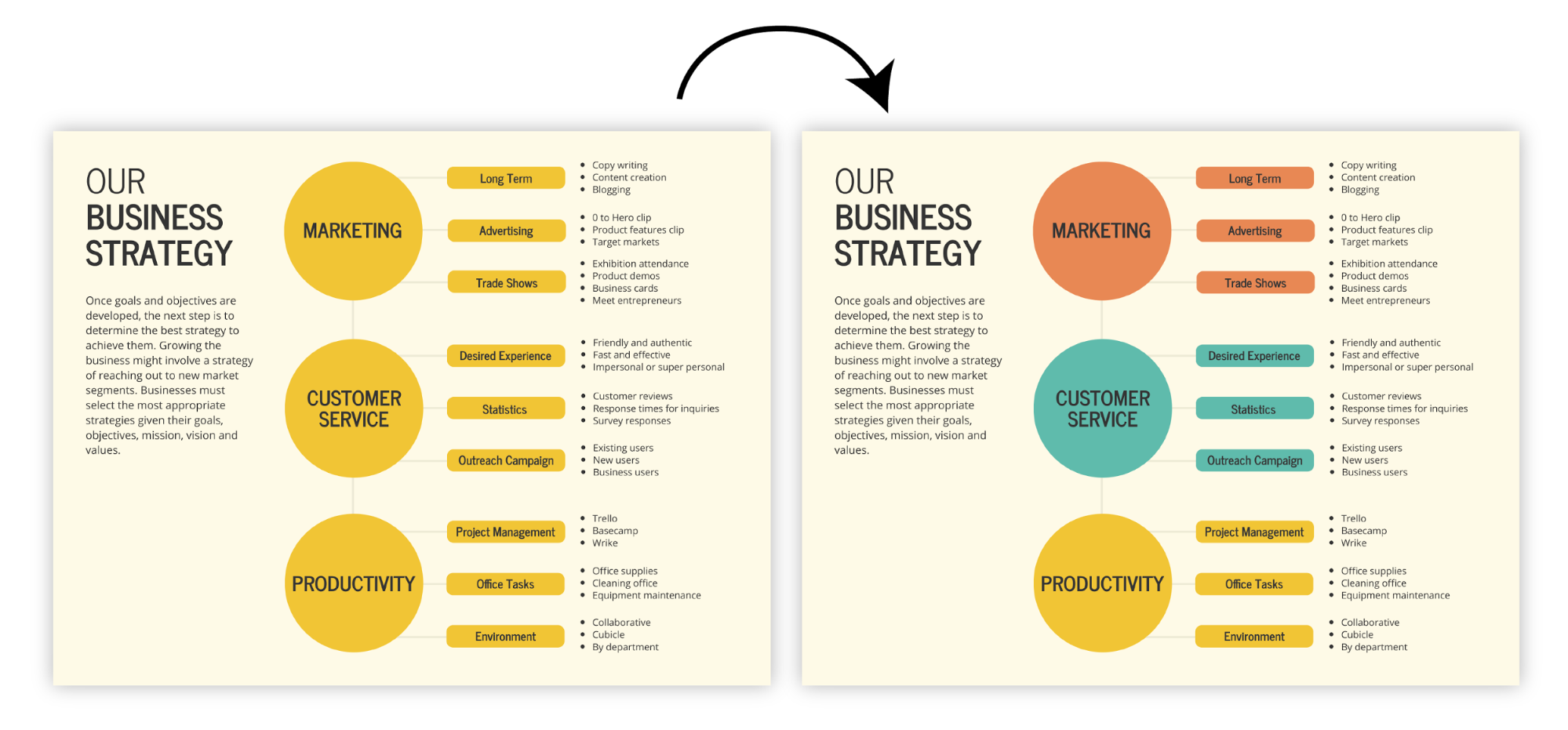
Or to group related elements:
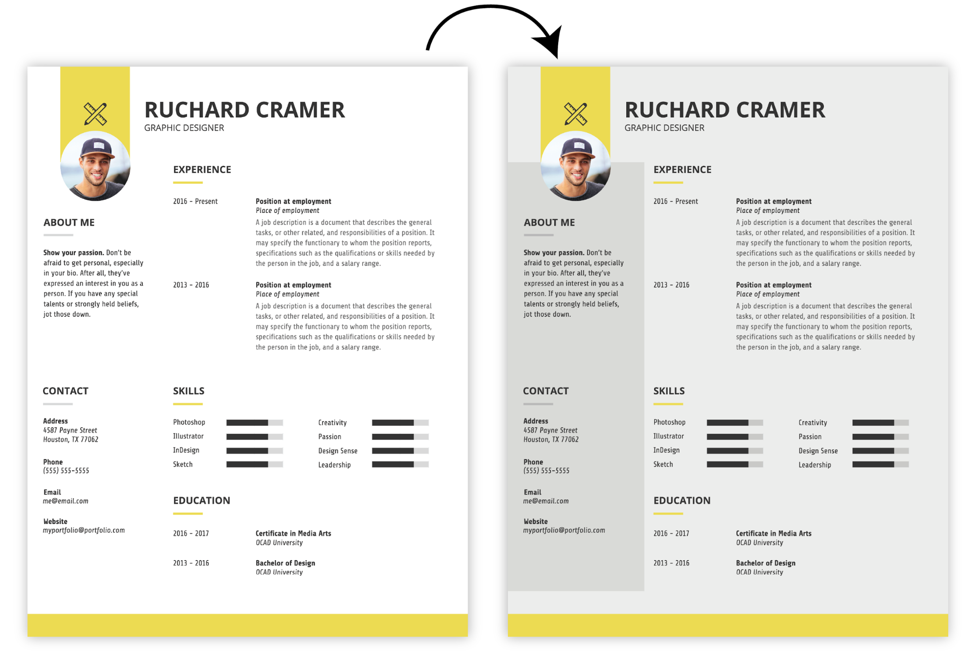
Don’t overlook neutrals. They’re easy to work with, and when used to offset bright colors they can really pull together a composition:
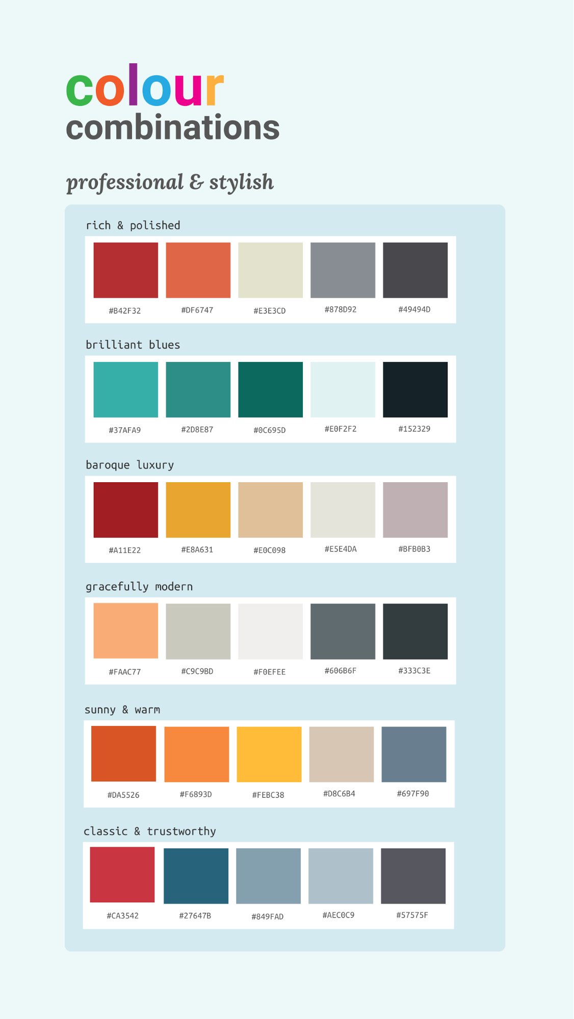
When it comes to combining colors, we’ve got you covered. We’ve put together a number of color schemes that will work for a range of infographics.
Need some inspiration for your design? Check out these infographic ideas and templates.
How to review your infographic design?
Before finalizing, take a step back and review your infographic with fresh eyes. Look for any areas where data or visuals might seem cluttered or unclear.
- Check for consistency in colors, fonts, and spacing.
- Ensure everything aligns with your original goals.
- Ask yourself: does the infographic communicate your message effectively at a glance?
- Adjust any design elements as needed to enhance readability and impact.
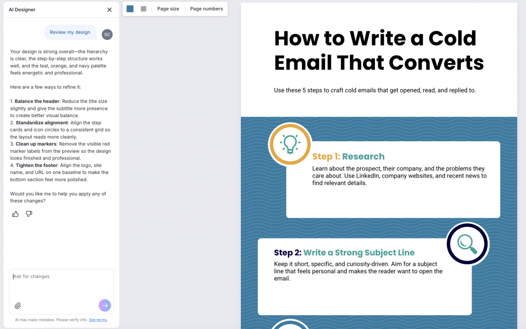
You can also review your infographic with Venngage AI Designer. It analyzes your design and suggests improvements to spacing, font sizes, alignment and visual hierarchy, helping you create a more polished, professional infographic.
Ways to publish or promote your infographic
Now that your infographic is ready, it’s time to share it! Publish it on your website or blog, and consider posting on social media platforms where your audience is active. Include a brief caption or description to add context and encourage sharing.
If you’re promoting a brand or product, embed your infographic in an email newsletter or as part of a presentation. The more visibility you give your infographic, the greater the reach and engagement it can achieve.
How can you embed an infographic in an email?
Embedding an infographic in an email involves a few simple steps:
- Optimize the infographic for email: Make sure your file is web-friendly, usually under 1–2 MB and in a supported format like JPEG or PNG.
- Host the image online: Upload the infographic to a reliable server or cloud service so it has a direct URL.
- Insert the image into your email: In your email editor, use the “Insert Image” or “Add Image” option and paste the image URL or upload the file.
- Add alt text: Include descriptive alt text in case the image doesn’t load for some recipients.
- Test the email: Send a test email to yourself to ensure the infographic displays correctly on desktop and mobile devices.
Following these steps lets your audience see the infographic directly in their inbox, making your message more engaging and visually appealing.
What are the use cases of an infographic?
Here are some of the best ways to use an infographic design.
Provide a quick overview of a topic
If you want to present a new concept that is difficult to understand, outline the steps in a project plan, or introduce a new policy, a process or list infographic can be useful.
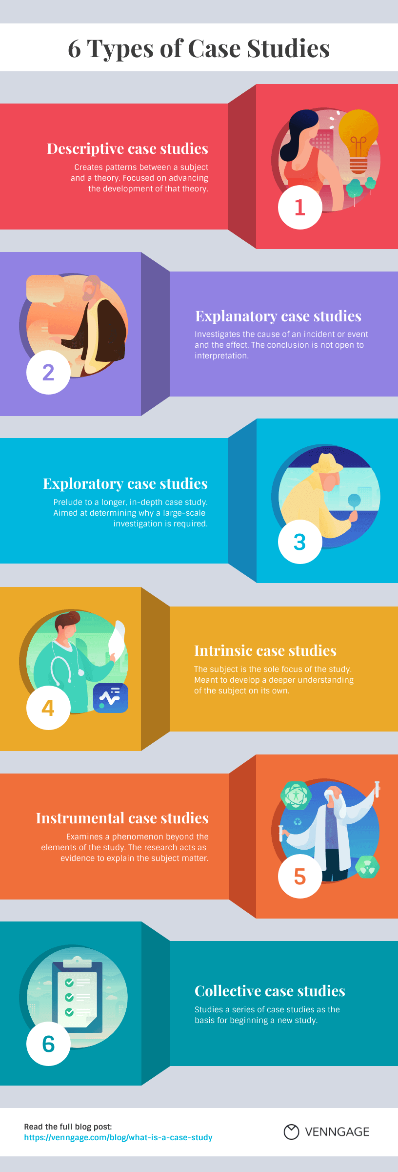
This one, for example, summarizes the main six types of case studies. It uses a zig-zag layout to create a clear reading flow, with distinct colors and illustrations helping readers quickly differentiate between each type.
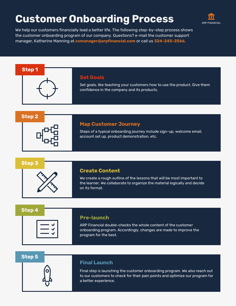
Explain and simplify a complex process
For a complex process that might be hard for people to wrap their heads around, try creating a process infographic that your audience or clients can use as a reference:
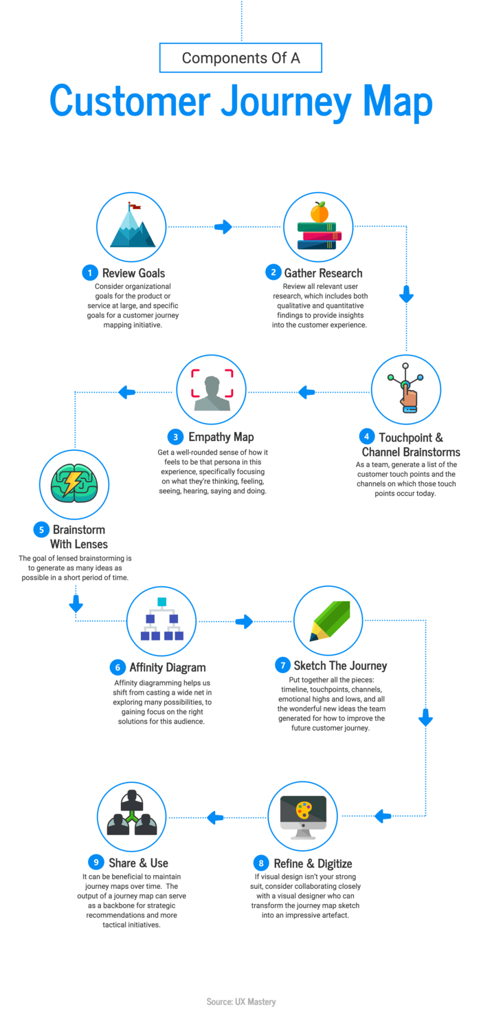
Process infographics can be helpful for demystifying abstract processes like a customer journey:
Display research findings or survey data
Data infographics are an ideal way to share survey results because they let you tell a story with your numbers. In fact, according to Design Rush, infographic posts on social media generate 650% more engagement than text-only posts. This makes them especially useful for sharing survey results in blog posts, white papers or social channels.
Infographics and data visualizations are powerful tools to help simplify the understanding of complex corporate data and improve the memory retention of that information by the audience.
Randy Krum, author of Cool Infographics
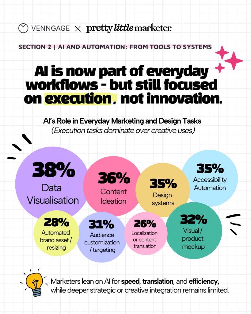
This is an infographic we created to illustrate the results from our survey on AI and design trends in 2026:
Summarize a long blog post or report
When you have a long blog post or report, it can be helpful to summarize key points in an infographic design. This makes it easy for readers to scan for the most important information.
Take this AI trends in design and content infographic, for example. It summarizes a complete blog on AI trends using bar charts, percentage callouts, and clear sections to make 15+ stats easy to scan.

Instead of having to answer the same questions after sending out a report, or having people miss out on important details — a summarized visual report helps to eliminate these issues.
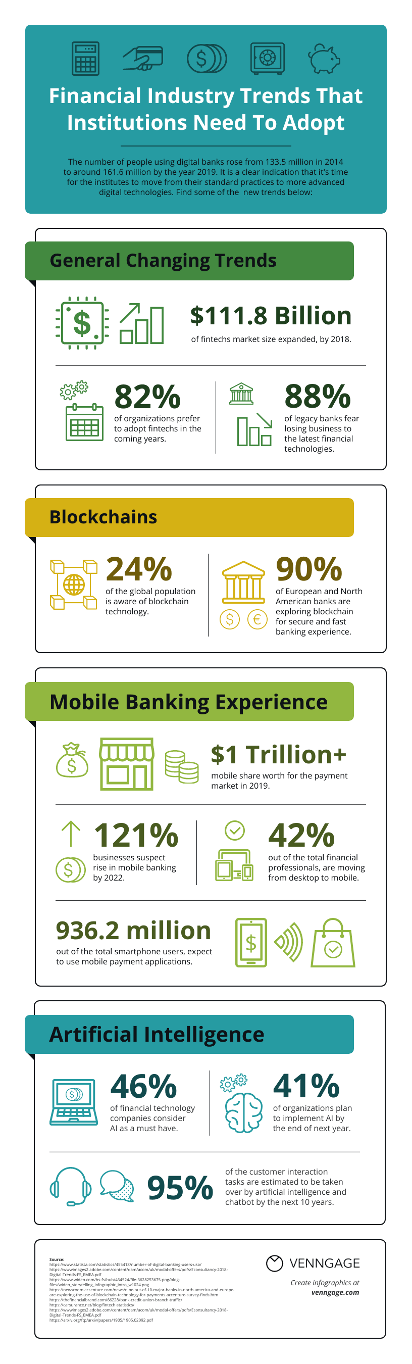
Here’s another example of an infographic that you can use to summarize information many people might find dry or boring:
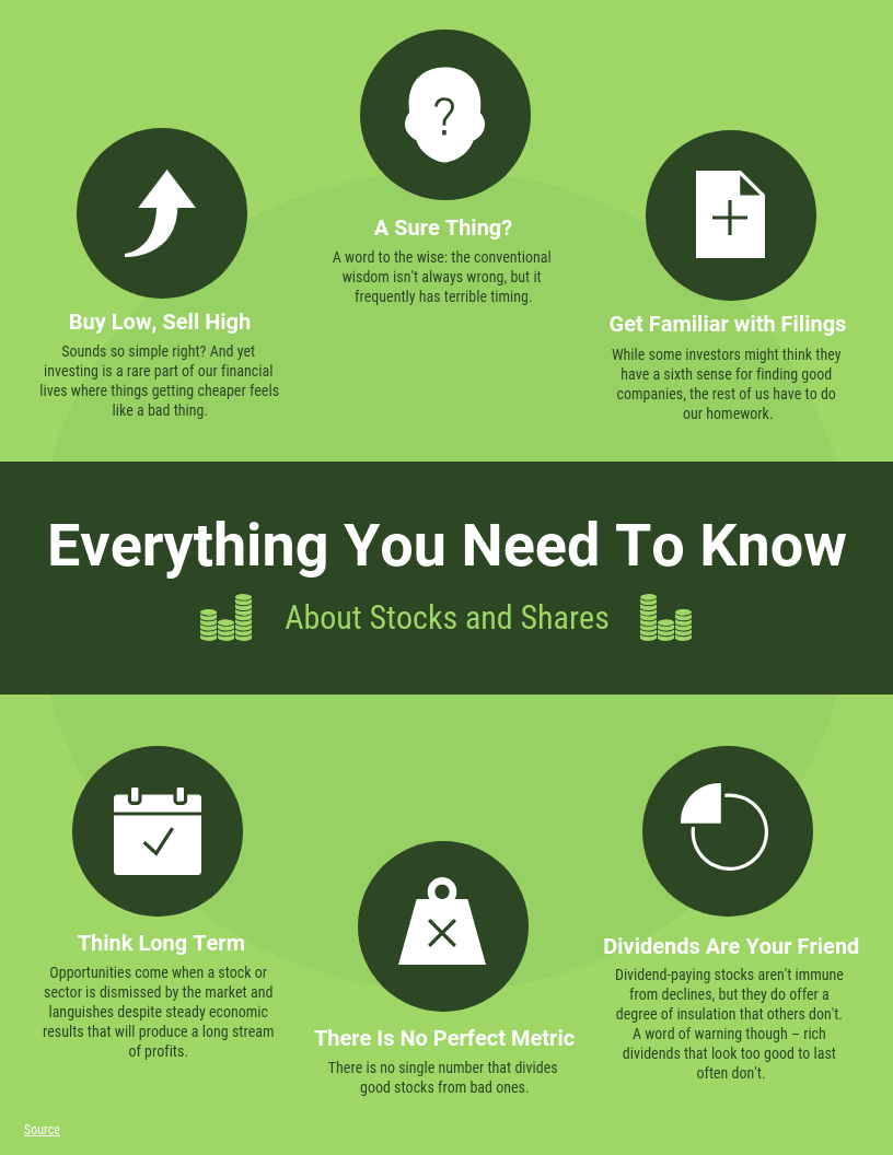
Or something that could be hard to understand:
Compare and contrast multiple options
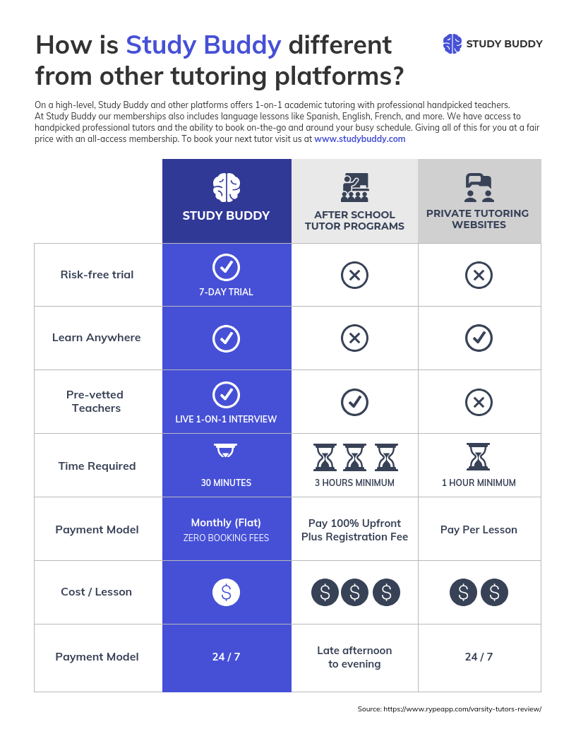
When presented with two good options, how do you make a decision? Write down the pros and cons of each. A comparison infographic is a visual way to compare products, plans, arguments, and ideas:
Raise awareness about an issue or cause
Using your social channels to build awareness is important for many organizations. Infographics have the power to help you tell a story with data—to put a face to numbers.
An example would be the infographic about the refugee crisis above, or this one about racial inequality in the US:

As Alberto Cairo, author of The Truthful Art, explains: “The purpose of infographics and data visualizations is to enlighten people, not to entertain them, not to sell them products, services or ideas, but to inform them. It’s as simple and as complicated as that.”
FAQs on how to make an infographic
1. How do I make my infographic match my brand’s look and feel (quirky vs. corporate)?
Venngage’s BrandKit feature makes this easy. You can upload your logos, select brand colors and set fonts so every infographic automatically reflects your brand’s style, whether it’s playful and quirky or clean and corporate.
2. How to use Infographics?
You can use infographics to present data visually, summarize reports, explain processes, illustrate comparisons, share on social media, enhance blog posts and support presentations.
3. What is the best free tool to create infographics?
Venngage is one of the top free tools for creating professional infographics. It offers a wide variety of infographic templates, drag-and-drop design features, and easy customization, making it simple for anyone to create visually engaging graphics.
4. Is it better to create an infographic with AI or use a template?
It depends on your workflow. An AI infographic generator helps you create a first draft in minutes from a simple text prompt, while infographic templates offer more control over the layout and design. Many people use AI to generate ideas quickly, then refine the design using a template.
5. How do I create an infographic?
Start by defining what you want the infographic to communicate and who it is for. Then gather the key information, organize it into a clear structure, choose suitable charts or visuals and create the design using an infographic maker or template. Keep the layout easy to scan and make the most important information stand out.
6. What are the 5 elements of an infographic?
The five key elements of an infographic are: a clear headline, concise supporting text, data or key information, visuals such as charts, icons or illustrations and a structured layout with strong visual hierarchy.
Together, these elements help readers understand the main message quickly.
7. What should I include in an infographic?
Include only the information needed to support your main message. This usually means a clear title, key statistics or facts, short explanatory text, relevant charts or visuals and source information where necessary. Avoid adding too much detail, as infographics work best when the content is easy to scan.
8. What does an infographic look like?
An infographic combines text and visuals in a structured layout to explain information quickly. It may include headings, statistics, charts, icons, illustrations and short blocks of text arranged vertically, horizontally or in sections depending on the topic.
9. What are the different infographic styles?
Common infographic styles include statistical, informational, timeline, process, comparison, geographic, hierarchical and list infographics. The best style depends on the type of information you want to present. For example, use a timeline for chronological events, a process infographic for steps and a comparison infographic for side-by-side differences.
10. Can you give me an example of an infographic?
A research infographic summarizing survey results is one example. It might feature a headline, several key statistics, bar or pie charts and short explanations of the most important findings. You can also find infographic examples throughout this article to see how different formats work for different types of content.
11. Can ChatGPT create infographics?
Yes. ChatGPT can help you plan an infographic, organize the content, suggest layouts and generate infographic images from a prompt. For better results, include the topic, key information, preferred infographic style, visual direction and any colors or branding requirements in your prompt. You may still need to edit the final design for layout, branding or accuracy.
Start creating your infographic
A great infographic tells a story, simplifies complex information and helps readers quickly understand your message.
Start with a clear objective, choose a layout that supports your content and focus on clarity over decoration. Whether you’re explaining a process, presenting research or comparing ideas, following these design principles will help you create infographics that are both engaging and effective.
When you’re ready to start designing, explore professionally designed infographic templates or use Venngage AI Infographic Generator to turn your ideas into a polished infographic in minutes.