


Think you need a professional graphic designer to create amazing infographics?
Think again.
By customizing a pre-designed infographic template, you can get all the benefits of a custom infographic without the hassle of hiring a graphic designer. And yes, it is possible to create amazing infographics (like the one below) without professional design skills.
Follow these 10 tips to create amazing infographics:
- Set the right tone with a custom infographic color scheme
- Customize your infographic with content-appropriate icons
- Replace stock photos with custom images for a touch of authenticity
- Inject some character with stylized infographic fonts
- Add brand imagery to promote your business
- Customize the style of your infographic charts
- Add style to a basic infographic with flashy title art
- Enhance the structure of your infographic with basic shapes and borders
- Customize the infographic layout for different platforms
- Mash-up multiple infographic templates to create the ultimate amazing infographic
Let’s review how to make each of these tips work with some of our most popular templates.
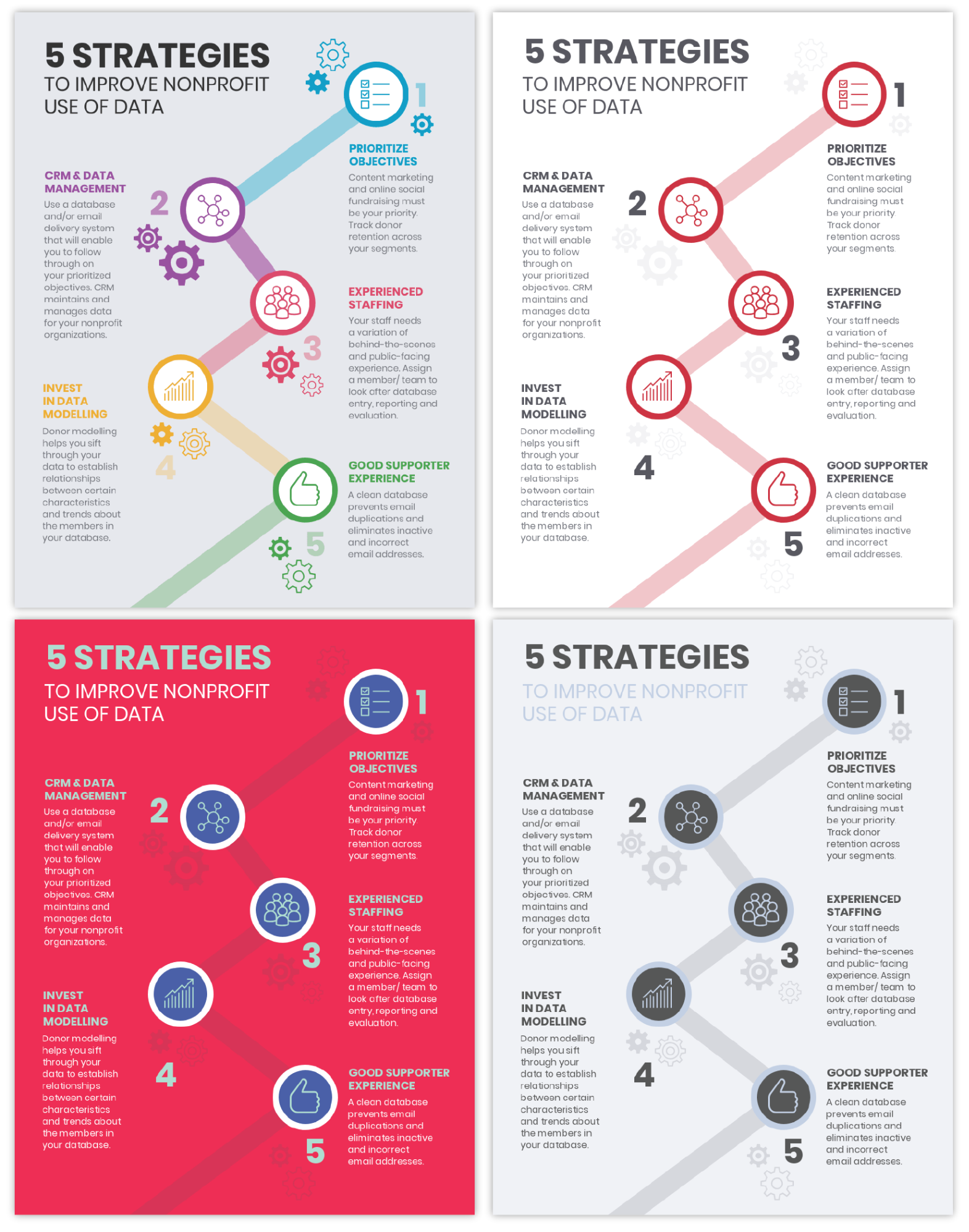
1. Set the right tone with a custom infographic color scheme
Color means more in infographic design than just decoration. Sure, we use color to create infographics that are easy on the eyes, but color is also a key characteristic that contributes to the overall tone or “feel” of an infographic.
By customizing our infographic color schemes, we can tailor the mood and tone of our infographics to fit the theme of our content.
Check out this list infographic template, for example. Its 5 bright feature colors set a playful, cheerful tone:

By simply tweaking the color scheme of this one template, we can take the infographic from playful to professional, modern, or minimal. With four different color schemes, we can create four completely different styles and completely different feelings.
To help you personalize your own infographics with custom color schemes, here are a couple quick tips:
For professional infographics, stick with crowd-pleasing greens, blues, greys, and reds
Apply a few different shades of the same color for a sleek, professional look. Keep the text white or black for readability.
For a fun infographic, apply 4-5 bright, saturated colors in equal amounts
Use a light, neutral background color to offset the bright colors and tie the graphic together.
Color schemes with more than 3 colors can be hard to pull off, but it’s worth the effort if you do manage to make it work. I mean, can you resist these bright, cheerful colors?
For minimalist infographics, pair a white background with grey text and one highlight color

Custom infographic color schemes are key for creating infographics that fit the theme and tone of your content. Check out our article on picking infographic colors to get color palettes for every mood.
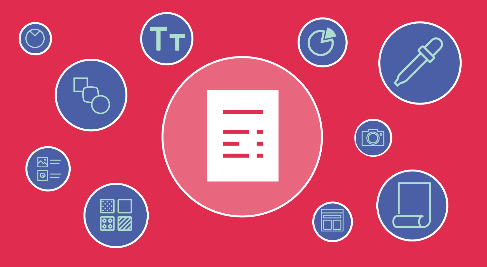
2. Customize your infographic with content-appropriate icons
Infographic icons are typically paired with headers or lists elements to emphasize important concepts in the text.
This means that the default icons found in most infographic templates simply won’t be appropriate once you add your own content.
So once you add your own text, customize the icons in the infographic template to reflect your key ideas, list elements, or headers.
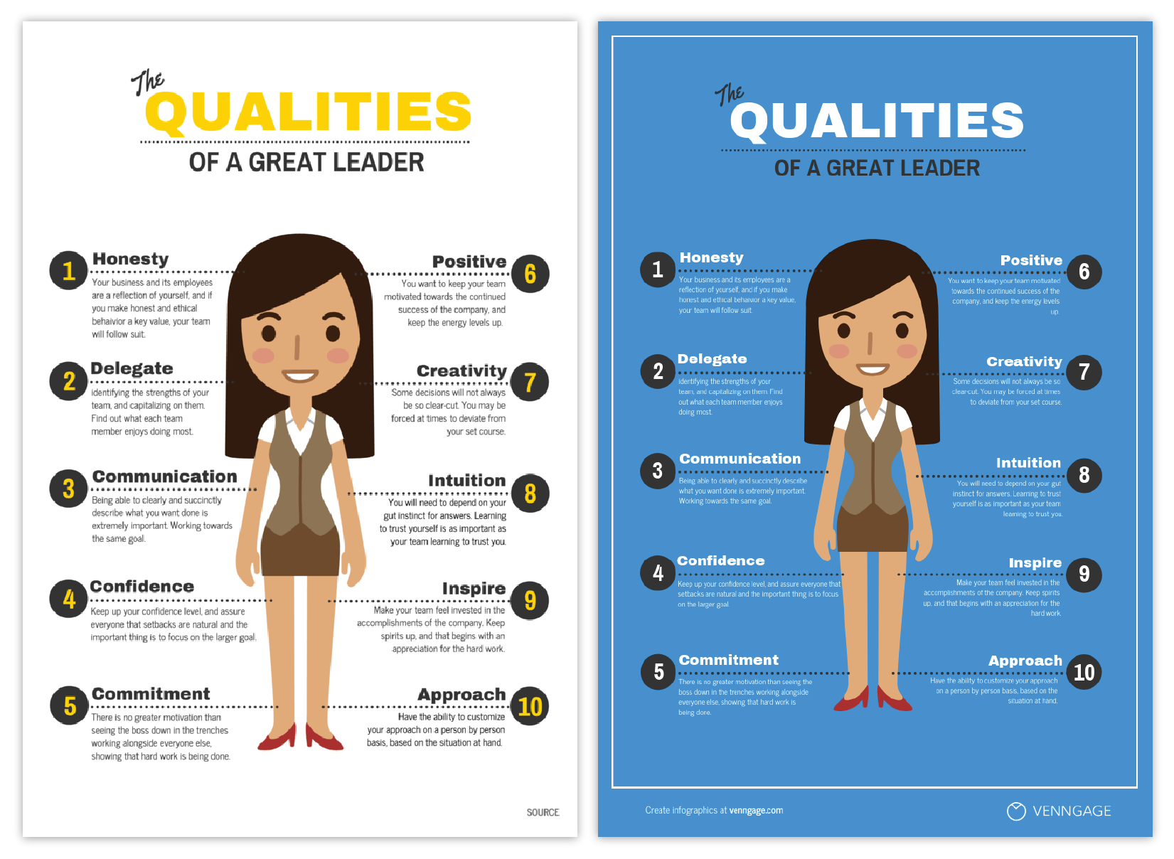
Take this infographic on job search tips, for example:

When I customize this template with my own content on digital marketing trends, the original visuals no longer make sense.
By making the most of Venngage’s extensive icon library, I can find new icons to match up with each of my headers. I can create a completely custom infographic, without drawing, illustrating, or designing a single thing.
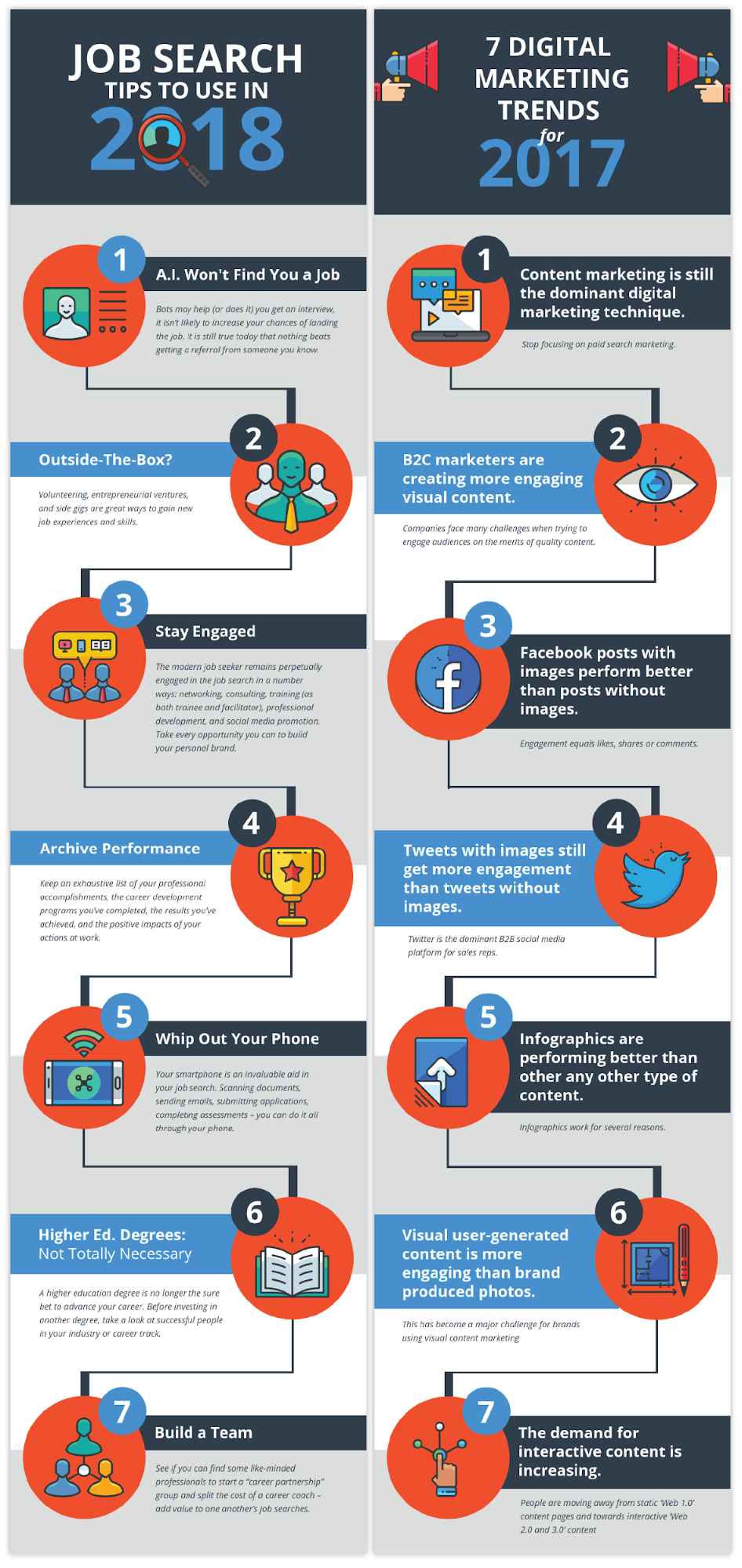
So remember–as soon as you update a template with your own content, replace the default icons in the infographic template with icons that make your content pop.
Before we move on to the next strategy for creating amazing infographics, here are a few quick tips for working with icons:
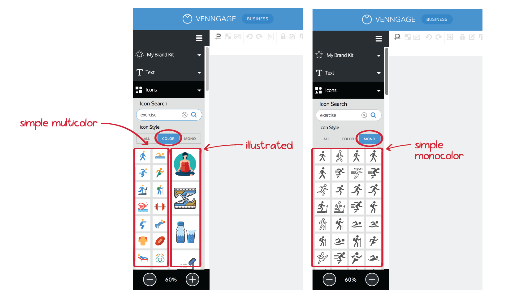
To find the best icons for your content, search the Venngage icon library for the keywords you’d like to highlight.

Filter icon search results by “color” or “mono” to find icons that coordinate in style.
Try to use icons of the same style throughout an infographic so that the final product feels cohesive. Use simple monocolor icons with other simple monocolor icons, use simple multicolor icons with other simple multicolor icons, and use illustrated icons with other illustrated icons.
3. Add photos for a touch of authenticity
Icons are great, and all, but sometimes you want graphics that feel a little more real. For a touch of realism and authenticity, consider featuring photos in your designs.
Don’t feel constrained to stick with the same type of visuals (like icons, charts, or illustrations) found in the original template. Swap out the built-in visuals for photos for a more personal touch.
Check out this icon-focused template on thought leadership strategies, for example.
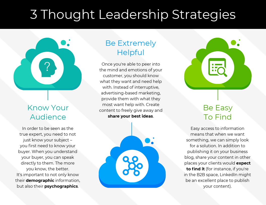
We can keep the original color scheme and layout, and swap the icons for photos. Thin borders around the photos help carry through the pops of color from the original icons, and tie the composition together.

Venngage’s built-in library of photos means you’ve got hundreds of photos at your fingertips, but in case you haven’t heard, stock photos are dead. For a truly custom infographic, upload your own images into our templates.
To upload an image, head to the “Image Uploads” section of our toolbar, and drag and drop an image file into dotted the box. Simply click the uploaded image to insert it.

A few ways you can make your photos shine in your amazing infographic:
Crop images to equal sizes and aspect ratios for a polished effect
To incorporate images seamlessly into a template, you’ll need to make them look like they belong together. Use our image editing tools to scale and crop each images to the exact same size and shape.

Stylize images with colored filters and borders
Add a touch of flair and finesse to your photos by creating a color filter in these 4 steps:
- Add a basic shape icon that matches the shape of your photo
- Scale it to fit exactly over the photo
- Adjust its color to fit the color scheme
- Reduce its opacity to reveal the photo underneath.

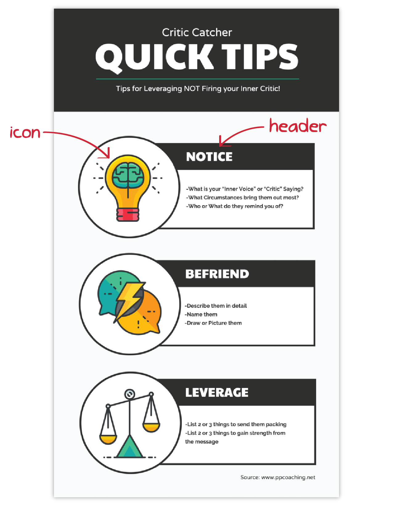
4. Inject some character with stylized infographic fonts
Fonts have personality. Switching up the fonts for your infographics can have a massive impact on the effectiveness of a design and its tone of voice (we refer to this as font psychology).
Add personality to an infographic with stylized header and subheader fonts:
- Use a serif font (like Old Standard TT or Playfair Display) for an timeless feel.
- Use a script font (like Rochester, Great Vibes, or Petit Formal) for an elegant feel.
- Use a sans-serif font (like Lato, Roboto, or Open Sans) for a modern feel.
- Use a handwritten font (like Knewave, Yellowtail, or Chewy) for a playful feel.
- Use a display font (like Ultra, Paytone One, or Abril Fatface) to make a bold statement.
Check out the effect that different font styles have on this simple informational infographic:

Notice how the feel of the infographic completely changes with different header and subheader fonts? Notice how I’ve kept the body font the same throughout, and that all of the personality comes from the header fonts?
When choosing infographic fonts, keep these rules of thumb in mind:
- Don’t use more than two or three fonts per infographic – one for the header, one for the subheaders, and one for the body text
- Use a minimal, readable font for the body text
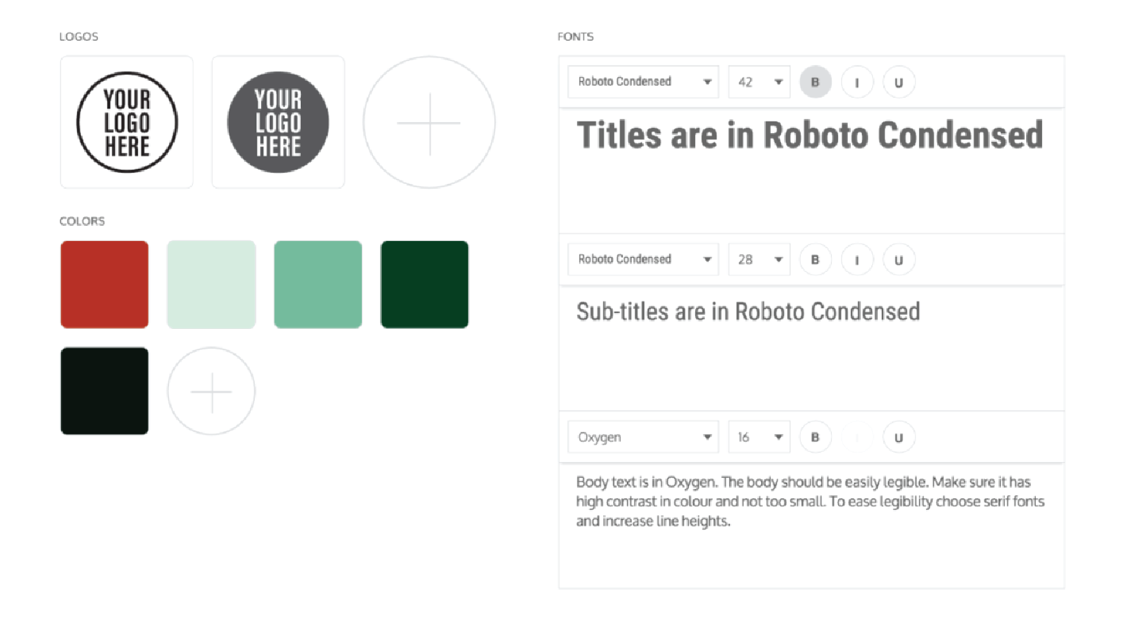
5. Add brand imagery to promote your business
Creating infographics to promote a business?
Customize your chosen template to align with your company’s branding. Take cues from your company’s brand style guide to create infographics that faithfully represent your brand’s style and voice.
- Add your brand logo to the infographic header (or footer)
- Embed a link to your website in the infographic footer
- Incorporate your core brand color into the infographic color scheme
Take a look at how with these three quick steps, we can turn this standard template into a customized, branded infographic:
By applying your brand colors and logos to every promotional infographic you produce, you’ll be helping to develop brand consistency and brand awareness. It’s a good habit to get into if you frequently produce visuals as part of your marketing strategy.
(By the way, have you heard about Venngage’s My Brand Kit? It allows you to save your brand elements directly in our tool, making it a breeze to customize each infographic with the same branded color scheme and logos.)
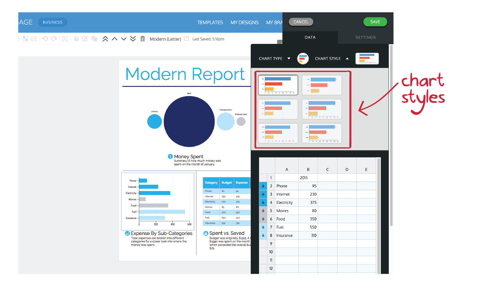
6. Customize the style of your infographic charts
Data doesn’t have to be boring or confusing.
By customizing your chart style (and type) you can create custom reports and statistical infographics that engage your audience and communicate the insights in your data clearly.
We can easily switch up one of the chart types this modern report template to emphasize the money spent on rent, for example. We can also refine the style of the bar chart to make the category labels easier to read:
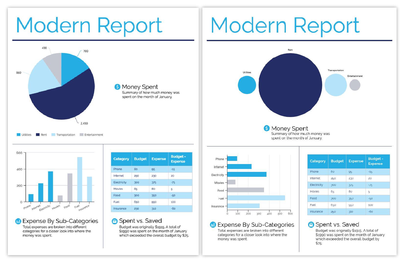
These simple chart changes make an enormous difference to the readability of the report, and they took less than 5 clicks to complete.
To switch up chart types in Venngage (without re-entering any data), simply double-click the chart you want to change, select the “Chart Type” dropdown, and click the desired chart type.
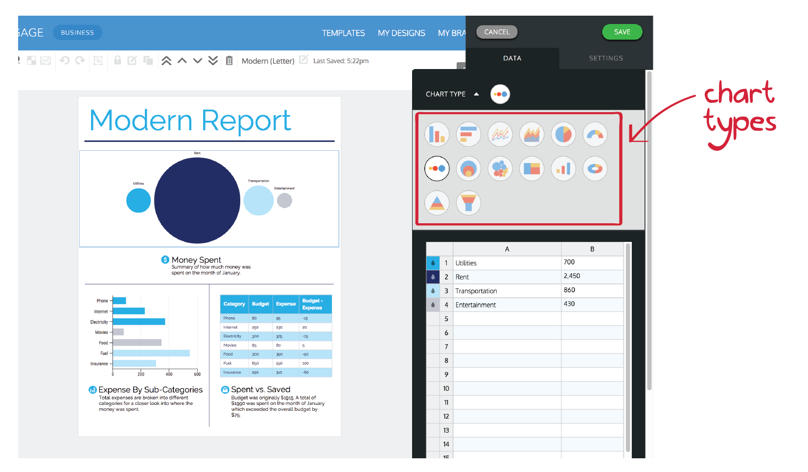
It’s the same process for tweaking chart styling, too. Double-click the chart your want to change, select the “Chart Style” dropdown, and click the desired chart style. More chart customization options can be found in the chart “Settings” tab.
Learn more about infographic chart best practices in our recent articles about chart design and choosing infographic charts.
7. Add style to a basic infographic with flashy title art
We’ve all been there–staring at an infographic we just made, thinking: there’s something missing.
It need more oomph. More pizzazz. More excitement.
That’s where group widgets come in handy. Found under the text section of the Venngage toolbar, they’re trendy combinations of text and graphics that can add a bit of visual interest to your designs.

A simple but effective way to take your design up a notch is to use a group widget as title art, like in the example below. By swapping out the standard title text for a pre-designed group widget, we can inject some extra style into the template.

8. Enhance the structure of your infographic with basic shapes and borders
Effective infographics use repeated structural elements (like backgrounds, borders, and lines) to create visual rhythm, an essential element of graphic design. This visual rhythm is important for keeping readers engaged when scrolling through a long infographic, for example.
To create a pleasing sense of repetition and rhythm that ties your design together:
- Alternate between light and dark background colors for every section
- Add borders and backgrounds to multiple icons
Check out how these basic design elements, color blocks and borders, are used to make this infographic appear more polished and complete:
9. Customize the infographic layout for different platforms
Different platforms (i.e. print, blog, Twitter, Facebook, Instagram) have different image size and aspect ratio requirements. That doesn’t mean, however, that you can’t use an 11”x14” template to create an 8.5”x11” infographic.
Each template is designed with its content divided into defined sections. If you get creative with the placement of those sections, you can customize the page size and aspect ratio to fit any requirements.
First off, to change the infographic page size, head to the “Settings” tab in Venngage’s infographic editor and choose a default page size (or enter custom pixel dimensions).
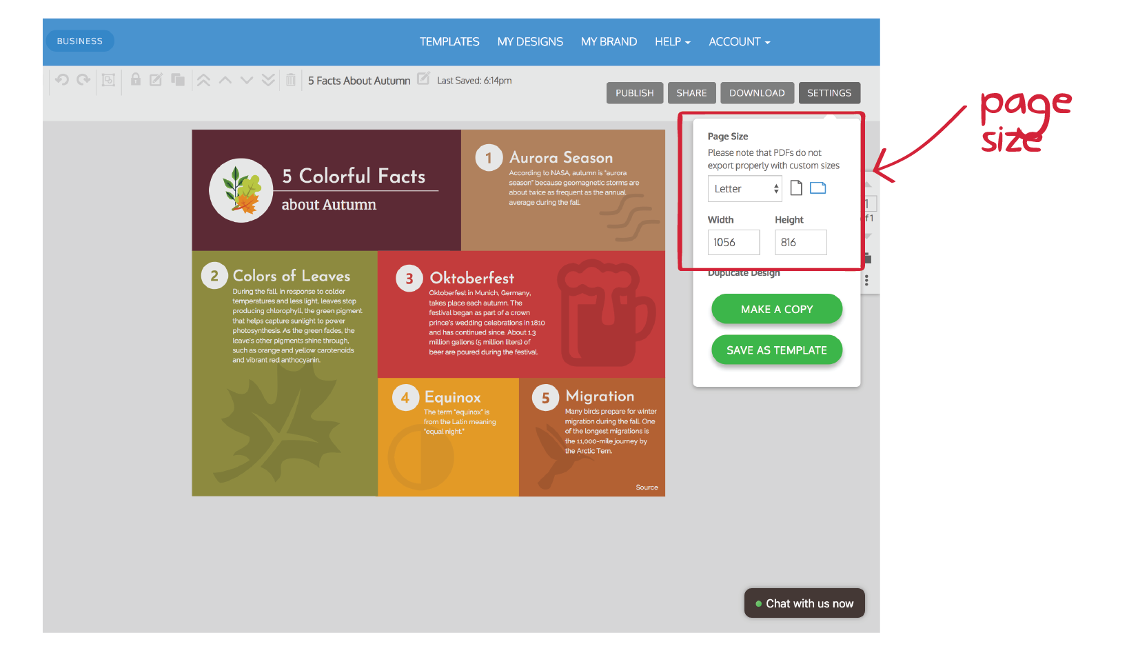
Then play around with the layout of the sections. Check out how we’ve made this landscape letter-size template work on a portrait letter-size page, and even a longer, scrolling-style page:
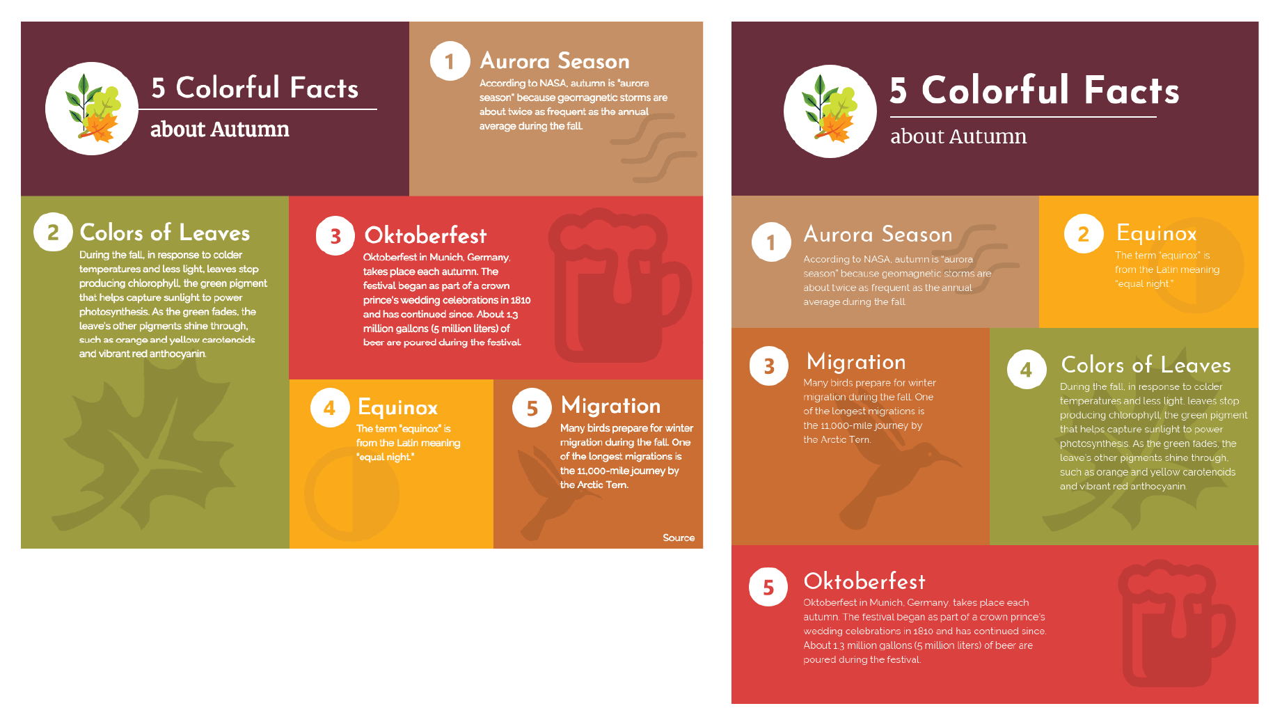
Don’t let the size of your favourite infographic template get in the way of your design process. Try adding a section, removing a section, adjusting sizes, or moving things around to find a layout that works for you.
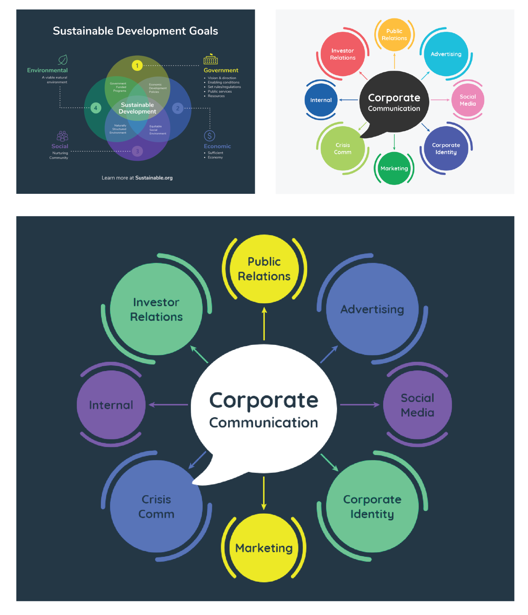
10. Mash-up multiple infographic templates to create the ultimate amazing infographics
Even designers get inspiration from other designers. If you see two infographics that you like, and can’t choose between them, use both!
Steal a color scheme or some design elements from one template, and use the basic structure of another template, and mash them up to create the ultimate amazing infographic.
Conclusion
There’s much more to customizing your infographic template than just adding in your own text and data. By changing up design choices like fonts, colors, and graphic elements like icons, images, and title art, you can easily turn basic templates into amazing infographics.


