


Emailing is by far one of the most effective digital marketing tools out there. According to Statista, there will be over 4.1 billion active email users in 2021, and that number is expected to grow to 4.3 billion in 2023.
But before you go and compose tons of emails, know that it isn’t as simple as that. A successful email marketing campaign asks for much more than just the ability to write—you’ll need to acquaint yourself with email strategy, customer journey, performance analytics, and more.
But let’s take it slowly, shall we? The first important thing that you will need to create is responsive email designs. Let’s look into what is a responsive design, how it can help your business and responsive email design best practices you can apply to your email campaign.
Interested in getting a responsive email template? Customize one using our Email Maker and export it to HTML to use with your email client. No design experience required.
Click to jump ahead:
- What is responsive email design?
- The importance of responsive email design
- How responsive emails can help your business
- Responsive email design best practices
- Responsive email design FAQs
What is responsive email design?
Simply put, responsive email design refers to creating email content that is custom fit for the reader’s device of choice. Different elements of the email may shift around to fit the device’s screen and max width while still having the text and images large enough to read.
Responsive email design guarantees the same smooth user experience, whether the person is reading the email on their laptop, their tablet, or their mobile device.
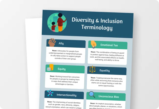
Take this email newsletter template for example:

The middle section (which adopts a two-column layout) may look as is when the email is viewed on a laptop. However, if this is responsive, that section may shift to a single-column layout instead when viewed on mobile devices to make sure that the items aren’t crowded and hinder user experience.
The importance of responsive email design
According to Perficient’s analysis of Google data for 2020, nearly two-thirds of visits to websites in the U.S. and across the world are on mobile devices.
A Litmus survey claims that 41.6% of all emails are opened on mobile in 2021, which means it’s safe to assume that at least half of your email newsletter recipients are viewing your content on a smartphone. In fact, a report from Adobe in 2018 pointed out that 81% of survey responders used a smartphone to check emails.
This goes to show that if you want to integrate emails into your marketing strategy, you’ll need to make them responsive.
How responsive emails can help your business
Provide a better user experience
The mentioned statistics also show that lots of people use multiple devices when checking their emails. It’s not uncommon for someone to go from their laptops to their mobile phones and then to a tablet all in the span of just a few hours.
Incorporating responsive design in your email marketing gives users a better overall experience, allowing them to view your content without having to squint, pinch, or zoom their way through.
Increase sales
Potential customers undergo what you call a customer journey. In this journey, there are several touchpoints that a potential buyer goes through to become an actual customer.
An example of a touchpoint could be someone who has just signed up for your email newsletters receiving a welcome email like this:

If one of your touchpoints has a snag, then getting a customer to buy dwindles. Responsive email design prevents that from happening.
When you offer potential customers a better user experience, it automatically boosts your chances for a sale. With responsive emails, all your CTAs (calls to action) should be clearer, functional and easy to access, plus your whole layout should be better optimized across all devices.
Related: Top 20 Welcome Email Design Templates & Examples to Boost CTR
Fence in your market
Omnichannel marketing is just another fancy phrase to describe the ability to market across multiple channels. Nowadays, it is pretty common for companies to have social media accounts, online spaces with online retailers, Google presence, and own an online store. Of course, this also includes using email marketing.
But how can you truly incorporate omnichannel marketing without creating responsive content? True, you can be present where everyone is, but if you give them content that doesn’t work properly, it won’t be effective.
Get and retain more subscribers
Content that is made for your desktop may not necessarily work so well with, say, a mobile device. Users may tear their hair out with buttons that don’t click right, images that don’t load properly, and words that will get cropped.
Clunky content typically means a click to the delete or unsubscribe button, and that’s actually the case: 71.6% of consumers will delete emails if they don’t look good on mobile, according to a study from Adestra.
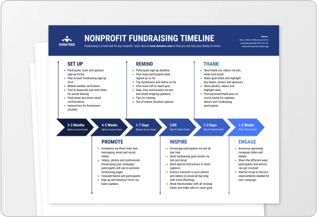
Even for emails meant to be sent internally like this one:

You don’t want them to mess up and make your employees reluctant to check internal emails and miss information because of poor email formatting.
Capture a bigger customer base by making your emails responsive to whatever device they may be using at the moment. You will get more people subscribing to you, which means more exposure to your brand and ultimately bigger sales.
Make email marketing easier
Responsive email designs are typically made using pre-existing templates. This is a big plus for marketers as templates are easier to construct designs from, allowing them to make more.
You can choose from dozens of high-quality email newsletter templates from Venngage’s newsletter library. Edit the layout, swap out icons and photos, add your logo and brand colors, or even collaborate in real time with your colleagues to create emails that work—you can do all that using Venngage’s Email Maker.

Once you’ve done creating your email, you can export it as an HTML file and upload it to your email client (we recommend Mailchimp or Outlook).
Here’s a quick video on how to do that:
Related: 40+ Business Newsletter Templates to Captivate Your Audience [100% Customizable]
Optimize for mobile devices: Responsive email design best practices
So how can you create a responsive, mobile-first email? Read on to learn about these best practices to design responsive emails for your marketing campaign.
Stick to a single-column layout
Single-column layouts that are 640 pixels max (or ideally, 600 px max) work best on mobile devices. It’s simpler, meaning that there’s a lower chance of your content falling apart because of the complicated layout.
Here’s an example of an email infographic template using this layout:

Keep your font size 13-pt at minimum
That’s for the body text. For the title, make sure the font size is no less than 20-pt. This ensures readability for your email, especially on a small screen like a smartphone. Plus, anything smaller than 13-pt will be upscaled and can break your layout.
Make your links actually clickable
This means testing your links to see if they lead to the right pages, and whether you have too many links crowded in one space. You don’t want your readers squinting their eyes, trying to tap the one most important link but failing because it’s sitting too close to some other ones.
When creating emails using Venngage’s email templates, you can make sure the links work by exporting the emails into HTML and uploading that file to your email delivery service.

Create big, tappable CTA buttons
If there’s one link that you really want your customers to click, make sure it’s noticeable and stands out from the rest, like in this example:

Or in this example where there’s a mouse click icon near the CTA button, making it even harder to miss:

Keep your most important message above the fold
In this context, content that’s “above the fold” appears when the reader opens the email—anything that requires scrolling to see is “below the fold”.
You’ve managed to catch the audience’s attention with your subject line, your sender name or whatever else—make sure your above-the-fold content is catchy and contains the most important information, in case your audience doesn’t scroll down.
Notice how in this employee newsletter, the email banner stands out from the body with the large font size and with the word “Announcement” in bold. The first three paragraphs of the body also go straight to the point (sharing the new policy):

Use smaller, responsive images
Make sure the images you use respond to the device’s screen size—you don’t want your mobile users to see only parts of the image which is only fully visible on a laptop or tablet. Also, add alt tags to all your images in case the email clients don’t load images.
Testing, testing, testing
Always check to see how your email looks on different screens as well as performing A/B tests to see which types of messages fit best with your customer. This can easily be done using just about any email client or email marketing tool. Send yourself and your colleagues some test emails before sending the email to your subscribers.
Plus, you should always pay attention to the metrics reported by your email delivery service. Do most of your target audience open emails using a mobile device? How long do they read the emails and where do they click? Make sure you report on learnings and apply them in creating new responsive emails for the next campaign.
FAQs about responsive email design
Do you have more questions about responsive emails? We’ve got answers.
Should emails be responsive?
The short answer is yes, emails should definitely be responsive. There’s a high chance your target audience uses multiple devices to check their emails, and you don’t want them to delete or unsubscribe just because your emails don’t load properly when they’re using their mobile device.
What is an email template?
An email template is an email designed with content (images, icons, illustrations, text, etc.) that you can edit to make it your own. This helps you create emails in a short time, especially if you don’t have much experience designing an email from scratch.
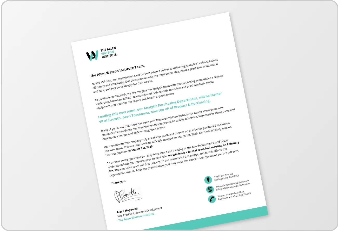
This is an example of an email template created for internal communication, but you can edit it and make it an email blast to your subscribers:

What does a responsive email template mean?
A responsive email template is one that’s designed to work seamlessly when sent to different devices, be it laptop, mobile or tablet. Using a responsive email template eliminates the need to design an email from scratch, saving you time and (possible) headaches or worries that your emails get deleted because they don’t look good.
What is an adaptive email?
You may have heard of adaptive emails. So what’s the difference between adaptive and responsive emails?
Simply put, an adaptive email adapts to the screen size by scaling down proportionately. This means the email layout stays the same no matter the device, but the text or image will get smaller or bigger to fit the screen. One downside of this is that the text might get too small as the layout doesn’t change, and it can be hard for mobile users to read.
A responsive email, on the other hand, responds to the screen size by recognizing the width. This means the email layout may change—from a two-column on a laptop to a single-column layout on a mobile device for example—to make sure that the text fits the device while still remaining large enough to read.
What is a media query?
A media query is a CSS technique that can be used to create responsive design (responsive web design, responsive email design, etc.). It helps modify your site, app, or email depending on the device’s type or specific parameters (like screen resolution, screen’s max width, etc.)
Responsive email design won’t work unless the device (mobile clients) supports media queries. Which brings us to the next question…
Which email clients support media queries?
Email and mobile clients that support media queries include iOS (iPhone/iPad), Android 4.x native client, Android Samsung Mail app, Windows Phone 7.5, BlackBerry OS 6, BlackBerry OS 7, BlackBerry Z10, and Kindle Fire native client.
Mobile clients that don’t support media queries include Android Gmail app, Android Outlook.com app, Gmail (Android browser), and more. You can check out the full list here.
In summary: Create responsive emails with email templates to gain subscribers, increase sales and more
Go for responsive email design when you’re creating emails for your marketing campaign. No more broken buttons, links that are cropped, or images that won’t load. Plus the design templates are always optimized for the best text-to-graphic-elements ratio. It’s a proven winner when it comes to your online marketing.
Grab your responsive email templates to create designs that can help you gain subscribers, increase sales and more. No design experience required.