It’s always frustrating to realize you’ve forgotten something. But in certain circumstances, forgetting necessary steps can also lead to serious consequences. That’s why you should never underestimate the usefulness of a checklist ist. As Atul Gawande wrote in The Checklist Manifesto, checklists “not only offer the possibility of verification but also instill a kind of discipline of higher performance."
A checklist is a list of points to complete, consider, meet the requirements of, or be reminded of. Checklists can be very satisfying, as they quantify things you have accomplished. They also help you to refine processes.
Not a designer? No problem. With the Venngage checklist maker, you can design effective checklists quickly and easily.
Here are some situations when you might need a checklist:
- Requirements control within an organization.
- Daily/weekly/monthly tasks to be completed.
- Procedural steps to follow.
- Verification of best practices.
- Troubleshooting checklist.
There are many ways checklists, like the example below, can come in handy. 
In this guide, we'll explain when you should use a checklist, how to make a checklist, as well as checklist design best practices.
How to Make a Checklist Infographic
1. Decide whether or not you want your checklist to be interactive.
Interactive checklists are handy for personal use when you want to tick off one item at a time.
There are tools you can use to make an interactive checklist, including Forgett. You can use interactive checklists to keep track of which tasks you have completed. You can also distribute them to your team to get stock of what they have completed as well.

Static checklists are useful when you want to create a poster or reference sheet, either for yourself or to circulate to your colleagues. They help keep procedures regulated and prompt people to remember steps they may have otherwise forgotten.
2. Choose the perfect template.
Venngage offers a bunch of easy-to-use checklist infographic templates. Your design will depend on the purpose of your checklist, so let’s go through some different situations where you would use a checklist.
You can also use Venngage's Smart Templates to quickly add and duplicate nodes to your lists.
List requirements to control within an organization.
If there are a set of requirements that have to be met in an organization, a checklist will inform team members of those requirements. In the following example, a checklist is used to list expected outcomes and the services required for each.
The checklist is divided into sections where each general point has its own set of sub-points that need to be covered.
Daily/weekly/monthly tasks to be completed.
If there is a set list of tasks that needs to be completed, then a checklist will act as both a reminder and an incentive to get those tasks done.
This example from Buffer divides tasks up by Day/Week/Month. They include boxes that you can tick off if you were to print out your list.


Procedural steps to follow.
Even when it comes to longer processes, a checklist of the key steps to follow can serve as a helpful reminder. The following example divides an onboarding process into steps, with points to check off within each step.
Verification of best practices.
Items on a best practice list don’t necessarily have to be in any particular order. But it’s a good idea to order them by importance, or by order of process. This example acts as a reminder of best practices to follow when conducting SEO tests.
Troubleshooting checklist.
In times of stress, like when a program breaks, a checklist breaking down steps for troubleshooting the problem can be a godsend. This example walks through each step in order.

Of course, there are many other ways you can use a checklist. Basically, any time you need to remember multiple items, a checklist is your friend.
3. Customize your design.
Now that you’ve chosen your template, it’s time to make it your own.
Customize the colors.
To customize colors, click on the element you want to change the color of and click the color button. A color wheel will pop up which you can use to adjust the color.

Customize the fonts.
To customize fonts, click on the text box you want to edit. Select which font you would like to use from the drop-down font menu.

Customize the images.
Generally, the use of images should be minimal in a checklist infographic. If you do choose to do images, make sure that they are not too detailed and won’t distract from the items on the list.
Venngage has an image gallery of over half a million images. Search for images in the image gallery.

You can also import your own images and resize them. Click the upload tab and choose a file from your device.

For a detailed guide on how to crop and frame images, click here.
Best Practices
Keep it simple.
A checklist typically isn’t the right situation to get too fancy. List each point in a linear, chronological order.
Moreover, you need a simple and clean design. Too much adornment will make your checklist cluttered and harder to read.
Use uniform formatting.
This is standard infographic design best practices. Use uniform font family, sizes, colors, spacing, etc. Aside from looking nicer, there is a practical reason for this as well. Too many different design styles will distract from the content and make it difficult to read. The cleaner and more uniform the design, the easier it is to read.
Use recognizable icons.
A popular approach to creating a checklist infographic is to use icons as bullet points.
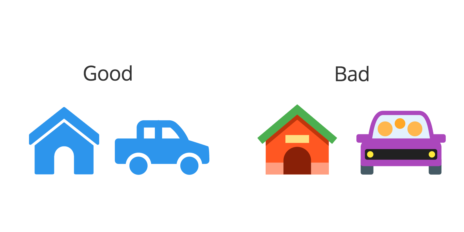
Icons are generally flat, simplified designs of concepts. Icons are handy for their ability to illustrate concepts while taking up little space in a design. In order for them to be effective, however, they need to be easily recognizable designs. Here's a rule of thumb: try to use icons with a very simple design as opposed to more detailed designs.

For a more detailed article on how to use icons, click here.
Use intuitive coloring.
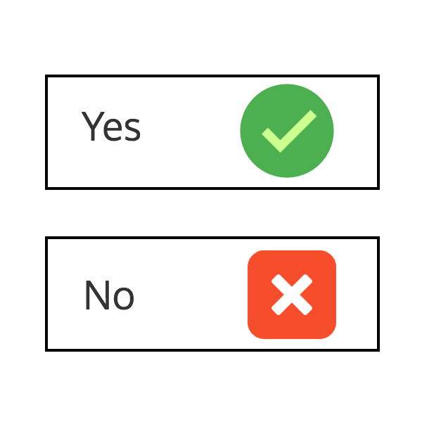
Basically, don’t use colors that go against what has been ingrained into us. For example, use green for checkmarks and red for x’s.

Take the purpose and target audience into consideration when adjusting the color scheme. Are you targeting business people? If so, corporate blue is a safe bet. Are you targeting parents and their children? If so, bright primary colors are appropriate. HubSpot has a great guide for choosing the right colors for your design.
Use the same kind of phrasing/verb tense for each point.
In line with the point about uniform formatting, following the same phrasing pattern simply makes it easier to read the content.
Further Reading
The Checklist Manifesto by Atul Gawande.
Blog Home How to Use Simple Checklists to Boost Efficiency and Reduce Mistakes


