


The way humans communicate today is radically different from years ago.
Instead of being limited by text to share information and convey emotion, people are now more visual and use infographics, emojis, gifs to tell stories that inform, engage, and inspire.
The rise of visual communication makes sense — images tap into our brain’s preference for visuals, which explains why they’re so practical and engaging.
However, visual communication is a broad term and can refer to an emoji, video, or anything between. To make sense of it all, I’ll explain the top visual communications in this blog.
PS: Infographics are powerful visual communication tools used on social media, reports, posters, presentations, and more. To create infographics quickly, check out our Infographic Maker or use our professionally designed infographic templates.
10 visual communication examples
Visual communication can be categorized into three categories — informative, engaging, and persuasive.
Here’s a brief overview of each type of visual communication.
- Informative: These visuals educate audiences about a specific topic, process, or outcome.
- Engaging: The goal here is to elicit emotions and create an impression.
- Persuasive: Illustrations or images that present a viewpoint or influence action.
Want to learn more about visual communication? Check out our video for a deep dive.
Informative visual communication examples
Informative visual communication refers to using illustrations, charts, and diagrams to make complex data or ideas easier to understand and remember.
Infographics
Infographics are a collection of images and/or data visualizations combined into a single graphic that provides an overview of a topic.
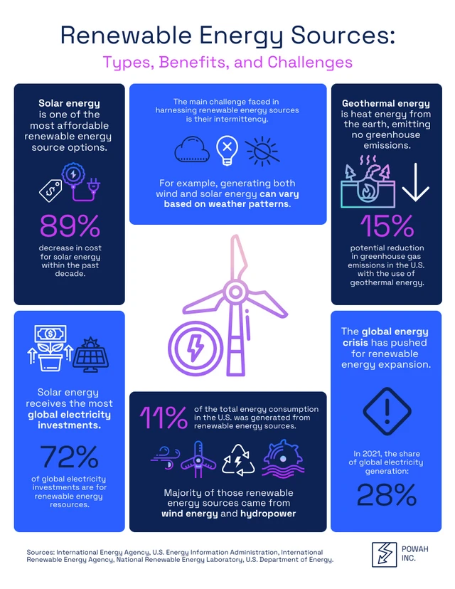
This infographic template uses icons and short text descriptions to provide insights into different aspects of renewable energy. It is organized into clear sections, which makes comprehension easy.
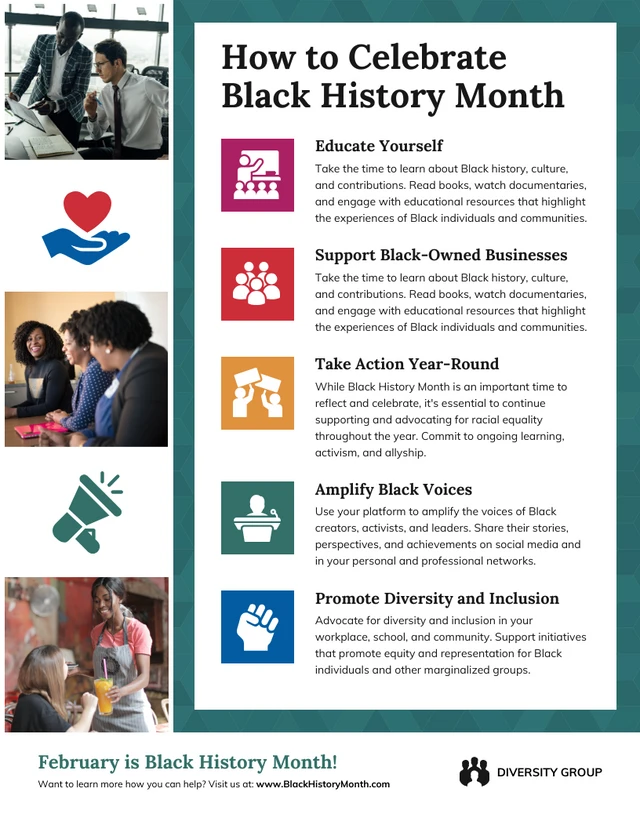
This process infographic shows step-by-step how people can celebrate Black History Month, making it a great option for anyone who needs an infographic to educate an audience.
To learn more about creating infographics, read our other blogs.
Charts and graphs
Charts and graphs convert raw, hard data into stunning visuals that reveal trends, patterns, and relationships without the viewer having to read the numbers themselves.
The most common types of charts and graphs are:
- Bar charts: A great way to compare different categories, but cannot be used to highlight trends over time.
- Pie charts: An excellent choice to show proportions of several categories, however, including too many data points leads to clutter.
- Line graphs: The best format to show trends and patterns over time, however, they cannot show discrete data such as the number of apples sold each day.
This line graph illustrates a company’s historical and projected financial performance in a sleek and professional format, making it ideal for presentations or investor reports.

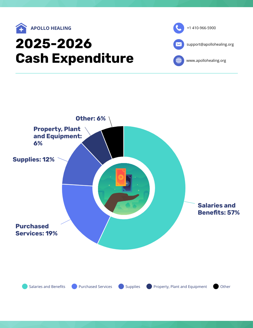
This pie chart breaks down a company’s cash expenditures in a single view, making it practical for communicating with stakeholders or using in internal reviews.
Scatterplots reveal trends that may need to be evident from just numbers, like this example which shows the relationship between park size in the US and the number of visitors.

Diagrams and flowcharts
Flowcharts and diagrams (such as a Venn diagram) use symbols and shapes to explain steps, connections, and decision points within a process or system.
This flowchart details the a user’s journey from opening an app to accessing features. It’s a great way to study user behavior and allows designers and developers to optimize navigation and functionality.

Venn diagrams can be great educational tools, as in this example, where medical information is presented in an easy-to-understand format to help viewers understand diabetes.

For more information on flowcharts and diagrams, check out our other blog posts.
- What is a Flowchart? Use Cases, Templates & Design Tips
- How to Make a Family Tree Diagram (+ Examples)
Maps
Maps help us understand the spatial relationships between different geographical locations. They can generally be classified as either political or physical.
- Political maps focus on political boundaries, like countries, states, or provinces.
- Physical maps depict natural features like mountains, rivers, and oceans. They help us understand a region’s topography, climate, and landforms.
For example, this political map is a great way to quickly highlight the economic health of different European nations. It can be used to educate viewers in a classroom or even in policymaking environments.

A choropleth map, like in this example, is a great way to show how data (like the distribution of a disease outbreak across a country) varies across regions using different shades or colors.

Here’s a cool map of the US with color-coded lines representing hiking trails you can enjoy across the country.

Engaging visual communication examples
Engaging visual communication, such as cute images or interactive animation, grabs attention and makes viewers curious to explore more.
Illustrations and photos
High-quality photos or illustrations can trigger an emotional response, making them powerful tools for capturing people’s attention in a world of information overload.
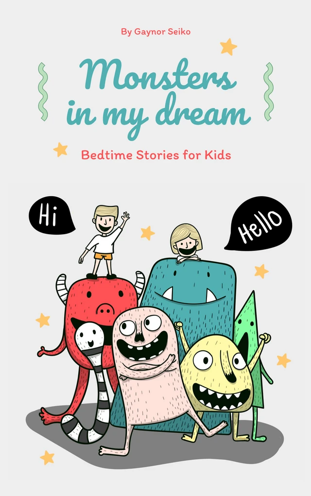
This children’s eBook shows how illustrations can communicate a theme and spark imagination.
This black and white photo captures the emotions of a protest rally and is a great way to communicate a message to audiences.

This brochure page is an excellent example of the power of product illustrations to showcase features or details of a new gadget or item.

GIFs and animations
While images are great, GIFs and animations can elevate your presentations, onboarding and training programs, or teaching strategy by making instructions engaging. They’re also a great way to lighten up the mood and showcase your humor.
Videos
Most people prefer videos because they’re easier to digest and can be consumed passively compared to text.
Videos massively vary in length from Instagram Reels to full-scale documentaries and everywhere in between. Let’s review common video formats.
- Short-form video: Brief in length to capture attention quickly.
- Explainer videos: Simplify complex concepts or processes using clear, engaging visuals and straightforward narration.
- Documentaries: Dive deep into a topic and combine thorough research with narrative storytelling.
Persuasive visual communication examples
As the name suggests, persuasive visual communication uses images and illustrations to influence people’s attitudes and behavior.
To see examples of effective visual communication, keep an eye out for billboards or ads when you’re outside next time. These are designed to catch your attention and get you to take action.
Advertisements
Advertisers understand that purchasing behavior is emotion-driven, so ads feature visuals that evoke emotions like happiness, nostalgia, or excitement to connect with the product.
Another common tactic advertisers employ is testimonials where real or fictional characters are shown using a product to provide social proof and build credibility.
In this poster advertisement, the image of a muscular man lifting weights communicates the core benefit of joining the gym — achieving a fit and toned physique.

Packaging design
When you think of a brand, what picture comes to mind?
The best brands have a unique and recognizable visual element. For example, an apple silhouette with a bite taken out will instantly make most people think of an iPhone or MacBook.
Similarly, product packaging allows brands to attract and convey their values.
Who do you think these brightly colored cereal boxes with a cartoon mascot target? (Hint: It’s children).

Besides images, colors also play a significant role in packaging design because they elicit different emotions. For example, red creates excitement and energy, while blue represents trust and security.
Social media graphics
Whether it be Facebook, Instagram, or X, our social media feeds are flooded with content which means competition is fierce for engagement. How do you get someone to stop at your tweet or post on their feed (you know the answer by now) — visual content!
A well-made social media graphic stops users from mindlessly swiping or scrolling past your content.
This social media infographic is colorful and has a clear and readable layout which makes it perfect to get your message across on social media feeds where people skim content.

This graphic is perfect for product-oriented social media campaigns requiring appealing photos and user-generated content. The sunglasses are highlighted which could lead viewers to imagine themselves enjoying summer with the product.

Conclusion: Stand out from the crowd and tell stories with the help of visual communication using Venngage
Visual communication is all about creating engaging and eye-catching message.
While creativity can complete half the job, you’ll need graphic design skills to add visual appeal. And that’s where Venngage can help you with professionally designed infographics, charts, graphs, maps, graphics, and more that can be customized and made your own.
So the next time you have to educate an audience, present information, or demonstrate a process, ditch the text and take the visual route. To get you a head start and create visuals that leave an impression, check out our infographic templates and create your own in minutes.


