In May 2020, I gave my first formal talk on Zoom. I do a fair amount of public speaking, and generally I move about the stage quite a bit: it’s an expression of energy, serves as punctuation to what I’m saying, and supports an intentional effort to make sure I look at and connect with as many people in the audience as possible.
So when it came time for this remote talk, I figured that standing while I delivered it might feel more “normal” and akin to my regular modus operandi.
About halfway through, I realized that since I couldn’t pace in my normal fashion I was…swaying back and forth.
Fortunately this was an internal presentation for our new interns at Merriam-Webster, and while they are absolutely important, it wasn’t quite as bad as doing it in front of hundreds or thousands of strangers.
Two months later, I was indeed slated to give a remote talk to hundreds of attendees; this one pre-recorded followed by live Q&A. Mindful of my earlier gaffe, I walked through my talk several times thinking about how it might play differently on a screen than in person.
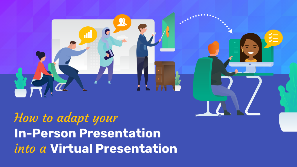
While the content of an in-person presentation versus an online presentation may be the same, there are some fundamental differences between how you deliver the presentation and in your presentation design.
Here are some practical virtual presentation tips I learned from this experience:
- Replace your physical energy with vocal energy
- Replace physical cues with visual cues
- Vary your slide layout
- Don’t count on reading the room
- Don’t count on audience interaction
- Do use interactive virtual presentation tools
- Think about your ending
- Prepare for your Q&A
Replace your physical energy with vocal energy
Skilled speakers, of course, bring both to the stage. But when you’re limited to the video equivalent of a head shot, it’s even more important to vary the pace, volume, and intensity of your delivery throughout the virtual presentation.
Pause early, pause often.
This is a great tip for all speakers, especially if you’re a fast talker like I am. The best training I got was not to alter my natural cadence, but to pause more often to let what I’ve said settle, and allow people to catch up.
You can reinforce that pacing in your slides, by focusing on a single point per slide. This prompts you to pause as the speaker, and lets the point sink in for your audience.
In person, a pause is also a good opportunity to catch someone’s eye, smile, and make personal contact. When you don’t have the audience in front of you, the temptation is great to just run through at full tilt. Resist that temptation and remember: without a room to look around, pauses might feel awkward to you—but they’ll still read as natural flow to the audience.
Replace physical cues with visual cues
Your physical cues add a layer of meaning to your presentation. When a presentation is given virtually, certain physical cues can be lost in translation.
That’s where adding visual cues to your presentation slides can come in handy. You can use icons, apply arrows and lines, use contrasting colors, or add shapes to grab and direct your audience’s attention. Here are a few examples of visual cues in action.
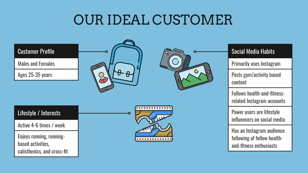
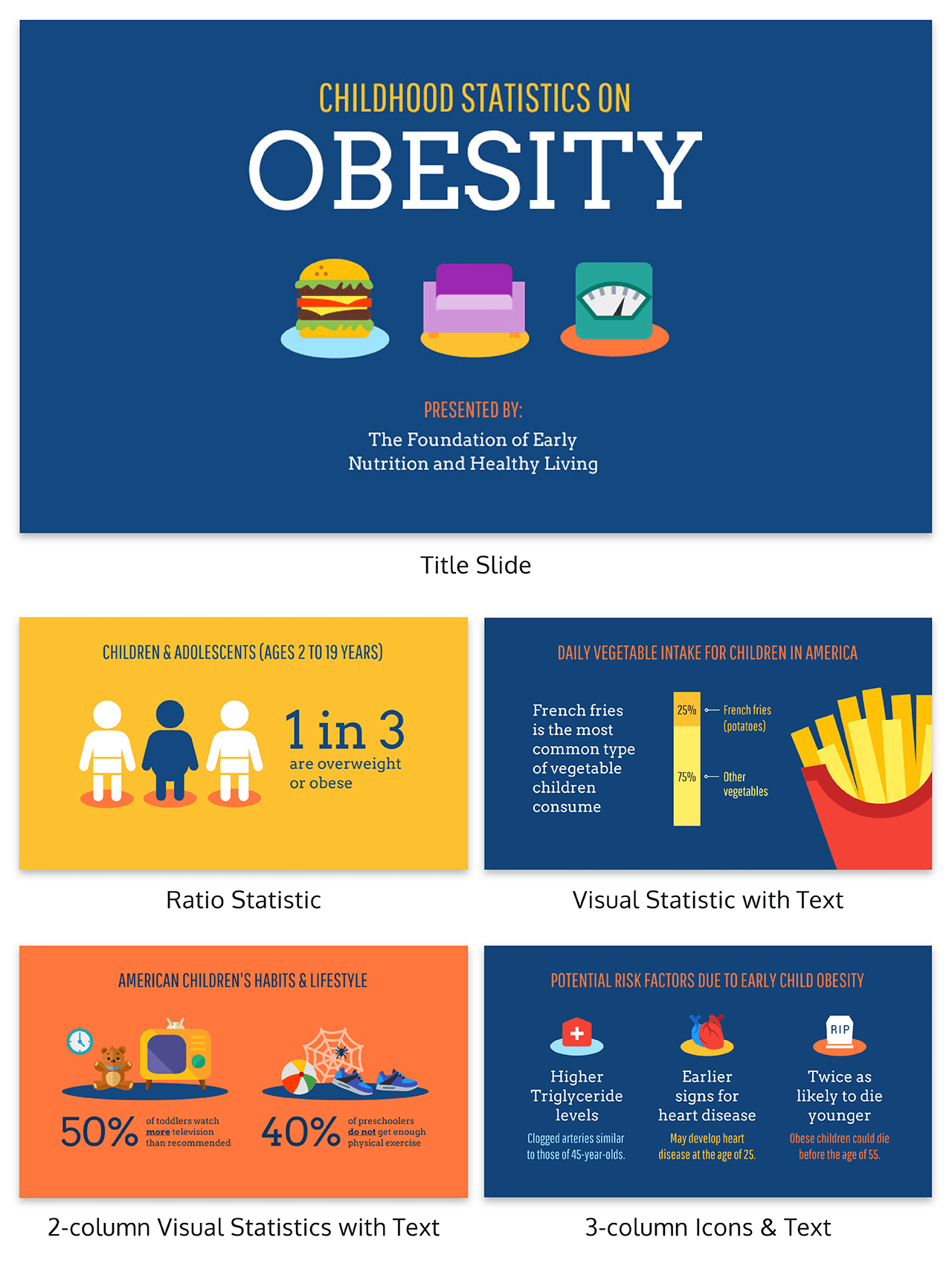
This slide design uses icons to reinforce content. The use of icons helps your audience not only make sense of the information you’ve shared, but process it and hold onto it for longer.
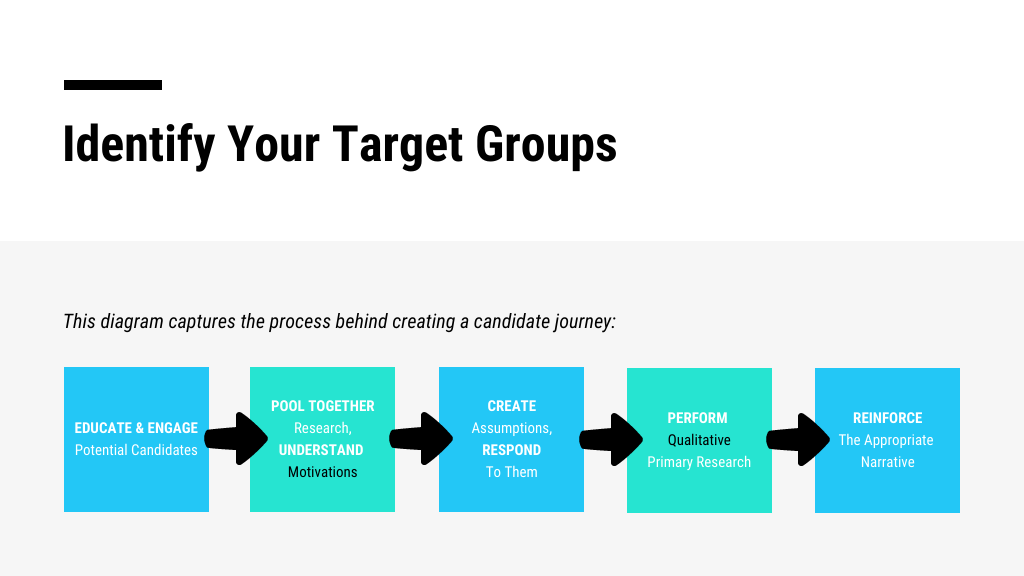
Arrows are simple ways to visualize a process. This slide design organizes information into a logical flow with the use of arrows. It helps your audience to organize and understand your content.
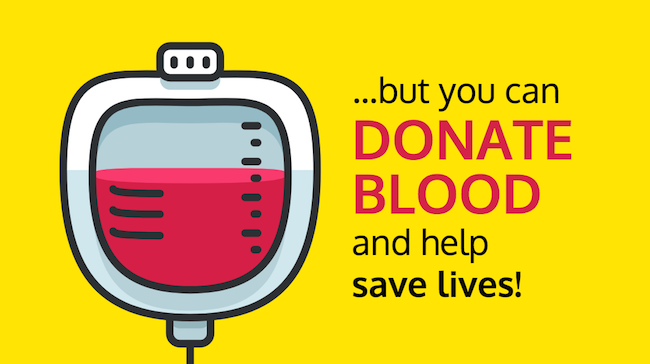
High-contrasting colors help to emphasize information. This slide is obviously tackling a problem. Other slides can be differentiated the same way when you describe a solution, next steps, and so on.
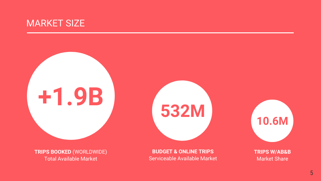
Shapes are also great ways to emphasize information or visualize data. In this slide, circles are used to convey the magnitude (and significance) of the statistics shared. Even without the numbers, you’d guess the circle on the left has the highest value.
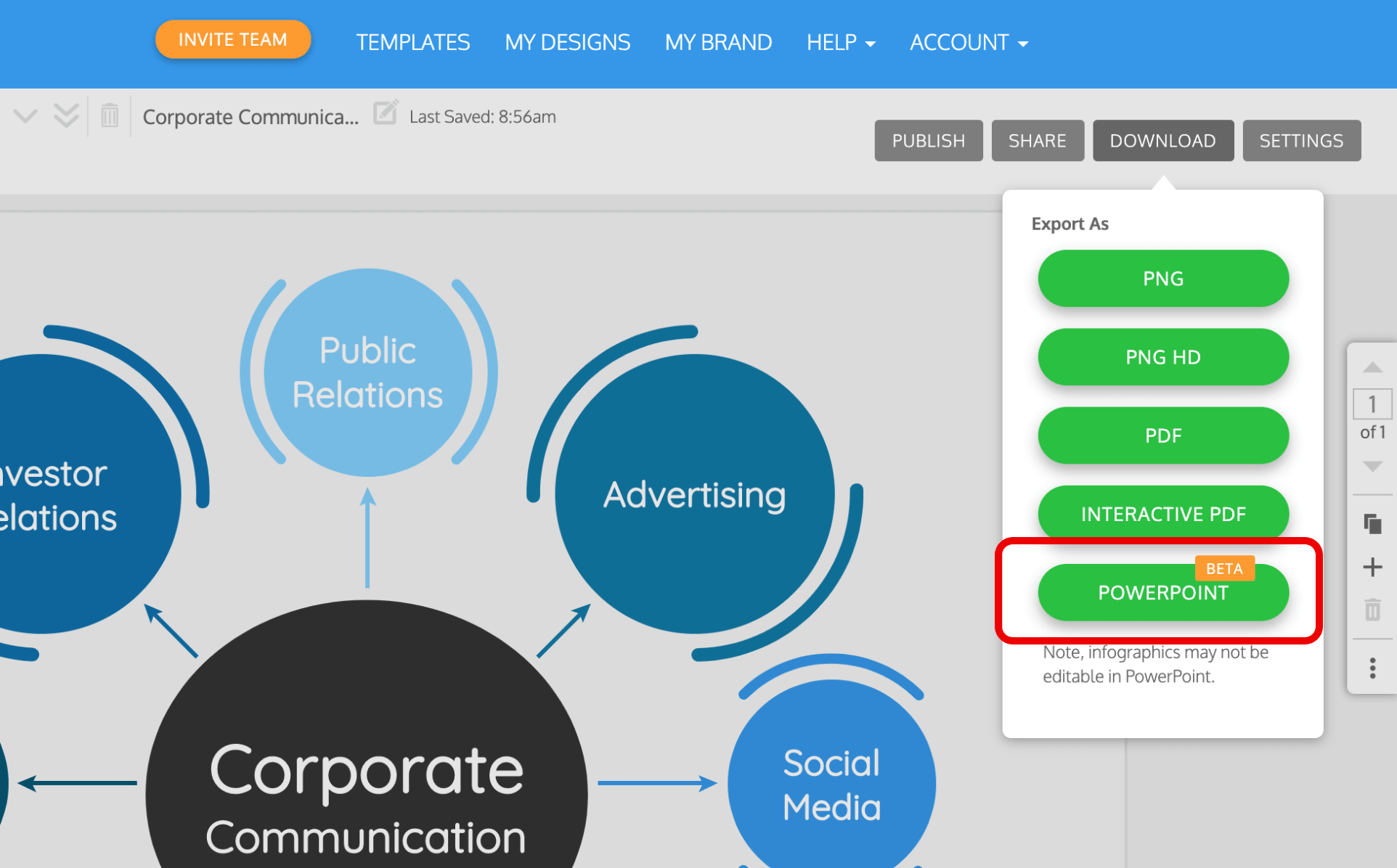
In some instances, you may need to use PowerPoint to host your slides. But that doesn’t mean your creativity should be stifled by boring PowerPoint presentations templates. With Venngage, design your entire deck in the editor and then export it as a PowerPoint file.
Use short, punchy text on your presentation slides
Keep in mind, the opening of your presentation impacts how excited and engaged people are throughout. A strong opening statement brings energy to your virtual presentation, and helps you start off strong.
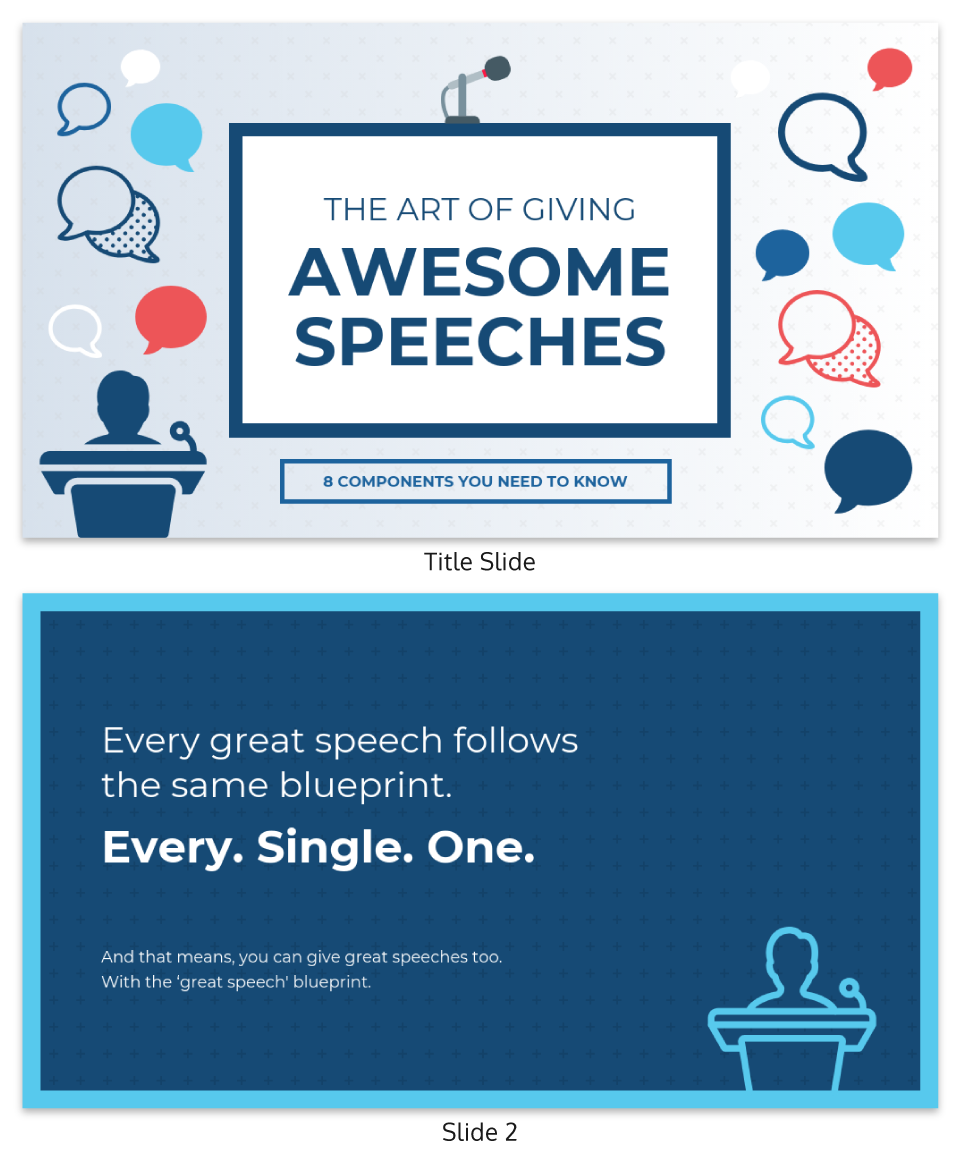
Combine an impactful title with an image that reinforces the message to hook your audience:
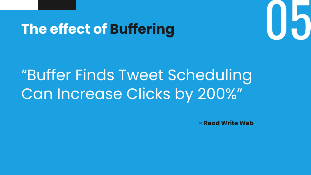
Punchy sentences are a trademark element of a persuasive presentation. For a speaker, it adds emphasis and weight to your statements as you present. A presentation slide isn’t the place for fluff—stick to short sentences or even just phrases to really drive the point home.
Learning to effectively summarize information for your slides is an important skill. It enables you to repurpose blog content, present detailed reports, discuss research findings, and so much more in ways that are organized and clear.
Vary your slide layouts
Naturally, you can’t just rely on your title slide to do the heavy lifting. The slides that follow need to be equally as engaging and effective.
A rule of thumb is to vary your slide layouts. Different layouts will help offer something new for your audience to latch on to. In a virtual presentation, the same repeating layout can put them to sleep.
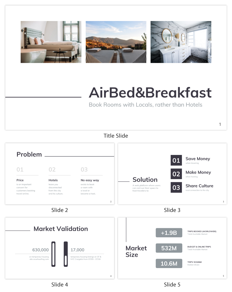
Here’s a presentation example that uses different slide layouts to keep the information fresh:
Need more presentation ideas? This blog has all the presentation examples you need.
Don’t count on reading the room
This was a big one for me. I’m a natural-born storyteller, so I use a lot of anecdotes to illustrate my points, and am often more conversational than presentational. But all of that requires reading the room and pacing myself according to the audience reaction in real time. When you’re behind a screen running a virtual presentation, you don’t get any of that feedback. Your talk can still incorporate those elements, but it has to be very tightly scripted and balanced.
Usually when I’m sharing personal anecdotes I have a single, simple background slide. The focus is on my delivery of the story and how it connects with the audience. As you tighten that storytelling for a virtual presentation, think about amping up the infographics or illustrations on your slides for balance.
For example, the icons and illustrations on this presentation are bold, meaningful, and engaging and really help underscore the information and make it memorable.
Don’t count on audience interaction
Last year, I gave a talk at a Women in Publishing conference. One of my slides was a GIF of an epic eye roll—in context, it got the (mostly female) audience responding with an eye roll and enthusiastic head nod in response. It was a group bonding, amirite?! moment.
In another presentation, I reference learning on the playground “the longest word in the dictionary.” Usually at this point I pause, look around, and audience members will spontaneously call out what they think the word is that I’m referring to.
These moments of group comity can’t really be replicated on a recorded talk or virtual presentation, and I adjusted my slides and my script accordingly.
Do use interactive virtual presentation tools
If you’re on the right platforms, of course, you can engage the audience with polls, chat boxes, and the like. But as with all platform changes, don’t lift-and-shift your exact interaction: what works in person might not translate as compellingly to a poll widget.
If you’re doing this, be sure to practice how integrating these tools changes the flow of your talk, and what you might do if the interaction or response are not what you expect.
Tools like Demio and Zoom, GoToWebinar, WebinarNinja and others let you conduct live surveys/polls, but the process can vary. With a tool like Poll Everywhere, you can create word clouds in real time. Online games like Kahoot are great for creating online real-time quizzes (ideal for smaller groups).
You can also use whiteboards to create diagrams as you’re explaining a process, which involves the audience’s attention as they follow along. Zoom, ClickMeeting and other platforms have a whiteboard feature.
Think about your ending
How do you usually close your talk? Are there physical cues, such as moving to center stage and quieting your body language? Have you rehearsed with the moderator when they will come back on stage? Absent these cues, you’ll want to make especially sure you have a powerful and clear closing statement, ideally one that will resonate in people’s minds for a moment as the platform switches to the moderator or next speaker.
To close your virtual presentation, consider a strong call-to-action or next step for your audience. Asking people for what you want them to do is always powerful. You can also leave them with something worth thinking about, to help your engagement extend longer than the duration of the talk.
A simple thank-you also is a great way to sign off. It’s clear, concise, and reminds audiences that you appreciate their time. Plus, it’s the easiest slide you can design.
Prepare for your Q&A
I gave the same talk, for the same conference, at two different locations (opposite ends of the country, different audiences).
At one, there were so many questions we ran out of time.
At the other, there were so few questions that the moderator (bless you, Rob!) filled the space with questions of his own.
For some virtual presentations you will still have a moderator who plays this role and is prepared to step in, but for others you may be tasked with checking the Q&A or chat box on your own. If the latter, be sure that you have some questions prepared so that you’re not fumbling if the audience is a bit quieter.
Conclusion
It’s fun and exciting to share something you’re passionate about and to connect with people as you do it. For a lot of us, pre-recording our talk or presenting from behind a laptop can throw us off our game. If public speaking was already a little tough for you, losing the in-person presence may be an even harder adjustment.
As you prepare for a virtual presentation, walk though your presentation with an eye to where you rely on that audience connection and adjust accordingly:
- Tighten the spots that are more interactive
- Think about using platform tools like upvotes and polls
- Practice a delivery that is more vocal than physical (and remember to pause and breathe!)
- Replace some of your physical cues with more illustrative and impactful slide design
- Prep your close and Q&A
You got this!


