


Creating a presentation from scratch may sound like hefty work but with the right presentation layout, you’re basically off to a good start.
Then again, you don’t actually have to design your presentation from scratch. Not when you can find countless ready-to-use presentation templates that are designed to blow your audience away just a search away.
But sometimes, having too many options can be a problem too. So here’s a collection of Powerpoint presentation templates along with tips for creating different types of presentations that you should totally check out.
Now, no more chit-chat – it’s time to dive right in and create the ultimate slide layout for an awe-inspiring presentation!
What is the layout of a presentation?
A presentation layout refers to the arrangement and organization of various elements within a presentation. It involves the placement of text, images, graphics, and other visual components on slides to effectively communicate information to the audience.
When it comes to delivering an effective presentation, the layout plays a crucial role in capturing and retaining your audience’s attention. A well-designed presentation layout not only enhances the visual appeal but also helps convey your message clearly and coherently.
A good presentation gets things moving – check out the top qualities of awesome presentations and learn all about how to make a good presentation to help you nail that captivating delivery.
The next question is — what makes up a presentation layout that can elevate your presentations to the next level?
Top 5 tried and tested presentation layout ideas you should try
There have been numerous articles published online about how you can start upping your presentation design game. Most of them offer you some presentation ideas, but when you’re rushing to put something together quickly, can you really afford to spend time fiddling with presentation software?
At my company HighSpark, we develop presentations on a daily basis and we’ve found a way to significantly reduce the guesswork required to put together solid presentations.
One of the ways is by reusing proven presentation layouts that work.
Here are five presentation layout ideas that we’ve used time and time again to build awesome presentation slides in record time. Check out these presentation templates to use our layouts easily.
1. Presentation layout following the rule of three
The “rule of three” has been widely used in many mediums of communication to increase memorability and engage audiences. Similarly, if you want to take advantage of the rule of three, splitting the slide into three equally sized sections is an easy way to build layouts for a variety of purposes.
Team slides
Since team slides generally showcase the professional experiences of founders or teams. Splitting your slide into thirds will leave just enough space for a headshot, as well as bio information for each of the team members.
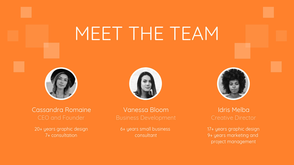
This three-part layout is also commonly used for pitch deck designs, where startups showcase their core founding team and advisors.

Remember you don’t want a boring pitch deck design to cost you opportunities!
This layout is also used when showing the steps in a process or timeline:
Big pointers
There will be instances where you have big distinctions as headlines that you’ll need to display on your presentation. These points are usually followed by additional evidence or information to support your stance.
For example, a “pointer” in this case could be: “China: The Next Big Economy”, followed by a statistic supporting that point.
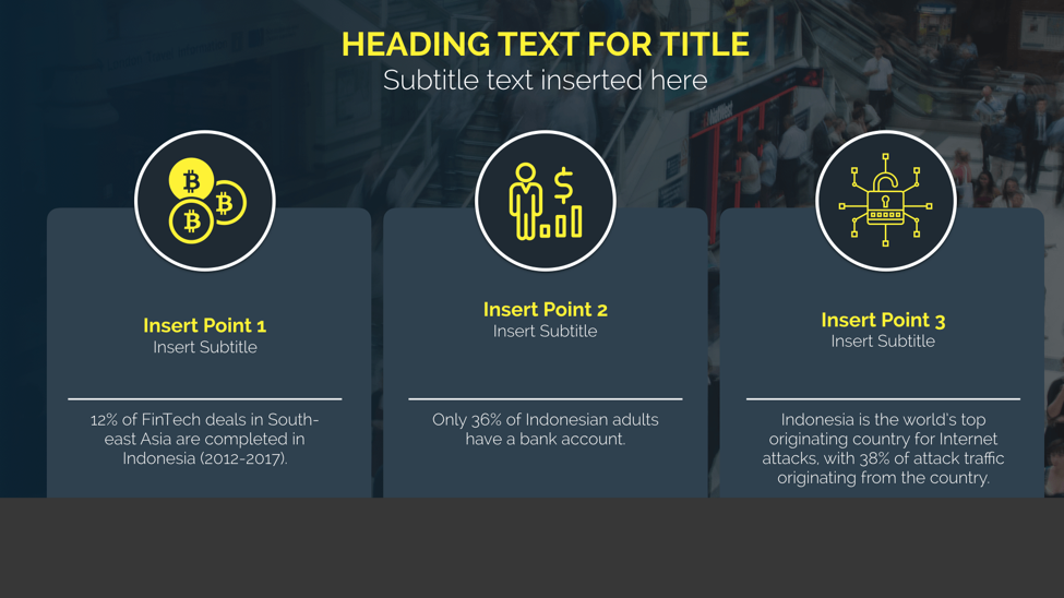
When showcasing a few different statistics, it can be challenging to decide on a layout that will make data more interesting. If you’re using charts or icons to represent your data visually, having the visuals up top, accompanied by text below, is an easy way to make data more interesting.
So you get the gist. By using a simple three-part presentation layout, you’ll be able to organize content in a variety of ways, limited only by your imagination.
2. Left image, right text presentation layout
As dictated by the Picture Superiority Effect, pictures are more likely to be remembered than words. Pictures command attention more quickly. If you use more visuals than text in your presentation, your audience will be six times more likely to recall what you were talking about.

Having your pictures on the left side of your slide offers a comfortable eye-flow for your audience. Images have inherent meanings associated to them (if I asked you to think of a chicken, you’d probably think of a bird and not the letters “C-H-I-C-K-E-N”).
Using larger images lets you reduce the amount of words on your slide, especially if you’re telling a story.
There is no hard and fast rule for how big the proportions need to be, but what I’ve found works really well is to:
- Make the words on your slide as concise as possible
- Size the text to a minimum 12-point font and above
- Take a look at how much space you have left for your image, then pick the most ideal image
Some of the best types of images to use for presentation design are…
Images with faces
Using faces in your presentation helps to build trust with your audience. We’re “hardwired” to recognize human faces since birth, and that’s why they’re widely used in marketing content. For instance, having a “hero-character” helps viewers to imagine themselves in the character’s position.
For example, this character: “Neel” is used to demonstrate the need for a financial management platform.
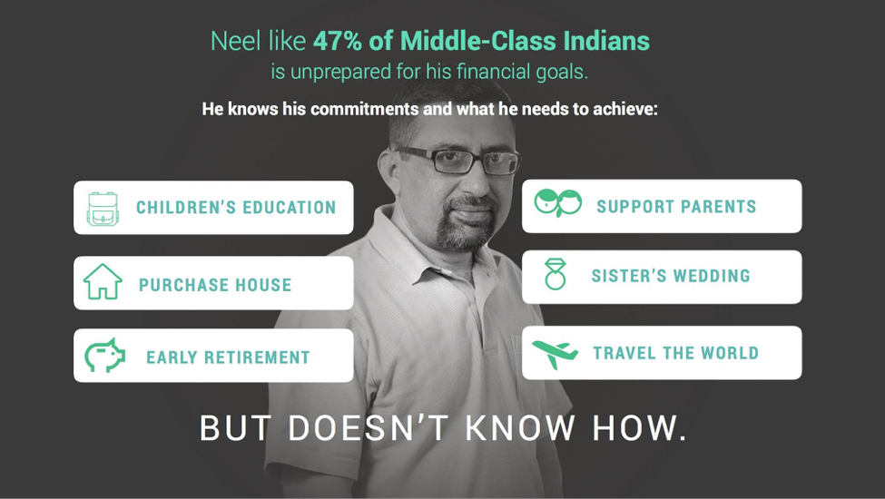
The startup using this presentation is creating financial solutions for a very specific group of people: middle-class Indians. Using this image of “Neel”, the audience can very quickly understand the segment the company is trying to serve.
Using faces also helps you frame text, especially if the person is “looking” in the right direction. Our eyes naturally gravitate towards where the human figure in the image is looking towards.

Images with large whitespace
In the field of design, whitespace is used to reference how empty space is used for functional and aesthetic purposes. Certain images are more pleasing to the eye because of the space around them. It’s the reason why you find certain paragraphs of text on a website hard to read, because of the lack of space between the lines.
Having more white space means that you’ll have more room to play around with text, icons and other information that you might need to include on the slide.
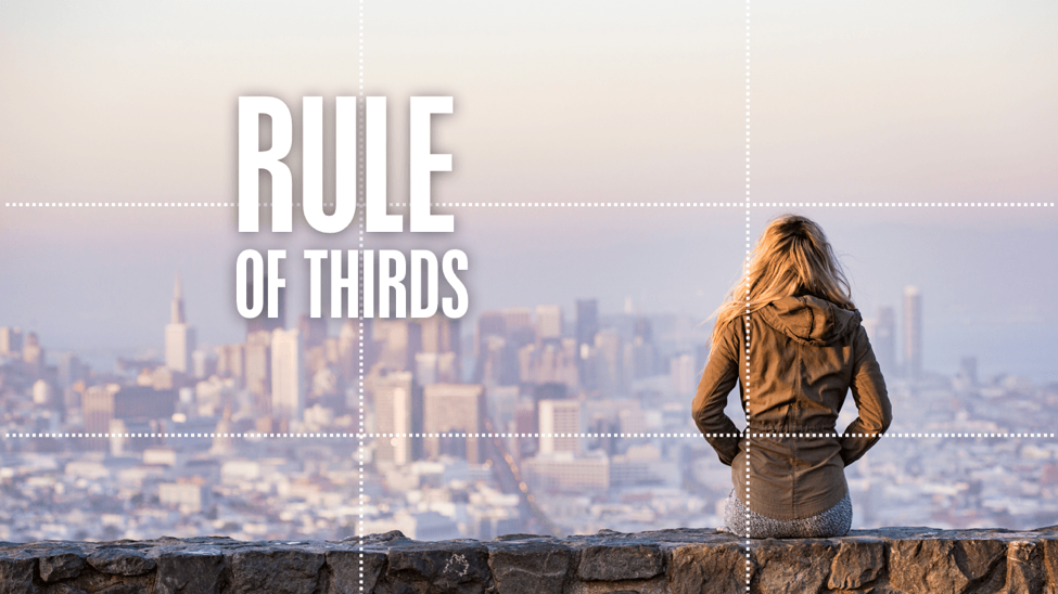
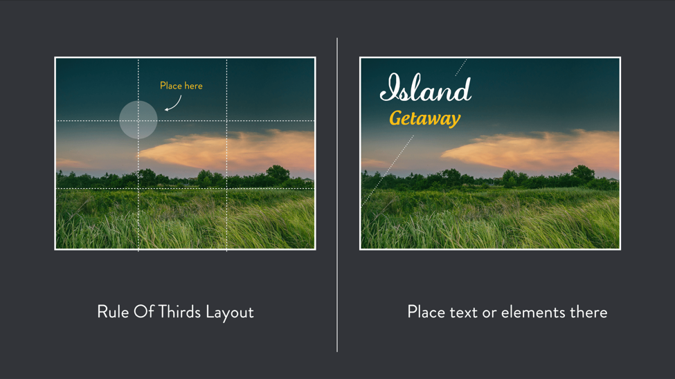
Generally, if you pick an image with a lot of empty space, placing text at any of the intersecting “power points” that follow the Rule of Thirds will ensure an aesthetically pleasing slide overall.
One of the most famous examples of someone using white space with only text is Steve Jobs and his famous WWDC presentations.
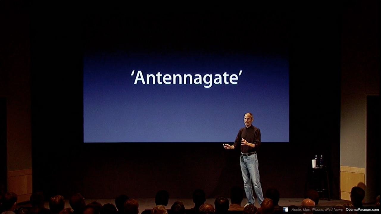
You’ll notice that there’s a lot space in the slide–this draws your attention to the headline and avoids inundating the audience with visuals.
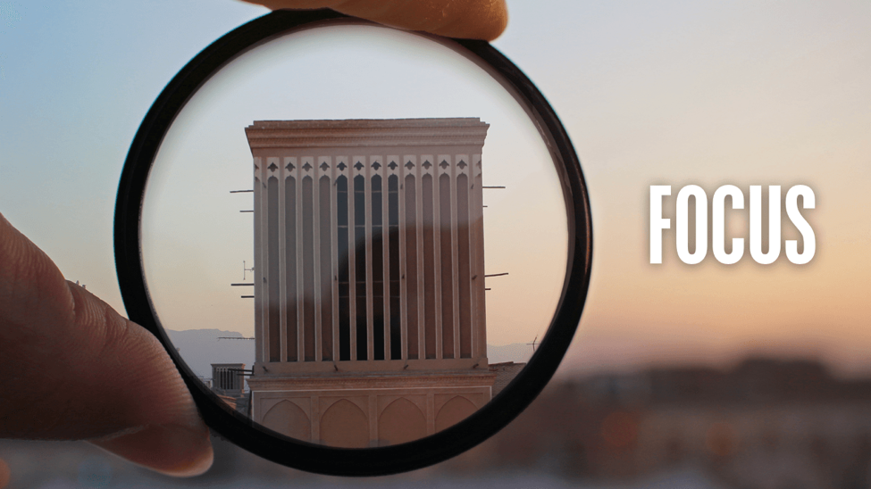
Images with a clear focus
Using images that are too busy will hinder your viewers from honing in on the information or visuals that matter. Picking images that have blurred backgrounds or a sharp focus on a specific subject can help to reduce noise.
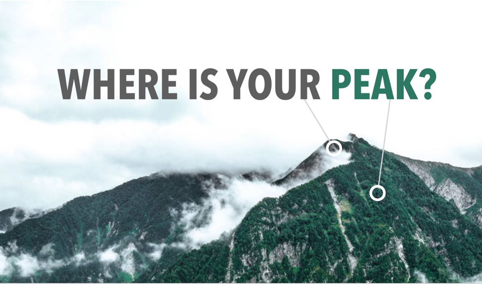
3. Presentation layout with full bleed and whitespace
When you’re using evocative full bleed images to tell stories, as seen in presentations by orators like Elon Musk and TED speakers, you may want to include a few words to give the image context.
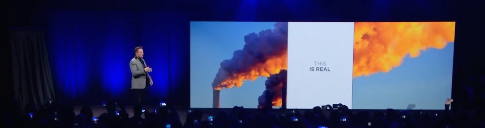
Elon Musk used full bleed images of pollution and satellite images of the Earth during his PowerWall presentation. This helped to bring attention back to himself and also highlighted the very real problems that they seek to solve with their products.
This shot from a TED presentation also demonstrates how you can tell stories using images and a little bit of text for context.

There are three simple ways to include words on full bleed images…
Split your slide into nine parts
Split your slide into nine equal parts. Place any elements of focus at any of the four points where the lines intersect. This is a photography technique that applies to presentations too.
Frame text with a shape
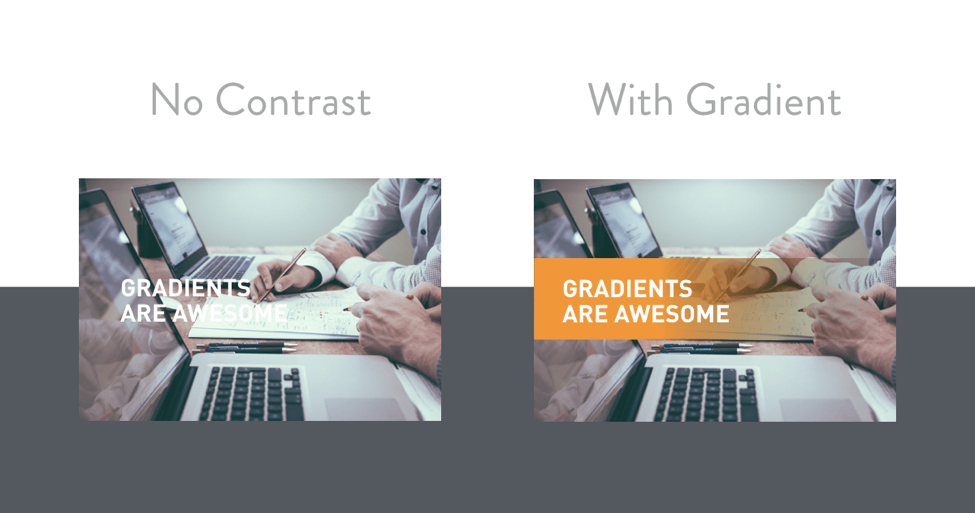
If there isn’t enough contrast between the background and your text, consider using shapes to frame the text. This way, your audiences can still read the text and be able to see the image of interest as well.
Use empty space
If your full bleed image has empty space, it’s the perfect area to place your text without too much guesswork.

When picking font colors, a trick to pick something that’ll look good is:
- Having adequate contrast with the background
- Picking colors directly from the image itself!
For example, the picture you see below is of a mountain with quite a bit of whitespace above the photograph.
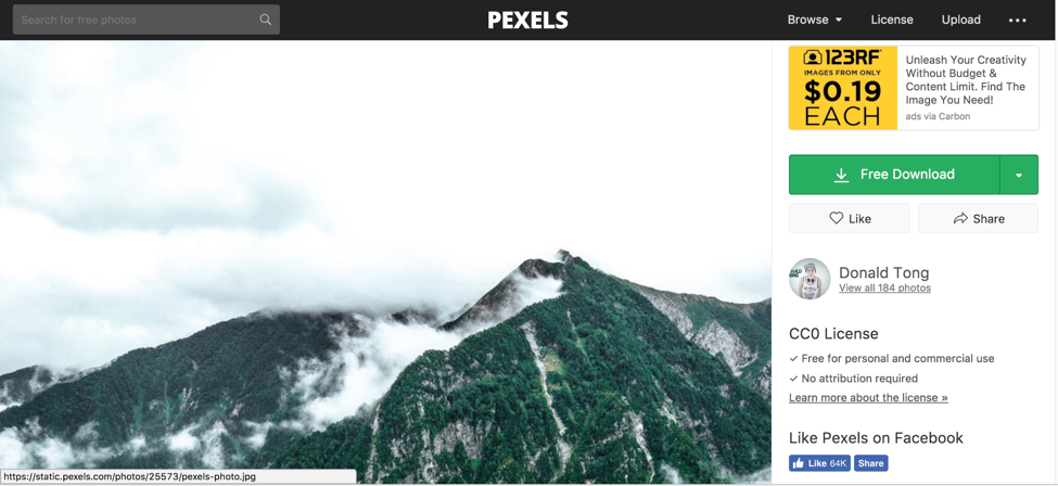
So, assuming we’re putting our text where the clouds are, we just have to pick a color that is darker than the background (in this case, the background is white).
Instead of just randomly selecting a color, we’ll select the turquoise color of the moss that is on the mountain in the picture, as well as the grey of the mountain itself.
The result is that you’ll have a very consistent-looking slide with colors that work well together.
4. Horizontal split presentation layout
By splitting your slide equally using horizontal bars, you can instantly see a usable layout for your information. It doesn’t take much guessing to know where you can place content in these cases. Just fit it to the grid you made.
This is similar to the three-part layout but allows for a different kind of representation of information.
Here are some examples of how a horizontal split can be used:
This presentation layout idea works great when you have:
- An image representing each of your points
- A heading for each point, when there are no more than four points (otherwise there won’t be enough space on the slide)
- Body text that might be a little too dense to put into a vertical grid layout
For example, you could use this layout in a team slide within an investor pitch deck, where you simply have too much information about the founders to force into a tight space.

Learn how to customize this presentation:
A horizontal split layout can also be used as an alternative to bullet points when you are listing the benefits of a product, or spelling out a timeline of execution:
5. Centred callout presentation layout
There will be instances where you need a big callout (a specific and short message). For example, it’s great to have big callouts for “thank you” slides when ending a presentation.
A great way to do this is to either pick a background image with contrasting space or to add the color contrast on your own using gradients.
When picking font colors for your callout, always ask yourself:
- Will people be able to see it?
- Is there adequate contrast?
How to pick fonts for your callouts
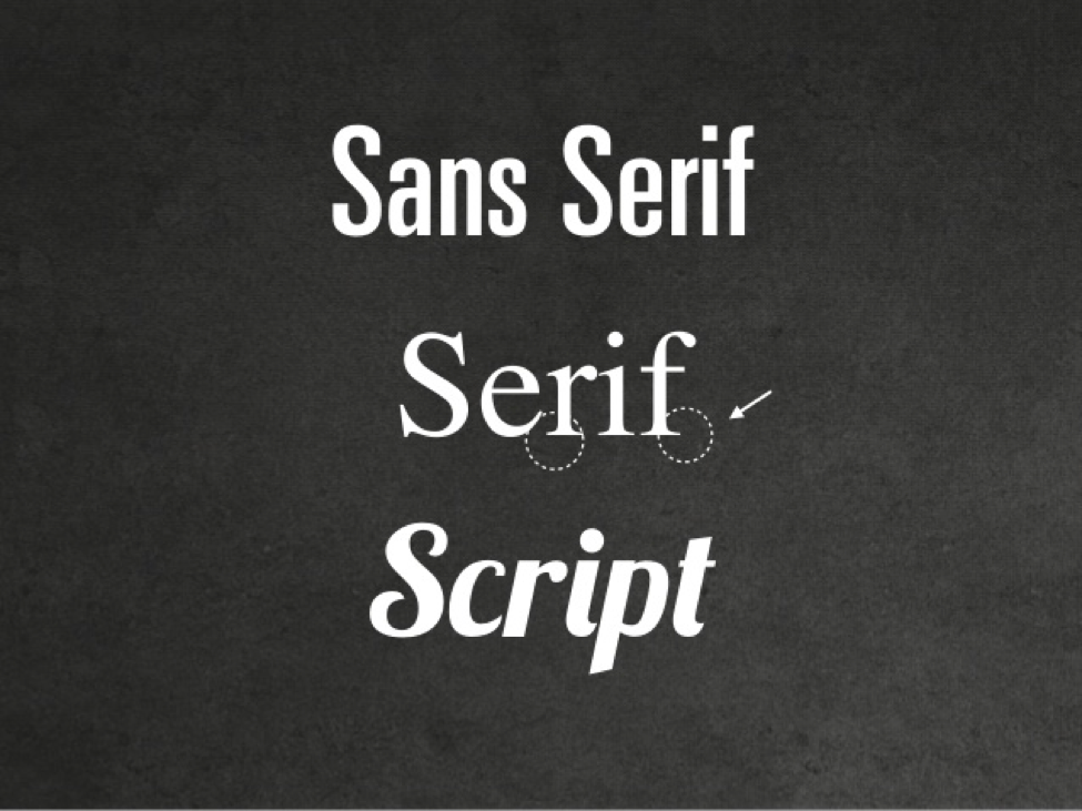
There are many different font types. There’s sans-serif fonts (fonts with no line embellishments, i.e. Arial, Helvetica), serif fonts (fonts with line embellishments, i.e. Times New Roman), and scripts (hand-written cursive or fanciful typefaces).
These fonts all communicate different personalities based on your audience. Naturally, you wouldn’t use Comic Sans when presenting to an executive audience, would you?
Fancy fonts that are harder to read have been shown to promote better recollection. If you only have a few words on your slide, using a script can help to bolster this effect.
However, to be on the safe side, if you’re not sure whether you can keep your words brief, it’s better to stick to more legible fonts where people can easily make out the letters.
To leave a lasting impression on your audience, consider transforming your slides into an interactive presentation. Here are 15 interactive presentation ideas to enhance interactivity and engagement.
Recap
When faced with a blank slide, keep in mind these distinctions so that you’ll put together functional, aesthetic slides:
- Think about how much content you need on your slide. That will limit or expand your layout options. If you have three big points, use a horizontal or vertical layout split, it’s easy and fuss-free.
- If you have the prerogative to keep your presentation brief, use larger images for callouts, to take advantage of the “picture superiority effect” for better audience attention and recollection.
- When picking images for your slides, try to pick ones with more whitespace and, if humans are concerned, ones with faces. This gives you more layout options as well as helps to build rapport with your audience.
- Always ensure there is adequate contrast between your text and the background. If there isn’t, either add a shape or gradient to make the words legible.
- When laying out elements or text, be deliberate. Use the rule of thirds and try not to choose too many fonts.
There you have it! If you ever find yourself stuck with layouts when preparing a presentation, refer back to this article and start moving from there. Any questions? Do leave a comment!
Read also:


