


The news is the best source to understand today’s world the best way. However, daily updates and interview dialogs can get time-consuming and confusing. Luckily, you can use graphs and infographics to understand the world’s economic situation today.
The world isn’t in its best shape all the time. But we hope these engaging and easy-to-understand economic infographics help you easily understand our current global economy and hold out hope for the future.
Feel free to customize any of our economic informational graphics, or use our simple Infographic Maker if you want to create any other types of templates.
Click to jump ahead:
- 2020 economic trends infographic
- U.S. gasoline prices economic graphic
- Infographics on COVID-19 impacts
- Infographic on vaccination and the pandemic
- Britain’s economy infographic: Brexit
- Infographic economics on the environment
- Infographics on climate change
- Infographic about real estate and the economy
- Growth infographic on global trade in the UK
- U.S. racial population infographic
- Pandemic vs. Epidemic venn diagram
- A presentation on illegal tobacco trade
1. Economic infographics on 2020 economic trends
This infographic from the Asia-Pacific Economic Cooperation (APEC) focuses on depicting the world’s economy in 2020:

This is just the first of the four infographics included in this report, which holistically covers the trends observed in 2020, the projected recovery in 2021 and a checklist to assist with setting the recovery to success:

You can visit the APEC website for a closer look at each of the infographics.
2. U.S. gasoline prices economic infographic
This economic informational graphic depicts the inflation in U.S. gasoline prices in the first half of 2021:

Note that this finance infographic has a very natural flow: it first shows the surge in U.S. gas prices, then proceeds to explain why gas is so expensive and what goes into the cost of gas.
It’s engaging in its clever use of data visualizations (line charts, bar graphs) to show numbers in a meaningful and easy-to-understand way. Also, the use of relevant icons and consistent color code also makes it easy to follow the flow of the information without burdening the reader.
For a more detailed breakdown of the infographic and the story involved
3. Economic infographics on COVID-19 impacts
Wondering why we included COVID-19 infographics in this list? COVID-19 has made detrimentally massive impacts on the entire world’s economy. This effect has made millions of people and businesses lose everything they had.
We’ll examine in more detail the impacts of COVID-19 on the refugee crisis and the environment, using these two infographics.
Refugee
This statistical infographic provides a holistic view of how countries handle the refugee crisis during COVID-19. Notice the heavy use of numbers and the way the designer offsets it by using lots of icons, illustrations and data visualizations:
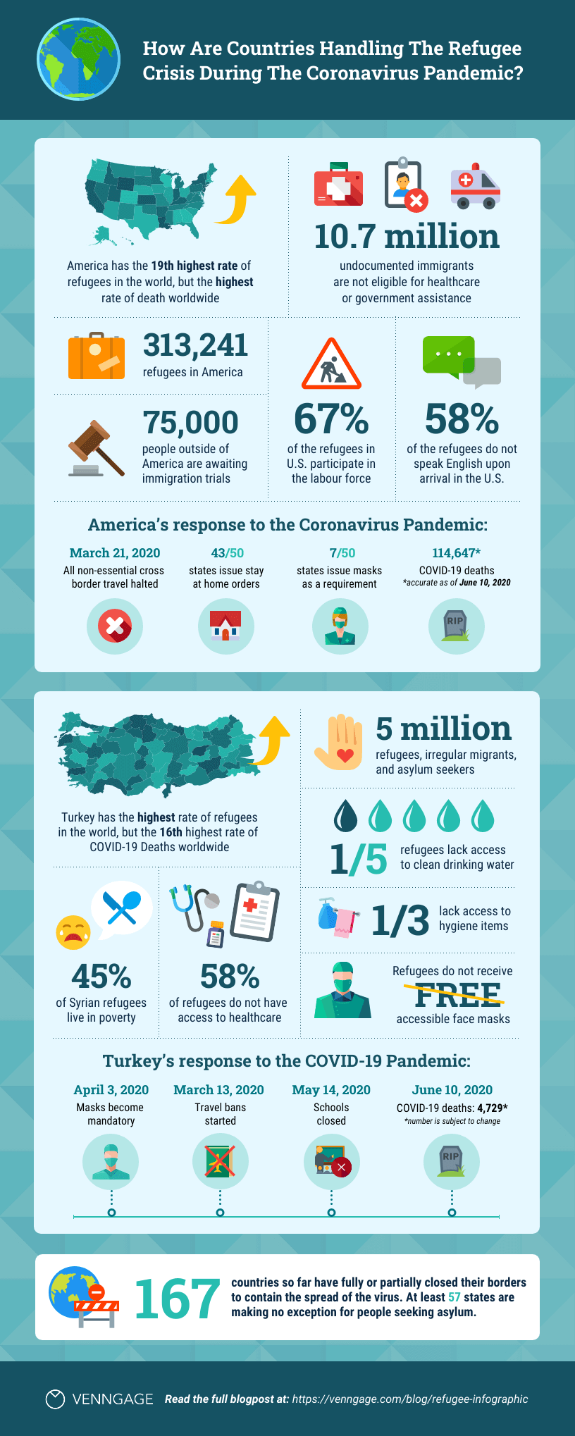
The infographic also compares two countries in detail: America (19th highest rate of refugees but highest rate of COVID-19 deaths) and Turkey (highest rate of refugees but 16th highest rate of deaths) and see how different their responses to the crisis are.
Environment
This long, informational infographic details the impact of the pandemic on the environment in terms of carbon emissions, waste, wildlife & habitat, and energy:

Again, it uses lots of data to provide a good overview of how the pandemic has affected different elements of the environment.
Here are a few more details for readers who want to learn more about the world’s economic situation today due to COVID-19.
Widening inequality
This factor has enormous implications for worldwide economic recovery because many developing and developed nations have widening inequality in their populations. The U.N.’s report states that both China and the U.S. are on their way to economic recovery, but the rest of the world has to continue enduring and vaccinating.
Vaccine inequity
Developed nations housing and supporting their respective world-leading pharmaceuticals receive the most efficient vaccine doses immediately. On the other hand, developing nations with weak pharmaceutical research and manufacturing will have to import both data and effective vaccination samples to vaccinate their respective national populations.
4. Infographic on vaccination and the pandemic
Speaking of vaccines, let’s take a look at this health infographic about the barriers to COVID-19 vaccination, with mentioning of economic stability as a factor:

COVID-19 in America has fully defined the divide between various groups. This infographic from Venngage sums everything up.
Barriers to COVID19 Vaccination highlights economic stability, health-care access, education quality and access, and other details in visuals in this infographic.
You can learn more about COVID-19’s impact in this easy-to-understand vaccine infographic.
Related:
5. Britain’s economy infographic: Brexit

Here’s a small primer about Brexit in two sentences: Britain’s economy continues to boom independently than its other United Kingdom constituents. Thus, it fulfilled its belief to stand as an unaffiliated nation on January 31, 2020.
This infographic from Venngage shows conflicting and highly divisive data. Here’s an example of high division in Britain: about 42.11 percent of British people want to stay in the U.K. On the other hand, 57.89 percent want to leave.
Want to be surprised? About 55.10 percent of survey respondents believe they have sufficient data and did enough research to make a good decision on the Brexit Referendum.
6. Infographic economics on the environment

Don’t know anything about renewable energy? Then, the Renewable Energy short infographic can inform you all about it. This infographic is a bit short. However, it’s well made because it’s easy to understand the infographic’s iconography and two-sentence paragraphs that explain everything.
Want to inform everybody about it? This infographic can also pass as an excellent social media post that you can fully back with helpful links to government and research agency periodicals. Plus, you can print it out and educate everyone in your area about renewable energy.
7. Economic infographics on climate change

Climate change is the greatest threat the planet has ever faced. We have already raised global temperatures by 1 degree Celsius as a result of our greenhouse gas emissions. Sadly, we are on a path to increase this to 4 degrees or more in the coming decades.
Climate change consequences are devastating: Unchecked climate change could displace hundreds of millions of people from their homes. This infographic shows that Asia’s developing nations contribute significant carbon emissions alongside developed nations.
Here are two more infographics on climate change and its impact:


8. Infographic about real estate and the economy

This Venngage real estate infographic pertains to the U.S.’s real estate situation and economic growth. It was surprising to see the country’s economy contract enormously down to 1.6 percent in 2019. However, it smoothly recovered to 2.3 percent in 2020.
This infographic does a great job explaining the shortage of affordable mid-range residences and properties through its small but straightforward chart that shows the prices rising as the residential purchases became lower from 5.5M in 2019 to 5.2M in 2020.
The infographic talks more about real estate’s role in growing the U.S.’s economy in the last two years in its later sections.
9. Growth infographic on global trade in the UK

Are you an investor trying to get into the devolved U.K. market? You’ll surely love seeing the increasing online shopping trends, mobile commerce, and international trade growth. Check out Modern Economic Policy Editorial here.
This Venngage infographic talks about the UK’s modern global trade policies. It looks at the sizable changes the UK faces after devolution.
Experts believe that competition from countries within Europe will drive further increases in productivity levels. As a result, the event could lead to increased price pressure for U.K. firms as they seek out new markets overseas.
10. U.S. racial population infographic

Many businesses and investors worldwide focus on racial inclusivity as a successful business feature. The world’s values have shifted towards kindness, and investors believe it’s for the better. Therefore, it’s great to learn about the U.S.’s racial populations in the biggest American states.
Thanks to this Venngage economy infographic, visuals will provide you with knowledge about the largest racial demographics in the United States. Business owners and investors who want to make snap investments will love this infographic’s quick informative approach.
11. Pandemic vs. Epidemic Venn diagram

Surprised that most people misread pandemics and epidemics? It can be challenging to differentiate them without proper scientific briefing. This simple Venngage infographic is an effective way to inform everyone about this common mistake.
In this Venn diagram, a pandemic is any disease that affects a high percentage of the population within a wide geographic area. On the other hand, an epidemic pertains to a disease that quickly spreads and affects many individuals without regard to its geographic area.
12. A presentation on illegal tobacco trade

Despite not being an infographic, this presentation contains lots of useful information about illegal tobacco trades all over the United Kingdom. Thus, it’s a problem that investors and economists want to learn about because it will affect their trading decisions.
In the U.K., researchers used many surveys at secondary schools and youth clubs. About 6,000 youth aged 13–17 years continue to try and consume tobacco.
The research results showed that although there has been a decline in cigarette smoking among U.K. schoolchildren, the illegal tobacco trade is still thriving, with nearly half of teens buying them over the internet or on their smartphones.
Economic infographics: Making it easy to understand the world’s situation
You can use these infographics to learn more about the world’s current economic condition. However, we still recommend remaining updated on the latest news to have precise figures and hour-old information on the world’s events.
Interested in creating infographics like these to convey your ideas? Simply sign up for a free Venngage account and start customizing our hundreds of professionally designed infographic templates using the drag-and-drop editor. No design experience required.


