


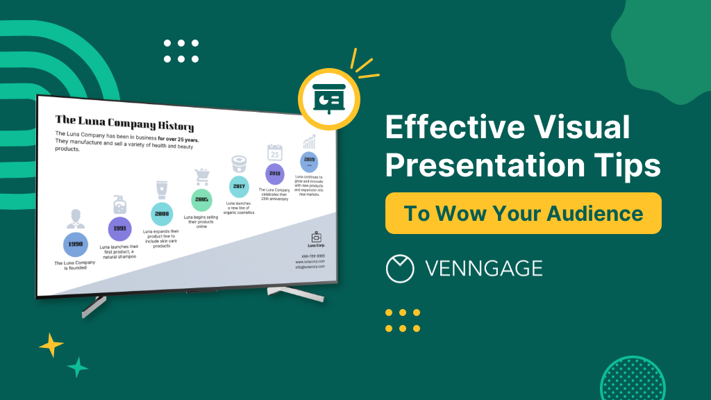
So, you’re gearing up for that big presentation and you want it to be more than just another snooze-fest with slides. You want it to be engaging, memorable and downright impressive.
Well, you’ve come to the right place — I’ve got some slick tips on how to create a visual presentation that’ll take your presentation game up a notch.
Packed with presentation templates and examples that are easily customizable, keep reading this blog post to learn the secret sauce behind crafting presentations that captivate, inform and remain etched in the memory of your audience.
What is a visual presentation
A visual presentation is a communication method that uses visual elements, such as images, graphics, charts, icons and other visual aids to convey information, ideas or messages to an audience.
Visual presentations aim to enhance comprehension engagement and the overall impact of the message through the strategic use of visuals. People remember what they see, making your point last longer in their heads.
15 effective tips to make your visual presentations more engaging
I’ve compiled these tips and some examples of visual presentations to help you design a presentation that’ll leave a lasting impression
1. Use the rule of thirds for layout
Ever heard of the rule of thirds? It’s a presentation layout trick that can instantly up your slide game. Imagine dividing your slide into a 3×3 grid and then placing your text and visuals at the intersection points or along the lines. This simple tweak creates a balanced and seriously pleasing layout that’ll draw everyone’s eyes.
2. Get creative with visual metaphors
Got a complex idea to explain? Skip the jargon and use visual metaphors. Throw in images that symbolize your point – for example, using a road map to show your journey towards a goal or using metaphors to represent answer choices or progress indicators in an interactive quiz or poll.
3. Engage with storytelling through data
Use storytelling magic to bring your data to life. Don’t just throw numbers at your audience, but explain what they mean, why they matter and add a bit of human touch. Turn those stats into relatable tales and watch your audience’s eyes light up with understanding.
4. Visualize your data with charts and graphs
The right data visualization tools not only make content more appealing but also aid comprehension and retention. Choosing the right visual presentation for your data is all about finding a good match.
For ordinal data, where things have a clear order, consider using ordered bar charts or dot plots. When it comes to nominal data, where categories are on an equal footing, stick with the classics like bar charts, pie charts or simple frequency tables. And for interval-ratio data, where there’s a meaningful order, go for histograms, line graphs, scatterplots or box plots to help your data shine.
In an increasingly visual world, effective visual communication is a valuable skill for conveying messages. Here’s a guide on how to use visual communication to engage your audience while avoiding information overload.
5. Employ the power of contrast
Want your important stuff to pop? That’s where contrast comes in. Mix things up with contrasting colors, fonts or shapes. It’s like highlighting your key points with a neon marker – an instant attention grabber.
6. End with a powerful visual punch
Your presentation closing should be a showstopper. Think a stunning clip art that wraps up your message with a visual bow, a killer quote that lingers in minds or a call to action that gets hearts racing.
You can also add a short branded outro created with an ai video generator for maximum effect.
7. Tell a visual story
Structure your slides like a storybook and create a visual narrative by arranging your slides in a way that tells a story. Each slide should flow into the next, creating a visual narrative that keeps your audience hooked till the very end. You can also create a digital flipbook to deliver an even more immersive storytelling experience.
Icons and images are essential for adding visual appeal and clarity to your presentation. Venngage provides a vast library of icons and images, allowing you to choose visuals that resonate with your audience and complement your message.
8. Show the “before and after” magic
Want to drive home the impact of your message or solution? Whip out the “before and after” technique. Show the current state (before) and the desired state (after) in a visual way. It’s like showing a makeover transformation, but for your ideas.
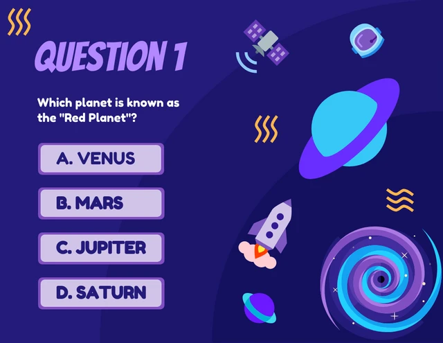
9. Add fun with visual quizzes and polls
To break the monotony and see if your audience is still with you, throw in some quick image quizzes or polls. It’s like a mini-game break in your presentation — your audience gets involved and it makes your presentation way more dynamic and memorable.
10. Use visuals wisely
Your visuals are the secret sauce of a great presentation. Cherry-pick high-quality images, graphics, charts and videos templates that not only look good but also align with your message’s vibe. Each visual should have a purpose – they’re not just there for decoration.
11. Utilize visual hierarchy
Employ design principles like contrast, alignment and proximity to make your key info stand out. Play around with fonts, colors and placement to make sure your audience can’t miss the important stuff.
12. Engage with multimedia
Static slides are so last year. Give your presentation some sizzle by tossing in multimedia elements—think short video clips you’ve combined with apps for merging videos, animations, or a touch of sound when it makes sense, including an animated logo.
For those dealing with multilingual audiences, consider the use of an AI image translator to seamlessly convert text within images to various languages, enhancing accessibility and understanding. There are tons of video and clip creator tools like HubSpot or Adobe But remember, these are sidekicks, not the main act, so use them smartly.
13. Interact with your audience
Turn your presentation into a two-way street. Start your presentation by encouraging your audience to join in with thought-provoking questions, quick polls or using interactive tools. Get them chatting and watch your presentation come alive.
14. Incorporate stories and examples
Weave in relatable stories, personal anecdotes or real-life examples to illustrate your points. It’s like adding a dash of spice to your content – it becomes more memorable and relatable.
15. Nail that delivery
Don’t just stand there and recite facts like a robot — be a confident and engaging presenter. Lock eyes with your audience, mix up your tone and pace and use some gestures to drive your points home. Practice and brush up your presentation skills until you’ve got it down pat for a persuasive presentation that flows like a pro.
Venngage offers a wide selection of professionally designed presentation templates, each tailored for different purposes and styles. By choosing a template that aligns with your content and goals, you can create a visually cohesive and polished presentation that captivates your audience.
Looking for more presentation ideas? Why not try using a presentation software that will take your presentations to the next level with a combination of user-friendly interfaces, stunning visuals, collaboration features and innovative functionalities that will take your presentations to the next level.
6 major types of visual presentation you should know
Visual presentations come in various formats, each uniquely suited to convey information and engage audiences effectively. Here are six major types of visual presentations that you should be familiar with:
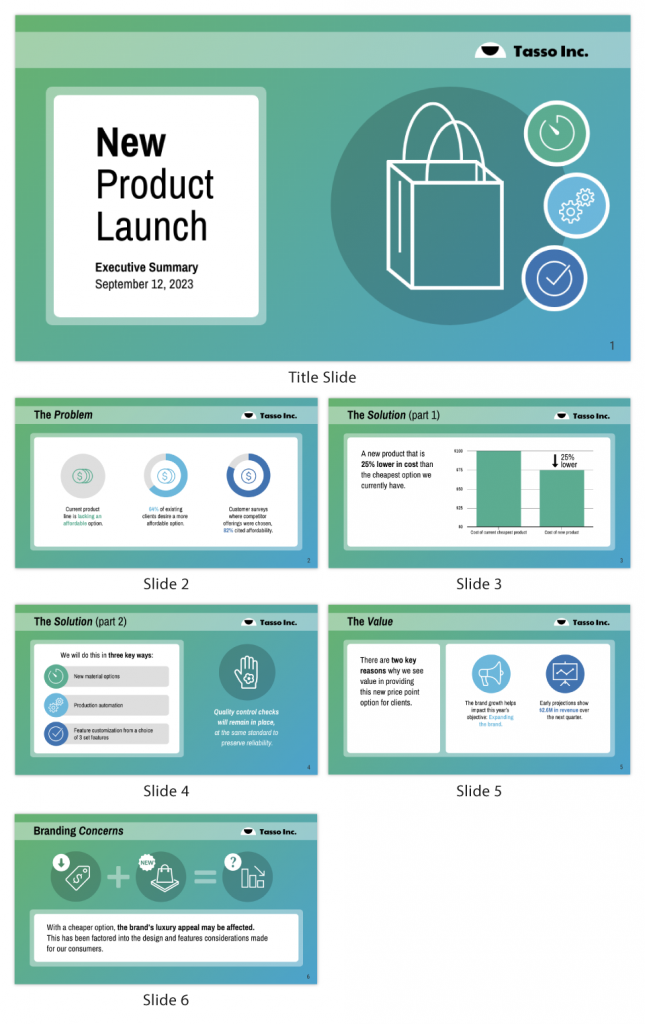
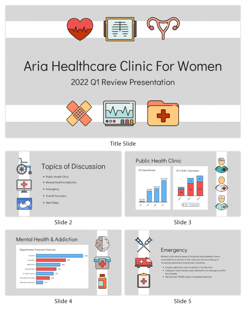
1. Slideshows or PowerPoint presentations
Slideshows are one of the most common forms of visual presentations. They typically consist of a series of slides containing text, images, charts, graphs and other visual elements. Slideshows are used for various purposes, including business presentations, educational lectures and conference talks.
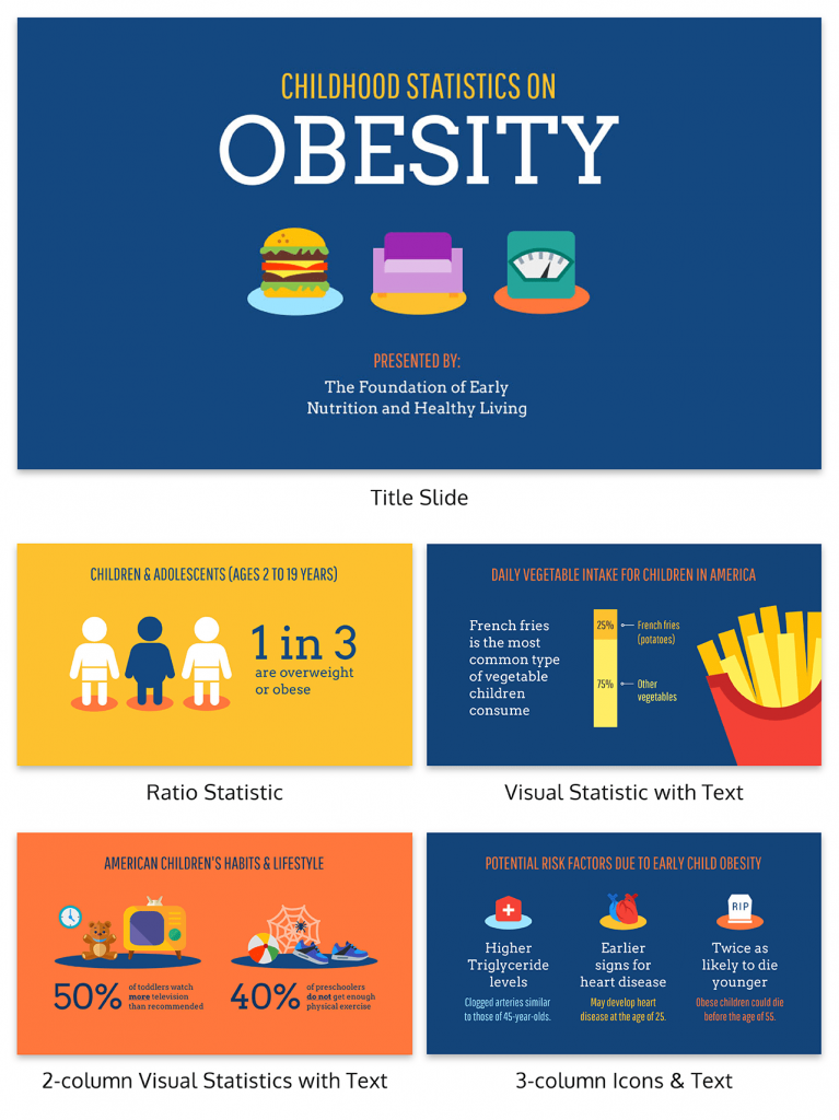
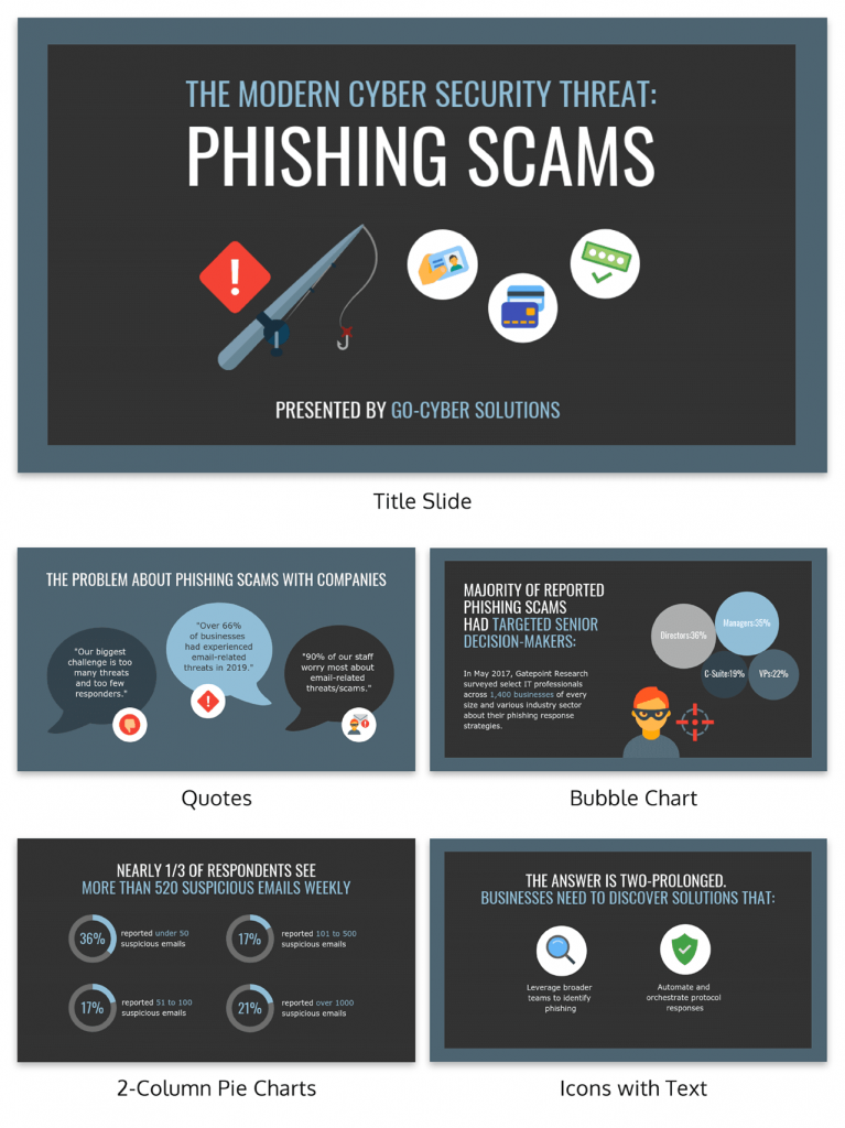
2. Infographics
Infographics are visual representations of information, data or knowledge. They combine text, images and graphics to convey complex concepts or data in a concise and visually appealing manner. Infographics are often used in marketing, reporting and educational materials.
Don’t worry, they are also super easy to create thanks to Venngage’s fully customizable infographics templates that are professionally designed to bring your information to life. Be sure to try it out for your next visual presentation!
3. Video presentation
Videos are your dynamic storytellers. Whether it’s pre-recorded or happening in real-time, videos are the showstoppers. You can have interviews, demos, animations or even your own mini-documentary. Video presentations are highly engaging and can be shared in both in-person and virtual presentations.
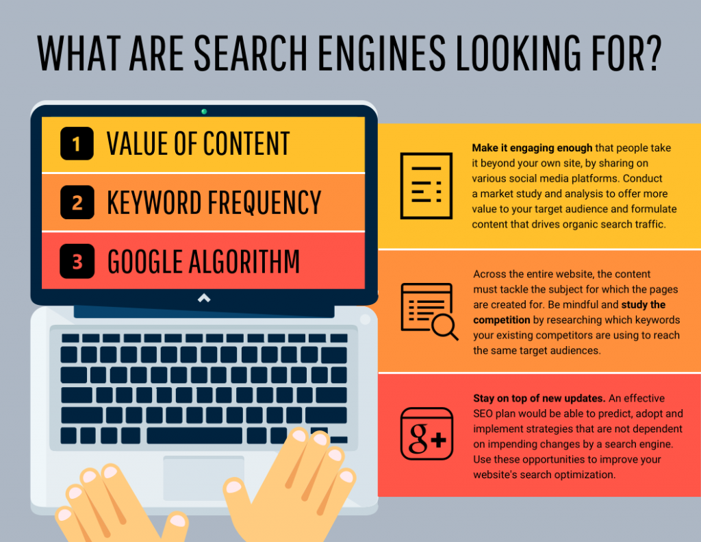
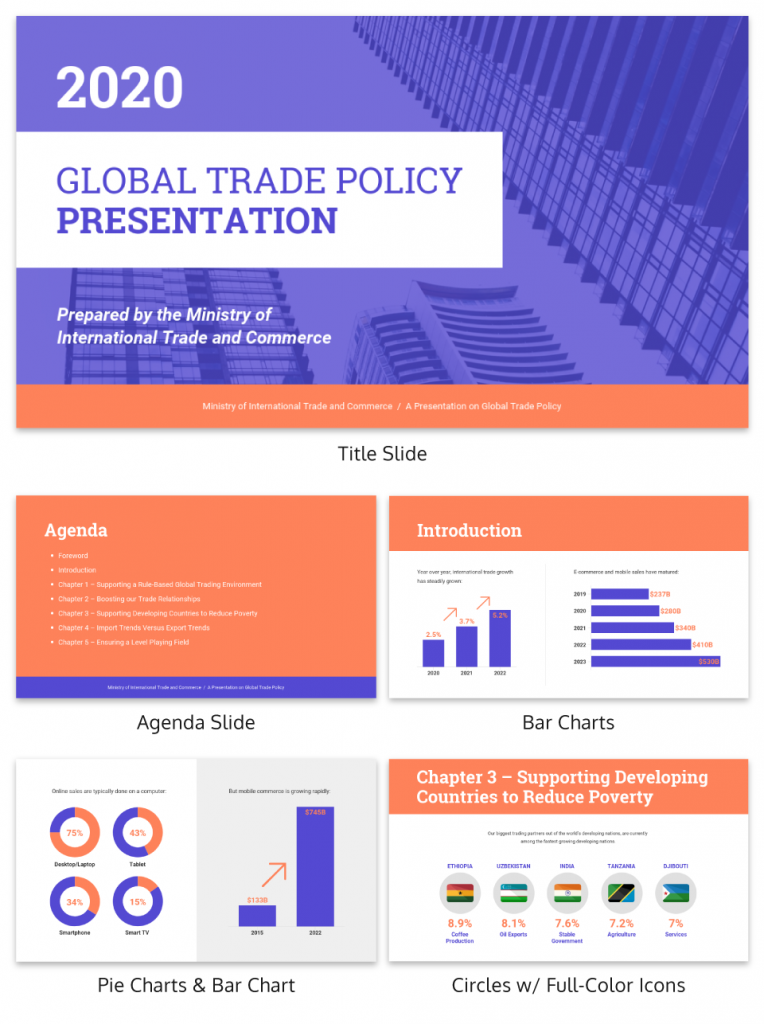
4. Charts and graphs
Charts and graphs are visual representations of data that make it easier to understand and analyze numerical information. Common types include bar charts, line graphs, pie charts and scatterplots. They are commonly used in scientific research, business reports and academic presentations.
Effective data visualizations are crucial for simplifying complex information and Venngage has got you covered. Venngage’s chart templates enable you to create engaging charts, graphs,and infographics that enhance audience understanding and retention, leaving a lasting impression in your presentation.
5. Interactive presentations
Interactive presentations involve audience participation and engagement. These can include interactive polls, quizzes, games and multimedia elements that allow the audience to actively participate in the presentation. Interactive presentations are often used in workshops, training sessions and webinars.
Venngage’s interactive presentation tools enable you to create immersive experiences that leave a lasting impact and enhance audience retention. By incorporating features like clickable elements, quizzes, embedded multimedia, and even taking inspiration from engaging word-based games like Outspell, you can captivate your audience’s attention and encourage active participation.
6. Poster presentations
Poster presentations are the stars of the academic and research scene. They consist of a large poster that includes text, images and graphics to communicate research findings or project details and are usually used at conferences and exhibitions. For more poster ideas, browse through Venngage’s gallery of poster templates to inspire your next presentation.

Different visual presentations aside, different presentation methods also serve a unique purpose, tailored to specific objectives and audiences. Find out which type of presentation works best for the message you are sending across to better capture attention, maintain interest and leave a lasting impression.
What are some common mistakes to avoid in visual presentations?
To make a good presentation, it’s crucial to be aware of common mistakes and how to avoid them. Without further ado, let’s explore some of these pitfalls along with valuable insights on how to sidestep them.
Overloading slides with text
Text heavy slides can be like trying to swallow a whole sandwich in one bite – overwhelming and unappetizing. Instead, opt for concise sentences and bullet points to keep your slides simple. Visuals can help convey your message in a more engaging way.
Using low-quality visuals
Grainy images and pixelated charts are the equivalent of a scratchy vinyl record at a DJ party. High-resolution visuals are your ticket to professionalism. Ensure that the images, charts and graphics you use are clear, relevant and sharp.
Choosing the right visuals for presentations is important. To find great visuals for your visual presentation, Browse Venngage’s extensive library of high-quality stock photos. These images can help you convey your message effectively, evoke emotions and create a visually pleasing narrative.
Ignoring design consistency
Imagine a book with every chapter in a different font and color – it’s a visual mess. Consistency in fonts, colors and formatting throughout your presentation is key to a polished and professional look.
Reading directly from slides
Reading your slides word-for-word is like inviting your audience to a one-person audiobook session. Slides should complement your speech, not replace it. Use them as visual aids, offering key points and visuals to support your narrative.
Lack of visual hierarchy
Neglecting visual hierarchy is like trying to find Waldo in a crowd of clones. Coupling this with video transcription can make your presentation more comprehensive and engaging. Use size, color and positioning to emphasize what’s most important. Guide your audience’s attention to key points so they don’t miss the forest for the trees.
Ignoring accessibility
Accessibility isn’t an option these days; it’s a must. Forgetting alt text for images, color contrast and closed captions for videos can exclude individuals with disabilities from understanding your presentation. Use a video caption generator to add closed captions for your videos.
Relying too heavily on animation
While animations can add pizzazz and draw attention, overdoing it can overshadow your message. Use animations sparingly and with purpose to enhance, not detract from your content. In some cases, animation services can help strike the right balance and ensure a smooth, professional look.
Using jargon and complex language
Keep it simple. Use plain language and explain terms when needed. You want your message to resonate, not leave people scratching their heads.
Not testing interactive elements
Interactive elements can be the life of your whole presentation, but not testing them beforehand is like jumping into a pool without checking if there’s water. Ensure that all interactive features, from live polls to multimedia content, work seamlessly. A smooth experience keeps your audience engaged and avoids those awkward technical hiccups.
Presenting complex data and information in a clear and visually appealing way has never been easier with Venngage. Build professional-looking designs with our free visual chart slide templates for your next presentation.
Visual presentation FAQs
What is a visual presentation?
A visual presentation is a method of presenting information through visual aids such as slides, images, charts and videos. It enhances understanding and retention by illustrating key points and data visually. Visual presentations are commonly used in meetings, lectures, and conferences to engage and inform the audience effectively.
What is the role of storytelling in visual presentations?
Storytelling plays a crucial role in visual presentations by providing a narrative structure that engages the audience, helps them relate to the content and makes the information more memorable.
What software or tools can I use to create visual presentations?
You can use various software and tools to create visual presentations, including Microsoft PowerPoint, Google Slides, Adobe Illustrator, Canva, Prezi and Venngage, among others.
What is the difference between a visual presentation and a written report?
The main difference between a visual presentation and a written report is the medium of communication. Visual presentations rely on visuals, such as slides, charts and images to convey information quickly, while written reports use text to provide detailed information in a linear format.
How do I effectively communicate data through visual presentations?
To effectively communicate data through visual presentations, simplify complex data into easily digestible charts and graphs, use clear labels and titles and ensure that your visuals support the key messages you want to convey.
Are there any accessibility considerations for visual presentations?
Accessibility considerations for visual presentations include providing alt text for images, ensuring good color contrast, using readable fonts and providing transcripts or captions for multimedia content to make the presentation inclusive.
Most design tools today make accessibility hard but Venngage’s Accessibility Design Tool comes with accessibility features baked in, including accessible-friendly and inclusive icons.
How do I choose the right visuals for my presentation?
Choose visuals that align with your content and message. Use charts for data, images for illustrating concepts, icons for emphasis and color to evoke emotions or convey themes.
How can I adapt my visual presentations for online or virtual audiences?
To adapt visual presentations for online or virtual audiences, focus on concise content, use engaging visuals, ensure clear audio, encourage audience interaction through chat or polls and rehearse for a smooth online delivery.
What is the role of data visualization in visual presentations?
Data visualization in visual presentations simplifies complex data by using charts, graphs and diagrams, making it easier for the audience to understand and interpret information.
How do I choose the right color scheme and fonts for my visual presentation?
Choose a color scheme that aligns with your content and brand and select fonts that are readable and appropriate for the message you want to convey.
How can I measure the effectiveness of my visual presentation?
Measure the effectiveness of your visual presentation by collecting feedback from the audience, tracking engagement metrics (e.g., click-through rates for online presentations) and evaluating whether the presentation achieved its intended objectives.
5 steps to create a visual presentation with Venngage
Follow the 5 simple steps below to make your entire presentation visually appealing and impactful:
1. Sign up and log In: Log in to your Venngage account or sign up for free and gain access to Venngage’s templates and design tools.
2. Choose a template: Browse through Venngage’s presentation template library and select one that best suits your presentation’s purpose and style. Venngage offers a variety of pre-designed templates for different types of visual presentations, including infographics, reports, posters and more.
3. Edit and customize your template: Replace the placeholder text, image and graphics with your own content and customize the colors, fonts and visual elements to align with your presentation’s theme or your organization’s branding.
4. Add visual elements: Venngage offers a wide range of visual elements, such as icons, illustrations, charts, graphs and images, that you can easily add to your presentation with the user-friendly drag-and-drop editor.
5. Save and export your presentation: Export your presentation in a format that suits your needs and then share it with your audience via email, social media or by embedding it on your website or blog.
So, as you gear up for your next presentation, whether it’s for business, education or pure creative expression, don’t forget to keep these visual presentation ideas in your back pocket.
Feel free to experiment and fine-tune your approach and let your passion and expertise shine through in your presentation. With practice, you’ll not only build presentations but also leave a lasting impact on your audience – one slide at a time.


