


In years past, HR or L&D departments handed their employees training materials laboriously created in Microsoft Word. These guides were too wordy and too boring. For the most part, employees never looked at them again after training was over.
Boring training materials are not memorable, and they don’t help your employees improve their performance.
Let’s look at how we can create more engaging training materials with visuals. You can then customize your own training documents using our easy-to-edit training plan templates and simple online editor.
Click to jump ahead:
- What are training materials?
- Training materials templates
- How do you write training materials?
- Why are training materials important?
- What is included in training materials?
- Training materials FAQ
What are training materials?
Training materials are digital or printed content of a training program. These can be used for student or employee training and development — but in the context of this blog post I’ll be discussing business/corporate training materials only.
Training materials come in different formats (which I’ll discuss in a minute). Here’s an example of one:

Just so you know, some of our templates are free to use and some require a small monthly fee. Sign up is always free, as is access to Venngage’s online drag-and-drop editor.
Besides presentations, training materials can be infographics, checklists and more. This onboarding infographic guides managers on how to best onboard new hires remotely:

From onboarding to professional development, training materials play an essential role in human resource strategy. Well-designed training content can effectively communicate expectations, establish roles and responsibilities, and define processes and procedures.
One simple way to keep training costs down while providing effective learning materials is to use a budget-friendly learning management system used by nonprofits.
You can also use free authoring tools to create online courses for employee training and upload them to LMS dashboards. Implementing these affordable tools allows organizations to uphold high-quality training standards without exceeding their budgets. Let’s take a closer look at the role of training materials in your organization.
10 Training material examples
Venngage has created training material examples and templates to help you get started. These easy-to-use templates make training content creation a breeze. Let’s take a look.
Soft skills training material
Sharing large amounts of information can be a real design challenge. These soft skills templates provide great examples of how to organize and present lots of information in a one pager.


Healthcare training material
The ability to communicate effectively can make or break an HR department. A healthcare organization’s most valuable asset is its people, so taking care of employees is an important job. Knowing how to prepare training materials will make you more effective as a leader, a manager and a mentor.


Marketing training material
If you had to summarize the information contained in this matrix in a few words, what would you say? A visually engaging, intuitively designed matrix can help you organize complex, multi-factored information. At a glance, your audience will be able to find out what they need to know. By incorporating these matrices into your learning management system, you can provide employees with accessible, self-paced training that tracks progress while simplifying complex marketing concepts.

Emotional intelligence training material
You can use graphics and words to tell a compelling story. Training materials that provide an at-a-glance snapshot of complex topics are easier to understand and the learning is more likely to stick.

Diversity and inclusion training material
Organizations often develop their own ways of talking about what they do. However, what may be familiar and commonplace to you may be strange to new team members. These templates are great for supporting diversity and building a common language in your organization.


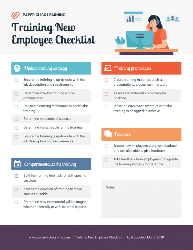
Safety training material
Why ask your employees to keep track of safety procedures and responsibilities when you can create training materials that are functional and informative? Checklist templates are great for summarizing safety information.


Sales training material
Process, process, process, am I right? Organizations need to provide their employees with training materials that clearly articulate processes and procedures. These templates will help you establish a single source of truth for organizational processes and procedures.


Customer service training material
When it comes to the fundamentals, you don’t have to overwhelm people with everything you know. These templates do a great job of using graphics, colors, and font sizes to present important information.


Leadership training material
Being a leader takes a special set of skills that don’t happen by accident. Empower the leaders in your organization by creating high-impact, relevant, and instructive training guides.


HR training material
The majority of Human Resources departments are responsible for the training and development of employees across departments. This is a huge lift! When the need for training is great, the need for great training materials becomes even greater. If you can communicate your message effectively the first time, you increase retention and improve employee’s chances of success.
Related: Microlearning: A Pathway to Effective Training Retention and Behavioral Change

How do you create training materials?
Here are some of our best tips for how to prepare training materials that deliver real results.
1. Know your audience and write for them
You can’t communicate effectively without knowing who your audience is.
For corporate training materials, you’re mainly presenting information to your colleagues. If they’re from the same department as yours, chances are they already understand most of the jargons, so you won’t need to refrain from using those.
However, if you’re developing training materials for coworkers from a different department, or for new hires — make sure you scrutinize for technical/industry language. Which brings us to our next point…
2. Use accessible, approachable language
The best practice is to write your training materials to be understood at the 7th to 8th-grade level. Don’t use overly big words. The wisest training content creators know that the goal is to inform, not impress.
Of course, you should also know to use jargons where they fit. If your audience is already used to using a certain amount of technical language, they’ll process those words more easily than simpler (or oversimplified) terms.
3. Keep it short
Punch up your training material by keeping it short and visually impactful. Too many words on a page dilute your message. Focus on the most important stuff and toss out the rest.
This is especially important for handouts or worksheets, which are two very popular types of training resources. Your colleagues rely on these documents as a memory refresher, so it’s best to keep them to the point and memorable.
4. Break it up
When you do have a larger quantity of information to share, chunk it out into smaller chunks using headers and graphics to break up the flow. This job aid makes the most use of illustrations to guide readers through how the company’s internal processes work:

If you need some guidelines on how to summarize your content, check out our post: How to Summarize Information and Present it Visually
5. Proofread it, read it, and share it
Make sure you carefully check your presentation for spelling and grammar. Many trainers will tell you that having a typo in their presentation will end up being the only thing the participants take from it. Don’t let that be your fate. You can use an online grammar checker to help you in this process.
Related: Storyline: A Starter Guide to Creating Engaging Visual Training
Why are training materials important?
Whether your business is two employees or thousands, training materials are an invaluable resource. Organizations need training content of all kinds: training materials for leadership development, training plans for up-skilling employees, customer service training materials to teach phone skills, or even training materials for trainers.
Related: Employee Training: Definition, Benefits & Visual Aids
Training materials are essential for:
1. Establishing best practices
Creating consistency in processes and procedures is essential for helping businesses scale. Your training materials will help to define the best practices for your organization.
2. Defining roles and responsibilities
Your training materials can help your team to understand what their job is and what is expected of them. And, because you have established your training materials as the single source of truth on these roles and responsibilities, both you and they can refer to this resource as needed.
3. Improving employee performance
You can’t expect employees to hit a target that you haven’t defined. Your training materials are a great place to determine what exemplary performance looks like, as well as to articulate avenues for professional development.
Related: How to Easily Create Job Aids That Improve Employee Performance
4. Improving compliance
In addition to procedures and practices, organizations are also governed by rules. Providing a clear articulation of an organization’s rules and governing regulations establishes an expectation of compliance and outlines the potential consequences of ignoring these rules. Also, integrating compliance training software ensures that employees receive regular training on rules and regulations, promoting adherence and minimizing the risk of non-compliance.
What is included in training materials?
Training materials for your organization could include everything from presentations, manuals to job aids and more.

Here are some of the most common types of training materials you might use for your organization:
- Presentations: They use graphics and words to deliver information. No need for Death by PowerPoint, Venngage has awesome presentation templates that are easy to customize for your organization.
- Checklists: Lists are used to organize sets of information, from a checklist of tasks to a directory of phone numbers. Why not make it attractive enough to keep on the wall?
- Worksheets or Workbook: They can serve one of two purposes: to collect information or help with making calculations.
- Handouts
- Exercises or Activities
- Procedures Documents: They provide sequential explanations for how to perform work-related tasks and functions. Make them pretty and functional enough and your employees might even use them in the future.
- Course Outline
- Forms and Self-Assessments
An effective way to enhance corporate training is by utilizing a sophisticated learning management system (LMS). For industries that have unique training requirements, like hospitality, investing in the best hospitality LMS can streamline training processes and ensure compliance with standards. Discovering the top options can help organizations improve employee performance and create a robust learning environment.
Related: Learning and Development 101: How to Get Started [With Visual Tips and Templates]
Training materials FAQ
1. How can I develop more effective training materials?
Here are some tips to help you make more effective training materials:
- Tell some stories
Stories are a way to bring your training to life by engaging your audience’s empathetic imagination.
Telling real-world stories helps to improve audience buy-in. Not only will they be invested in it, but they’ll also remember it.
- Don’t talk down to your audience
Take the time to understand what your audience knows about the topic and meet them there. If you misjudge them, you will come across as condescending. Not a good look.
- Don’t explain things your training population doesn’t need to know
What’s the “need to know?” Don’t clutter up your training materials with stuff that doesn’t need to be there. Be intentional in your design choices to make sure what you present is relevant and necessary.
- Rules on jargon
Try not to use jargon that could be unfamiliar to some or all of your audience. If it helps, have a peer who doesn’t do the job read your materials. They can help you identify jargon or other unclear terms.
- If you feel that adding jargon is essential, you should always define it for your audience
Either way, you must be consistent in your language and use the same term to mean the same thing throughout your training materials. This helps you create a shared language.
2. How can I create engaging training materials?
While you must certainly know your audience, in most cases, a little humor wouldn’t hurt. Sometimes, it can even help. Just be realistic about how funny you can get away with and take the high road. Not a time to be off-color or controversial. A joke or two about relatable problems in your industry, perhaps?
And finally, make it relevant. Have you ever found yourself absorb a new concept easily because it’s linked to something you already know? Or have you ever studied a theory much faster after doing several exercises based on it? This applies to training materials too. Come up with scenarios or exercises relevant to your colleagues’ day-to-day activities and this can reinforce their grasp of your training, making it more engaging and memorable.
You don’t have to be a designer to create engaging, high-impact training materials for your organization. With a little help from Venngage’s training material templates and easy-to-use editor, you can become a training content creator extraordinaire in no time.


