


Do you know that heart disease is the #1 cause of death worldwide? Yes, even as COVID deaths continue to climb globally. In fact, COVID-19 is expected to increase cardiovascular disease for some time, according to the American Heart Association.
Strokes are one type of cardiovascular disease, and it’s the #5 cause of death in the U.S. according to the CDC. There are several reasons stroke education for patients and families can make a big difference.
How can we make sure that it does? By using engaging and easy-to-understand infographics! I have worked with many health professionals over the past decade as an information designer, and I’m excited to share some best practices with you.
Not a designer? No problem. Venngage has easy-to-edit templates and a drag-and-drop editor that lets anyone create an infographic in no time.
Click to jump ahead:
- Stroke prevention requires stroke patient education
- Infographics improve stroke patient education
- How to create infographics for patient education
- More infographics for patient education
Stroke prevention requires stroke patient education
A stroke, also known as cerebrovascular accident or CVA, happens when blood flow to the brain is disrupted. The longer this flow is disrupted, the more severe the outcomes.
But only a fraction of stroke victims arrive at the hospital in time for treatments that can save lives and reduce disabilities. This is why it’s critically important that family members, caregivers, coworkers, or other bystanders call 9-1-1 immediately.
Unfortunately, studies have shown that there is a lack of public knowledge about strokes, according to the CDC. CVA patient education and family stroke education are needed to increase awareness and therefore successful treatments.
Infographics improve stroke patient education
The health of patients depends on a number of factors, and a critical one is effective communication between patients and providers. Providers often use patient education materials to better inform them about health conditions and treatment options.
The CDC has said that visual communication can be particularly beneficial, especially for people with lower literacy and data literacy skills. The majority of people (65% to be exact) are visual learners, according to the Social Science Research Network, so it’s not only beneficial, it’s vital when it comes to patient education.
We worked with the American Heart Association to create this infographic all about stroke prevention so you can have an easy way to start communicating visually.

Easy-to-digest content is becoming even more valuable with the rise of virtual medical care. Creating this content is also becoming easier than ever, which is especially important for busy healthcare professionals.
How to create infographics for patient education
Not just any infographic will make the difference that’s needed. It needs to contain the right information and this information must be incredibly easy to grasp.
It’s a process to create an infographic as purposeful and content-rich as the stroke infographic above. I will walk you through the creation of this infographic to help you learn some best practices for using infographics for patient education.
1. Conduct thorough research
Generally speaking, creating an infographic requires some research in order to identify:
- Key concepts
- Important facts
- Relevant data

When it comes to creating infographics that are for patient education, it’s worth digging even deeper. You will want to look into whether research has been done on communicating with patients or the public about the topic at hand. You might explore, for example, answers to the following questions.
- Are there certain messages that have been proven to work in the past?
- Are there specific concepts that it’s been shown people struggle to understand or remember?
- Are there certain people that research has shown are especially important and/or especially challenging to reach?
We know that bystanders are the best people to help someone having a stroke, so it makes sense that in addition to educating patients, professionals need to educate families, neighbors, caregivers, and coworkers.
A report from the CDC showed that those who are at the highest risk of having a stroke are the least knowledgeable about stroke warning signs and risk factors.
It cites research showing that recognition and knowledge of stroke are notably low among ethnic minorities, younger and older people, those with less education, and nonsmokers. Another research study cited showed that some signs of a stroke are more well known than others.
2. Organize key takeaways and calls to action
It’s essential to identify the most important purpose for patient education before beginning to create a healthcare infographic. This purpose will be a guide, as you want to make sure it is completely clear and that nothing distracts from it.
The U.S. Agency for Healthcare Research and Quality’s Patient Education Materials Assessment Tool (PEMAT) and User’s Guide provides some additional guidance on organization, layout, and actionability, including:
- Break information into short sections, which follow a logical sequence
- Use visual cues like boxes, bullets, and larger headings to emphasize key points
- Identify at least one action that can be taken, and break it into steps if needed

The format used in the stroke infographic above may apply to other topics as well:
- Start by explaining why the topic matters to the audience
- Then provide a high-level introduction or overview of key ideas
- Next describe what the audience needs to know, starting with the most important takeaways
- Lastly, summarize what actions are recommended
Begin your process by fleshing out an outline, keeping the tips above in mind. To keep yourself from getting too bogged down in the details, remember to keep your purpose front and center.
3. Write text in plain language
One of the easiest ways to lose a patient (or any other audience for that matter), is to talk “over their heads.” It’s absolutely vital to use everyday or plain language. It’s so important that there is a law requiring federal agencies to use language the public can understand and use.
Here are some best practices from the Plain Language Action and Information Network:
- Use concrete, familiar words
- Use short sentences, and omit excess words
- Use active voice and simple present tense
- Address the reader directly by using the word “you”
- Include useful headings
- Use lists and tables to simplify complex information

The only reason to use a medical term is if you want to familiarize your patient with the term, so it follows that you will need to define it clearly for them.
Related: How to Simplify Technical Jargon for Healthcare Patient Education Materials and Infographics
It’s a good idea to assess the readability of the complete text—a third- to eighth-grade reading level is ideal. I recommend using Dr. Sarah Tyler’s online Readability Analyzer because it offers six different scores for you to compare.
Sometimes, numbers will be included in the text, so here are some tips for that:
- Limit your data points to only a few that are critical to the message and purpose
- Use whole numbers if possible, and if they are large numbers place them in some context or compare them to something the patient or audience will relate to
- Do any calculations needed, don’t expect your patient or audience to
- Use visuals if you can, especially if you are communicating about likelihood, risk, or uncertainty of some kind (more on this next)
For more about communicating numbers and data, check out the National Cancer Institute’s workbook Making Data Talk.
4. Use visuals that clarify concepts and numbers
Are you surprised that incorporating visuals into your infographic is the fourth step listed here? That’s because you want to make sure that any visual you include is used to support the purpose, reinforce key ideas, and make it easier for the patient or reader to take the appropriate actions.
Here are four basic options for visuals you might add.
Photos
Photos are helpful for connecting the information included with real-life people.

If you want to include a photo, be sure to check out the CDC’s Public Health Image Library and the National Cancer Institute’s Visuals Online. Most of these images are free for public use, but be sure to check the image caption for copyright restrictions.
Icons and illustrations
Icons and illustrations are great visuals for supporting text, so long as they are relevant and colorful. Here is an example:
![]()
Icons can be helpful for drawing attention to differences, such as between severity of side effects or various symptoms and warning signs of a disease.
Data visualizations
As mentioned before, data visualizations are ideal for helping patients better understand raw numbers. The most common data visualizations are:
- Pie charts, which are ideal for showing percentages (out of 100%)
- Bar charts, which are ideal for comparing most numbers
- Line graphs, which are ideal for describing changes over time
- Pictograms or icon charts, which are great for showing ratios (such as 1 in 3)
- Maps, which are great for comparing differences in numbers based on location
You can learn how to pick the right charts for your data in this short video:
There are several specific and very useful examples for how to communicate about risk in the report Visualizing Health, which was a project of the Robert Wood Johnson Foundation and the University of Michigan Center for Health Communications Research.
Diagrams
Diagrams are great ways to describe concepts, such as parts of a whole or processes. Common examples are flow charts (like the one below), Venn diagrams, and pyramid or triangle charts (such as the food pyramid). Here is another example:

If you use one, be sure to use shapes, lines and arrows to guide your patient’s eyes.
5. Pay attention to patients and other audiences
This last step is too easy to overlook. Once you have developed an infographic for patient education, you are ready to discover how effective it is and whether it achieves its purpose.
If you can, it is especially wise to get feedback from patients or other people who are target audiences while you are still developing the material.
You can do this through informal conversations or by conducting interviews, focus groups, or surveys.
Another very useful method for getting feedback is to observe patients or other audiences as they interact with the infographic, noting, for example, things like how long they spend looking at it, and if it’s printed and available whether they take it with them before or after reading.
Here are some great open-ended questions to ask patients, based on the International Patient Decision Aid Standards (IPDAS) Collaboration‘s criteria for judging the quality of patient decision aids.
- How does this material help you better understand health decisions that you may need to make?
- Tell me about the different choices it explains and the potential outcomes of those choices.
- Describe the steps you might take based on this information. (If it’s important, you can note if they mention speaking with a health professional.)
- How is the use of different communication tools (words, numbers, visual diagrams) helpful or not?
Of course, the whole point of soliciting feedback is to improve the material or infographic. So be sure to take this feedback and use it to improve your patient education over time.
For example, when we created the stroke prevention infographic, we quickly found out that many health professionals like to give materials to patients as takeaways, so we then created this version for printing onto letter-sized paper.

More infographics for patient education
We know stroke education for patients and families is very important, but of course it’s only one example of how healthcare professionals can use infographics to inform patients. You can use any of the templates below to practice using the tips above and start creating infographics today.
Here are a couple of examples of infographics that would help patients prevent other diseases.


In addition to disease prevention, infographics can help patients recognize signs of disease so they are prepared to seek treatment in a timely manner.
While strokes are especially timely, it’s also important to help patients recognize slower-onset diseases, which is what these infographics can do.
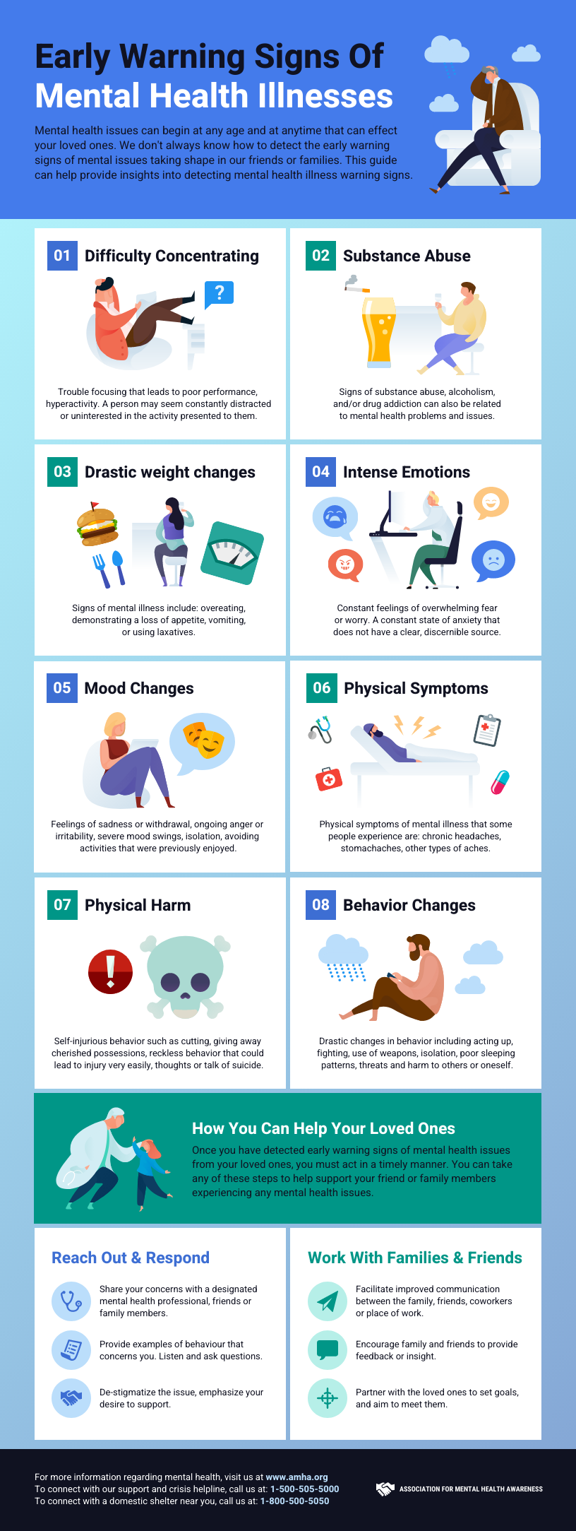

Healthcare professionals want to help patients recognize signs of disease so that medical treatment can occur in a timely, appropriate way.
Infographics like the ones below can help patients better identify when treatment is needed and even learn more about various treatment options.


Patient education about strokes and other diseases saves lives.
By creating engaging, thoughtful infographics, health professionals can equip patients and their families with the tools to take care of their health and get the medical care they need.
Strokes aren’t the only diseases the public lacks adequate knowledge of. Public health and the success of medicine depend on improved patient communication and education. Infographics can make it easier and more effective for important health messages to get through.
And you don’t have to be a designer to begin making them—sign up for Venngage and get started today.


