


Have you found yourself eagerly waiting to attend a concert, or count the days until a food festival?
Well, you’re not alone! As humans, we crave connection, entertainment and a sense of belonging within a community.
Event organizers understand this and task marketing teams to spread the word to attract the maximum number of people.
So how do they do it?
By far, the best method is to create advertisements using a Poster Maker that can be shared online, offline or in both places for maximum reach and exposure.
Not too confident about your design skills? Why not customize one of our event poster templates using our easy-to-use editor tool?
Our professionally-designed event posters have already been optimized to make that music concert or charity fundraiser a hit.
In this post, I’ll explore the various types of event posters, share event poster examples you can use to promote that next gig, conference or exhibition, and show you how to create an event poster.
Let’s begin!
Click to jump ahead:
Why are event posters important?
At a high level, event posters provide a visual and cost-effective way to share information about an upcoming event with an interested audience. Ticketing platforms also use these kinds of informative posters to attract more attendees.
An event poster generally includes the following details:
- Date
- Time
- Venue
- Ticket information
- Contact details
- Featured speakers/performers
- Branding
But these types of posters are more than just advertisements that share information.
Event poster design should be viewed as an art and science that sparks curiosity and entices people to attend an event or share the details with others in their social circle.
Besides drawing attention, an eye-catching event poster with the right layout and the use of colors and fonts creates a sense of professionalism, allowing brands to share their identity.
Moreover, the visual identity of an event can be extended through other materials such as event badges, giveaways, presentations, and access bracelets, all of which contribute to a more cohesive and memorable experience for attendees.
21 event poster examples
There’s no such thing as a one-size-fits-all event poster.
Rather, they vary as a different design is needed depending on the type of event you want to promote.
For example, using cheery illustrations for party posters, an image of the guest speaker for a conference poster or a photo of the star players in a sports poster will ensure success.
As I go through each example, remember you can use each of these event poster templates to inspire your next design.
If you want to skip ahead, here are all the types of event posters covered below:
Fundraiser event poster examples
A fundraising poster or fundraising flyer allows charities and nonprofits to generate interest in events such as galas and charity auctions.
In this breast cancer awareness poster, the use of a symbolic ribbon and colorful pink scheme instantly communicates the main theme.

Another type of fundraising poster is the charity poster.
These posters emphasize the auction aspect and play up the opportunity for attendees to bid on exclusive items or experiences.
The key focus here is to create anticipation and encourage individuals to participate in the auction by sharing details about or showcasing the items up for grabs.

But if an organization wants to recruit volunteers interested in supporting a cause or organization, they’ll need to take a different approach.
A volunteer recruitment poster utilizes design elements that often reflect the spirit of community, collaboration and altruism.
These posters usually include images that depict volunteers in action and showcase the positive impact their contribution has.
The text on these posters should highlight specific roles, the benefits of volunteering and the power of individual contributions.

Business event poster examples
Business posters are used by companies to promote conferences or employee training activities.
A conference event poster can include academic, and scientific posters, or promote workshops.
The most important aspect here is sharing information about speakers, research and topics that will be covered during a conference.
A conference poster focuses mostly on visuals relevant to the academic or professional field.

Note: If you want to share or present your findings, a research poster is what you want.
A workshop event poster helps promote educational or skill-building activities.
These are more targeted and emphasize educational content and hands-on learning experience.
You’ll notice the design of these posters is similar to an educational poster focusing on the theme of the workshop, key topics and the practical skills or knowledge that participants will gain.
These posters feature brand colors and photos that depict the workshop environment, such as images of participants actively learning or working on projects.

Sports event poster examples
A sports poster serves to attract spectators, participants and supporters to a gathering.
The layout includes elements that convey thrill, competitiveness and entertainment associated with a particular sport.
I’m sure you’ve seen football, basketball, a marathon or other sport event posters at some point.
The common theme among these templates is action-packed visuals and vibrant colors, bold typography and striking images that help to convey excitement.
For example, this horse racing poster provides an overview of the schedule that allows attendees to ensure they don’t miss their favorite race.

Unlike a sports event schedule poster like above, the design of a sporting event poster helps promote individual matches or games.
These posters employ graphic elements that zoom in on a specific game or match-up to create an impact.
They are created to emphasize the competitive nature, rivalries or significance of a particular match, enticing fans and spectators to attend or tune in.
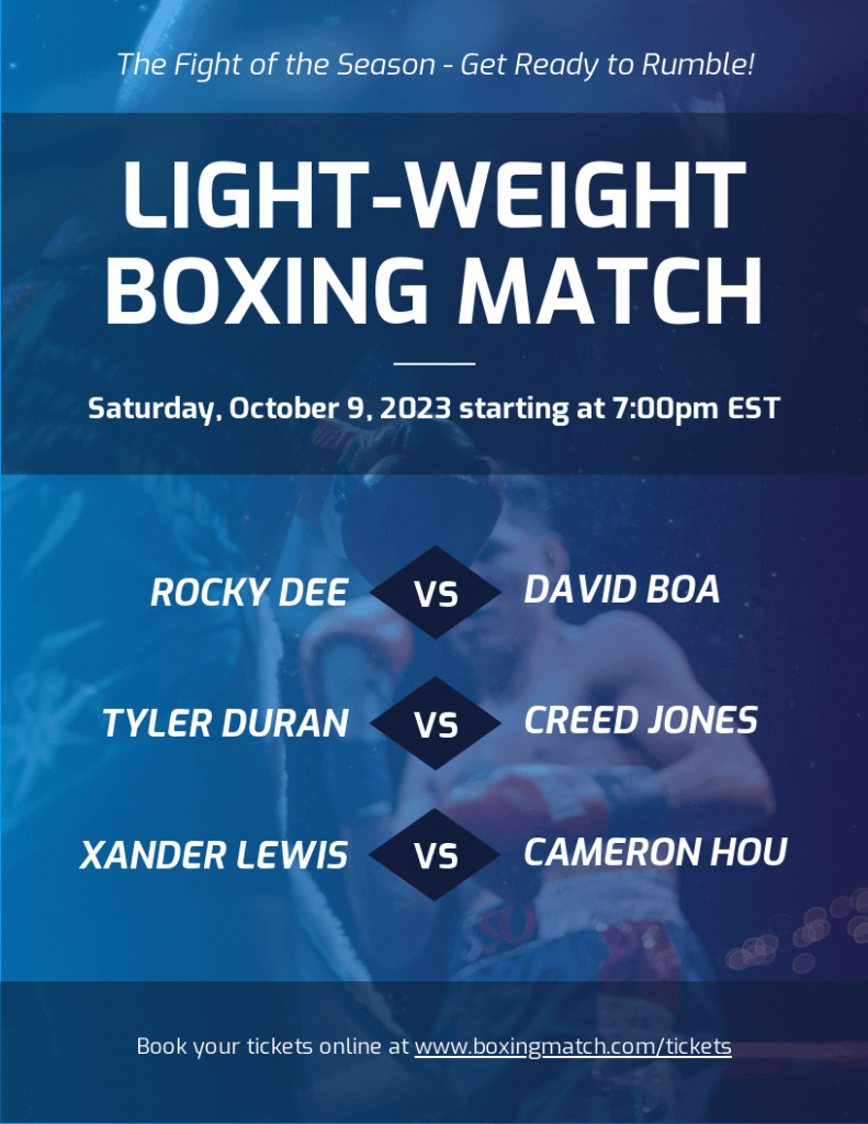
Here’s an example that highlights an individual boxing match:

Music event poster examples
The main goal of music posters is marketing concerts, festivals, live performances or DJ sets.
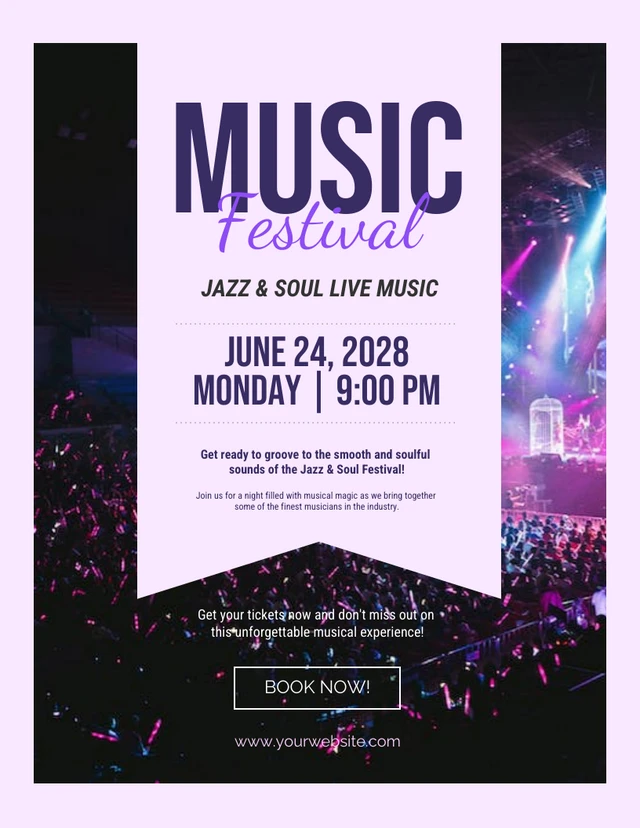
Most music event poster templates use bright colors and creative designs based on music trends to show how much fun an attendee can have like this concert poster.

On the other hand, festival posters promote multi-day events that feature a lineup of artists and performances.
These festivals often span multiple stages or venues and showcase various genres, such as rock, pop, electronic, hip-hop and more.
Live performance music posters are associated with smaller venues like clubs, bars or intimate spaces.
These posters prioritize a specific artist or band and rely on a creative poster design approach.
For example, you’ll often see unique illustrations, hand-drawn elements or experimental graphic design techniques to capture the essence and style of the featured artist or band.

Cultural event poster examples
If you want people to engage in activities such as an art exhibition, film festival, or theater performance, a cultural poster is the way to go.
An art exhibition poster, like in the example below, aims to attract art enthusiasts, collectors and the general public. To achieve that goal, it highlights a sculpture along with the exhibition date and venue information.
A photo poster that includes images of paintings or sculptures is a great way to promote an art event.

Another type of cultural event poster covers film screenings.
Movie posters feature the title and incorporate visual elements from the film itself, such as still images, scenes or artistic representations that capture the tone, genre or atmosphere.
Or like in the event poster template below, the design reflects the cinematography, mood or artistic direction of the film.

Meanwhile, festival posters highlight the festival itself as a whole, rather than a specific event or activity within the festival.
They capture the overall theme, atmosphere, and essence of the festival, like in this example of a Chinese Lantern Festival poster.

Other festivals or holidays where a poster is a great supplement are Halloween posters.
Food and drink event poster examples
Another popular type of event poster is food-related. It includes everything from restaurant openings, food festivals and competitions, wine tastings and similar events.
These posters aim to convey unique experiences, flavors and atmosphere to entice people to attend.
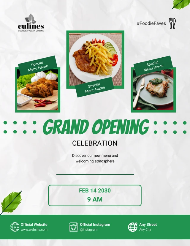
In this restaurant opening poster, a special menu is highlighted for the grand opening. Giving potential customers a glimpse of what to expect is a great way to drive footfall.
A poster focused on promoting cooking lessons require a slightly different approach.
They focus on the educational aspect, hands-on experience and skill development to appeal to aspiring cooks, food enthusiasts and those wanting to enhance their culinary abilities.
Using the ingredients or dishes as a poster background like in this example is a great way to reinforce the theme.

Food festival posters promote large-scale events that showcase a variety of food and culinary experiences.
They often utilize designs that reflect the range of cuisines, food styles or culinary offerings available.
In this example, it’s instantly clear visitors can expect delicious desserts to satisfy their tastebuds.

Fashion event poster examples
Want to promote fashion shows, runway presentations, clothing exhibitions or fashion conferences?
Look no further than fashion event posters.
A fashion show poster is a type of advertising poster featuring striking visuals of models or unique clothing designs to emphasize the glamour, creativity and style of the event. Don’t forget to add the relevant information on the poster like the venue location and date, dress code like stylish cocktail attire for men and gowns for women, etc, to make your posters informative.

Social event poster examples
Social gatherings such as birthdays, anniversaries and other special occasions pop up often on our calendars.
And I’m sure many of us have become insensitive to the generic email invite.
So why not spend a few minutes to do away with something dry and boring and spice up your event invitations with fun and creative social posters?
Trust me, you’ll thank us after.
Birthday posters often use balloons, cakes, candles, party hats or gifts as visual elements to help convey the festive and celebratory nature of the occasion as can be seen in this example.

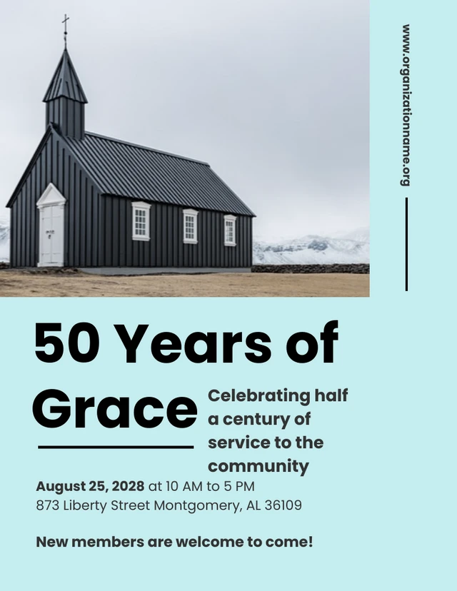
Another type of social event poster is the anniversary poster which promotes the celebration of a milestone.
These posters include details about the number of years being celebrated, such as “10th Anniversary” or “50 Years Of Grace”, like in the example below. They often feature event photography that captures poignant moments, enhancing the emotional connection.
Anniversary posters can incorporate details relevant to the couple or organization, such as including names, photos or moments that hold special meaning to enhance the emotional connection.
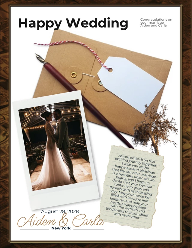
Another popular social event poster is one covering weddings.
These event posters feature details specific to the wedding ceremony and incorporate romantic and elegant visual elements that reflect the theme, style or color scheme of the wedding.
These can include motifs like flowers, rings, hearts or other symbols associated with love and marriage.
How to make an event poster
Now that you’ve seen beautiful event poster designs, it’s time to create your own.
Here’s how you can do it:
Step 1: Sign up for a free Venngage account
Sign up for Venngage using your email, Gmail or Facebook account.

Step 2: Select an event poster template from our library
Besides the templates above, our event poster template library has many other options. You can edit each template with our drag-and-editor

Step 3: Edit your event poster with our easy-to-use editor
Most of our event poster templates are editable using a simple drag-and-drop editor tool that lets you design in minutes, even if you have no design skills.
Step 4: Bring your event poster to life with icons, illustrations, and branding
We have a library of over 40,000 icons and illustrations for you to bring information on your poster to life.
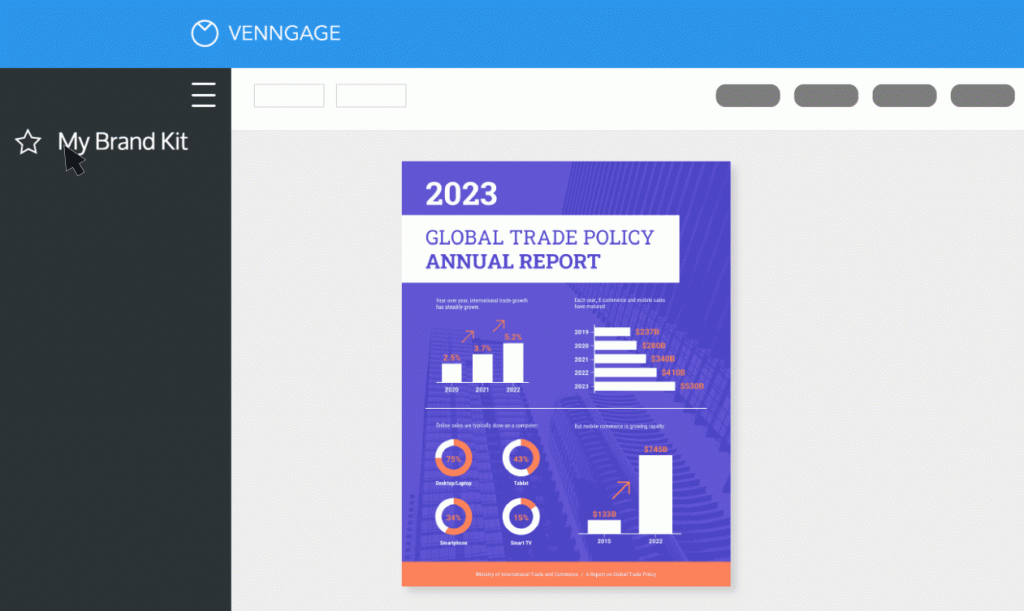
Want even more features? Upgrade to a Business account to access My Brand Kit — a one-click branding kit that lets you upload your logo, brand colors and fonts once and apply it to any design.
Step 5: Share a link for free or upgrade to download your poster
Once you upgrade to a Business account, you can also download your event poster in PNG, PDF, or as an interactive PDF.
In Summary: Event posters are a great way to convey information and spice up invitations to your next event
Event posters are an essential element of event marketing and promotion.
They serve as powerful visual tools and create a memorable impression.
If you’ve made it this far, you’ve seen many event poster examples that showcase the unique design styles, themes and approaches you can utilize to ensure your next event is a success.
So what are you waiting for? Start creating today to promote a music festival, charity fundraisers, cultural events or sports matches, and more.
Or check out our event poster templates to save time and maximize visitors.


