 Creating landing pages that convert is all about clearly expressing your value as soon as possible. This doesn’t mean word vomiting all the benefits of your offer or service onto the page. Nobody wants to read a treatise on the values of your specific brand.
In fact, using too much copy on your landing page will often result in users bouncing away. So, instead of drowning users in endless copy, why not create customizable landing pages that incorporate powerful visuals to emphasize your offer?
A good application of using strong visuals is getting people to engage and signup for contests and giveaways. You know what they say: (insert world’s most cliche quote about “pictures and words” here).
Truth is there’s actually some serious science and psychology at work when using visuals on your page. Studies show that people remember 80% of what they see, while only 20% of what they read and 10% of what they hear. On top of that, content with visuals is usually viewed 94% more than without–that’s nearly double. And these posts, while viewed more, also see 180% stronger engagement. Understanding how to write strong copy is important, but strong visuals will have way more of an impact. 
The stats speak for themselves. So, now you know the importance of using them, here are 7 ways you can increase landing page conversions by using visuals. It even works for building better email landing pages. As you incorporate these tips, remember that a/b testing these changes. will help you understand what works and what doesn’t. Here are some landing page best practices.
1. Be subtle–make your headline less sales-pitchy
Nothing can get a user to bounce faster than a boring, sterile, sales-pitchy headline on your landing page. Show a little subtlety instead of bashing your potential lead over the head with a ham fisted headline. 
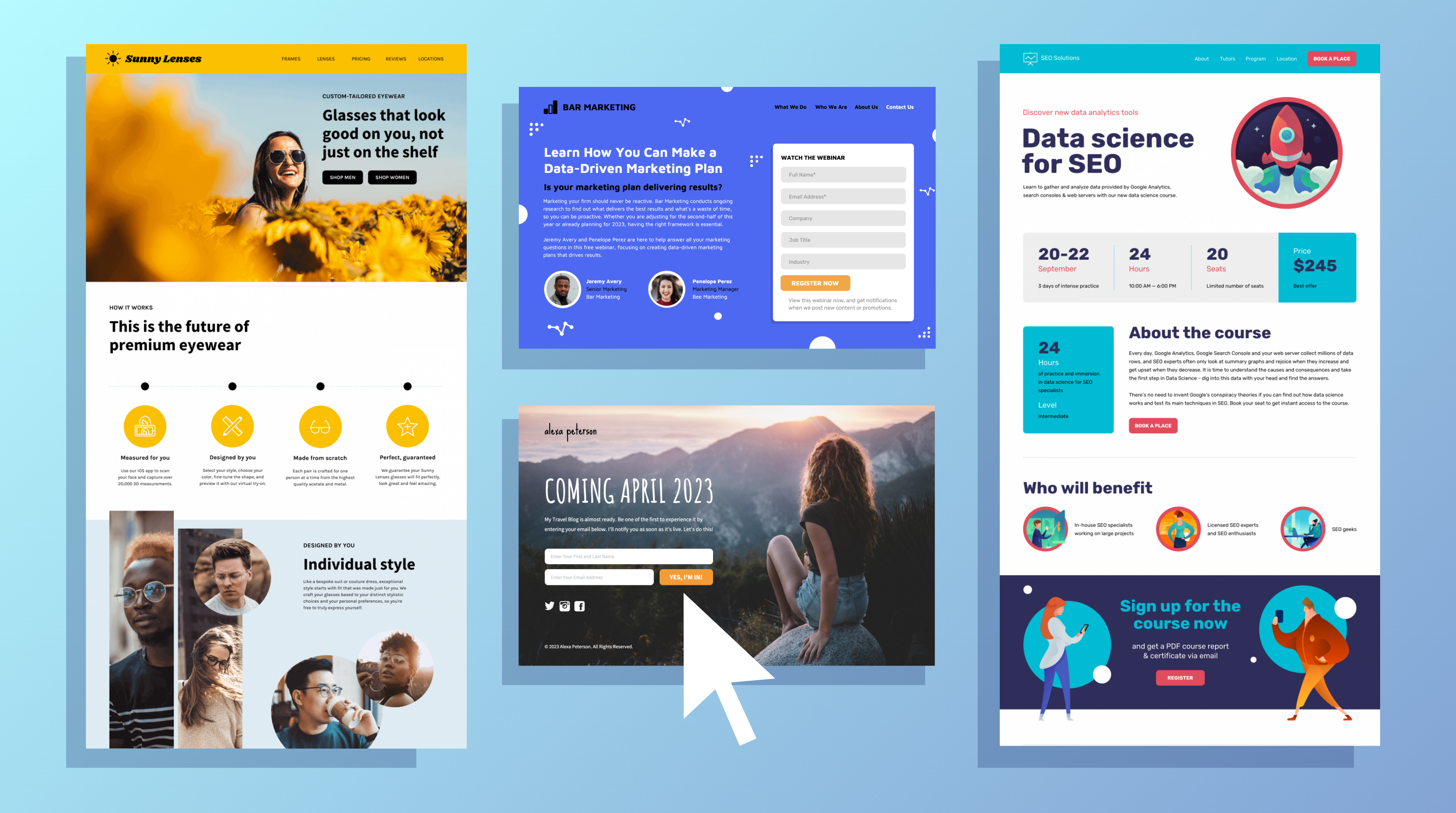
Liven up your landing page with a creative and delightful background image to grab your user’s attention. The image above is a great example of a subtle headline with an attention grabbing image. You can also lighten up the copy in your headline to lower the threat level. Not every user is going to want to convert on their first visit (few are, in fact). Make sure you’re matching your offer to where your user is in your funnel, and leading them back to your site in a more conversion ready mood. On top of that, you can literally lighten the text itself with some transparency (like above). This is a great way to express the value of your offer with some subliminal imagery.
Make sure to keep it relevant to your brand and the specific offer of your landing page. As a rule, relying on stock imagery isn’t going to work. Lazy or average inputs produce lazy or average results. Invest in some unique creative assets and it will pay off.
2. Use color gradients to highlight your offers
Remember Microsoft Word Art? Remember when creating a fancy title on your book report with a rainbow gradient color fill was a guaranteed A? Thanks to Instagram leading the charge with their own branding, color gradients are making a comeback. Using color gradients is a great way to add some eye-catching design to your page if you still want to keep it clean and simple. You can even use complete color overlays to give your page a unique and highlighted quality. 

In the examples above, you can see how the landing page was slightly altered to highlight the product more (as opposed to just plain stock imagery). The color overlay also helps highlight the new imagery and juxtaposes the color of the CTA button, which helps draw the user’s attention away from the yellow towards the purple. This may not seem like a big change. But the results speak for themselves:
-
- Old landing page conversion rate: 6.02%
- New landing page conversion rate: 15.63%
This is more than double the previous conversion rate. And that’s the goal here, after all. You aren’t just trying to show off your design chops to the user. You’re trying to get conversions. So, everything you’re doing in your landing and product page design should be helping you direct their attention towards your CTA.
3. Direct users towards goal conversion with visual design cues
You want to keep your user focused on the goal conversion of your page. But design is a powerful part of your optimization toolkit, and you can use more than just colors to keep your users focused. Yes, there are certain colors that work to encourage action better than others (you can observe some in the chart below). 
But design cues go even deeper than that. Using the concept of lines and shapes to encourage where the user should look and what action they should take is all part of landing page design. Vertical lines can guide the eye down the page while perusing your content. At the bottom, horizontal lines can shoot the user’s eye to the right where you have your form submissions. You can even use more playful lines and shapes to create a lighter tone for your business landing page. 
In the KlientBoost example below, you can see how the landing page copy was pared down and the imagery was improved. Instead of just a random (but cute) squid graphic, the new landing page uses the cartoon to highlight different insurance policies to compare. 
This shows the user the value of converting without boring them with text. It also gets them in the linear reading mindset which primes them for the form submission. Again the results speak for themselves: The new landing page has increased conversions by 13%. Regardless of how you emphasize where the user should look to see your offer, you still need to express the value of why they should convert. That’s where visuals can really start to boost your conversions.
4. Hold user’s attention with real value-expressing visuals
Many digital marketers believe in value-driven copy on their landing pages. Clearly explaining the value of your product or service to your user is a great way to encourage them to convert. But that doesn’t mean you have to stick to jargon-focused or stat-filled copy. Visuals can accomplish a lot more in less time and space. The more pervasive digital media becomes, the shorter user’s attention spans become. This is something you always need to account for.

Another great way to improve your conversions is to get literal with your value. Show them the statistics behind your successes to give them some hard proof on why to convert.
5. Use data visualization to explain complex problems/solutions
Visuals provide you a great opportunity to show your users some hard earned data in an easily digested format. You can see an interesting example of strong data visualization in the infographic below. 
Especially on landing pages, where users are hopefully at least at the consideration stage of your funnel, having these stats can make or break your conversions. The more descriptive your data visualization is, the more powerful the visual will be. For example, you don’t just want a basic image of a graph with some general stats overlaid. Instead, create a custom image with the graph showing what changes were implemented to cause these percentage increases, or a chart dissecting what implementations attributed to the growth. The example below does a great job of explaining the cost vs benefit of outsourced accounting, which could pull in many conversions. 
Make sure you keep the designs playful and enjoyable. These aren’t for a shareholders meeting; these are for boosting your conversions. The more delightfully you can display the hard numbers, the more conversions you’ll see.
6. Leverage easily digested infographics to delight and inform users
When it comes to delightfully expressing hard data, infographics (or gifographics – which we’ll discuss later) are usually at the top of the list. Infographics are a great combination of color, guiding design cues, explanatory text, and data visualization. In fact, infographics can cause a significant increase in engagement and social shares–up to 58% for some brands.
You can use them to help explain how-to processes, or even competitive analyses. You can see a process infographic example below. 
7. Invest in animation (gifographics & video) to better engage users
If you really want to supercharge your infographics for even more conversions, you can insert some animation. In terms of attention grabbing hierarchies, the usual order is color, imagery, animation, and video. So, even the subtle shift from an infographic to a gifographic can significantly boost engagement.
And, ideally, the more engagement you generate early on in your funnel, the more leads you’ll be able to convert at the bottom of your funnel. 
The more interactive your animations are, the more engagement you should see. Especially when so much of today’s acquisitions come from social media, this can be a huge win. In fact, videos take up 26% of the most engaged content on all of social media. Just by scrolling down any of your social media news feeds, you’d notice that video is everywhere. And for good reason. Using video on landing pages can boost conversions up to 80%. This is because it brings a level of engagement and authenticity to your brand. As long as you are following the commandments of quality landing page videos, you should see huge gains. 
Just be sure to invest in the quality of your interactive content. CrazyEgg decided to animate their entire landing page explainer video to have complete control of their content–and boy did it work. This new landing page video results increased conversion rates by 64%. So, don’t passover the importance of video–if it works for CrazyEgg, it can work for you. Remember: don’t sacrifice good work and brand authenticity in an attempt to “wow” your user. Regardless of whether it’s design, images, graphics, marketing videos or animations, quality matters in all content. If you’re interested, Vidyard has a great post you can check out on creating effective explainer videos, including best practices and real examples. On that note, balance your use of visuals, animations and video content with your site’s performance. This website design checklist walks you through how to design a page without comprising performance.
Conclusion: dynamic visuals grow conversions
In the end, improving landing page conversions will come from grabbing (and holding) the user’s attention. It also come’s as a result of efficiently conveying your value to your users in a delightful way. If you’re looking to increase conversions on your landing pages, improve the user’s experience on those pages. How? Well, answer the question yourself: what holds your attention more as you scroll through the web–long paragraphs and opinion articles or a clever video/animation? What makes you consider converting more, boring business-focused text on white backgrounds or a colorful page that jumps off the screen? The answer is simple. Visuals simply do more (with less) than text can in today’s digital marketing world. I’ll avoid the old cliche–but I think you “get the picture.”
20+ Landing Page Examples To Inspire Your Design [+Templates]