


A divide has developed between infographics and data design as businesses, government agencies, educators, marketers and organizations of all stripes continue to embrace the use of visual tools in their communications.
While both infographics and data design are outstanding options and have their place in the visual communications landscape, there are many reasons why nine times out of 10, the better option between the two is an infographic.
What should you know about the differences between these two methods of information design, and what are some ways in which infographics are the superior option to data design?
In this post, I’ll show you how using infographics for data design is a better way to present data and engage your audience in a business setting. I’ll also deliver templates you can make your own right now and customize using Venngage’s Infographic Maker.
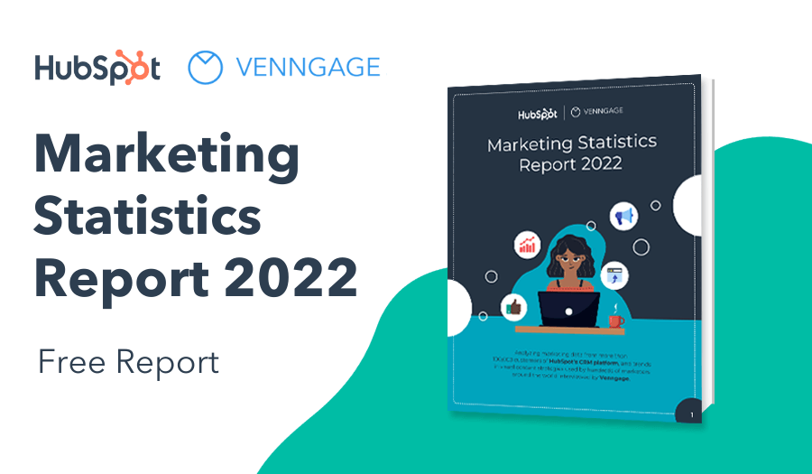
NEW! Introducing: Marketing Statistics Report 2022
It’s 2022 already. Marketers, are you still using data from pre-COVID times?
Don’t make decisions based on outdated data that no longer applies. It’s time you keep yourself informed of the latest marketing statistics and trends during the past two years, and learn how COVID-19 has affected marketing efforts in different industries — with this FREE marketing statistics report put together by Venngage and HubSpot.
The report uses data gathered from over 100,000 customers of HubSpot CRM. In addition to that, you’ll also know about the trends in using visuals in content marketing and the impacts of the pandemic on visual content, from 200+ marketers all over the world interviewed by Venngage.
Grab your copy now — it’s not like any other marketing reports out there, plus it’s 100% free!
Click to jump ahead:
- Difference between data design and infographics
- How to tell data design and infographics apart
- What makes infographics better than data design
What’s the difference between data design and infographics?
Infographics and data design are not one and the same, and it’s often possible to have your cake and eat it, too.
That’s because while both are methods of visual storytelling, many infographics contain data design, which is also known as data visualization.
Charts, maps and graphs are all common forms of data visualization, and they are right at home in just about any infographic.
New to infographics? This video will walk you through what you need to know.
Here is an example of an infographic that kicks off its story with data visualization. In this case, a bar graph compares the relative market share of major computer companies.

Related: What Is Data Visualization? (Definition, Examples, Best Practices)
How can you tell data design and infographics apart (and does it matter)?
To the first part of that question, if you’re looking at a visual representation of a single set of data, it probably is not an infographic.
That’s because one of the hallmarks of standalone data design is that, well, it stands on its own.

As an example, check out this expansive interactive map the New York Times published in 2015 that takes a massive set of data and allows users to explore it at their own pace.
The data set is from the U.S. Census Bureau. It covers population by racial or ethnic group with each dot indicating which group is the largest in a given area. Users are able to learn more about racial segregation in major U.S. cities by exploring the map.
We can revisit the Times for an example of an infographic that includes data design. This infographic used multiple methods of data visualization (line charts, bar charts and pie charts) to tell a multi-part story and illustrate an article about the U.S. economy.

While the infographic as a whole can stand alone, multiple sets of data are used to support the positions taken in the column.
There are also several types of information design at play in crafting that narrative, and, crucially, explanatory text that provides nuance and analysis.
All of these elements are hallmarks of good infographic design, and they are absent in the Times’ interactive map.
Now, to the second part of that question, does the difference between data design and infographic matter? It’s important to understand the differences so that you can decide the best option for telling your story.
Related: How to Tell a Story With Data (A Guide For Beginners)
There are times when standalone data visualization is the best option, but infographics usually have the advantage, and in the rest of this post, we’ll explain the ways in which infographics are the better alternative to data design.
What makes infographics better than data design?
The short answer to this is that infographics use more storytelling methods than data visualization, but there are many reasons to default to infographics even when you have a data-driven story to tell.
This isn’t an exhaustive list, and your mileage may vary, but these are the biggest factors that play into making infographics the superior choice compared to data design:
- Infographics can help tell just about any story
- Emotional connection
- Context
- Pairing different types of content and data
- Calls to action
- Doing the math
- Branding
1. Infographics can help tell just about any story
It’s not a bold statement to say that infographics haven’t met many stories they can’t tell, and their flexibility is the single biggest reason to make sure they’re part of your visual arsenal. The list of infographics that can be created using Venngage is incredibly diverse.
Not every story should be told through infographics, but there aren’t many other modern storytelling methods that are as flexible or have such broad applications for virtually all industries and use cases.
Data design, on the other hand, is vast but largely unchanging. When was the last time someone invented a completely new way to visualize data? In fact, the basic principles of data design can be traced back centuries.

This line graph from 1614 representing all the known (at the time) longitudinal differences between Rome and Toledo (in Italy, not Ohio) is believed to be the oldest surviving example of data design.
But necessity is the mother of invention, and the need for executives, journalists, researchers, marketers, HR, trainers and others to reinvent the infographic form to reach their audience means that infographics will continue to evolve.
2. Emotional connection: Data design can be cold and voiceless
On its own, data visualization often doesn’t tell people why they should be interested in the information being presented.
The act of curating the story that’s being told in an infographic requires the infographic maker to think about the audience at every step, whether that’s a potential client, internal stakeholders or a company’s audience, and engage them in the topic.
Even though it’s excellent overall, the New York Times’ interactive map we looked at earlier does this to some extent. If a reader encountered it without any narrative structure, they may not make an emotional connection to the story.
Infographics using data can combine serious topics with well-curated information to make an immediate emotional connection in a way that data design by itself simply cannot do.

3. Context: Infographics let you weave information into a clear picture
By their nature, infographics require you to include at least some text that gives readers crucial details about the story that’s being told. It’s good practice to include as little as necessary, but that content is crucial for adding context.
As has been said in the realm of religion and politics, text without context is pretext. With standalone information design, you have little way of controlling or even predicting how the audience will interpret or use your data.
For evidence of the dangers of this, we need only look at the nightmare year that was 2020.
The COVID-19 pandemic created the perfect storm for bad data design. This Time magazine article, for example, includes a data visualization that looks terrible in hindsight.

On its own, the biggest takeaway from this data design is that people should have been much more concerned with MERS and SARS than COVID-19.
Telling your story through infographics and data can ensure you’re able to add the details that prevent misinterpretation.
Related: 5 Ways Writers Use Graphs to Mislead You
4. Infographics make it easy to pair different types of content and data
While you should avoid cherry-picking, or excluding information that doesn’t support your hypothesis, infographics make it easy to select the most relevant or interesting bits to include, and they let you layer in many types of content.
In telling your story through data-heavy infographics or informational infographics, you can bring together many types of content to create a single, cohesive narrative. And you can be as narrow or broad in your storytelling as you like, whether you’re presenting a report to stakeholders or creating an infographic for social media or your website.
This data-heavy infographic about racial inequality in the U.S. is layered with many types of numbers and analysis from a slew of sources, and it culminates in an empowering set of tips.

5. Calls to action: Data design often leads to ‘so what?’ moments
When it lives on its own or is shared without any original context or articles, data design can often lead to a reaction from users of “OK. And…?”
Users may not fully understand why they’re looking at the data or what they’re meant to get out of it.
Infographics resolve that problem by including clear calls to action or conclusions that are often stated unequivocally.
The racial equity infographic above is a perfect example of this, ending with a strong call to action. A non-profit could use this infographic to convince their audience to take the step of donating to the Black Lives Matter movement. Or you could convince stakeholders of a certain business initiative or convince your audience why your product or service is the best fit for their needs.
6. Doing the math: Infographics simplify stories
Think back to the New York Times’ interactive map; getting the most out of it means doing some investigative work yourself.
Sure, you can compare neighborhoods manually, but efficiently analyzing that map is beyond the capabilities of mere mortals.
The data covers nearly 5,000 Census tracts in New York City (and a bunch of other big U.S. cities, which each have thousands of tracts). Infographic data that effectively incorporate data visualization does the math for the reader.
What is given up from the expansiveness of data design is more than made up for by highlighting specific findings and analysis that will be of interest to most people.
This infographic uses data that could easily become overwhelming if applied to every country in the world through one big data design. But by highlighting the specific findings the average audience member will find useful, the result is a clear and powerful message.

7. Infographics help reinforce a company’s brand with its audience
When used for marketing purposes, infographics can help reinforce and elevate a brand or corporate culture since a company’s logo and brand identity travel right along with the infographic every time it’s shared.
And when companies use infographics for internal purposes like annual reports, tutorials or guides, they can inspire and educate team members by enhancing traditional methods of corporate communication. Learn more about branding for business in this helpful video tutorial:
Venngage’s My Brand Kit lets companies apply their branding to any template with one click. Add your company fonts, colors and logo and apply them without any design know-how. My Brand Kit is part of Venngage for Business, which includes exclusive templates and team features such as real-time collaboration.
In summary: Infographics are a more powerful way to design data for business
Data visualizations gain their power from big data sets. Infographics are a better way for most people to present the data they have in ways that are easily understandable and engaging.
Infographics are also a perfect way for businesses to convince their audiences of a certain call to action, which can be applied anywhere from marketing to sales to training to human resources to management. They’re a versatile way to tell a story while also presenting hard data to an audience.
Start creating your own infographic today using Venngage’s simple online editor and easy-to-edit templates. It’s free to get started. Once you’re finished customizing your work, upgrade to download (see pricing plans).


