


 When it comes to decision making, data is becoming indispensable for professionals. But translating data into action isn’t easy. First we have to make sense of the numbers, and for that infographics are where it’s at.
Oftentimes, what we’re seeking to explain in an infographic is how things have changed over time. What has been affecting the problems we and our customers have been facing, and how have our decisions thus far impacted us and them?
Did you know there are several options for how we can show changes in data over time? When we are deciding what to include in our infographic, in order to help ourselves and others use data to make better decisions going forward, we need to consider what we most want to emphasize.
Not a designer? You can use Venngage’s easy-to-edit templates and simple online Graph Maker to create beautiful data visualizations in minutes.
Click to jump ahead:
- Showing changes in numbers
- Illuminating factors that drive change
- Explaining stages of a process
- Telling a story
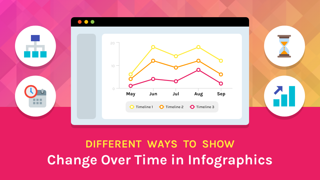
1. Showing changes in numbers
We can create infographics to help us communicate and understand lifetime sales trends, quarterly revenue changes, annual website traffic patterns, employee retention last year, and much more.
When we’re describing how numbers have changed over time, it is essential to use line graphs in our infographics. They’re the best graphs when you need to how changes like how seasonal cycles affect sales and revenue.
Line graphs to show change over time
Here are a couple examples. This one is super straightforward and hyper focused on the data at hand.

This one has more graphic elements, which might be helpful if the audience needs a bit more information and perhaps emotional appeals to develop an understanding of the data. If you are communicating numbers that seem to be difficult for others to take action on, this is especially important.

When you create line charts, keep in mind that you want to include enough data to paint a complete picture. If you are highlighting recent changes, be sure to put this data in adequate context by including as much data over time as you can to make it clear what the data is indicating. If need be, you can create two graphs, one showing a longer time frame and another showing a shorter one.
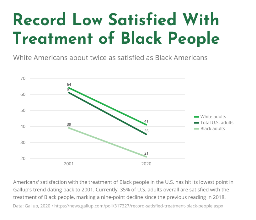
There is one exception to this rule, and that is if you want to focus on only two time intervals (two months, two years, etc.) to compare them to one another. For this, slope charts can be very effective. These charts are also great if you want to show how the ranking of various items has changed over time.
Here’s an example. Notice the years 2002-2019 have not been included, so you can see the change that happened over the past couple decades. Because this data shows a record low, it makes sense to frame the dramatic change in this way.
2. Illuminating the factors that drive change
Numbers can help us see that changes have occurred, but sometimes it takes investigation to determine exactly why. We may want to make infographics to help us solve customer service problems, for process improvement efforts, or to reflect on organizational changes.
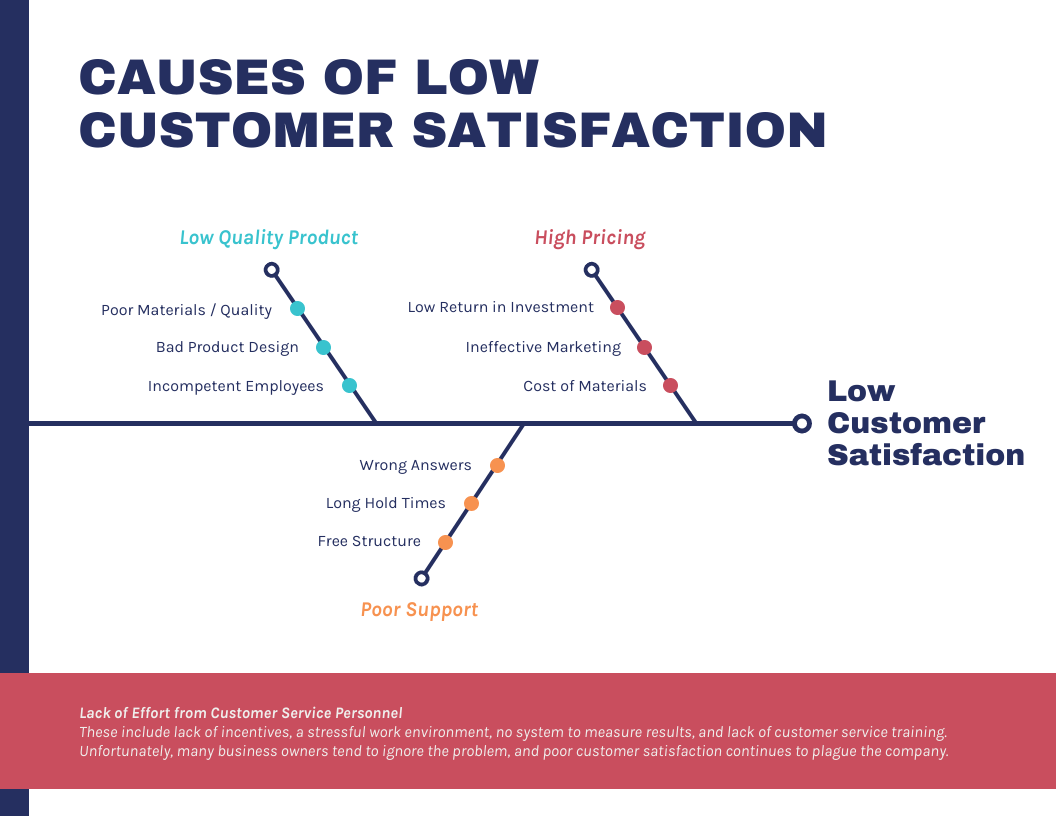
For these types of infographics, consider using a fishbone diagram to support others in understanding causes and effects. You will need to decide what level of detail your audience needs as you outline what to include.
Here are some examples. This first one is very basic, helping the audience get conceptually what is contributing to an outcome.

This next one has a bit more detail so the audience can identify specific things that might need to change to reduce the likelihood of the problem occurring.

This last example of a fishbone diagram has even more detail. This is really helpful if there are multiple contributing factors, and they can be categorized under themes, like “poor support.”
3. Explaining stages of a process
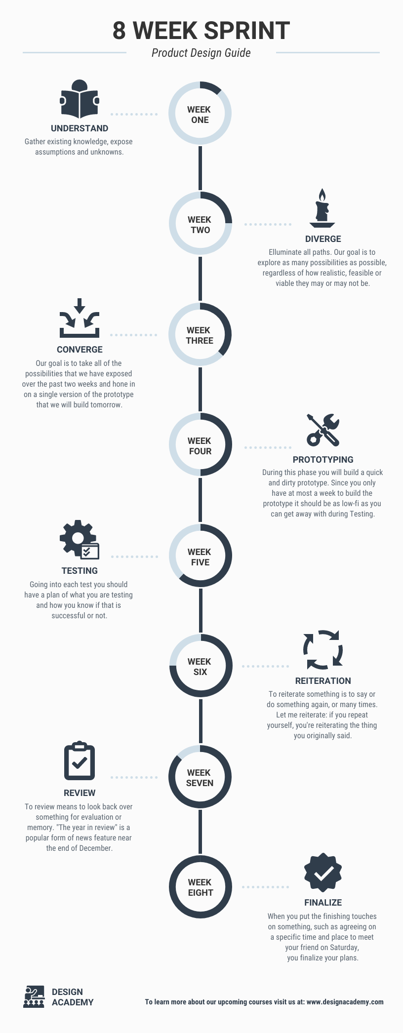
Diagrams are great for helping people see how things unfold over time. Infographics that include such diagrams can be used to explain sales and service processes, project planning, and employee onboarding.
Flow charts are a natural option for outlining stages of a process. They are ideal for showing how decisions impact the way a process unfolds. Make sure the visual flows for its reader from top to bottom or left to right, and use arrows and/or colors to help guide them.
Here is a relatively simple example of a flowchart infographic that would be useful for employees.

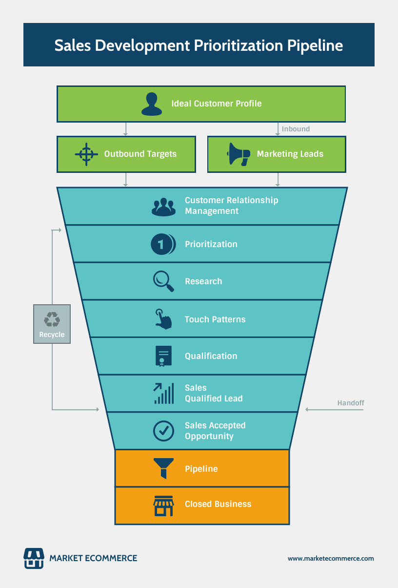
If you want to spotlight a specific goal that a process is oriented towards, a funnel chart will fit the bill. As you’d expect, these charts are generally read from top to bottom.
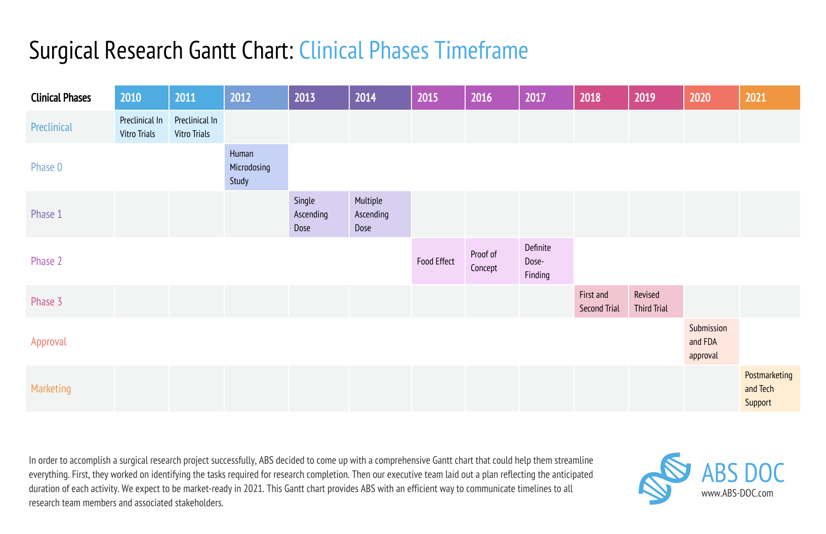
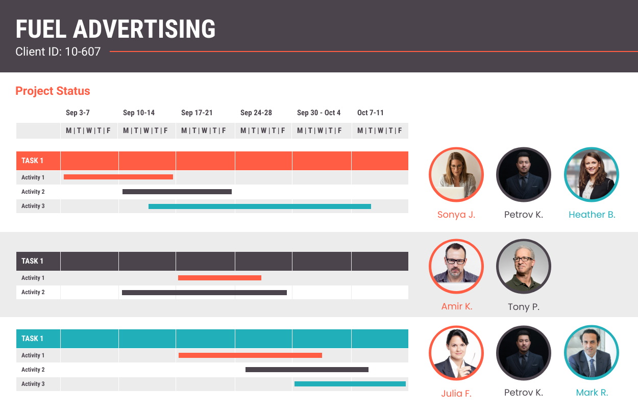
If you need to add more detail, for example about the people and tasks involved throughout a process, Gantt charts are excellent for project management.
This one would help people remember the phases of a project across a lengthy time period.
This one is perfect for showing how different teams and team members are responsible for different project activities.
4. Telling a story
If you are looking for a way to describe and connect events, then you are probably thinking of creating a timeline infographic. These can be useful for retrospectives, for detailing company history, and for showcasing success stories.
Timelines are engaging when they include captivating visuals like photos and icons.
A horizontal format like this one would be great for a large poster. Notice that the use of color helps tell the story.

This one includes fun illustrations, and because it’s vertical it works well for websites and emails.

You can also use data visualizations to show changes over time in your timeline infographics. You can include any of the previously mentioned charts and diagrams to flesh out the story.
Here is an example with donut charts used not to describe data but to visualize the weeks passing.
Excited to get started? Anyone can visualize data with Venngage. Our professional templates and simple drag-and-drop editor make it easy to get started.


