


Want to take your PowerPoint presentations to the next level and truly engage your audience? Infographics are one of the hottest trends in visual content and can be leveraged to create exciting and memorable slide decks.
In this comprehensive guide, you’ll learn expert tips on tools to use, designing compelling slides, and applying the 10/20/30 rule for presentations that wow.
With the right approach, you’ll be able to turn boring walls of text into sleek visual stories that captivate attention. Read on to become a PowerPoint pro!
Step 1: Find the right tool or service
Although Microsoft PowerPoint now has a ton of great options for customizing your PowerPoint backgrounds, they simply are not exciting and engaging enough for many users.
If you’re hoping to take advantage of a variety of charts, pictograms, maps, and diagrams, you will need to find yourself a tool that provides more options.
Venngage
If the idea of having to design an infographic or just create anything for yourself is freaking you out, have no fear! Venngage is a platform that creates custom PowerPoint and SlideShare presentations for you. They also create animated PowerPoint presentations.
I use Venngage all the time. For just about everything. Although it is an infographic maker, I find I mainly use it to make charts and to resize images to a specific pixel width and height. The convenient part about Venngage is that you can resize the canvas to any width and height you want. On top of that, the interface is completely drag and drop, making it easy to add and edit text, icons, and a variety of charts.
Smart Photostock
For backgrounds and relevant images, I use Smart Photostock because it is completely free and has a great collection of photos. There are also a few great websites allowing you to create vector images.
Step 2: Creating your PowerPoint template
Once you’ve settled on a method for creating your PowerPoint or SlideShare presentation, you need to plan out what content you will include. Make the cover image really stand out. It’s the first thing people are going to see, and it determines whether they will continue viewing your presentation, or leave.
The following pages need to sustain your audience’s interest. Most PowerPoint presentations you’ve likely encountered maintain a very consistent layout throughout the entire presentation. They are usually very text-heavy with some cheesy images and animations that get plastered on as an afterthought.
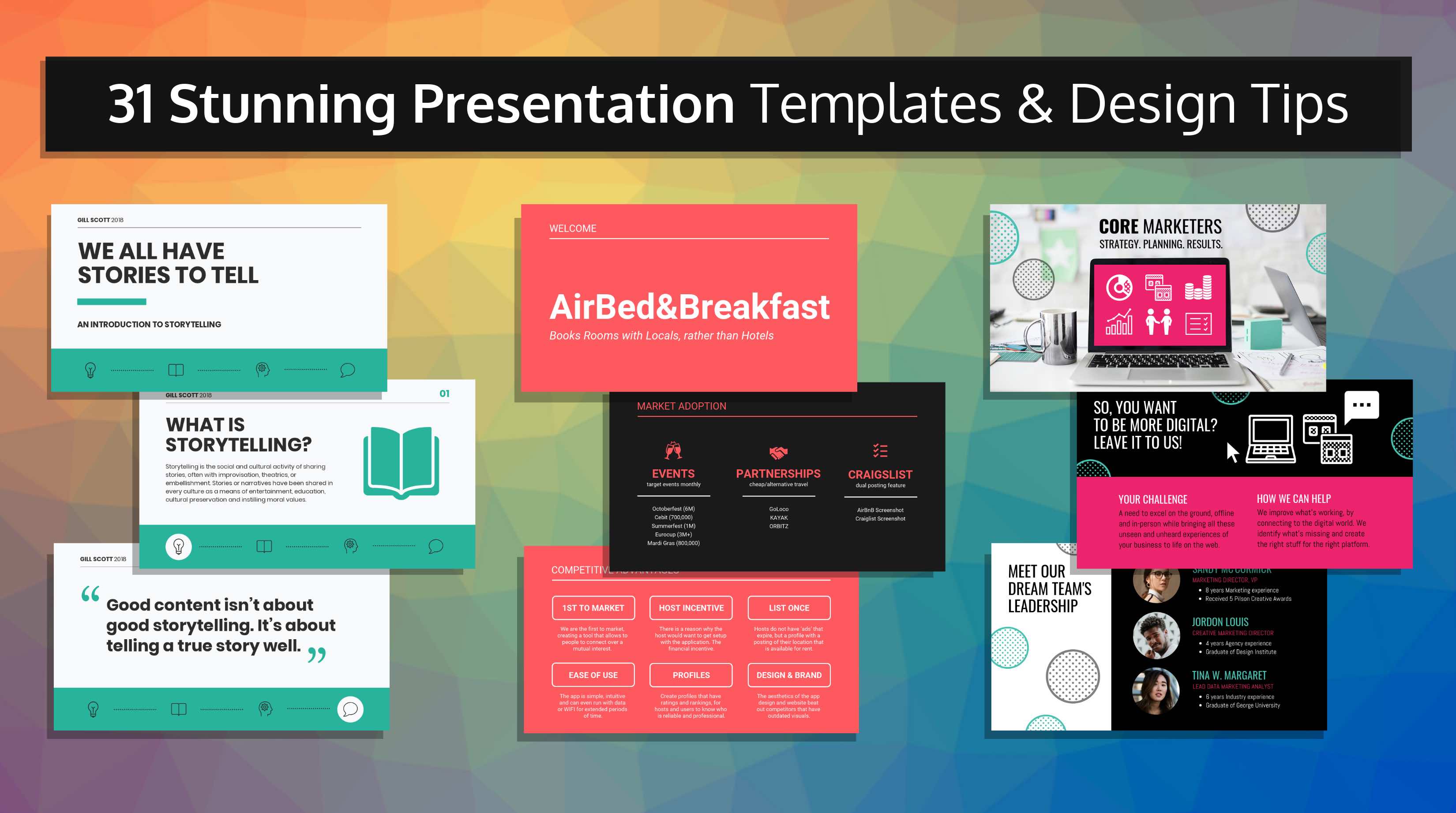
Building a slideshow from an existing infographic
Some common factors of an infographic are:
- They only highlight key data points
- Statistics and data are often represented visually with icon charts and pictograms
- There is a strong element of design and/or illustration
- Visuals are often used to enhance text
- Everything is cohesive and fluid
Many infographics are often laid out in sections or blocks.
Whether or not you decide to use the whole infographic as a slideshow presentation, or whether you just want to pull out a few takeaway points, it’s relatively easy to cut down the sections into visually attractive slides.
Branding is another key aspect not to overlook. Make sure your visuals remind people of your brand and print-on-demand assets.
Including infographic elements into a slideshow:
If you don’t have an existing infographic that you want to convert into a slideshow, you can certainly add infographic elements to your slides like maps and charts.
The key is to make your presentation as visual as possible. After all, only 10-20 percent of spoken and written information tends to stick in a person’s long-term memory, whereas people retain close to 65 percent of visual information.
Another thing to keep in mind is to highlight major data points in your slideshow so that they stand out.
If you are publishing your slideshow online, make sure there are some CTAs embedded, so that it could trigger an action. It is a good idea to track those CTAs in your CRM software.
Step 3: The 10/20/30 Rule
Guy Kawasaki often references the 10/20/30 rule for PowerPoint presentations: a PowerPoint presentation should have 10 slides and last no more than twenty minutes.. Although I agree that twenty minutes is more than enough time for a presentation to last, I think the idea of using only 10 slides really depends on the quality of those slides. If your content is visually engaging, you might get away with a few more slides.
That being said, you should always try to keep your presentations as condensed as possible. Avoid adding filler text and data that isn’t necessary for your audience to know. Just ask yourself one simple question whenever you’re in doubt as to whether or not you should trim the fat:
“Is this point crucial to know, or will my audience still understand the gist without it?”
Besides, if they really do need more information on a specific subject, they can always come and talk to you later.
The point of infographics and slideshows is to provide people with just enough information that they understand the basics of the concept you are trying to teach.
You need to be able to pique their interests to the point where they want to come back to you for more information (this is how you get good and valuable leads). When you make your content easy to digest, people will come back more frequently to intake more.
Final words
It continues to blow my mind how popular PowerPoint presentations still are. I remember making them in high school for every presentation I had to give to the class. Why is it that we are instructed to use PowerPoint presentations every time we are meant to speak before a crowd?
My theory was that most people are just not great speakers, and they need some other means to hold onto their audience’s attention. But the reality is that people are auditory and visual learners, so having something to look at while a person is reinforcing those points through speech, makes the information stick!
So to ensure that your information remains in the minds of your audience, even more, you need to wow them with pretty pictures, fonts, and layouts. It’s the most effective way to keep them coming back for more.
Takeaways
- Use tools like Venngage and SlideModel for easy infographic creation and unique presentation templates
- Structure presentations into visually engaging “blocks” like infographics with key data points highlighted
- Apply the 10/20/30 rule – 10 slides, 20-minute duration, 30pt minimum font size
- Focus on the essential information and use visuals to enhance and simplify
- Infographics and visual presentations boost memorability – people remember 65% of visual info vs. 20% of oral/text
Let me know if you would like me to modify or expand the introduction or takeaways in any way!


