


What’s a geographic infographic?
Well, when you use visuals to capture regional data, you’re basically designing a geographic infographic. Like so:

Aside from highlighting dangerous regions, you may be analyzing global trade patterns, identifying where your target market is located, tracking population growth, presenting the impact of a natural disaster, and more.
When your data has regional significance, there are optimal ways to present it visually.
In today’s post, I’ll touch on the following areas when it comes to designing geographic infographics:
- Start with a geographic infographic template
- How to use maps
- Use different types of charts
- Using icons in your geographic infographic template
- Deciding the perfect color scheme
Along the way, I’ll show you 12 different geographic infographic templates and drop a few design tips. Not a designer? No problem. Venngage’s free Map Maker lets you create compelling maps in minutes.
NEW! Introducing: Marketing Statistics Report 2022
It’s 2022 already. Marketers, are you still using data from pre-COVID times?
Don’t make decisions based on outdated data that no longer applies. It’s time you keep yourself informed of the latest marketing statistics and trends during the past two years, and learn how COVID-19 has affected marketing efforts in different industries — with this FREE marketing statistics report put together by Venngage and HubSpot.
The report uses data gathered from over 100,000 customers of HubSpot CRM. In addition to that, you’ll also know about the trends in using visuals in content marketing and the impacts of the pandemic on visual content, from 200+ marketers all over the world interviewed by Venngage.
Grab your copy now — it’s not like any other marketing reports out there, plus it’s 100% free!
Want to learn more about other types of infographics? Read our blog on the 9 types of infographics or watch the video below:
Start with a geographic infographic template
A geographic infographic can cover a wide range of data. It can be super simple, or very complicated and dry. Whichever the case, the type of data you’re sharing should determine your design approach.
Rather than stare at your screen, waiting to be struck by a bolt of inspiration lightning, start your design with a solid geographic infographic template.
A good template consists of:
- Smart layouts
- Unique design touches
- Relevant chart types
- Icons
At the same time, a geographic infographic template provides plenty of room for customization, additional content, opportunities for branding and more.
So let’s take a look at the different geographic infographic templates you can use.
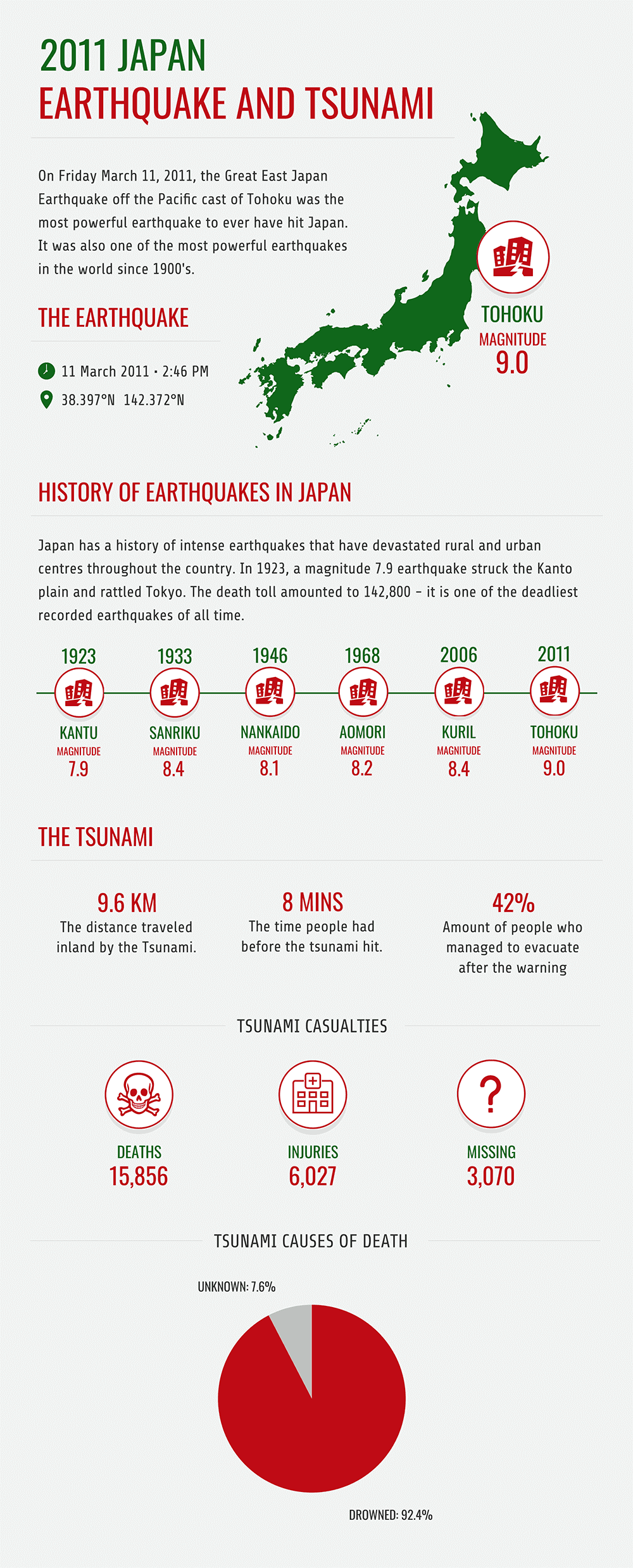
1. How to use maps
If you’re looking at data relevant to different countries, states or provinces, using a map may be an obvious choice. You don’t need to use a map for every geographic infographic, but there are some advantages.
A map can act as a focal point, serve as a reference point for your data, draw comparisons and highlight patterns.
For a detailed guide on how to make map infographics, read our Beginner’s Guide to Creating Infographics with Maps.
Incorporating individual maps
The geographic infographic template below, titled “Facts About Iceland”, is pretty straightforward. A unique shape, the map of Iceland reels the audience in, making it easier to impart Iceland-related facts:
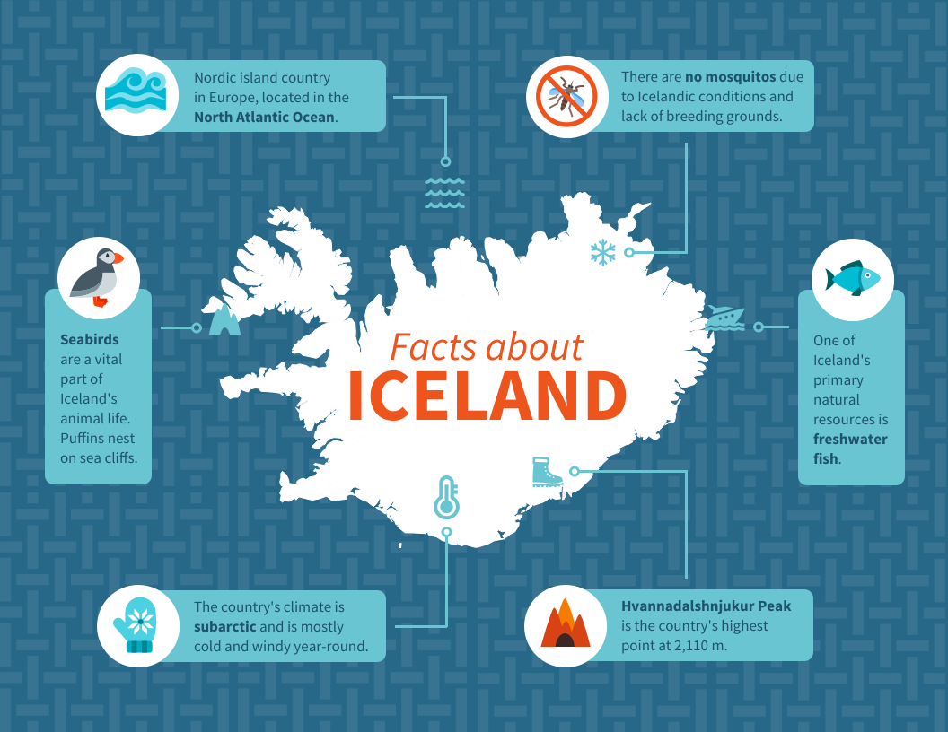
And as silly as it may sound, it informs your audience that you’re describing a country.
Maps for comparison
When comparing countries and regions, you can use maps as a form of reference for your data points:

These maps are uniquely shaped, which attracts the audience’s attention immediately. Also, each map helps your audience connect to your data.
There are other ways of comparing regions. For example, the following geographic infographic template compares data between three countries.
Color-coded markers for each country make it possible to refer to them throughout the rest of the geographic infographic:
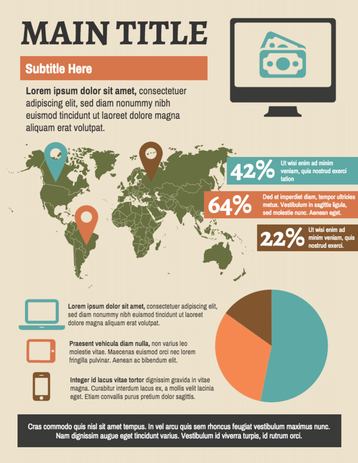
Keep in mind, the color-coded markers only work in this template because there are three countries being discussed. When comparing numerous countries, states or cities, a different approach is needed.
Comparing multiple regions
For comparing states or provinces in a country, you can use a map-chart. A map-chart is exactly what it sounds like, and likely something you’ve seen before.
With a simple color gradient, a map chart communicates the intensity of a trend between regions. The template below is a standard view map-chart in Venngage:
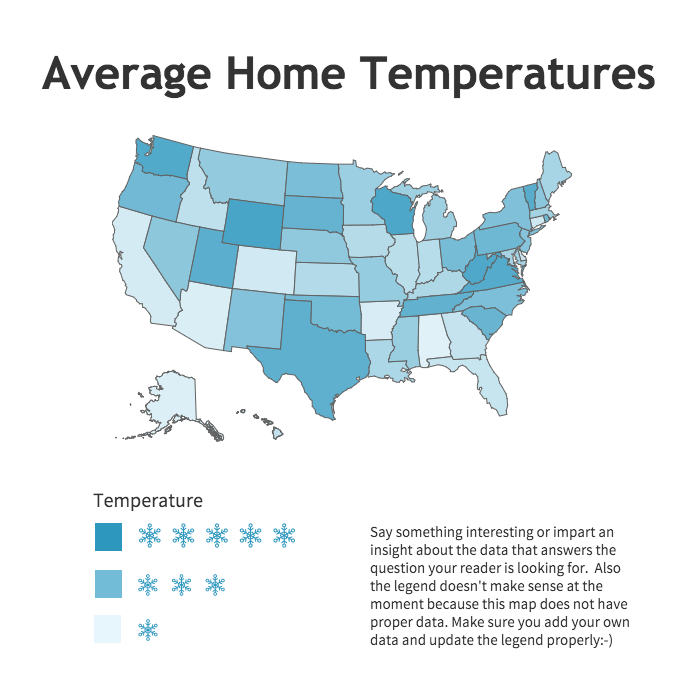
With a map-chart, regional patterns jump right out. At a glance, the viewer sees if states in the west differ greatly from the east, or if southern states differ from northern states.
Patterns that would not be as easily noticed in a bar graph or scatter plot, easily show up in a map-chart!
2. Use different types of charts
To convey the full impact of a particular phenomena, you’ll likely want to use multiple charts. Each suited to tell a different part of the story better than the others.
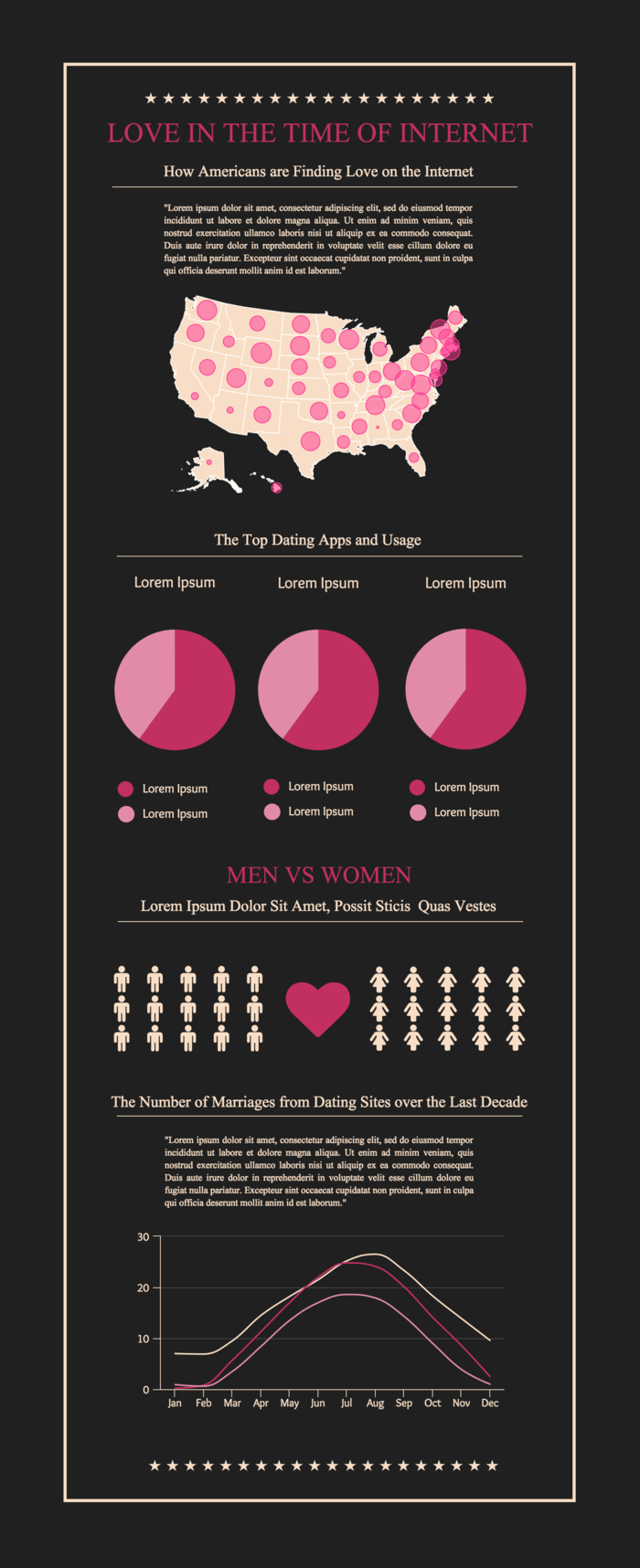
The geographic infographic template below uses several charts that together tell a multifaceted story:
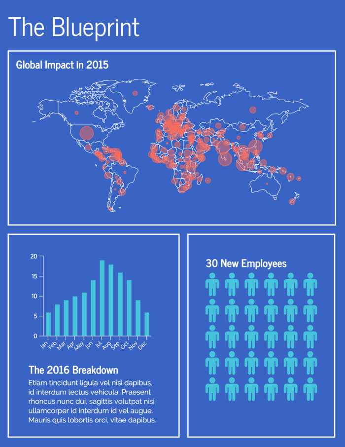
Let’s say there was a zombie virus outbreak. How would the different charts capture the magnitude of this event?
The bubble map demonstrates that Europe, Asia and Africa were hit the hardest by the spread of this virus. Points where the regional data overlaps indicate locations the virus is most prevalent.
The bar graph could be a measure of the number of people turning into zombies each month!
Then the pictograph may represent the number of monthly hires by the Center for Disease Control (CDC) as a response to the viral outbreak.
In this scenario, the different charts of data helps us understand the whole story rather than just parts.
Here’s another geographic infographic template that also uses a similar set of charts to tell a well-rounded, data-driven story:
Choosing to use different charts isn’t just a design consideration. Every type of chart has its own form of data it’s ideal. Understanding how to use charts in your infographic will help you present your data clearly.
3. Using icons in your geographic infographic template
With geographic infographics, using different types of charts is only part of telling your story visually. Understanding how icons help get your message across is still crucial.
Emphasize important information
Pairing icons to different data points helps that information stand out. As your audience scans your geographic infographic, well-placed icons lead them directly to the information that’s most important.
Take a look at this template:
Where do your eyes naturally fall? Mine skim through the content, landing on sections with icons like here:
Icons easily overpower sections of more in-depth information in this geographic infographic template. They intrigue readers, ensuring they spend more time on your content.
This geographic infographic template is a great example of how communicative icons can be. By just using calendar icons, it nearly eliminates the need for text:
![]()
Icons make information memorable
Not only do we process visual information faster, we retain more of it than plain text. Pairing unique icons to core messages helps make our points stick.
Take a look at the template below and each interesting fact it shares:
![]()
Each icon corresponds to the central idea of each fact being shared. While your audience may not remember every typed word, they will remember the connections you create between the icon and message.
A word of caution, throwing icons into your geographic infographic without a plan is a bad idea. If you’re not sure how to approach incorporating icons, read up on the ways to use icons effectively.
4. Deciding on the perfect color scheme
We tend to associate certain ideas, feelings and organizations with specific colors almost naturally. It shouldn’t come as a surprise then that colors are great communication tools.
In terms of themes and feelings, the right color scheme amplifies the message behind your geographic infographic.
The below template focuses on the healthiest countries in the world. It uses varying shades of green to convey this theme:
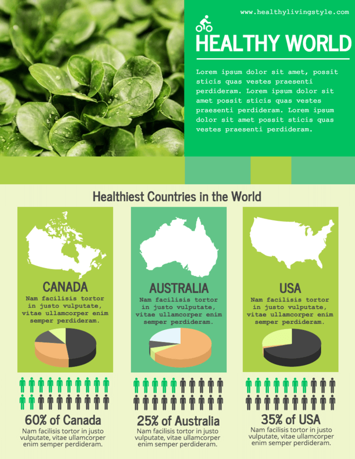
Since green is often a color associated with life, renewal and nature, its application here supports the topic of the infographic.
When the topic is about natural disasters like volcano eruptions, a slightly different color palette would be applied. In the below template, the color palette is derived from the image of an erupting volcano:

In other scenarios, your topic may have specific sets of colors already associated with it, such as a specific brand, organization or country.
In the geographic infographic template below, the data is about England and the color scheme reflects that:
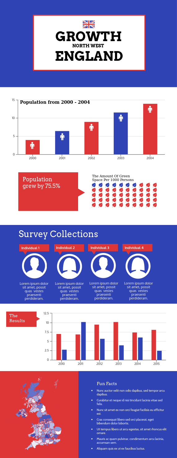
Not only is the choice of colors in the above template a nice design touch, it is helpful for audiences outside of England. The color palette reinforces a regional focus and is simply more relevant to your design than other sets of colors.
Take a look at these alternative color palettes. Are they helpful, confusing or misleading?
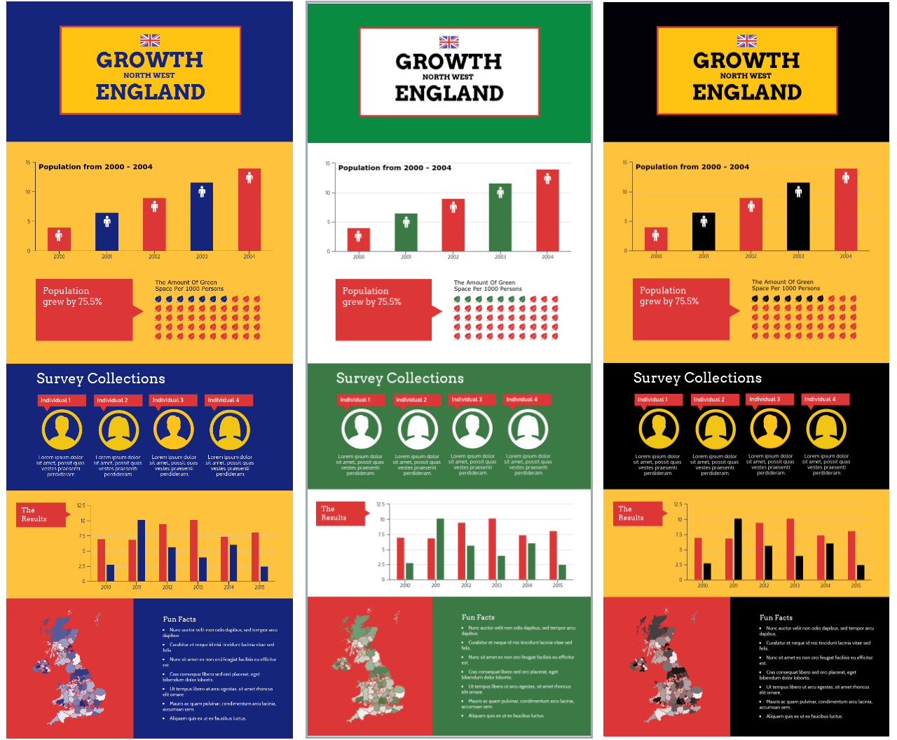
There’s nothing wrong with exercising creativity, but be aware that some color choices will be better than others for your geographic infographic. Better in the sense that they help emphasize your content rather than distract from it.
Conclusion
Now that you have a solid idea of how to design a geographic infographic, it’s time to get started. Browse our geographic infographic templates library to find the perfect template for you.


