You know there are some big ideas behind that spreadsheet — ideas that can help you make better business decisions, like which product to focus your marketing efforts on or how to optimize your training program to get the best ROI.
But it’s hard to draw any concrete conclusions from a dense spreadsheet. To make decisions, you need to extract insights from all those raw numbers.
The best way to go about this is to visualize your data. Yet most data visualization tools are way too complicated, or at least, involve a lengthy learning curve.
Enter Vizdium by Venngage — a simple data visualization tool.
Like having your own personal analyst assistant, Vizdium turns datasets into custom visualizations, so you don’t need to learn how to use complicated pivot tables or business intelligence (BI) tools to uncover valuable insights.
Click to jump ahead:
What is Vizdium?
Vizdium by Venngage — or Vizdium for short — is a smart, simple data visualization tool, designed to help non-analysts gain insights from their data, quickly and easily.
To tell a story with data, it’s best to use a data visualization tool. Yet most tools nowadays are too complicated or require a steep learning curve for non-analysts. Vizdium is here to solve that problem.
How to visualize your data with Vizdium
It’s easy to visualize your data with Vizdium! Even better: you don’t need to register for an account or pay a penny to get started.
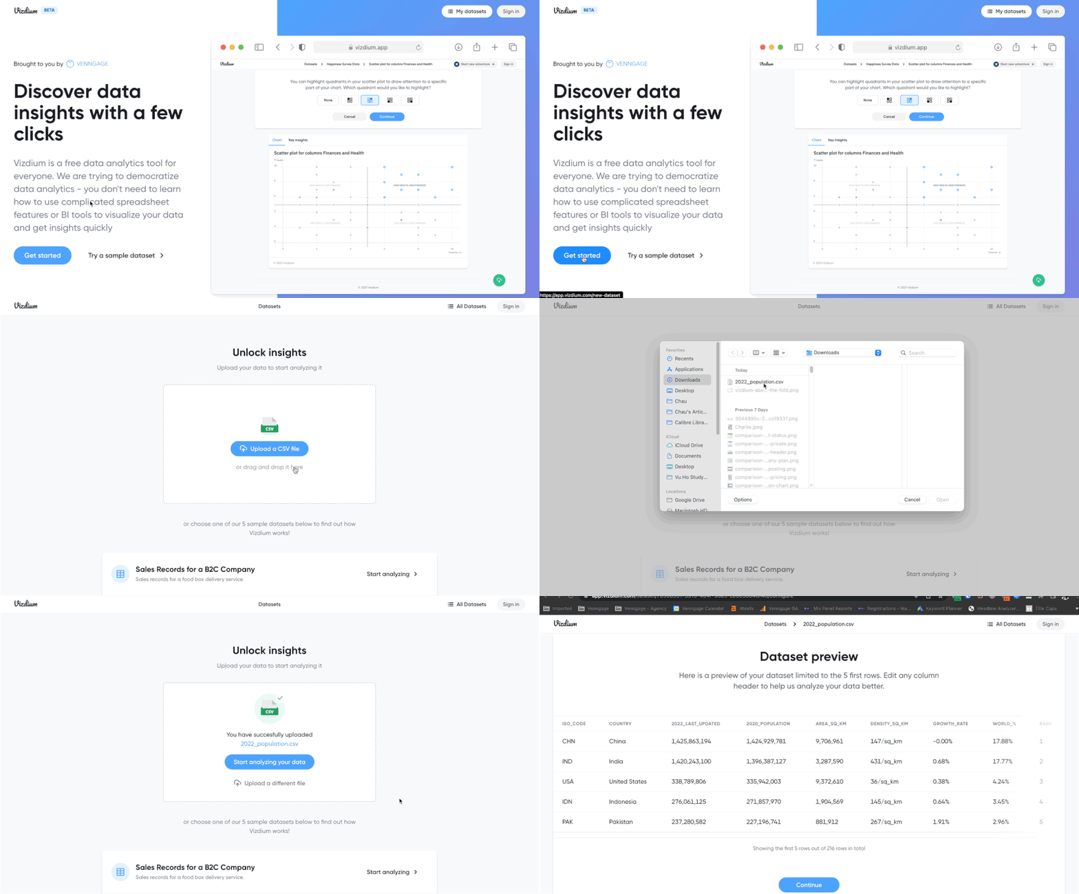
If you already have a dataset you want visualized, great. Click “Get Started” and upload your data in a CSV file. Here’s how I uploaded a dataset about the world population in 2022 to Vizdium:

You can also try out Vizdium by using one of the sample datasets provided:

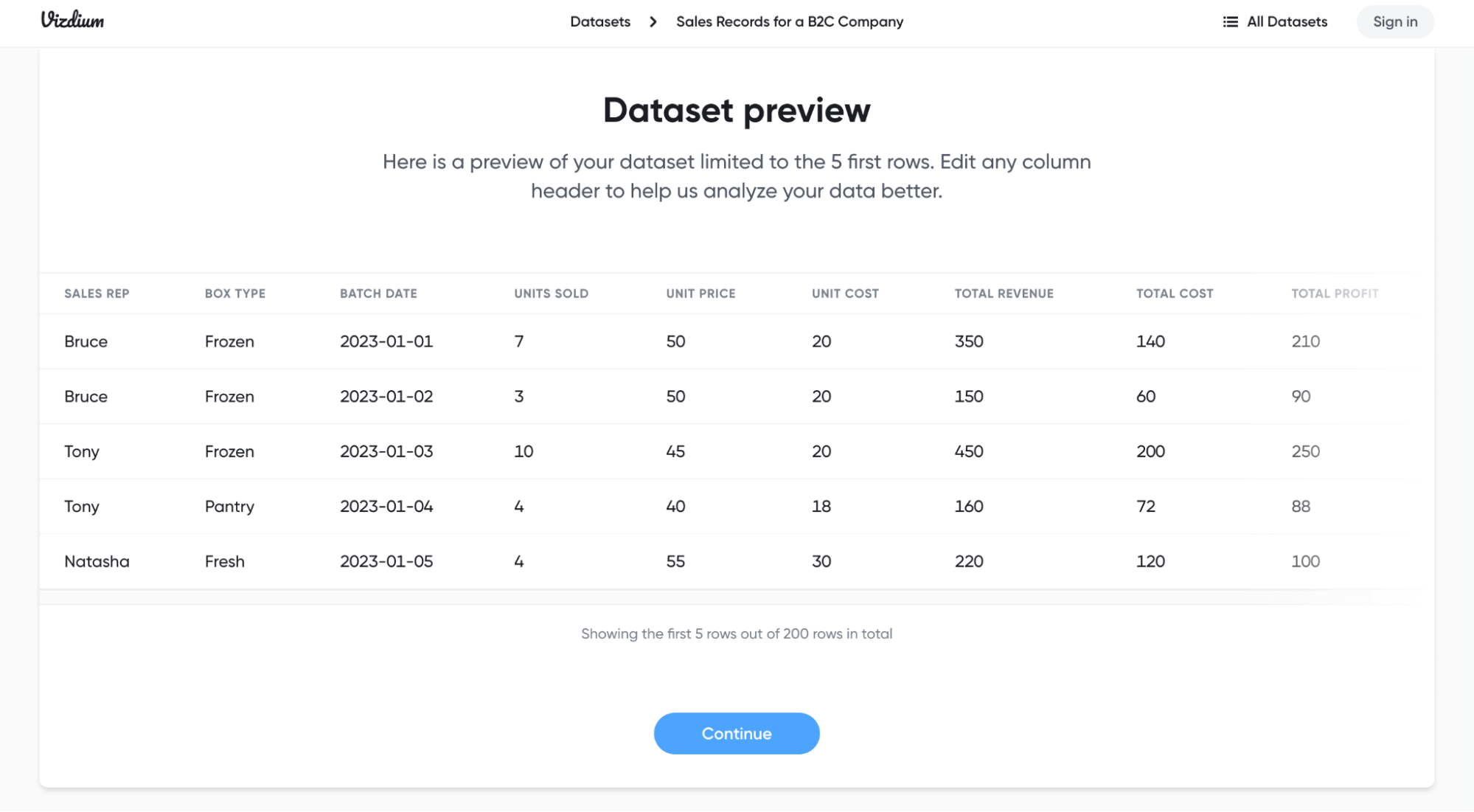
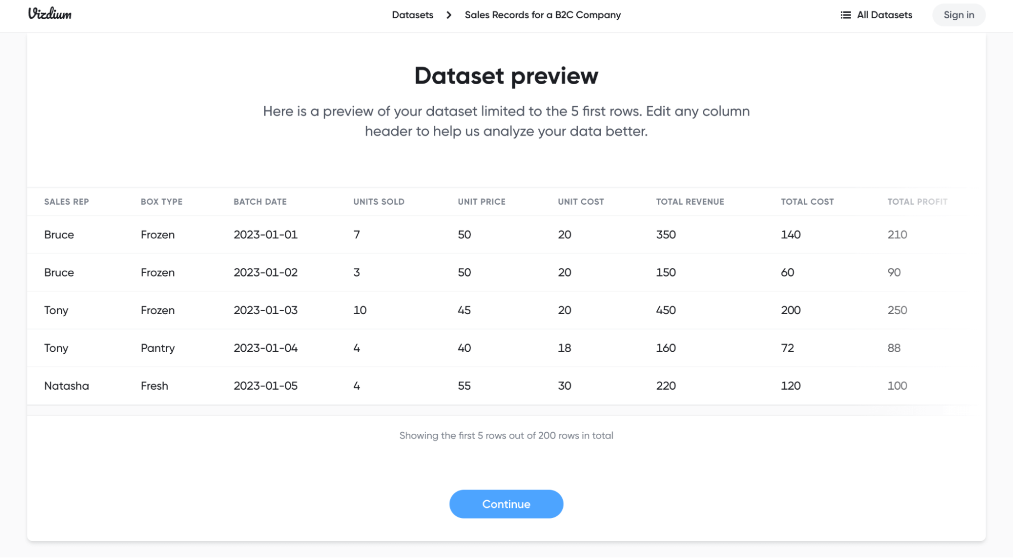
Let’s try visualizing the “Sales Records for a B2C Company” dataset. After clicking the file, you’ll see a preview of the dataset showing the first five rows:

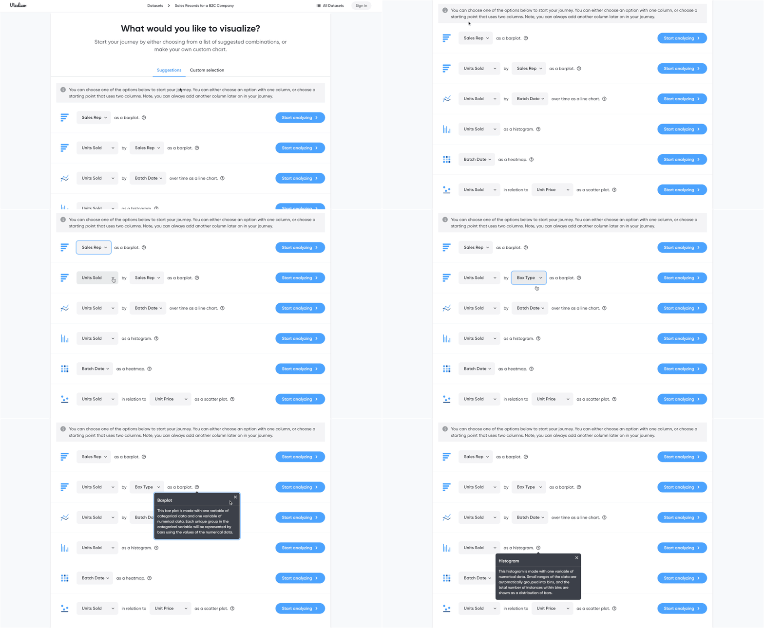
Click “Continue” to start visualizing your data. Vizdium then suggests a list of data visualizations you can choose from:

Notice how you can change the type of data you want to be visualized. If you’re not sure which graph/chart to choose, click the Question Mark icon to learn about that chart type or just click “Start Analyzing” to see how the chart turns out.
Related: How to Choose the Best Types of Charts For Your Data
If you don’t want to go with the suggested data visualizations, you can choose the data you want to visualize by clicking “Custom selection”. Vizdium will suggest a custom chart type depending on the data you choose:

Whether you choose “Suggestions” or “Custom selection”, Vizdium can help you visualize your data in five types of charts:
- Barplot/Bar chart
- Line chart
- Histogram
- Heatmap
- Scatter plot
Now, what if I want to know who among the sales reps sells the most units? To see this, I go with the “Units Sold by Sales Rep as a barplot” option…

… then I click “Start analyzing”. And voilà! Vizdium instantly visualizes the data for me in this bar chart:

But remember: I want to know who sells the most.
It’s pretty easy to see this at first glance with the current graph, but I want that information to stand out. So I choose to draw attention to the max value in the chart…

And just like that, Vizdium highlights the highest number of units sold in blue:

And I know Tony sells the most at 319 units!
Let’s try another chart. This time: a scatter plot.
I want to know if the more expensive the unit is, the less it sells. To do this, I get Vizdium to visualize Units Sold in relation to Unit Price as a scatter plot and it produces this chart:

Hmm, at first glance I’m not sure what the relationship between these two data types is… But this can easily be solved by highlighting the quadrants. I choose to highlight the top left quadrant:

And get this new scatter plot:

As you can tell from this graph, units that cost $50 or more sell the least (less than 10 units).
Surprisingly the lowest priced units ($30) don’t sell the most — it’s actually units priced between $40 and $45 that are most popular (up to 35 units sold)!
Feel free to try out Vizdium and create the other charts — there’s a line chart, histogram and heatmap left in the menu!
Now if you want to download the chart, there are two options. You can either click the green Download icon at the bottom right corner and the Download menu will pop up:

Or you can click “Continue” then “Download”, and you’ll see the same menu:

With either option, you can download your chart in:
- SVG
- PNG — here you can choose the final size of your chart. 3x gives you the highest quality chart image, but it will be the largest size and vice versa.
Here’s my scatter plot with the largest chart size:

Let’s say I want to download my bar chart as well. I don’t need to recreate the chart — instead, I can go back to the Vizdium home page, access “My datasets” at the top right corner and here I can find all the datasets I’ve analyzed using Vizdium:

Next, I select the dataset with the charts I want. In this case, it’s the “Sales Records for a B2C Company” dataset. Vizdium then takes me to a page hosting all the charts I’ve created using this dataset, and I can choose the chart I want to download from here:

Now, I can download my bar chart! Here’s how it looks:

FAQ about Vizdium
Is Vizdium by Venngage free to use?
Yes! Anyone can access and use Vizdium for free. You don’t even need to create an account or share any personal information to start visualizing your data with Vizdium.
Who can use Vizdium?
Vizdium by Venngage is a free, simple data visualization tool for non-analysts. This means that anyone can use Vizdium to visualize data and get insights quickly — no need to learn how to use complicated spreadsheet features or heavy duty data visualization tools, like Tableau or Microsoft Power BI.
Here are just some of the ways you can use Vizdium in your day to day:
Vizdium for leaders and executives
Say you want to know which of your products is the most profitable, or how to optimize your product’s pricing to up your revenue. You can upload a dataset just like the Sales Records sample and create a scatter plot chart with Vizdium to see the relationship between your product’s pricing levels and the amount of revenue gained.
Vizdium for marketers
With a dataset similar to the Sales Records sample, using the same scatter plot chart, marketers could tell which product is the most profitable in order to best focus their efforts.
Vizdium for HR professionals
If you’ve got some data from a happiness survey or employee engagement survey, great. Visualize it using Vizdium and see how your colleagues feel about different company policies or organizational benefits. Then, you can create a better work environment from those insights.
Vizdium for L&D professionals
Learning and Development peeps, we’ve got you! Vizdium can help you visualize statistics on your learners’ performance or how your training programs help them in their day to day. From there, you can update your resources to best engage and assist your colleagues.
Can I use Vizdium with Venngage?
Vizdium is a great addition to Venngage. You can use Vizdium to analyze and see what insights you can get from your data — which is essential if you want to tell a story with data in a Venngage infographic, report, presentation, the list goes on.
And you can, of course, upload your Vizdium chart(s) into your Venngage templates! But if you’d rather visualize your data using one of Venngage’s charts or graphs, you can use Vizdium to see which chart type fits best with the data you have before creating that chart type in Venngage.
Can Venngage users access Vizdium without signing up?
Yes! You don’t need to create an account to use Vizdium, so feel free to use it as you see fit. If you like Vizdium and want in on feature updates, drop your email in the footer form and we’ll keep you in the loop.
Make informed decisions through data visualizations created with Vizdium by Venngage
Vizdium helps you extract insights from your data, quickly and easily — no confusing spreadsheets or BI tools required. The best part? You can use it for free.
Discover data insights with a few clicks and make informed decisions by using Vizdium — get started by uploading your own dataset or trying one of the pre-loaded samples!


