


Most human resource (HR) headaches boil down to one thing — unclear processes.
New hires get lost in a maze of unclear onboarding processes. Employees misunderstand payroll deadlines because — well, lack of clear processes. And performance review cycles? You guessed it.
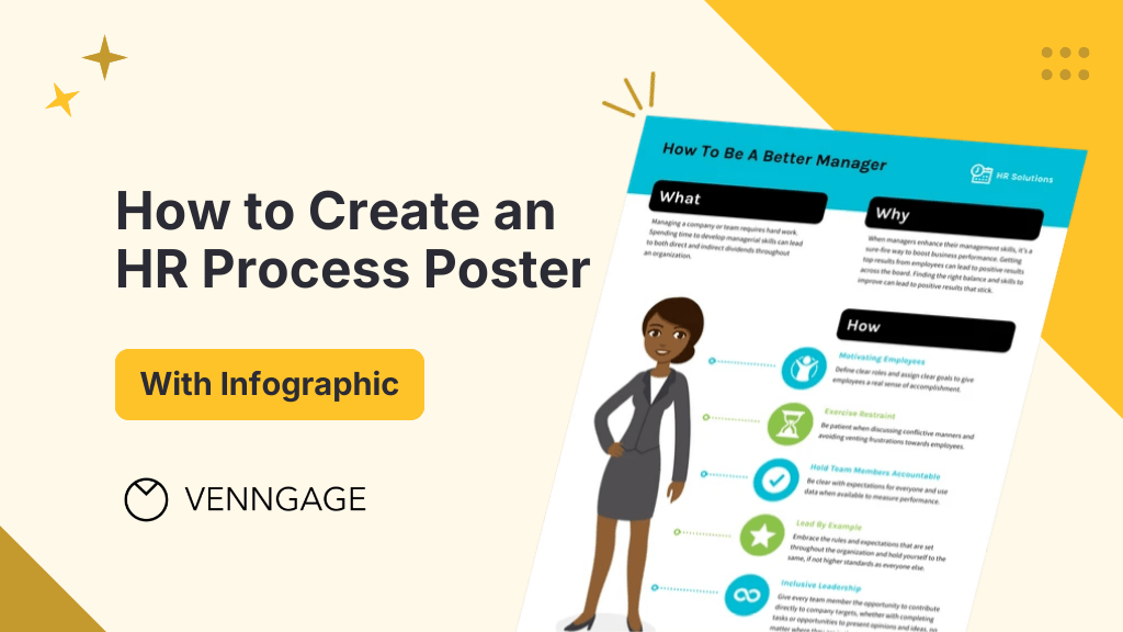
An HR process poster fixes most of these issues by turning complex procedures into clear, visual roadmaps.
But don’t be intimidated by the “poster” or “visual” part of it. You don’t need to be a designer to create an HR poster.
I’m not a designer either but I still made some pretty cool posters for this article. And if I can do it, so can you!
The process is simple. Just choose an intuitive poster maker and use ready-to-use HR poster templates to design a great HR process poster in minutes.
In this guide, I’ll break down the entire process in a step-by-step manner so that you can design the perfect HR process poster every time you need one.
What is an HR process poster?
An HR process poster is usually a one-page document that explains how a specific HR workflow works. It simplifies complex procedures — such as employee onboarding, payroll processing or performance reviews — into clear steps.
An HR process poster is way better than a room full of process manuals. Instead of handing out lengthy manuals or scattered emails, you can give new recruits a visual onboarding checklist to make sure they have a delightful onboarding experience.
HR teams can also streamline payroll-related documentation by using a paystub generator to quickly create accurate pay stubs for employees while keeping payroll records organized and easy to access.
Why does this matter? Studies show that visuals improve information retention by 65%. When you give employees instant access to clear HR processes, you ensure compliance, reduce chances of errors and improve productivity.
Steps to create an effective HR process poster
Yes, you would want your HR process poster to be visually engaging. But you also need to make sure it’s clear and actionable.
Follow these five steps to ensure it communicates critical HR workflows effectively:
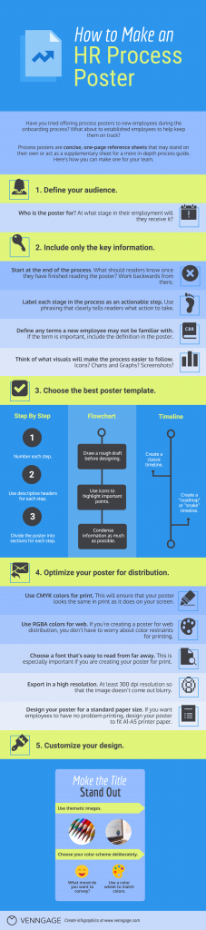
Define your audience
Who will use this poster? Answering the question can make your job of creating an HR process poster a lot easier.
For instance, new hires often need a simple onboarding checklist, while managers may require a performance review template.
Make sure you know who your intended audience is so that you can tailor the design and language to suit their preferences.
Also, decide at what stage you will give employees this poster.
Is it a standard process that every employee should become familiar with during their onboarding? Or is it a new process that you need to introduce the entire team to?
Once you know who your audience is, you will have some direction for where to start with both the content of your poster and the design.
If the poster is for new employees, the information will likely be basic and introductory. You may also have to reference places where they can get more information on specific points.
Generally, a process poster works best as a quick reference sheet that offers the basic outline of a process. The poster should clearly state where employees can go to get more detailed and in-depth information — if the process requires it.
Include only the key information
As a norm, start at the end of the process.
What should readers know once they have finished reading the poster? Figure out the answer to that question. Then work backwards to determine what information employees will need to be given to get to that point.
Next, label each stage in the process as an actionable step.
Pro-tip: always create a draft before beginning your design.
Use phrasing that clearly tells readers what action to take. For example, say:
Create an account on the employee intranet
…as opposed to:
Creating an employee intranet account
Make sure you define any terms a new employee may not be familiar with.
While there are certain industry-specific terms that a new employee will probably already know, there may be certain terms specific to the company or product that a new employee may not know.
However, avoid overwhelming your employees with unnecessary details. Most HR processes involve multiple steps. But a one-page poster must be concise and action-oriented.
Focus on including the most essential actions. For instance, instead of writing:
“Employees must complete Form W-4 to ensure accurate tax withholding”
…say
“Submit W-4 by Day 3 for payroll processing.”
Studies show that users read only 28% of words on a page. So keep the copy in your HR poster brief yet impactful.
Next, think of what visuals will make the process easier to follow.
Since you’re working with limited space, focus on visuals that enhance understanding rather than cluttering the design. Use icons, charts or images to simplify complex ideas.
Icons: Use icons to not only embellish your design, but also to highlight particular points. Check out the best ways to use icons in an infographic design.
Charts and graphs: Not sure what charts to use? Here are tips on how to choose the best charts. Just make sure that the chart style (colors, fonts) is consistent with the rest of your poster design.
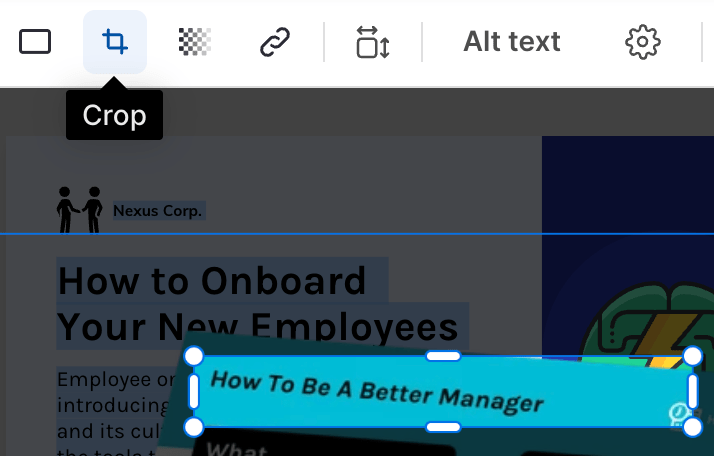
Screenshots: Screenshots show employees exactly what they need to see. You can incorporate screenshots seamlessly into your design by using the Image Cropping tool on Venngage:
Choose the right poster template
Your poster depends on the complexity of the HR process. For instance:
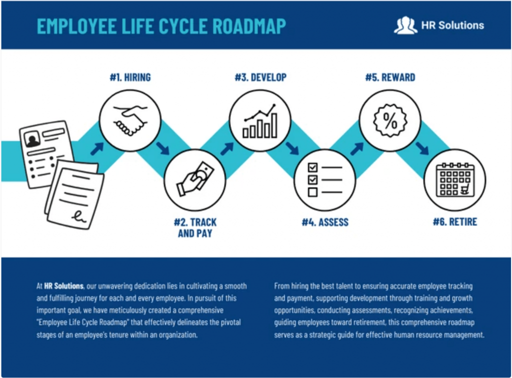
Step-by-step guides are best for linear processes like employee onboarding or offboarding procedures.
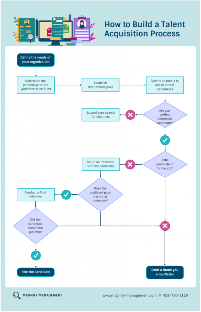
Flowcharts are ideal for decision-based processes, such as leave approvals or conflict resolution policies.
And timelines are great for time-sensitive processes like annual performance reviews or recruitment cycles.
Use Venngage’s poster maker to quickly create any of these formats with pre-designed templates.
Optimize your poster for distribution
Will your HR poster be printed or digital? Digital posters are easier to update and share via company intranets or email. If printing, choose A4 or A3 formats for better readability.
Whether or not you’re creating your poster for print will determine certain aspects of the design.
Certain colors come out wonky when printed. That’s why it’s important to use the right color palette from the get-go, so you don’t get attached to a design that won’t translate properly to print.
Printers use a CMYK color palette (Cyan, Magenta, Yellow and blacK). To make sure that your poster looks the same in print as it does on your screen, design your posters for print using a CMYK palette.
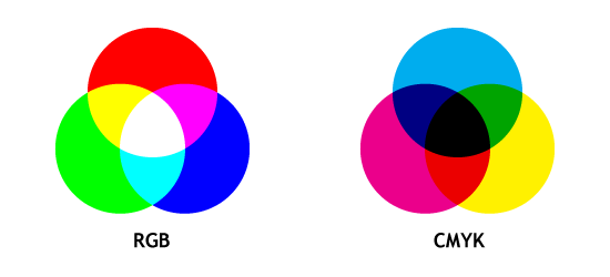
Source: coloring02.dd-dns.de
See the difference?
If you want to optimize your design for both web and print, play it safe and use a CMYK palette.
If you’re creating a poster for web distribution, you don’t have to worry about color restraints for printing. There is a wider scope of RGBA (Red, Green, Blue, Alpha) colors, so you might as well just design in RGBA for a web-exclusive poster.
Choose a font that’s easy to read from far away.
This is especially important if you are creating your poster specifically for print.
Size your fonts between 24-48 points big. Basically, readers should be able to still read the poster (or at least the headers) from a couple of meters away.
I made this very succinct image for my article on creating posters for events and I’m happy to share it again here:
Next, export your poster in a high resolution. This is especially important if your poster is being created for print. Export in a 300 dpi resolution so that the image won’t come out blurry.
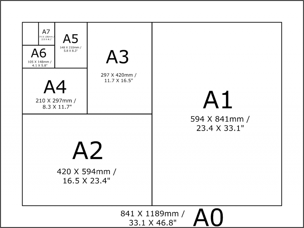
Next, design your poster for a standard paper size.
Creating a long poster means you’ll be able to fit more steps and more information. And that’s fine for web distribution.
The problem is, if an employee wants to print out the poster to pin up in their workspace or to bring home with them, they’ll run into formatting problems.
If you want to eliminate this problem, then just design your poster to fit a standard A1-A5 printer paper.
Source: seia-studio.com
Always save posters as PDFs for compatibility and ensure accessibility features like alt text for visuals to support all employees.
A cluttered poster loses its effectiveness. Use large, legible fonts (at least 24pt for body text), clear icons and whitespace for easy scanning.
Visuals improve comprehension by 400%. Therefore, design elements like arrows, checkmarks and even icons are critical for engagement.
Customize your design
Once you’ve decided whether you’re creating your poster for the web or print, you can get into the fun part: the design.
Here are some tips to follow when creating your process posters.
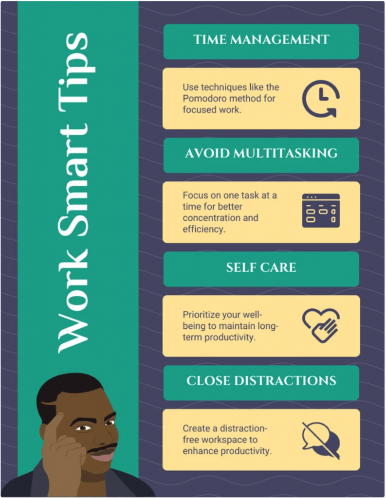
Make sure the main idea in the title stands out.
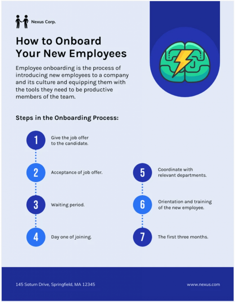
Say your poster is about what new hires can expect throughout their first week on the job. Make the subject the title of the poster and make the font 3x larger than the rest of the title font to ensure that it stands out.
This poster design does it perfectly:
Use thematic images.
A simple hack to spruce up your designs is to use thematic images as your poster backgrounds.
Just make sure the image styles are consistent. For example, don’t use a few images that are in color and a few that are in black and white.
The same principle goes for icons. Don’t use a few icons with bold lines and a few icons with thin lines. Pick one style and keep it consistent throughout.
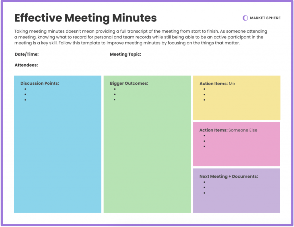
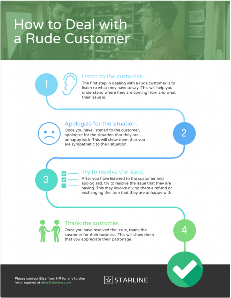
Take a look at this poster about how to safely defuse a situation where an employee is angry:
Next, choose your color scheme deliberately.
Colors have an emotional impact on the reader. Consider the mood that you want your poster to convey when choosing a color scheme.
Light, bright colors are often perceived as energizing and youthful, while darker colors can lend to negative feelings. Pastel and muted shades are often considered soothing.
Best practices for HR process poster design
A well-designed HR process poster simplifies complex workflows and improves compliance, but poor design can lead to confusion. Follow these best practices to create an effective, professional and engaging HR process poster.
1. Maintain consistency in fonts, colors and icons
Uniformity in design elements ensures clarity and reinforces brand identity.
Stick to 2-3 fonts: one for headings, one for body text and an optional accent font. Use a consistent color scheme aligned with your company branding to enhance readability and recognition.
Also, make sure you use icons from the same family — mixing styles can make posters look unpolished. Research by MIT found that consistent visuals improve comprehension by 89%, making standardization essential.
Want to learn more about maintaining a strong brand identity in your designs? Read our guide on how to maintain brand consistency.
2. Balance engagement with professionalism
HR process posters should be visually appealing but not cluttered. Use white space strategically to improve readability and direct focus to key steps.
Incorporate simple graphics, charts or flow diagrams to illustrate processes. For example, a step-by-step hiring workflow with icons for “Application,” “Interview,” and “Onboarding” helps employees quickly understand each phase.
3. Prioritize clarity over decoration
Overdesigning is a common mistake. Avoid excessive colors, decorative fonts or unrelated imagery.
Every design element should serve a purpose, If it doesn’t improve understanding, remove it. Instead of stock photos, opt for custom illustrations or branded visuals that reinforce key messages.
4. Structure information for quick scanning
Employees won’t have time to read lengthy explanations. Use bullet points, numbered lists and bold typography to highlight essential information. Consider adding a QR code that links to a detailed HR guide or interactive training materials.
Related: How to Choose Fonts For Designs (With Examples)
5. Make accessibility a priority
Ensure text is legible at a glance — fonts should be at least 16pt for body text and 24pt+ for headings. Use high-contrast colors to aid readability and avoid relying solely on color to convey meaning (e.g., pair red text with a warning icon).
Digital posters should be screen-reader-friendly and available in multiple formats (PDF, PNG) for easy access. You can choose accessibility-friendly poster templates from Venngage’s accessible templates library.
How Venngage can help simplify HR process posters
Creating an HR process poster from scratch can be time-consuming, but Venngage makes it easy with professionally designed HR-specific templates.
Whether you need an onboarding checklist, payroll workflow or employee training guide, Venngage offers a variety of HR poster templates. These templates are designed to communicate processes clearly so that you can avoid confusion, improve compliance and improve employee engagement.
Here’s an easy five-step process to creating and customizing an HR process poster in Venngage:
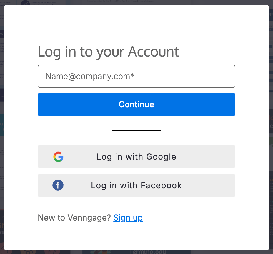
Step 1: Log in to Venngage
Log in to your Venngage account or sign up for a new account:
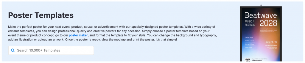
Step 2: Choose a template
Browse Venngage’s poster templates and filter by “human resources” to find the ones that fit your process:
Step 3: Edit text and visuals
Click on any element to update text, colors and icons. Keep the poster copy concise and action-oriented:
Step 4: Add company branding
Upload your logo, use brand colors and select fonts to personalize your HR process poster:
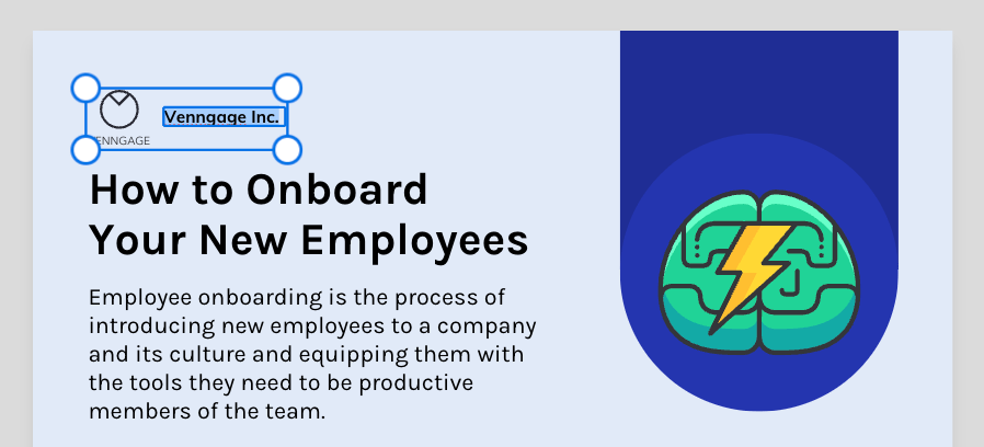
To make this process seamless, use Venngage’s Brand Kit feature to align your poster designs in just one click.
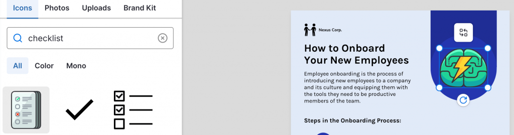
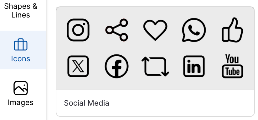
Step 5: Add visuals
Use Venngage’s library of icons and illustrations to make processes more digestible:
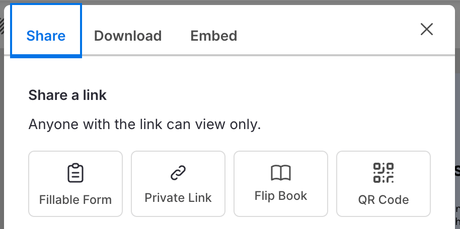
Step 6: Download or share
Download your poster design as PDF, PNG or click on the “Share” tab to get an online link to share the design with others in your company:
Transform your HR processes with visual clarity
HR process posters simplify complicated workflows, ensure compliance and improve employee engagement. Instead of relying on text-heavy manuals, the visually compelling posters do a much better job of communicating key HR processes at a glance.
Want to design professional HR process posters without hassles? Sign up for Venngage and create your first HR process poster now.


