


Politics can be overwhelming. A lot of people would rather not talk about it. Still, it’s a good idea to try and be informed.
The problem is, the political spectrum is pretty massive. Maybe you know the broad strokes about the biggest governing “isms” but get a little foggy on the details.
Luckily, infographics are perfect for making complex information easy to understand. That’s why we’ve pulled together these helpful political infographics to break down these concepts for you.
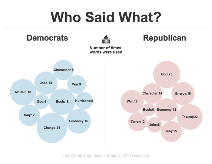
1. Democrats vs. Republican word comparison infographic
What do the two biggest parties in America value? Without reading their platforms, you can still get a sense of their values from which words pop up in the representatives’ speeches. This comparison political infographic uses a word bubble to highlight the most commonly used words by both party representatives.
2. Political infographic featuring cows
Sometimes, complex topics are easier to understand when you explain them using simplified analogies…like cows. Hey, why not? From communism to venture capitalism, this infographic clarifies each concept in an amoosing way (I’m sorry).

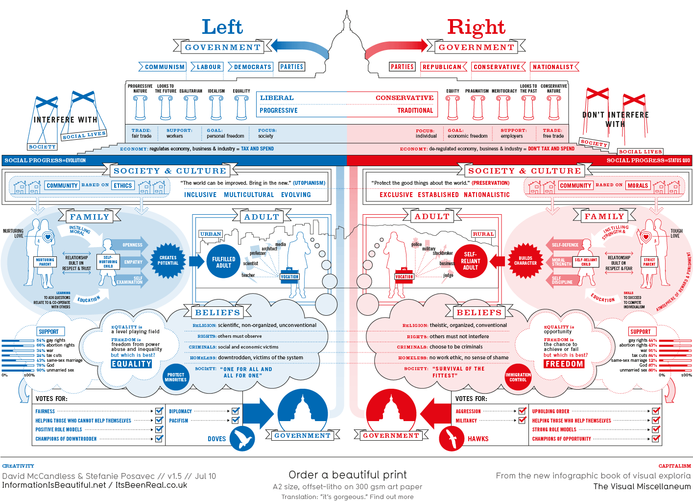
3. Liberals vs. Conservatives comparison infographic
Many people sit on opposing ends of the political spectrum. If you’re someone who doesn’t know where you fall, then this political infographic can help you figure out which party aligns with your values.
4. Capitalism, Socialism and Communism comparison infographic
Here’s another comparison infographic to help you identify the differences between political systems–this time, capitalism vs. socialism vs. communism. This political infographic uses illustrations to make each concept easier to understand.

5. Massive and detailed communism infographic
The history of communism, including its major players and countries, all in one infographic? Yep. This infographic is a great quick reference sheet if you want to learn how communism arose and what it looks like today.

6. Infographic explaining the Declaration of Human Rights
You’re a human (I’m assuming). Do you know what all your rights are? This is information everyone should know. This simple infographic breaks down the 30 articles of the Universal Declaration of Human Rights. Read and be informed:

7. Characteristics of Fascism infographic
We’ve all heard of Fascism, but what defines it, exactly? This simple political infographic identifies 14 characteristics of Fascism, as demonstrated by past Fascist governing bodies.

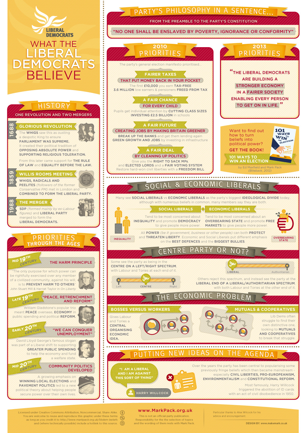
8. Liberal democrats belief system infographic
What do liberal democrats value? This infographic breaks down the major values of this political identification. It also compares their priorities over the years–after all, as the social and economic landscape evolves, so should political parties.
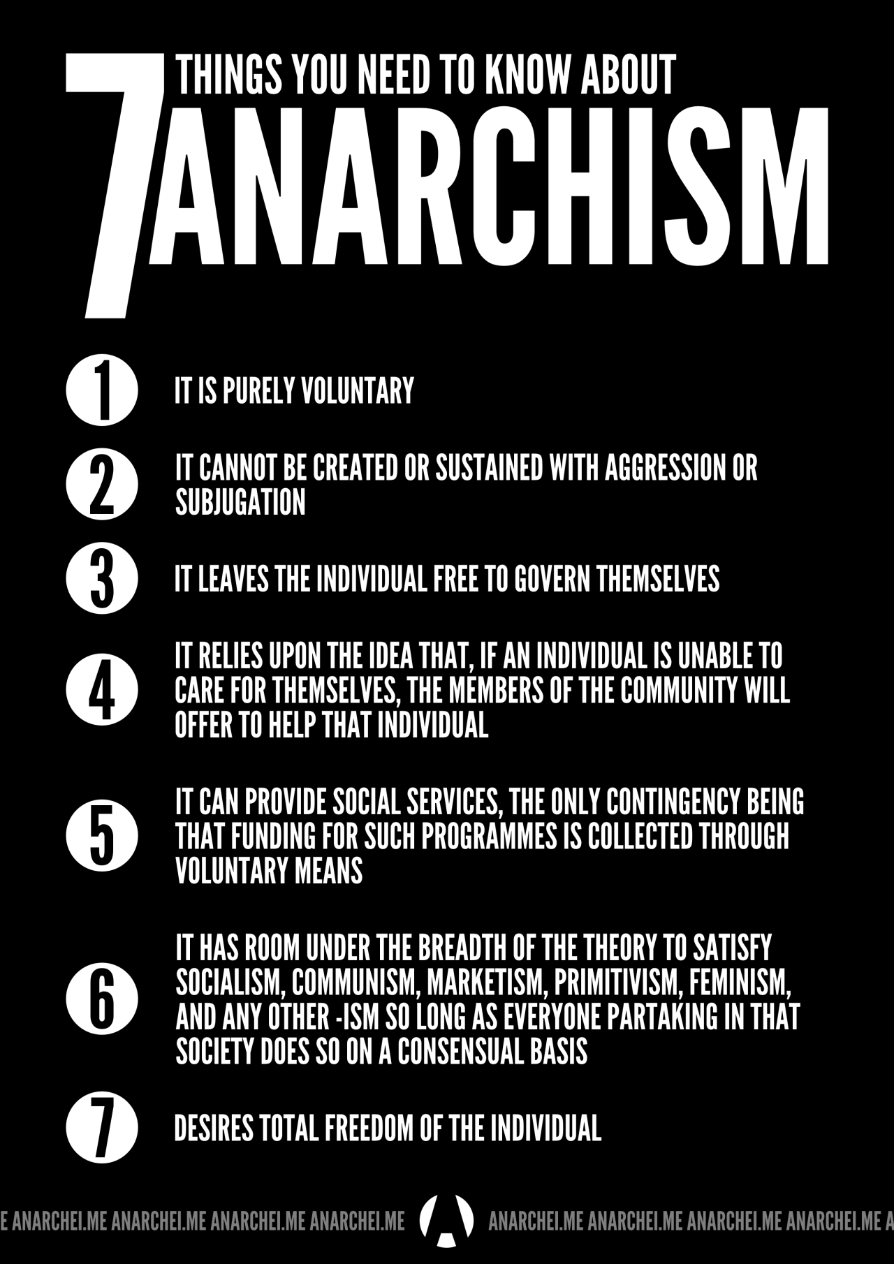
9. Anarchism facts infographic
Many people understand “anarchy” as it’s used to describe a state of disorder. But fewer people understand the fundamentals of anarchism as a political movement. This simple list infographic breaks down anarchism into 7 fundamental characteristics.
Remember, knowledge is power!
Also Read: 14+ Infographics That Will Make You A Literary Wizard


