


You’re producing content every month, sometimes a lot of it. You’re sharing valuable, actionable insights through these content pieces. And yet, the metrics leave you wanting for more.
You think your brand is adding value to your audience’s lives. Still, it doesn’t get as much attention as your competitors.
It’s a reality most marketing teams are going through right now.
And let me assure you, your strategy is not the problem here. The problem is that everyone else is doing the exact same thing.
We’re living in an information age where signals trump noise.
When everyone’s saying something valuable, what matters is how you say it. That’s where visual communication becomes a serious advantage.
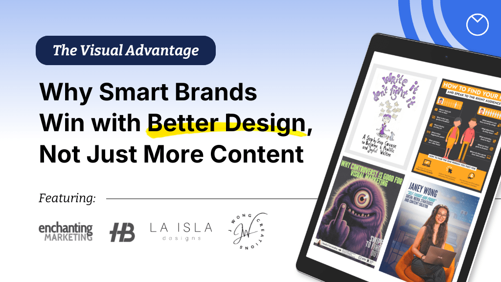
We talked to marketers and designers like Nadia Fernandez, Henneke Duistermaat, Janey Wong and Hristo Butchvarov to understand the power of visual communication
In the following sections, I’ll share insights from these experts and share examples of how ambitious brands use visuals to improve brand recall and engagement. You’ll learn practical ways to integrate visuals into your marketing, backed by expert thinking and real-world examples.
What is visual communication (and why does it matter)?
Visual communication, is the use of visual elements, such as images, symbols, typography, colors, illustrations and layouts, to communicate in a way that’s easy to understand and engaging for the audience.
But that’s a limiting world-view of visual comms. It sits at the intersection of design and marketing trends and uses data-driven personalization and immersive storytelling to shape brand perception and influence buying behaviors.
Henneke Duistermaat, founder of Enchanting Marketing and a seasoned writing coach, puts it perfectly:
“I learned that illustrations are much more than decoration. They communicate and reinforce ideas, helping people to comprehend and remember.”
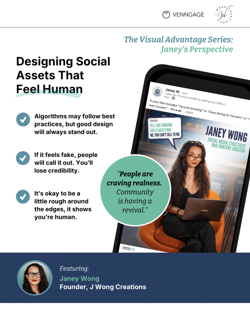
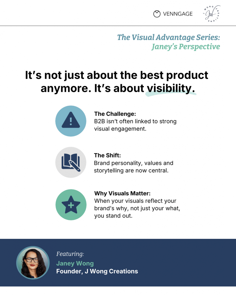
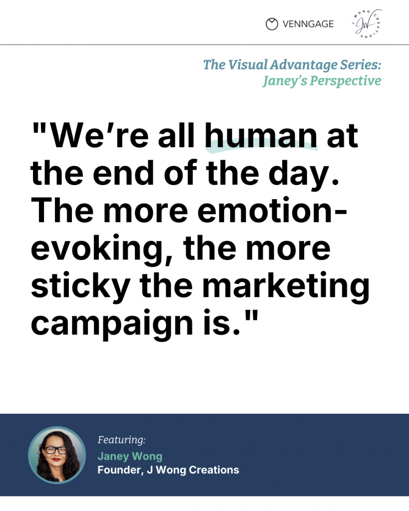
Visuals also convey who you are. Janey Wong, founder of J Wong Creations and a social media content creator, stresses that brand values must shine through design:
“Your brand values and personality need to show up… what better way to express that than through smart, intentional design?”
Visual communication is a direct channel for your brand’s “why”…a way to tell your audience what you stand for.
Consider Airbnb’s design-led growth, Apple’s obsession with design aesthetics or Nike’s visual storytelling that turns products into cultural symbols.
These brands have used visual comms to achieve more than just brand recall. They have built an enviable brand reputation.
Visual communication uses various forms like infographics, report visuals, presentations, diagrams and templates.
With the rise of Gen Alpha, who are digital natives and inherently visual learners, the importance of visual communication will only intensify.
Brands must integrate visual strategies across all communication interfaces to stand out and stay relevant.
Related: Design and Marketing Trends Predictions vs. Reality
The clarity gap in modern marketing
You must have seen this play out around you. A lot of brands with great products, solid messaging and a reliable stream of content still struggle to gain traction.
Why? It’s an issue nobody actually talks about: The clarity gap.
Brands might attribute their lack of traction to fierce competition, economic downturns or other factors. But if they take the time to acknowledge and fix the clarity gap, they will emerge triumphant to a great degree.
“Clarity always leads. If someone can’t understand the message in seconds, no amount of personality will save it.”
Nadia Fernandez
Let’s dissect what this clarity entails.
Why even good products fail to cut through
Look around you. You’re probably swamped with hundreds of notifications every day in your Slack, email and LinkedIn. All vying for your attention.
It’s the same for your audience. The digital landscape today resembles a 24/7 marketplace buzzing with noise clamoring for attention.
In this attention economy, your primary competition isn’t another brand in the same domain. Instead, it’s everything that distracts your audience.
If your message isn’t immediately clear or visually engaging, people scroll past it like cars pass billboards on the interstate.
Most brands still produce text-heavy content to market themselves. They unwittingly overlook the power of visual branding strategies to make an impression. And that’s where the cracks begin to show.
Related: How to Improve Newsletter Design: 5 Mistakes to Avoid
The attention tax of bad design
Poor design imposes an attention tax on your audience. When visuals are generic, inconsistent or cluttered, they require more cognitive effort to process information.
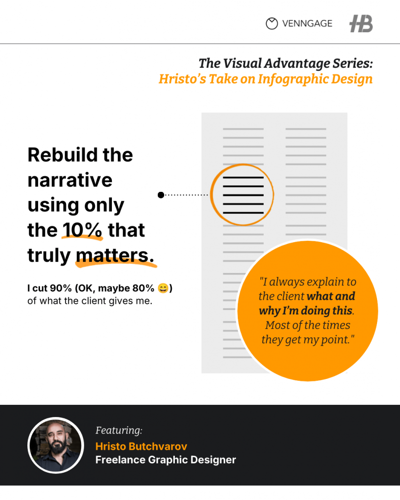
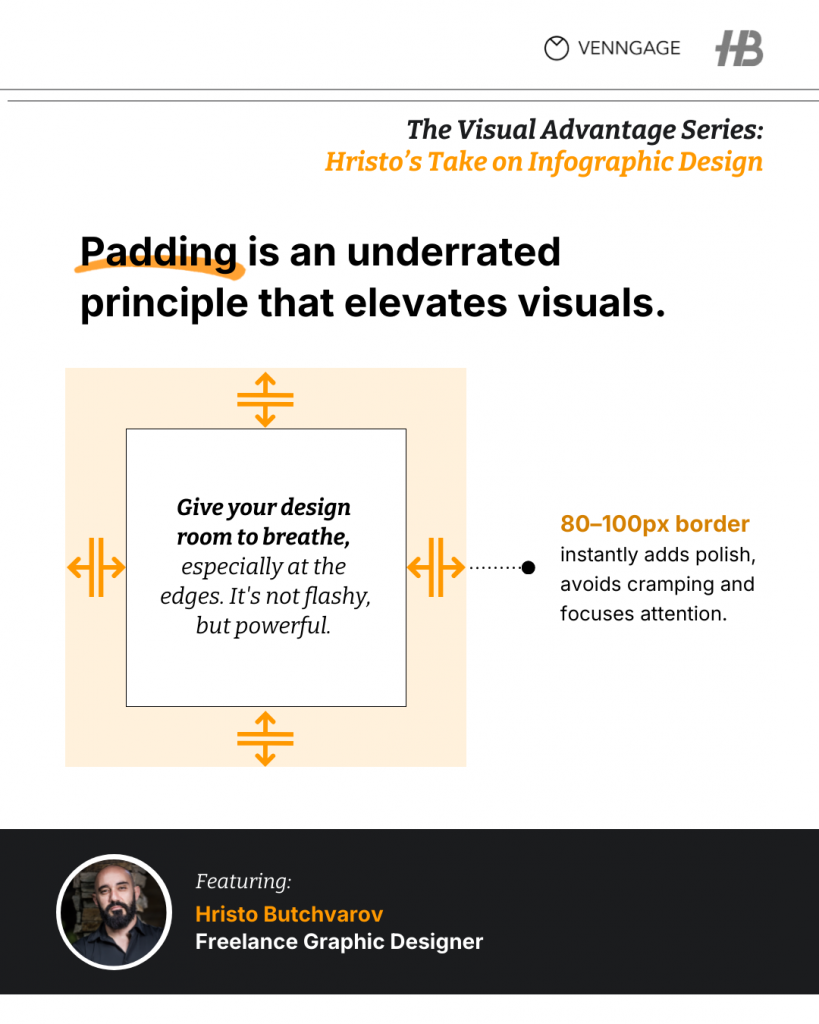
Hristo Butchvarov, a freelance graphic designer with over 19,000 followers on LinkedIn, advises ruthlessness in design:
“Each element should earn its spot. If it doesn’t help the story, it should go away.”
The idea is to reduce clutter, both visual and cognitive. Every icon, color or line should serve the narrative.
While UI/UX design isn’t visual communications, the latter often informs the former. To bridge this gap effectively, many brands rely on UI UX Designing Services to create interfaces that not only look good but also reduce friction and improve overall user experience.
But back to our main point, this friction is taxing for your audience and discourages engagement. On the other hand, clear and consistent visuals facilitate immediate understanding, build brand trust and improve engagement.
“If it takes effort to understand, you’ve already lost the viewer.”
Nadia Fernandez
The strategy behind standout visuals
Smart visuals start with sharper thinking.
The myth that design is the final dressing of an idea is one of the most damaging assumptions in marketing. The best visuals don’t come as an afterthought. Rather, they inspire original ideas.
Great visuals emerge from narrative clarity. You’ve got to know what story you’re telling. Who you’re telling it to and what you want them to feel, remember or do. Without that, all you’ve got is decoration. And decorations don’t sell, educate or make a mark.
As Hristo puts it, “If the story has a clear flow—problem, insight and solution—then it’s ready for visuals.”
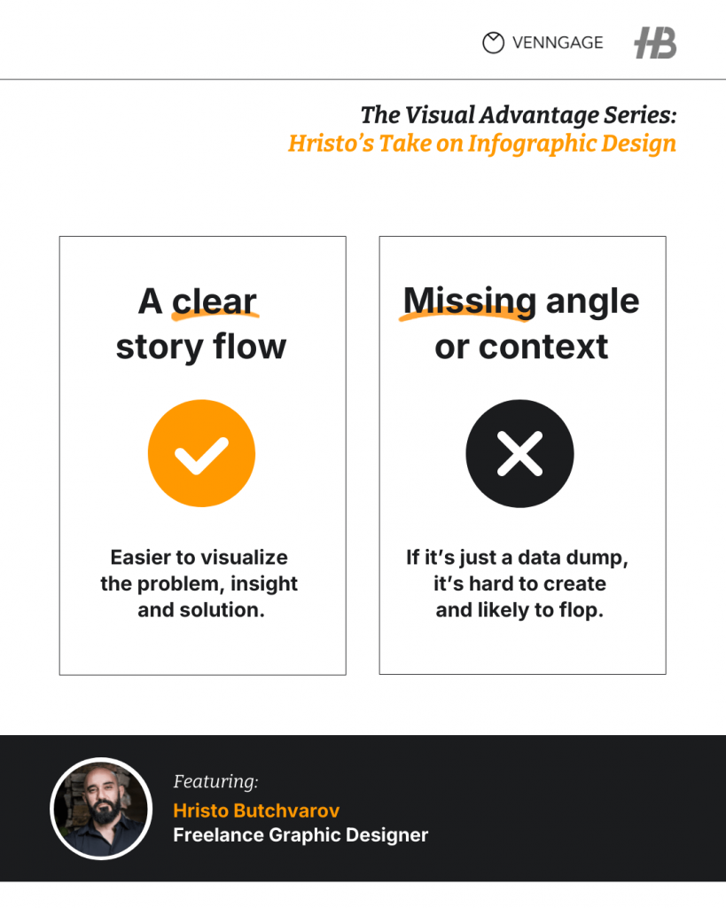
You earn the right to design once you’ve done the hard work of shaping the message. If you haven’t clarified the core point, no amount of styling will fix the confusion. That’s why design is the structure, not a final flourish.
Think of a visual like scaffolding around an idea. It holds the shape, directs the eye and keeps you focused. If something doesn’t hold the narrative, it drops.
This is creativity with constraints. It’s also the difference between designs that click versus the ones that just…exist.
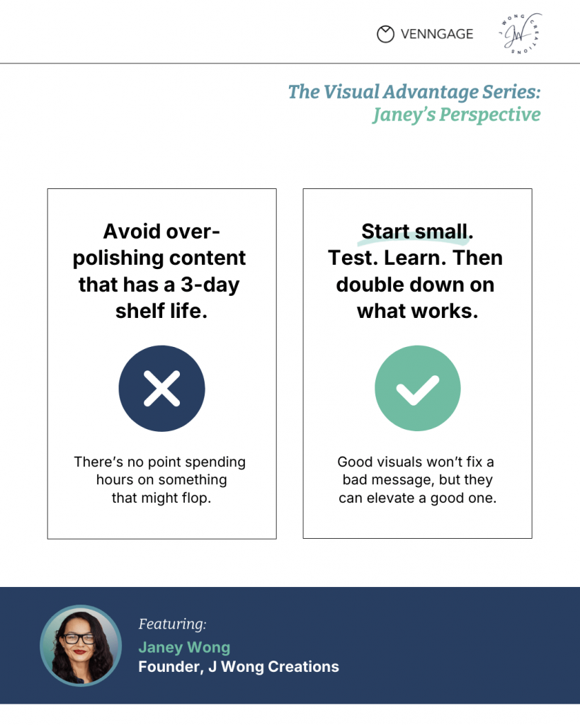
Janey nails it further:
“Good visuals won’t fix a bad message, but they can elevate a good one.”
And she’s right again when she says, “Data should always come before ego.”
That trending design style you love? Doesn’t matter if your audience doesn’t care. Great design doesn’t start with a mood board, but by understanding what your audience wants.
You can start by asking: What’s the one thing we want people to walk away with? And then: What’s the simplest, sharpest way to show it?
Smart brands win because they anchor their visuals in strategy, shaped by storytelling and focused on making abstract ideas real.
Visuals as the interface between your idea and your audience
Unlike most of his contemporaries, Harry Crews, the eccentric American writer, didn’t carry a diary with him to make notes of things that might inspire his writing.
His rationale?
“The good stuff sticks.”
(I tweaked the quote slightly to keep it clean; the original was a bit graphic.)
But the message is clear: you don’t have to make an effort to remember remarkable content. If it’s good, it will be hard for you to forget it.
I remember teaching my two-year-old how to write her ABCs and 123s. If you’ve done it, you know it’s equal parts joy and chaos. What finally made it click for her wasn’t tracing or repetition.
It was when I turned each letter into a doodle she could recall from her favorite cartoon shows. An alligator for A or bird for B and so on. Suddenly, the learning turned into a play and, more importantly, the lessons stuck with her.
This principle doesn’t just hold true for toddlers. In business, we do the same thing. We wrap complex ideas in simple, memorable shapes.
Executives casually drop phrases like ‘hockey stick growth,’ ‘the valley of death,’ ‘trough of disillusionment’ or (my favorite) ‘the dead cat bounce.’
All of these are dry data points in graphs and charts that supposedly resemble visuals that we can relate to.
That’s because visuals can do a lot more heavy lifting than processing through walls of text and a ton of boring data.
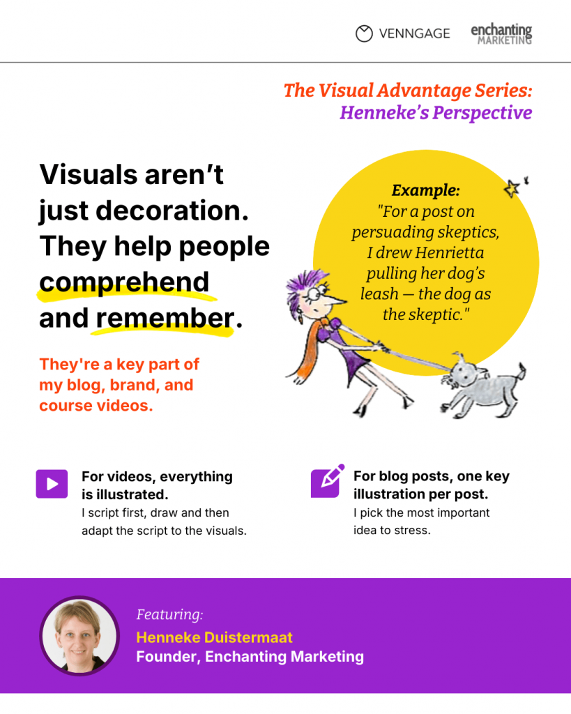
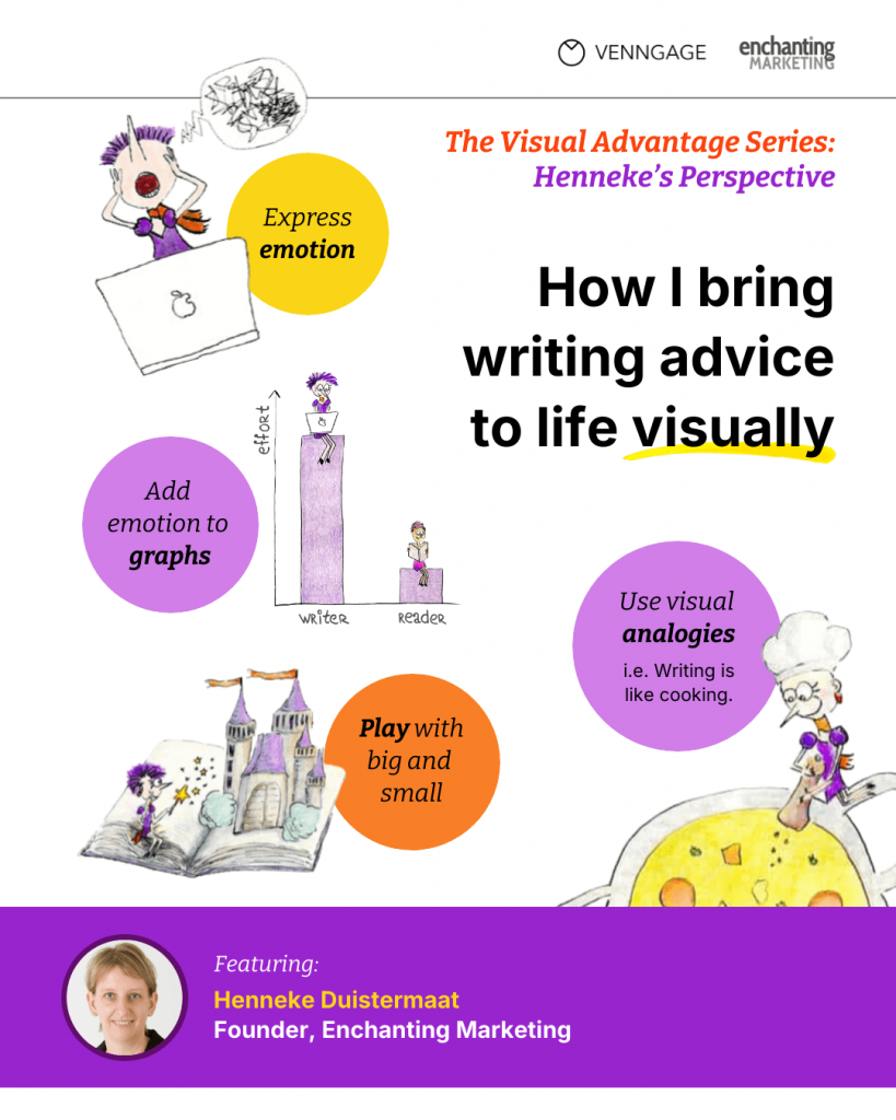
Henneke shares her first-hand, real-world anecdote:
“When I started my blog in November 2012, I couldn’t draw but I hated using stock photography on my blog so I decided I had to learn how to draw cartoon characters.
In January 2014, Henrietta first appeared on my blog. Henrietta is a purple-haired cartoon character who’s become much more than a simple illustration of my blog.
First, as a brand asset, she’s probably more important than my logo—easy to recognize and attract attention in social media feeds. Henrietta represents what my brand stands for: Irreverence, playfulness, joy and compassion. Of course, she uses my brand colors, too: Purple and orange. Even her hair is purple.
Secondly, I started drawing because my blog needed some illustrations. Initially, I thought of these drawings as a form of decoration—to make my blog look pretty and stand out. But over time, I learned that illustrations are much more than decoration. They communicate and reinforce ideas, helping people to comprehend and remember. The drawings have become an essential part of my course videos, too.
Both my drawing style and writing voice complement each other, expressing who I am and making it easier to connect with my audience.”
What a great story to understand how visuals humanize content!
By the way, here’s what Henrietta looks like:
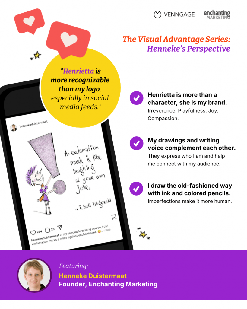
When people feel a connection through imagery (even something as simple as a stick figure drawing), they engage more deeply and remember the idea longer.
Designing for curiosity and emotion
What makes a message memorable? What drives someone on LinkedIn to pause mid-scroll or lean in during an otherwise boring office presentation?
It’s not data, logic and certainly not clarity (at least not on its own).
If you strip it down to first principles, it’s the feeling it evokes.
It’s the curiosity that says: “This feels…different.”
We already know this on a human level. You’ve probably seen it in your own life, like the time when you tried explaining a tricky concept to a friend on the back of a napkin.
The same principle applies to marketing. The best visuals make people feel something.
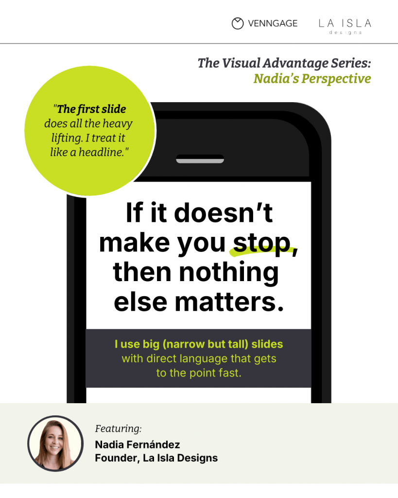
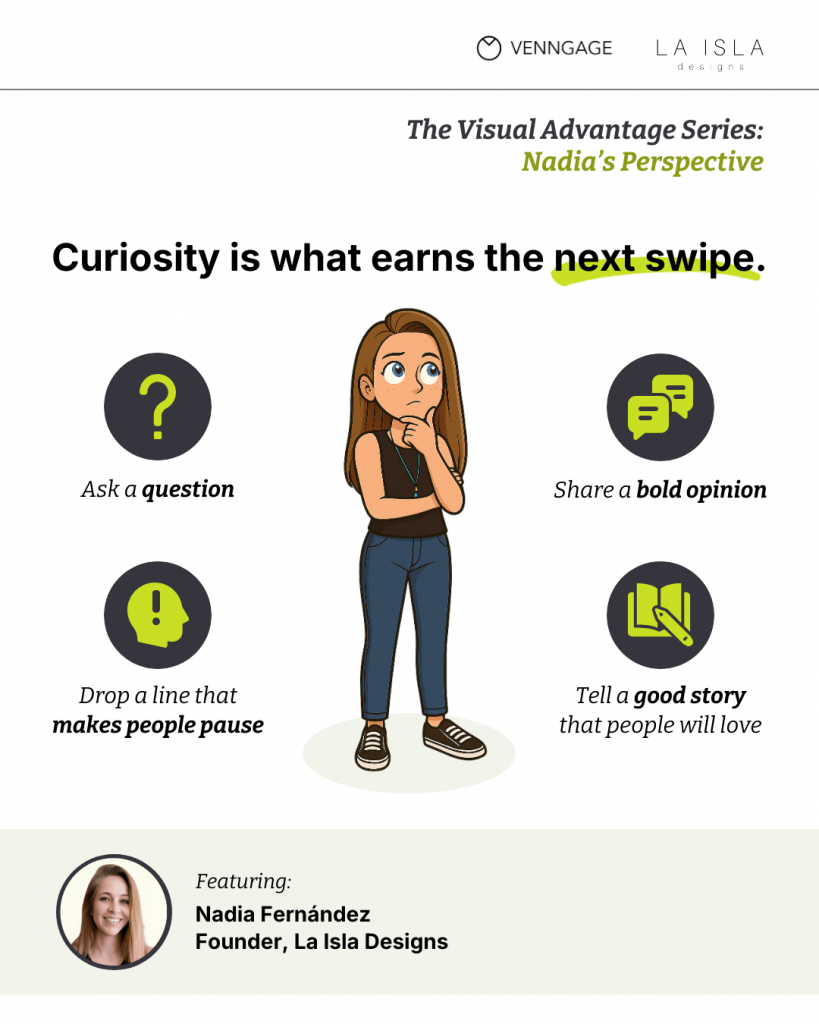
As Nadia puts it:
“Curiosity is what earns the next swipe. Really, it’s your biggest chance to win each slide.”
Whether it’s a LinkedIn carousel or a customer pitch, your visuals need to intrigue people.
It should create a “visual controversy,” according to Nadia. This can be anything that pattern-interrupts people’s attention or carries shock value to make them pay attention.
“Basically, if it doesn’t make you stop, nothing else matters,” she adds.
From content creation to communication design
Most marketers pride themselves on being creators. You write blogs, design campaigns, push out videos and churn out content consistently.
But creating alone doesn’t guarantee communication. It’s a common trap, we focus on volume or creativity without thinking about whether your audience will actually understand (or remember) what you’re trying to say.
Visual storytelling closes that gap. When you design your content to communicate, not just to exist, you help your audience retain information.
Rather than just making things look pretty, visuals make ideas stick. Even for those who are used to skimming through their feed.
And when the visuals are really powerful, some engage at a deeper level.
There are countless jokes, TV skits or Superbowl ads that you can think of which pass that test. And I bet most of them are visual, either in form or function.
Visuals are the bridge that helps you get your message to your target audience. But they are also the most compelling form of human communication. And, not to forget that visuals help with SEO as well.
From infants who doodle before they can write to Wall Street analysts who live by charts and graphs or from cavemen etching on cave walls to VR designers building parallel worlds, visuals have always been our first language.
Visual-first marketing is the new standard
We’ve hit a point where AI can write a blog post in 30 seconds, draft your email and summarize your sales notes. Due to this, everyone’s creating more content, faster than ever.
But speed isn’t a strategy and volume doesn’t amount to impact. What makes content stick is how clearly, quickly and memorably it communicates. And that’s where visual-first marketing steps in.
You don’t win today by being the first to post, but by being the one to make a lasting impression. And nothing makes an impression like visuals.
Design-led brands (think Slack, Figma and Notion) aren’t just good-looking. They perform better because they communicate better. They make their message scannable, understandable and hard to forget.
And their visuals aren’t sidekicks. They’re the bridge between what the brands want to communicate and what the audience needs to feel.
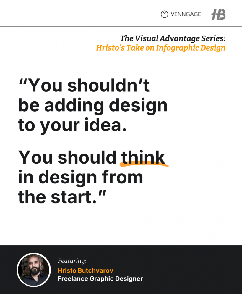
“You shouldn’t be adding design to your idea. You should think in design from the start.”
Hristo Butchvarov
So while the world races to crank out more content, smart brands slow down just enough to show their ideas, not just tell.
P. S. — Hristo is ‘the infographic guy’ who has built an enviable personal brand on LinkedIn. Want more of his visual storytelling insights? Check out our blog on LinkedIn infographics that actually perform.
The new rules of visual branding
Once upon a time, branding meant memorizing a style guide like it was the holy scripture.
Use this hex code. Never stretch the logo. Three fonts, max.
The result was a bland, polished sameness that felt safe but rarely stood out.
But today, leading brands are rewriting that rulebook.
Today’s best visual brands don’t rely on rigidity. They use strong visual language as a device to build brand recall and recognition, with the freedom to adapt. This lets them ensure that the audience can recognize a brand even in the busiest digital thoroughfare.
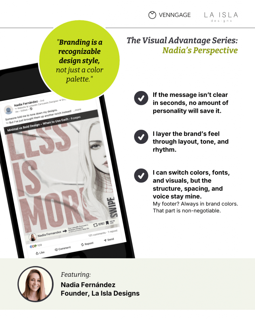
To quote Nadia:
“I treat branding more like a recognizable design style than a fixed color palette… It’s the structure, the spacing, the voice and the visual language that make it mine.”
That shift from compliance to coherence is exactly what modern marketers need to embrace.
A recognizable visual system gives brands the best of both worlds: consistency without constraint and templates with plenty of breathing room. It also gives them the freedom to adapt to the message, when needed.
Janey adds another important truth:
“You need to test before you double down… See what works. Then refine. That’s how design becomes intentional.”
That iterative mindset is the real modern muscle of visual branding strategy. And it’s much better than chasing aesthetic perfection.
In that sense, the new rules of visual branding aren’t really rules at all. They’re cues that tell your audience, “Hey, this is still us,” even if a new competition copies your brand or you start building a following on a new channel.
That’s what makes a brand feel consistent. And in a sea of perfectly designed, perfectly forgettable content, feeling is the part they’ll remember.
The visual tools shaping today’s marketing
There’s another side to this trend. Marketing teams today are consolidating. With the growing popularity of self-service tools, brands today expect marketers to write copy, create designs, track data and launch campaigns…all by themselves.
A lot of marketers rely on AI design tools like Venngage to build campaign visuals, presentation decks or client-ready reports to communicate their strategy.
The change in marketing norms also reflects the speed with which brands expect their marketing teams to move and get outcomes.
When you need visuals for a campaign, you don’t want a long back-and-forth with expert designers. You want something that you can use by yourself.
Visuals help marketers turn boring reports, presentations and data dumps into clear narratives rich with compelling storytelling.
However, you don’t lose your brand’s visual authenticity. AI does the initial design heavy lifting, it’s still up to you to polish the copy, align the visual elements or re-generate the design to your liking.
Visual communication as a strategy means design isn’t an afterthought. It’s the first step in the long chain of guiding your audience from awareness to conversion.
Visual-first marketing is your framework for clarity. It guides your ideas, keeps teams aligned and gives your marketing momentum. Plus, when you leverage design in your marketing, it becomes the frontline tool for engagement instead of a final flourish.
Turn visuals into your marketing advantage
Marketing is evolving from being a game or volume to a game of clarity.
The brands that rise now aren’t just producing more content or being flashier than others. They’re more visual, more intentional and stickier than ever.
Done well, visual communication can help you make complex ideas feel simple and handhold your audience from awareness to decision.
“Good visuals won’t fix a bad message, but they can elevate a good one.”
Janey Wong
And you don’t need to be a designer anymore to turn ideas in your head into clean, compelling visuals. Whether you’re building an internal strategy deck, a sales pitch or a high-impact campaign, Venngage gives you a head start.
Start with a Venngage template or, better yet, try the Venngage AI Design Generator and see how quickly your next visual story comes to life.


