


In an online world, visual content rocks it.
Statistics show that infographics in particular are an important part of your content marketing strategy. Infographics have become extremely popular because they combine two things that people like: information and graphics.
However, slapping just any old infographic on your website will not automatically generate traffic or go viral. With so much content, including visuals, uploaded every day, you need to put some serious thought into your infographic creation if you want to get a successful one.
Here are 7 mistakes you should avoid when you create an infographic.
1. Your infographic is the same-old, same-old.
Infographics are popular because they contain information. However, creating an infographic for something that everybody has already done is a surefire way of getting lost in the crowd.
Imagine that you are doing an infographic on social media, which you think is an important topic. But about 11 million other people have done the same thing.
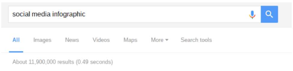
It such a popular topic, that an infographic you create may have to fight an uphill battle to get noticed. If you want to create an infographic on a popular topic, make sure you have something new or interesting to add, and work on your headline to make it more search-friendly.
If you don’t have anything new to bring to the table and, by some miracle, you get some hits, you will only succeed in boring your audience and increasing your bounce rate. Worse, you might give them a bad first impression about your authority and site.
Takeaway: Avoid topics that have been done to death, or at least make sure you give your audience something interesting or new if you do make an infographic on a popular topic.
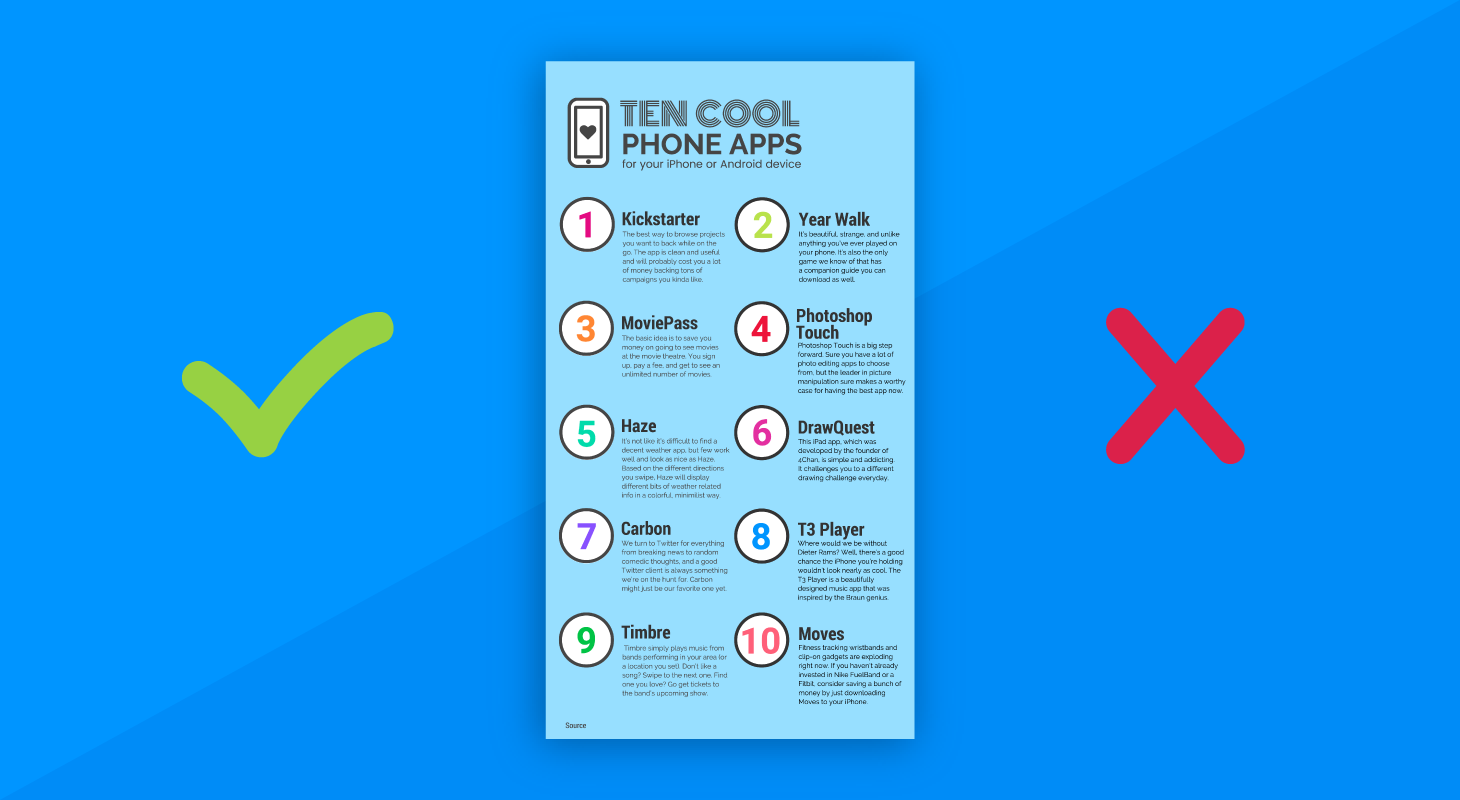
2. Your infographic has too much text.
The main reason infographics are so popular is because it provides a visual and easily digestible version of a concept or statistics, so they should not be too wordy.
The infographic above is certainly informative, and it does have graphics, but it forces the audience to focus on the text rather than the visuals, so it is not an effective way to retain the audience’s interest or help them understand the information you have presented. Keep your text short, simple, and powerful.
Here is a good example of information visualization and when actually don’t need any words:
What Matters Most to People Around the World?

Takeaway: You need to keep your text as tight and simple as possible. If you have a problem condensing your information in an effective way, get a professional copywriter to do it for you.
3. Your infographic has the wrong information.
One of the most unforgivable things you can do is create an infographic that give the wrong information.
It is easy enough to conduct research on almost anything, but anyone can post anything and sound authoritative. Just because you see it on the internet doesn’t mean it’s true.
You need to ensure that the facts you will include in your infographic are accurate. It does take a bit more digging and cross-referencing to make sure you get the real deal, but it will be worth the effort when you see your visitor counter, re-tweets, and shares go up!
The best way to ensure the accuracy of your figures is to use reputable sources. If you are creating an infographic on a medical thematic, go to peer-reviewed articles in established medical journals and double check the findings.
If you are posting statistics on the number of drunk driving incidents in a given place, go to government websites that collect such information. That way, you will get the most recent validated and confirmed data.
To clinch the credibility check, cite all your sources. Your audience will be able to check the facts for themselves. It not only makes you seem more professional, you can legitimately pass the buck if the information turns out to be inaccurate, after all.
Takeaway: Make accuracy a priority when you create an infographic.
4. Your infographic is copycatting.
Okay, so you saw a really awesome infographic online, and you want to share the same information with your audience.
It is a great idea to get your inspiration from it but not so much to copy it and pass off as your own. Changing the color and the fonts will not make it your own, and people will notice. Not cool.
If you like the information, you can use it as a base, but put your own spin into it. Get ideas from other infographic designs you like. Mix the information up a bit by putting in quotes, or adding facts and statistics from reputable sources. Create a kickass headline to get attention. In other words, eyes on your own paper.
Takeaway: There is nothing wrong with learning from others, but there is everything wrong with copycatting. Have your own take and style.
5. Your infographic has too many clashing colors.
Color is like spicy food. Just the right amount is good for you, but too much can give you hemorrhoids.
An infographic should definitely have color, but you need to be careful about spinning that color wheel too hard to avoid confusing your audience.
Using too many colors in an infographic can make it hard for your audience to understand the information you are offering. From a design viewpoint, it also makes it look incoherent and messy.
Here is an infographic with good color selection:
Takeaway: Use no more than five colors in any infographic, and try to use it to draw attention to the important information rather than drowning it out.
6. Your infographic is too long.
The thing with information is that if you have it, you want to share it. Some infographics reflect this need by being excessively long.
Not only does it force your reader to scroll down (and possibly miss important information), you also make them wait for it to load. Most of your viewers will not bother to do either. As a rule of thumb, try not to go bigger than 8,000 pixels and no heavier than 1.5 MB.
Takeaway: If you have a lot to share, break your infographic into several parts.
7. Your infographic is as busy as a bee.
Complex information can easily translate into an overly busy infographic with too many design elements, if you’re not careful.
You have all these cool graphics and information you want to put in, but you know you only have so much space to put it in. What do you do? You cram it all in.
Big mistake. You don’t need any studies to see why this is.
You want to spare your viewer a headache from reading reams of boring information, not give them one with a busy infographic. While the one above does this deliberately, cleverly convey how red tape can convolute the easiest process, that is not true for many infographic creators.

Takeaway: Use whitespace with great deliberation to give your viewers a break and help them focus on important stuff.
Creating an awesome infographic can do your content marketing strategy successful. However, you need to steer clear of some common problems that can spell death and loneliness to your creation. Avoid these seven mistakes and you stand a good chance of reaping the benefits of your efforts.


