C.S. Jones is a professional journalist, photographer, and illustrator. He lives in the part of South Philly where they still say “jawn.”
It’s simple: people remember 10% of what they hear, 20% of what they read, and 80% of what they see and do. So, if you want to make information memorable, turn it into something the audience sees and does, not hears or reads.
But wait: before you just load up some chart maker program, there are rules. Building infographics is an art these days, and if you want to make one that people will stop and read, you have to do it right.
First…
1. Make one big point
Ideally, you should have a single, coherent message that the entire infographic serves to deliver. Think of it as a story: it’s told with data and visual metaphors, but the structure is still the same.
First comes the hook: Building infographics worth reading is meant to illuminate some fact or to lead the viewer to some conclusion they otherwise wouldn’t have reached.
Then there’s the meat of the story, which comes in at the middle as the reader continues through to the supporting data. Then, at the end: the conclusion.
This plot can be as simple or as complex as you want, and more complex isn’t always better. In many ways, road signs are the perfect infographics: they convey exactly the information they need to convey, with a clearly visible premise and conclusion, at a size that can be read at 70 miles an hour. They’re done big, with bold colors and easily readable fonts, and their design language is so iconic. it’s imitated the world over.
But if you need to convey something more complicated than the speed limit, that’s where the rest of these rules come in.
2. Use simple combinations of primary colors
One more lesson you can take from road signs, though, is color palette design: you might have noticed they use as few colors as possible, they’re all eye-catching primaries, and there’s a clear logic to how they pick them.
Yellow: take notice. Orange: you should probably look at this. Red: Stop what you’re doing and read this now. That’s exactly how colors should be used when it comes to conveying data: simple ones, arranged by importance, with a clear sense of which color means what.
Full Infographic on Column Five
“If picking a color palette is hard for you, stick to the rule of three,” says Smashing.
How is the the rule of 3 used in design or in this instance, picking a color? Choose three primary colors: a light one as a background and two more for the base of your infographic and your accents, such as headings.
Use four at most, suggests Venngage’s own guide to the subject. (This guide goes into the different types of color scheme, like monochrome, adjacent, and tetradic, in much more detail than I can here, so we recommend you give it a read.)
As a general rule:
- Use as few colors as possible and,
- if you must add another color, make sure there’s a reason behind it, like if you find another piece of data that has to be separate from the others.
3. Space it out
Whitespace–or negative space, if yours isn’t white–is a fundamental element of good design. Contrary to what you might think, a cluttered infographic isn’t a good infographic. You need to pick and choose which information you want to display, that best suits your premise, and use negative space to lead your reader from point to point until they reach the conclusion.
The amount of space around each design element helps your reader prioritize what to read first, then in which order to read the rest of the infographic. Elements surrounded by negative space will be set apart from the rest of the document and seem more important—or at least, seem like they lead off in another, more interesting direction than elements that are closer to the rest of of the group.
And one of the most important uses of negative space is to make sure your elements are properly aligned. This’ll go a long way towards structuring your data, which is a large part of convincing your readers there’s a point to the information and showing them the pattern you want them to see in it.
In infographics, even more than in many other forms of media, balance and harmony are important. You don’t want your reader to get overwhelmed or bored by walls of information, do you? No, you don’t. So cut out anything that’s likely to do that and replace it with a big old slab of nothing. Your readers will thank you.
4. Choose three quality fonts
One thing you want to minimize when designing an infographic is text. Too much text defeats the purpose, anyway. Titles, headings, and a few pithy captions are good form but besides that, cut it out. People don’t click on infographics to read an article.
Typography can make or break a design of any type, though–infographics included–so it’s important to touch on it.
Again: the rule of three. Use three fonts:
- One for your title/header,
- one for your body,
- and a third for flavor.
The title is the perfect place to use an interesting font that serves as a visual metaphor for your data. Just make sure it doesn’t distract from the data it’s trying to underscore. Next is your body font, which should be simple and readable. Decorative fonts are for headers only. Nothing screams “noob mistake” like using anything that isn’t a simple, readable font for body text.
Finally comes the “accent” font: the one you’ll probably use for captions and subheadings. This should be somewhere between the two. You don’t want a full-on decorative font, but neither do you want something too simple.
If your graphic’s going to appear both online and in print, Dummies.com advises: “Check your fonts both on the computer screen and on paper because sometimes what looks great onscreen doesn’t translate as well to print documents.”
Remember the cost of exclusive fonts. There are plenty of free ones–DaFont is surprisingly good for that, and many other sites also have “freebies”–but remember that if a client insists on a high-quality custom one, they might have to be prepared to shell out anywhere from thirty to a few hundred dollars for it. And remember to invoice for that.
5. Come up with a solid, eye-catching design
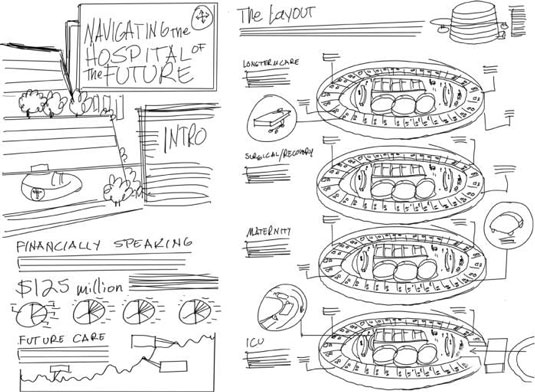
Set up your storyline and how you want the infographic to flow from one topic to the next before you start laying it out. Smashing recommends you spend an hour on this stage, and don’t stop until you have some usable layout sketches.
Most online infographics have a vertical flow–they’re laid out like articles, designed for the viewer to scroll down through them as they tell a story. Others are designed with interactivity in mind, and make use of devices like parallax horizontal scrolling or maps that you zoom in on to reveal more specific data about certain regions.
Generally, the more interesting your layout, the more interesting your infographic will be to look at overall (as long as it doesn’t interfere with the readability or presentation).
Remember that your readers should never be confused about where to look next. It should always be clear to them where to click next and how they’re supposed to move through the design.
6. Decide on what’s important and what’s not
Define which parts are the biggest and most important, and how to make that obvious. This mainly applies to text and any figures or bits of graph that you want to highlight—the ones that comprise your most interesting or relevant figures and facts, in other words.
Hierarchy in fonts is easier to figure out:
- The main title will be your largest font.
- The subtitle will probably be the same font, but in a smaller point size.
- Body text should be a simple, readable font in a modest size–somewhere in the teens is good for most situations.
- Chart labels will probably be the same size, but the same font is optional. You may want to use a different one to make your design more visually interesting.
Hopefully your infographic won’t be so complex that it needs instructions, unless it’s interactive. If it is more complex, consider using arrows or other visual guides.
Notes and sources will most likely be your smallest font: we’re talking “fine print” here. In fact, a lot of the time, it’s better to put this after the infographic itself so you can directly link to your sources. However, for the sake of providing proof to people who will only read it via social shares, it often takes the form of small text, with complete URLs, placed in the bottom right hand corner.
7. Make it addictive
It could be said that the ultimate measure of an infographic’s success is in the number of social shares it racks up. This is debatable, and largely dependent on if your infographic is the kind that’s designed to be shared all over the place. Maybe you’re making it for a technical crowd, an esoteric subject, or a highly specialized publication, in which case, you probably won’t want to judge it by how many millions of retweets it racks up. But you’ll still want to make it addictive.
Addictive infographics, like any other kind of addictive content, provide value to your audience. They focus on the audience, providing information the reader would want, not just what shows off the writer’s knowledge or makes the company look good. Excellent infographics are actionable, meaning that the audience comes away from reading them feeling they’ve learned something that they can do in order to improve their businesses or their personal lives. Or, at the very least, they’re illuminating: your infographic should drive home the story told within your data, in a way that text or numbers just couldn’t have.
Follow these tips and readers will retain 80% of the information you share with them, not just the 10% from hearing it or 20% from reading.
Did we miss anything? Do you have any of your own tips to add? Let us know in the comments.
Want to make an infographic? Check out our infographic templates page.


