


Most people think infographics are just for boosting blog engagement. While that’s true, limiting them to just likes and shares means you’re missing out on their real power. Visual content is one of the most versatile tools in your marketing kit for building relationships, earning high-quality backlinks and driving organic traffic.
You might be pitching to influencers or trying to simplify a complex process for your sales team; either way, infographics do the heavy lifting for you. In this guide, we’ll dive into 11 benefits of infographics that go way beyond simple social media engagement.
What is an infographic?
As the name suggests, infographics combine information and graphics. This means that an infographic is a strategic blend of data visualization, graphic design and storytelling intended to make complex information immediately understandable.
While a standard image might supplement a story, an infographic is the story. It uses a specific visual hierarchy, relying on icons, typography and color theory to guide a reader’s eye through a narrative without requiring them to wade through pages of dense prose.
Common types of infographics
Below are the different types of infographics you can use for relevant purposes:
- Statistical infographics: These focus on data visualization by using charts and graphs to make complex research or survey results easy to digest.
- Informational infographics: This format uses icons and descriptive headers to provide a clear, high-level overview of a specific concept or topic.
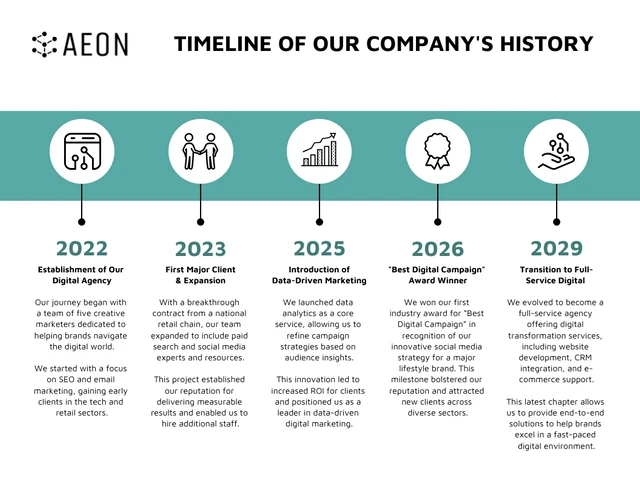
- Timeline infographics: Perfect for showing a sequence of events, these use a central line to visualize the history of a brand or the evolution of a project.
- Process infographics: Also known as “how-to” graphics, these break down a complicated workflow into a simple, step-by-step visual journey.
- Comparison infographics: These use a split layout to highlight the differences or similarities between two options, helping readers make decisions faster.
- Geographic infographics: When data is tied to a location, these use maps to visualize regional trends and demographic insights at a glance.
- Hierarchical infographics: This format organizes information into levels, like a pyramid or flowchart, to show the relationship between different parts of a system.
Here’s a timeline infographic example.
Infographics for SEO and engagement
Using infographics for SEO is one of the most effective ways to earn high-authority backlinks without the constant grind of traditional outreach. When you create a high-value visual, other sites will naturally want to embed it in their own content, giving you an organic link back to your source. This signal tells search engines that your page is a trusted resource, which helps improve your overall rankings.
Beyond just link building, infographic shareability and engagement play a huge role in keeping users on your page longer. High dwell time is a key ranking factor; if a reader stops to digest a chart or a process map, it tells Google your content is meeting their needs. Plus, optimized images appear in Google Image search results, creating an additional stream of organic traffic that text-heavy articles often miss.
How infographics improve content performance
The benefits of using infographics go beyond making a page look better. Most people only skim through articles, looking for the fastest way to get the information they need. If you give them a wall of text, they will likely bounce. Infographics improve content performance by providing an immediate “value hook” that keeps readers on the page.
When you include a visual, you cater to how the human brain actually processes information. Research shows we process visuals significantly faster than text, which means your audience can grasp your core message in seconds. This leads to higher retention rates and a much better user experience.
Here is how they specifically impact your content’s success:
- Lower bounce rates: A compelling visual at the top of a post hooks the reader immediately, encouraging them to stay and explore the rest of the page.
- Increased dwell time: Because infographics require a few moments to scan and understand, they naturally keep visitors on your site for a longer period.
- Higher conversion rates: Visuals simplify the “Jobs to be Done” for your customers, making it easier for them to understand your product and click your call to action.
- Better accessibility: Infographics break down language barriers and technical jargon, making your insights available to a much wider audience.
11 major benefits of infographics
Let’s understand how infographics can boost your marketing strategy.
1. Improve content readability and comprehension
Most readers don’t actually read—they scan. When confronted with a 2,000-word wall of text, the cognitive load is often too high, leading to high bounce rates. Infographics solve this by providing a visual anchor that breaks the content into digestible chapters. By using a “F-shaped” or “Z-shaped” layout, you guide the reader’s eye to the most critical information first.
- Scannability: Headers and icons allow readers to extract value in under 10 seconds.
- Reduced Overwhelm: Visual buffers between paragraphs prevent “reader fatigue.”
- Clarity: According to 2025 eye-tracking studies, users pay close attention to information-carrying images, spending more time on them than the surrounding text.
A well-designed infographic acts as a visual table of contents. If you use consistent icons for recurring themes throughout your article, a reader can jump to the section they need just by recognizing the visual cue. This reduces “reader fatigue” and ensures they actually absorb your key takeaways before they click away.
2. Promote data retention and understanding
The human brain is wired for visual processing. While we only remember about 10% of what we hear and 20% of what we read, we retain approximately 65% of what we see in a visual format. This is known as the Picture Superiority Effect. When you pair a statistic with a relevant icon or chart, you create a dual-coding effect in the brain, making the information stickier and more likely to be recalled later.
- Rapid Processing: We process images 60,000 times faster than text.
- Mental Mapping: Flowcharts and diagrams help the brain build a logical map of the concept.
- Long-term Recall: Visuals bypass short-term “noise” and move directly into long-term memory.
To maximize retention, never let a chart stand alone without a “so what?” caption. For example, if you show a bar graph showing a 50% increase in productivity, place a small callout bubble next to it that explains why that happened. By connecting the “what” (data) with the “why” (context) visually, you bypass short-term mental noise and move the information directly into long-term memory.
For example, this infographic by the World Economic Forum explains interconnected global risks.
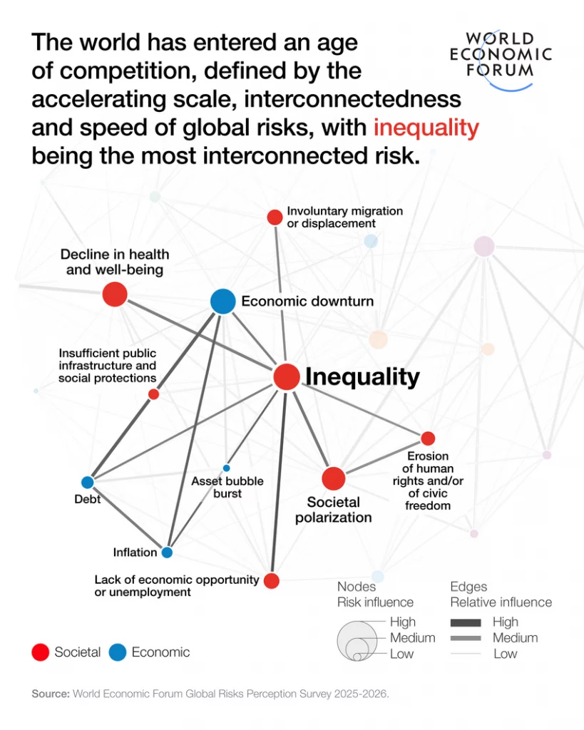
Source: World Economic Forum
3. Boost SEO and organic traffic
Using infographics for SEO is a high-leverage strategy for driving evergreen traffic. Beyond traditional keyword optimization, infographics allow you to rank in Google Image search and AI-generated overviews, which are increasingly visual. When your image is optimized with the right alt-text and file name, it acts as a secondary entry point to your website.
To maximize retention, never let a chart stand alone without a caption. For example, if you show a bar graph showing a 50% increase in productivity, place a small callout bubble next to it that explains why that happened. By connecting the “what” (data) with the “why” (context) visually, you bypass short-term mental noise and move the information directly into long-term memory.
4. Attract high-quality backlinks and referral traffic
Infographics are essentially “link bait” in the best way possible. Other bloggers, journalists, and educators are constantly looking for high-quality visuals to support their own claims. Instead of writing their own analysis, they would much rather embed your chart and give you a backlink as the primary source.
This creates a powerful referral engine. According to Search Logistics (2025), blog posts containing infographics earn 178% more backlinks than those without. These links pass on significant domain authority, which tells search engines your site is a trusted leader in your niche.
One of the main strategies we’ve used in the past to build better relationships with influencers is the creation of guestographics. Guestographics essentially means “guest infographic”. It has similar benefits to contributing guest posts to various blogs and sites within your industry.
Here’s how it works:
- First, you need to compile a list of the influencers you may not have relationships with but would like to build. You can use tools like Buzzsumo, Ahrefs, and Mention to identify who these individuals are. Once you find them, export the list of contacts and filter out anyone who might not be an ideal fit.
- Second, find a virtual assistant using a site like Upwork, or explore virtual assistant services that can help you fill in the contact information for these people. This can be their email address or Twitter handles.
- Third, once you’ve got your list prepared, use an outreach tool like Mailshake to get in touch with the different influencers and ask them if they would like to collaborate on an infographic with you. By providing a compelling offer like a piece of content, not only do you get an opportunity to work with the influencer, but the ongoing communication helps them get a better sense of what kind of marketer you are. If they’re happy with the results of this collaboration, they’ll definitely keep you in mind as someone to keep in touch with.
We’ve managed to build up our network of relationships by creating guestographics on Venngage’s infographic maker. This gives us an ever-growing database of contacts with large followings to reach out to when we have questions or need help with promotion.
In a crowded market, trust is your most valuable currency. High-quality, original infographics signal that you have done the research and own your data. When you consistently publish well-designed visuals, you stop being just another blog and start being a primary source for your industry.
Use a standardized Brand Kit—specifically your unique brand colors and a consistent icon set. When your content looks distinct, it builds a “recognition loop.” Even if a user sees your infographic on a third-party social media feed without a caption, they should be able to identify it as yours. This visual consistency signals a level of professionalism that stock photos simply cannot match.
Infographic shareability and engagement are significantly higher because they are “platform-native” for visual-first channels. Unlike a text link that requires a click-to-read, an infographic delivers the value directly in the feed. This creates a lower barrier to entry for the user, leading to a much higher velocity of shares. On LinkedIn, specifically, a well-placed chart can act as a “scroll stopper” that earns 98% more comments than a text post.
- Micro-Content ROI: A single long-form infographic can be sliced into 5-10 individual “cards” for Instagram or LinkedIn carousels, giving you a week’s worth of content from one asset.
- Viral Loops: When influencers share your data visualization, it often reaches audiences that your SEO strategy hasn’t touched yet.
- Platform Compatibility: Visuals are the only content format that works equally well across Pinterest, X, and professional Slack communities.
Don’t just post the full, long infographic. Slice it into 5-10 individual “cards” or “micro-assets.” Use these for a LinkedIn carousel or a series of Instagram stories. This allows you to get a full week of social content out of one design project. On LinkedIn, these visual carousels currently earn nearly double the comment rate of standard text-plus-link posts.
7. Simplify complex B2B sales cycles
In B2B SaaS, the “Jobs to be Done” are often technical and involve multiple stakeholders. A common mistake is sending a 20-page white paper that no one reads. Infographics act as a “Sales Enablement” tool by distilling your product’s value proposition into a single page. By visualizing the “before and after” state of a client’s problem, you make the solution feel inevitable rather than just theoretical.
- Decision-Maker Clarity: C-suite executives often scan for results; a high-level ROI chart gets the point across in seconds.
- Stakeholder Alignment: A process map ensures everyone on the buying committee understands exactly how the implementation will work.
- Persuasion Power: Visuals are documented to be 43% more persuasive than text alone, which can be the difference between a “closed-won” and a “no-decision.”
8. Enhance cross-platform brand consistency
Most marketers struggle with a fragmented brand voice across different channels. Infographics provide a visual anchor that keeps your messaging consistent. By using a standardized Brand Kit—applying the same hex codes, typography, and iconography—you ensure that your brand is recognizable even when the content is hosted on a third-party site or social platform.
- Visual Memorability: According to 2025 brand tracking studies, consumers need 5-7 impressions to recognize a brand; consistent infographics speed up this “recognition loop.”
- Asset Versatility: You can embed the same infographic in a blog post, include it in a monthly newsletter, and use it as a slide in a webinar deck.
- Authority Signal: A cohesive visual style signals to your audience that you are an established, professional entity.
Finally, infographics are formatted to fit on every social media platform. Unlike blog content, which is harder to share on visual platforms like Pinterest and Instagram, infographics can be promoted excessively across social media.
But on top of that, there are plenty of infographic directories that exist, to which you can submit your infographics. This will give you access to larger audiences that are interested in your content. Which means more referral traffic back to your site.
Some of these sites include:
- Visually
- Visualistan
- Daily Infographic
- Slideshare
Each of these sites has its own organic traffic and audiences, be sure to take advantage of the free traffic. Fast Company and Mashable also publish infographics. These sites require a more well-thought-out pitch. If you manage to get featured
9. Build trust through transparent data visualization
We are living in an era of information overload where consumers are increasingly skeptical of marketing claims. Infographics help overcome this skepticism by making your data transparent and easy to verify. When you take raw numbers and place them into a clean, logical chart, you are essentially “showing your work.” This objective presentation of facts builds a level of trust that “fluffy” copywriting simply cannot achieve.
Instead of just making a claim, try the ‘Annotated Insight’ method. Label your data points with the specific year and origin (e.g., “Source: 2025 Venngage Industry Report”). This small detail transforms a marketing graphic into a research asset. When readers see that your visuals are backed by credible sources, they stop viewing your content as an advertisement and start viewing it as an educational resource.
10. Improve Time on Page and dwell time metrics
Search engines use “dwell time” as a proxy for content quality. If a user clicks your link and leaves in five seconds, it signals that your content didn’t answer their query. Infographics act as “attention traps.” Because they require the reader to scan, zoom and process different visual elements, they naturally extend the duration of a site visit.
You can place a “Summary Infographic” or a “Key Takeaways” visual right after your first H2. This gives the reader an immediate reason to stop scrolling. Once they’ve invested 30 seconds into understanding the graphic, they are significantly more likely to read the rest of the article to get the full context. This simple placement shift can reduce bounce rates by double digits.
11. Scale lead generation with gated visual assets
High-value infographics are often more effective lead magnets than traditional e-books. Many users would rather trade their email address for a “One-Page Cheat Sheet” or a “Process Roadmap” than a 40-page PDF they’ll never finish. Because infographics offer instant gratification, they have a higher conversion rate for newsletter signups and gated content landing pages.
Example Use Case: The “Interactive Checklist” Imagine you are writing about B2B content strategy. Instead of offering a generic guide, offer a “30-Day Content Audit Infographic” as a high-resolution download.
- The Hook: “Download the high-res version to print for your office.”
- The Result: You provide a tool the user will actually look at daily, keeping your brand top-of-mind.
- The Data: Roughly 46% of marketers report that these high-utility visuals produce the best results for capturing qualified leads because the “perceived value” is higher than a text-heavy document.
Best practices for creating high-impact infographics
Creating a visual that actually converts requires more than just picking a template. To ensure your infographic performs well for both SEO and user engagement, follow these strategic guidelines:
Focus on one core message
The most common mistake is trying to cram too much information into a single graphic. An effective infographic should solve one specific problem or answer one primary question. If you find yourself covering three different topics, it’s better to create a series of smaller “micro-infographics.” This keeps the narrative tight and ensures the reader doesn’t feel overwhelmed by competing data points.
Establish a clear visual hierarchy
Use size, color and placement to tell the reader what to look at first. Your most important statistic or the “hero” of your story should be the largest element on the page. Use contrasting colors to highlight key takeaways and ensure your headings are bold enough to be read at a glance. A clear hierarchy guides the eye in a logical path, usually from top-to-bottom or left-to-right.
Keep copy minimal and scannable
If you find yourself writing full paragraphs inside your design, you’ve essentially just created a “text-heavy article with a background.” Aim for a 30/70 ratio of text to visuals. Use punchy headers, bullet points and short sentences. Every word on the graphic should earn its place; if it doesn’t support the visual data, cut it.
Design with distribution in mind
Before you start designing, decide where the infographic will live. A long, vertical infographic is great for a blog post or Pinterest, but it will be unreadable on a LinkedIn feed.
- Pro-Tip: Design your main asset in a high-resolution format, then create “social crops” (1080×1080 or 1080×1350) that highlight specific sections. This makes your content “platform-native” and easier to share.
FAQs on infographics
What are the main benefits of using infographics?
Infographics help improve content readability, increase data retention and boost engagement. They are strategic tools for simplifying complex information, earning high-quality backlinks and establishing brand authority in your niche.
How do infographics help SEO?
Infographics help SEO by increasing “dwell time” (how long a user stays on your page) and acting as a magnet for backlinks. When other websites embed your graphic, they provide an organic link back to your site, which improves your domain authority and search rankings.
When should you use an infographic vs. text?
You should use an infographic when you need to explain a process, compare two options or present data-heavy research. If the information is purely narrative or requires deep, nuanced discussion, a standard text-based article is better. Use infographics to support text, not replace it entirely.
What types of infographics are most effective?
The “most effective” type depends on your goal. Statistical infographics are best for proving a point with data, while process infographics are best for “how-to” guides. Currently, comparison and timeline infographics see some of the highest engagement rates in B2B marketing.
Can infographics increase organic traffic?
Yes. Optimized infographics can rank in Google Image search and AI Overviews, providing a secondary source of traffic. Additionally, the high shareability of visuals often leads to viral social traffic that a standard blog post might not achieve.
How long do infographics typically take to create?
Manually designing an infographic can take anywhere from 5 to 15 hours depending on the complexity of the data. However, using an AI Infographic Generator or pre-designed templates can reduce that time to just a few minutes, allowing you to focus on the strategy rather than the pixel-pushing.
What tools are best for infographic creation?
For professional results without a steep learning curve, Venngage is the industry standard. It offers specialized features like Brand Kits, automated chart makers and an AI Design Assistant that helps you maintain visual hierarchy and brand consistency effortlessly.
Conclusion
Infographics make great forms of content for engaging your existing audience. But don’t forget that they are also excellent tools for acquiring new visitors, leads, and users. The potentials are endless, just be consistent and keep executing!


