


Last week we released a very important feature – all our infographic published views and embed views are now responsive. That means when you view a published infographic on a mobile phone, a tablet or any other non-desktop screen, the view will automatically resize to fit that screen. We’ve also enabled mobile gestures such as pinching and all interactive elements work as you would expect it to work.
Published Views
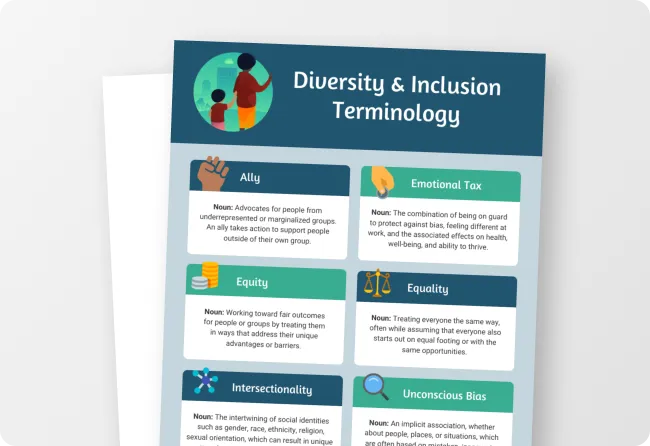
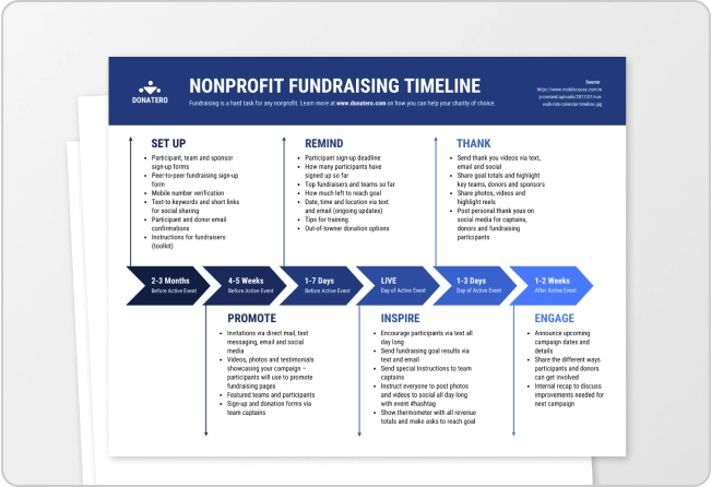
When you publish share your infographic as a link (what we refer to as the published view), this page will be automatically scaled based to your screen size. Anyone viewing this page on their phone or tablet will see an automatically scaled down view. If you’re on your phone, check out how this rather large infographic (from our recent page on nonprofit infographics) is scaled to fit your phone:

Embed Views
We’ve also made our embed views automatically responsive to your blog or webpage. This means that you can embed your infographic using our new embed code and it’ll automatically scale to the size of your web page. For example, our blog is quite narrow and below you’ll see an example of how the infographic’s width is automatically scale to fit the narrow width of our blog. It’ll resize automatically on any device. If you need to zoom in, use the pinch gesture.
How do you get the embed code or share the published view? Click on Publish and publish your infographic. After it’s published, you’ll see the URL and the embed code in the dropdown:

This is a first big step towards our mobile vision. We’ve long recognized that more and more people view content on their phones and as content creators, we’re going to continue to build more mobile friendly creation tools.
Let us know if you have any suggestions to make the mobile views better. Send us an email at info@venngage.com or comment below.