


The following is an excerpt from our eBook How To Design Facebook Images That Get More Clicks.
Are Facebook ads something you have wanted to try for a while, but you haven’t been sure where to start?
It can be a bit daunting.
Especially if you have to design your Facebook images yourself.
A good place to start is to identify the goal of your Facebook ads.
The ultimate goal of any Facebook ad is to catch someone’s eye with the right combination of stunning visuals and compelling copy. And then to get them to click through to your site.
You want the ad to stand out against the background noise of news, politics and status updates.
The ad copy could be impeccable but the visual has to be even better, since that’s what will be seen first. Now that almost every news site, company page or blogger uses compelling visuals, standing out has become more difficult.
In fact, Consumer Acquisition found that images are responsible for 75% to 90% of ad conversions.
That’s why our team worked hard to come up with these actionable tips for creating the most effective Facebook images for 2017!
By now there are thousands, or maybe millions, of guides on how to create the perfect visual for a Facebook Ad.
The problem?
Those tips and tricks is are either extremely broad or would only work for a specific product or niche. And worst of all, they are not immediately actionable, or they require a professional design team, which not everyone can afford.
Instead of being one of those incredibly broad guides that tells you what you already know, we decided to test very specific things.
So we tested 35 different Facebook ads over a few weeks to find out what visual elements drove the most clicks.
Here is what we found.
(By the way, if you want to create your own ebook like this one, check out our ebook templates).
What Facebook Images We Tested
We were interested in finding out what the best visual components were for a Facebook ad.
Because as the newsfeed algorithm keeps changing, ads may soon be the only way your content is seen.
The budget, audience, and time were kept exactly the same to limit the variables and hopefully make our test even more accurate.
So we decided to run Facebook ads for our “Ultimate Guide To Designing Epic Social Media Images” (not live now).
The ad copy was also kept consistent throughout, with the ads looking exactly the same as the example below:

From there, we decided to try 26 different design combinations to help narrow down the Facebook images for the next round of testing.
Some of the design elements we tested were quite different, like whether or not light or dark colors lead to more clicks.
But others were a little more subtle, like whether or not a combination of serif and sans serif fonts help bring in more clicks.
Here are a few of the ads that we tested:
As you can see, we tested different font families, sizes and positions.
Here is a breakdown of the different design combinations we tested:
- Color (Vibrant-Pastel-Neutral-Dark) — 4 Ads
- Font (Serif-Sans Serif-Caps-Sentence Case) — 4 Ads
- Text (Large-Small-Centered-Left-Right-Top-Bottom-None)– 8 Ads
- Illustrations (Illustrated-Control) — 2 Ads
- Image (Person-Animal-Food-Universal-Product-Location) — 6 Ads
- Chart/Data Viz (Chart-Graph) — 2 Ads
- Call To Action — 2 Ads
- Branding — 2 Ads
- Memes– 2 Ads
- Fraction Of Image — 1 Ad
- Before/After — 1 Ad
If you would like a deeper explanation about each of the ads and how we created them, do not hesitate to leave a comment!
First Test Run
So what did we find?
There are seven design elements and combinations that performed better than the rest.
Based on those results, we created a sample of new ads and tested them to see which were the ultimate Facebook ad design combinations.
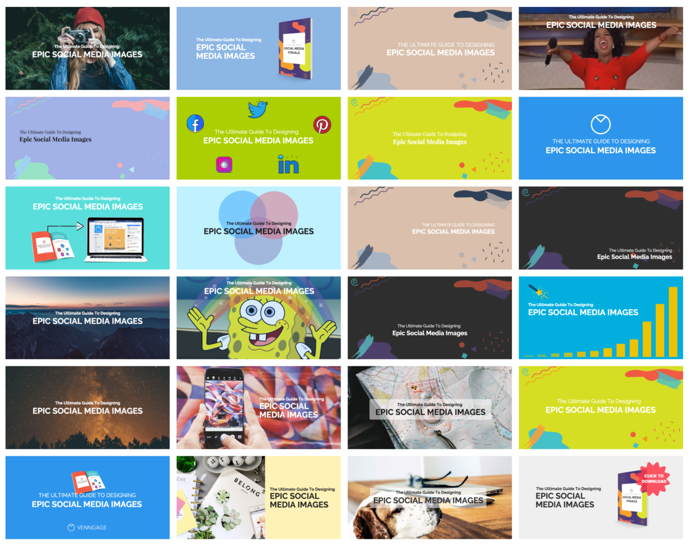
1. Use Recognizable Images
First, we found that people love relevant memes, or at least love Facebook images that they are familiar with.
The most popular ad we created involved none other than the queen of daytime TV, Oprah.
I mean, no surprises there.
For the people who love seeing numbers, this ad received 145% more clicks when compared to the sample average.
Not bad, Oprah.
Memes like this one are great for Facebook ads because the average internet user has some familiarity with them already. This gives your ad an advantage because the idea you are trying to convey is understood immediately.
Now, I am not saying that you need to be hip to the most popular memes to create successful Facebook ads, but it’s worth a try!
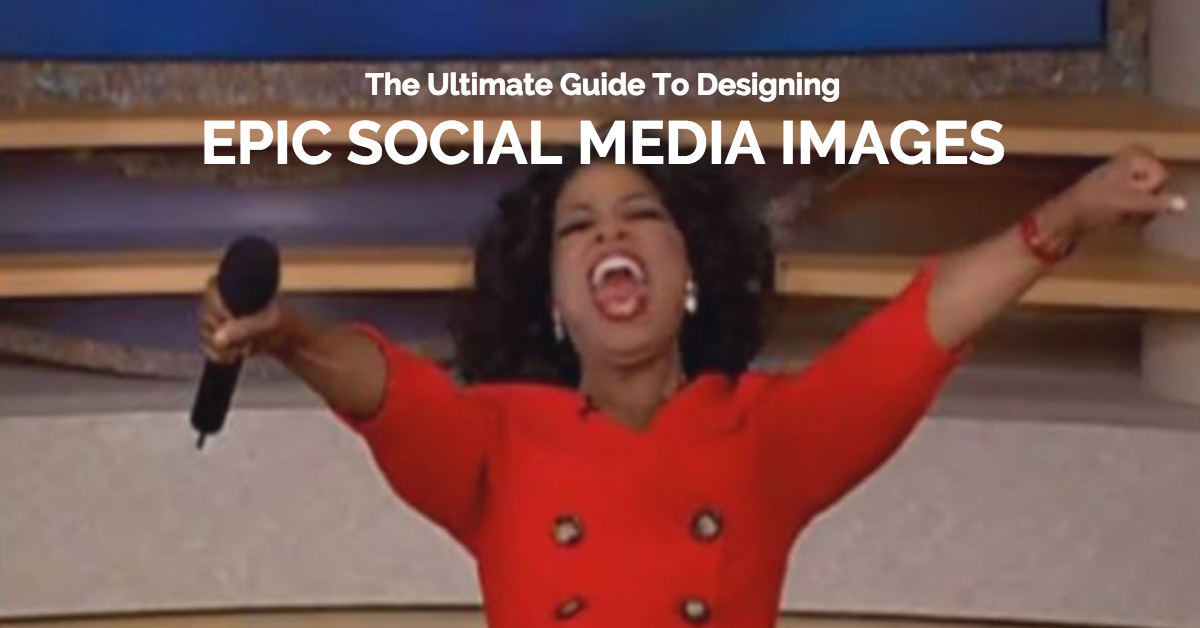
2. Try a Dark Color Scheme
The second best performing ad utilized a dark color scheme.
This ad received a total of 131% more clicks than the sample average and was our second most popular ad.
To be honest, I suspected that this would be one of our best performers for reasons I will explain below.
But first, take a look at the ad:
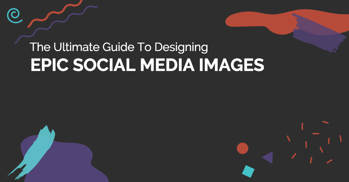
As you can see, the darker colors stand out well against Facebook’s light grey and white background. The white text is also very easy to read against the black background.
In this ad, we also tested the position of the text, which, as you can see, was left-aligned. We found that it performed significantly better than ads which had text that was right aligned or even centered.
Why is that?
I suspect it’s because people are used to scanning through headlines on Facebook and pretty much everywhere else where text is-you guessed it–left-aligned.
3. Use Charts & Graphs
The third most popular ad design included something that we are very familiar with at Venngage: a graph.
This was another ad that I knew would be a winner from the beginning. And it was, with 86% more clicks than the average for the sample.
And, as you can see, the text is left-aligned in this one as well:

A graph like this can be digested very quickly and also presents the idea that this ebook will help your social media metrics grow is distilled.
This is pertinent when people are consuming massive amounts of information on any social media platform.
Now, let’s take a look at the other design elements that made this a winner.
First, the contrasting colors of the graph really made the image pop on a blue background.
Next, the title or text is the only thing that is white in the ad, which makes it stand out.
And finally, the magic wand pushes your eye directly to the title of the ad.
Basically:
We kept it simple and used subtle design tricks to make it an effective ad.
This was in contrast with another chart ad that we used, which probably confused more than informed:

Not to mention, the text ended up being difficult to read on the busy background, which probably lent to this ad’s less than stellar results.
Second Test Run
After running our first batch of tests, we picked elements from the best ads and combined them into a few mega-ads.
There were a few surprises.
Here are the top three performing ads from our second test run.
1. Use Thematic Images & Product Shots
Instead of showing someone creating a social media image, the top performing ad from our second test utilized a more metaphorical image of a beautiful night sky.
The success of this ad was somewhat surprising since it didn’t directly have to do with social media.

But after I looked a little deeper into the image, it made sense why it performed so well.
First, the image utilizes dark tones to make it stand out against the white background of Facebook. But the main image is also able to use a vivid palette with contrasting colors to give it a great balance.
Next, we included the actual ebook cover in the image, which shows to the audience that it is a tangible product. In this format, it looks like a formidable guide full of interesting ideas instead of just a blog post.
Plus, just like with the magic wand from an earlier ad, the book draws your eye to the title.
And finally, the use of a white title made it pop on such a dark background!
2. Use A Dark Color Scheme and a CTA
Our second most successful ad from the second test used a similar dark color scheme to the second ad from the first test.
This ad used a solid black background with white left-aligned (which we already know is a winner!).
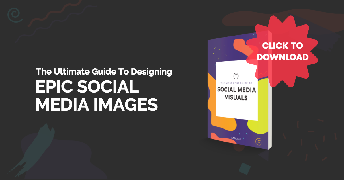
Unlike the original dark ad, this one included a few extra design elements that we saw performed well in other ads.
For example, you can clearly see the large red call to action button in the upper right corner. This was added to not only catch the eye, but also push our audience in the correct direction.
How so?
In the other ads it only said “Download Now” but the little extra instruction in “Click to Download” pushes our audience actually click.
I believe that this also informed people that they could get this product not only for free, but immediately as well.
People love free things that also provide immediate gratification.
And, again, we included a picture of the product, which helps people visualize a product that is virtual.
3. Use Icons and Charts
Like we have already discovered, popular topics like food, memes or locations work really well.
In the third most popular ad from the second test, we used coffee as our popular topic and built the visual around it.

This was also only one of a few ads from the whole study that used icons or graphics in the visual.
Aside from grabbing our audience’s attention, they were also used to give the visual more context–in this case, that this guide would help your social media and marketing metrics skyrocket!
The style of the icons also helped the ad succeed. Fun and whimsical icons can help put your audience at ease, appeals to the child in all of us, and makes the product seem more accessible.
So ditch the boring minimalistic icons and using something more fun!
In Summary
From both rounds of testing, we were able to glean to eight key tips to take away:
- Left-align text.
- Use recognizable images and memes.
- Include a product shot.
- Include a call to action.
- Use fun and playful icons.
- Use white text.
- Mix up font styles and Facebook image sizes.
- Use interesting and thematic images.
These are little things that you can add to your next campaign. To help you get started, we created a bunch of customizable Facebook image templates which you can see here!


