Free AI Dot Plot Generator
Turn any data set into a professional dot plot chart — no formulas, no coding, no design work.
Browse Through More Chart Templates
Popular AI Design Generators
Sample Prompts You Can Modify and Use
“I've uploaded a CSV file with survey responses collected from 50 participants on their daily commute times in minutes. Create a dot plot showing the full frequency distribution — labeled axes, a descriptive title identifying the survey and sample size, and the median commute time marked as a reference line on the chart.”
“As a university lecturer presenting grade distributions for a first-year statistics assignment to the department, create a dot plot showing the spread of marks out of 100 for 30 students, with the data organized to show clustering around the pass mark of 50 and the distinction threshold of 70, labeled axes, and a title identifying the module and assessment period.”
“As a customer experience manager presenting NPS survey results to the product team, create a dot plot showing the distribution of satisfaction scores from 1 to 10 across 25 responses — 4, 5, 6, 6, 7, 7, 7, 7, 8, 8, 8, 8, 8, 9, 9, 9, 9, 9, 9, 10, 10, 10, 10, 10, 10 — with a clearly labeled scale and a title that identifies the product and survey period.”
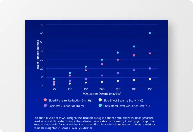
“The physics experiment went slightly differently than the textbook said it should. Turn the distance measurements from the uploaded text file into a dot plot with the theoretical expected value marked. The discrepancy needs to be visible for the lab report discussion section.”
How to Create a Dot Plot Using AI
Step 1
Enter Your Data or Upload Your File in Venngage
Type your data set into the prompt field — include the values, what they represent, and how you want the chart labeled — or upload a spreadsheet, CSV file, or PDF report and let Venngage extract the data and build the dot plot automatically.
Step 2
Generate Your Dot Plot Chart
Click generate and Venngage's AI Dot Plot Generator produces a complete, fully formatted dot plot — data points plotted, axes labeled, and visual hierarchy optimized instantly. A frequency distribution dot plot shows clustering and spread clearly, a comparative dot plot places multiple data sets side by side, and a statistical dot plot highlights the median and outliers automatically.
Step 3
Customize Using Venngage's AI Designer
Use the AI Designer to adjust colors, add reference lines — a target value, median marker, or benchmark threshold — and use the drag-and-drop editor to move labels, resize axes, and update typography until the chart is presentation-ready.
Step 4
Apply Your Brand Using Venngage's Brand Kit
Use the Brand Kit to apply exact fonts, colors, and visual identity across every dot plot and data visualization in a report or research paper. Teachers, researchers, and analysts producing multiple charts across a single project use the Brand Kit to ensure every visualization looks consistent.
Step 5
Export and Share Your Dot Plot From Venngage
Download as a PNG or PDF for presentations, research papers, and printed reports, or share instantly via a private Venngage link for team review, classroom distribution, or collaborative data analysis — every export is high-resolution and presentation-ready.
Create Dot Plots for Statistics and Data Assignments as a Student
Statistics assignments don't wait for Excel to cooperate. Enter the data set, describe what it represents, and Venngage’s Dot Plot Generator generates a fully formatted dot plot — axes labeled, distribution plotted, median marked — in the time it used to take to find the right chart type in a spreadsheet.
From frequency distribution dot plots for high school statistics to comparative dot plots for university data analysis coursework, Venngage builds the right chart for the assignment automatically. Download as a PNG or PDF ready to drop into the report — no reformatting, no resizing, no starting over because the axis labels disappeared.
Generate Dot Plots
Visualize Research Data Without a Dedicated Statistician as a Researcher or Academic
Building a publication-ready chart from raw experimental data has always required either a statistics package or a lot of time in Excel. Upload the data spreadsheet, PDF report, or CSV file and Venngage AI extracts the values and generates a fully formatted research dot plot with the median, outliers, and reference thresholds marked automatically.
Use Venngage’s Brand Kit to keep every dot plot and data visualization in a research paper visually consistent and export high-resolution PNG or PDF files ready for journal submission, conference presentation, or thesis appendix without additional formatting.
Generate Dot Plots
Turn Data Distributions Into Presentation-Ready Charts as a Data Analyst
The insight is in the distribution. The problem is getting it out of a spreadsheet and into a format a leadership team can read in a boardroom. Upload the CSV, paste the data set, or pull figures directly from a PDF report and Venngage’s Dot Plot Maker builds a comparative dot plot that places the distribution, the benchmark, and the outliers in the same visual.
Use the AI Designer to add reference lines and optimize the visual hierarchy for the specific audience. Use the Brand Kit to keep every chart in the report consistent, and share via a private Venngage link for stakeholder review before the presentation goes live.
Generate Dot Plots
Generate Dot Plots In Seconds With Our AI Dot Plot Generator

Turn Raw Data Into a Readable Chart Instantly
Enter the values, describe what they represent, and Venngage’s Dot Plot Generator builds a fully formatted dot plot — no formulas, no axis formatting, no hour spent making Excel cooperate.

See Where the Data Clusters Without Running the Analysis First
Venngage plots the distribution automatically and marks the median, mean, and reference thresholds so the pattern in the data is visible the moment the chart generates, not after a separate statistical analysis.

Compare Multiple Data Sets Without Building the Chart Twice
Enter two data sets in the same prompt and Venngage places both distributions on the same comparative dot plot automatically. Pre- and post-intervention scores, two team performances, three age groups — the comparison is built in from the first generation.

Add Reference Lines That Make the Insight Impossible to Miss
Use Venngage's AI Designer to add a target value, benchmark threshold, or median marker directly to the dot plot so the gap between where the data sits and where it should sit is visible without anyone doing the calculation in the room.

Keep Every Chart Consistent Across an Entire Report
Use Venngage's Brand Kit to apply exact fonts, colors, and visual identity across every dot plot and data visualization in a report or research paper — twelve charts that all look like they came from the same source are more credible than twelve that didn't.

Export Charts That Are Ready to Present
Download as high-resolution PNG or PDF files ready to drop into a presentation or research paper without resizing or reformatting. Share via a private Venngage link for team review or classroom distribution.
Fuel Your Creativity with AI-Powered Design Tools
Venngage is your one-stop shop for creating impactful presentations, infographics, reports, and more. It's a favorite among professionals, educators, and marketers for a reason:
AI Branding Automation
Instantly extract brand colors, fonts, and styles. Auto-apply your logo and visual identity to every design for seamless brand consistency.

DesignAI Generator
Turn simple prompts into stunning professional visuals in seconds. Describe what you need in plain language and watch our AI generate layouts optimized for maximum visual impact.

AI Content Auto-Fill
Kickstart your design process in seconds. Choose a template and let our AI auto-fill it with relevant, on-brand content, ideal for streamlining workflow and boosting productivity.

AI Generated Icons and Images
Create unique visuals that perfectly match your content and style. Generate custom illustrations, icons and images that align perfectly with your brand.

AI Writer and Translation
Enhance clarity, rewrite content, and instantly translate text to create accessible, global-ready visuals.

Smart Accessibility AI
Ensure every project looks great and works for everyone. Use AI to write alt text check contrast, layout, and font readability, and export fully WCAG-compliant visuals and PDFs.

FAQs
Absolutely. All AI-generated dot plots on Venngage's platform are fully customizable, allowing you to personalize colors, designs, images, copy, and contact details to match your clinic, hospital, or health system.
Yes, there are a variety of design generators available on Venngage. Along with the AI Dot Plot Generator, Venngage offers tools to create infographics, social media posts, reports, and more. These AI design tools are easy to use and customizable, helping you generate professional visuals quickly to match your style and needs.
Yes, the AI-generated dot plots created using Venngage's tools are copyright-free. You can use them for both personal and commercial purposes without any restrictions on copyright. However, it's always good practice to ensure that any externally sourced content you include is also cleared for use.
We offer a free plan so you can try out all our AI features without spending anything. If you want more advanced features like private sharing and auto branding, we've got Premium and Business plans available too.