
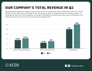
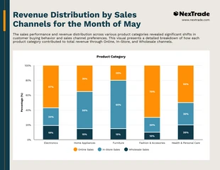
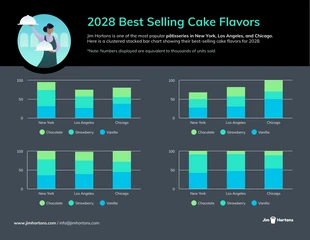
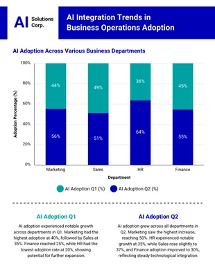
Stacked Column Chart
Looking for a stacked column chart template? Look no further – Venngage provides a fully customizable editable infographic template.

 100% customizable templates
 Millions of photos, icons, charts and graphics
 AI-powered editing features
 Effortlessly share, download, embed and publish
 Easily generate QR codes for your designs
- SizeLetter (11 x 8.5 in)
- File typePNG, PDF, PowerPoint
- Planfree
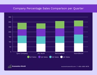
A stacked column chart is a visualization that combines two or more columns of data into one column. The top of each column represents a different category, and the bottom represents the values within that category. The difference between stacked and unstacked column charts is that in stacked charts, the values are grouped together as opposed to being shown individually as they would be in an unstacked chart. Stacked column charts help users by giving them a quick overview of multiple categories at once, making it easy to compare values between them. They also allow users to see trends over time more easily than other types of charts, which makes them useful for understanding performance over time. Stacked column charts have many benefits: they are easy to read, make it easy for users to compare multiple categories at once, can show trends over time better than other types of charts, and require less space than other types of charts do because they only need one axis instead of two or three axes like most other types of charts
Related Chart Templates
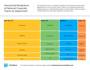
tree map charts
column charts
stacked charts
stacked charts
stacked charts

column charts
column charts
stacked charts
stacked charts
stacked charts