
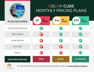
Purple Medical Plans Comparison Chart Diagram Template
Dive into designing your own Purple Medical Plans Comparison Chart for clear healthcare options!

 100% customizable templates
 Millions of photos, icons, charts and graphics
 AI-powered editing features
 Effortlessly share, download, embed and publish
 Easily generate QR codes for your designs
 Accessible and WCAG-compliant
- Design stylemodern
- Colorslight
- SizeTabloid (17 x 11 in)
- File typePNG, PDF, PowerPoint
- Planbusiness
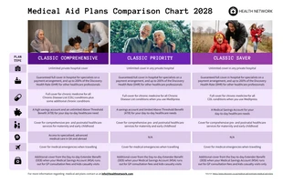
The Purple Medical Plans Comparison Chart template is an exceptional design tool that is perfect for showcasing and contrasting various healthcare plans. Its predominant purple theme gives it a distinct and professional appeal, making it a real attention grabber. The template is fully customizable - you can adjust colors, modify sizes according to your needs, and select the most appropriate photos or icons from our comprehensive free stock libraries. This template's design is ideal for promoting your healthcare plans and getting the word out about your offerings. Utilize this template in Venngage to generate your ideal design that effectively communicates the differences and similarities between the medical plans you have on offer.
Related Diagram Templates
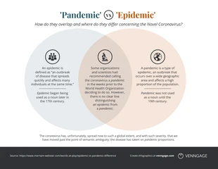
venn diagram diagrams
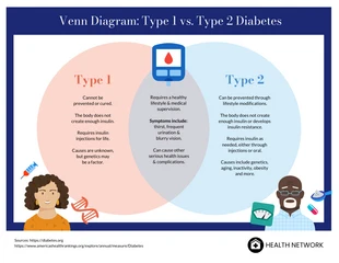
venn diagram diagrams
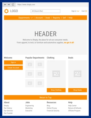
wireframe diagrams
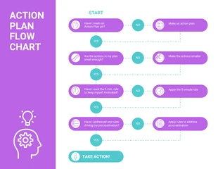
flowchart diagrams
comparison chart diagrams

comparison chart diagrams
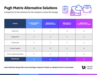
pugh matrix diagrams
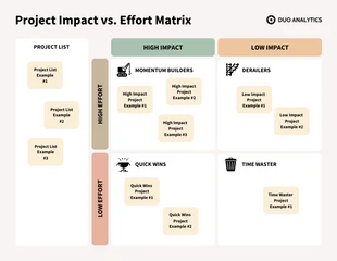
impact effort matrix diagrams

venn diagram diagrams
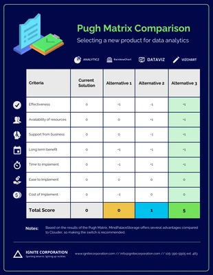
pugh matrix diagrams
comparison chart diagrams
venn diagram diagrams