
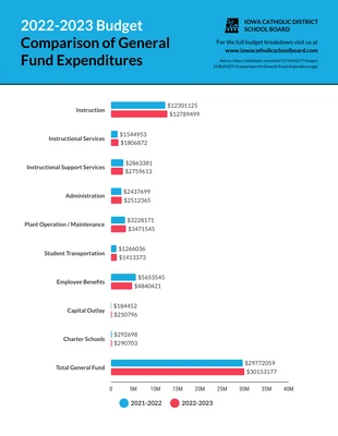
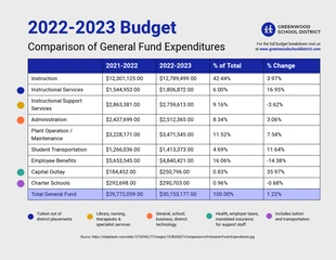
General Fund Comparison Infographic Template
Customize this General Fund Comparison Infographic Template for a traditional fund comparison and much more

 100% customizable templates
 Millions of photos, icons, charts and graphics
 AI-powered editing features
 Effortlessly share, download, embed and publish
 Easily generate QR codes for your designs
 Accessible and WCAG-compliant
- Design stylemodern
- Colorsdark
- SizeLetter (11 x 8.5 in)
- File typePNG, PDF, PowerPoint
- Planbusiness
Make a conservative fund comparison and more with this editable General Fund Comparison Infographic Template. You can easily make it your own by editing the professional color scheme, bold headings, and modern font. When it comes to the colors, keep it simple by adding a professional color scheme. Professional colors will make it look sophisticated and Venngage has a wide range of color palettes available, but you can create a new color scheme for a more personal touch. After you've applied new text, integrate bold headings so the titles pop off the page. You can also use bold headings to separate the headings from the body text and to maintain a natural flow to the General Fund Comparison Infographic Template. Choose a modern font when you're presenting data or statistics so that it's easy to follow. You'll find a large collection of modern fonts on Venngage, but you can opt for an entirely different style to suit your needs. Do you have questions about the template? Contact us today and we'll glad to answer your questions!
Related Infographic Templates
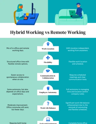
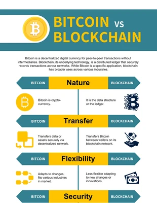
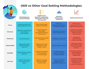
comparison infographics
comparison infographics
comparison infographics
comparison infographics
comparison infographics
comparison infographics
comparison infographics
comparison infographics
comparison infographics
comparison infographics

company infographics
comparison infographics