In today’s environment, documents are key to effective digital communication.
Documents are versatile and can be used to create business plans, company performance reports, newsletters, brochures, and even presentations.
But there’s one big problem.
Most people still use graphic design tools like Canva or Adobe Express to create digital documents.
Yet, none of these tools are fully WCAG compliant.
This means people with visual impairments or other disabilities are being excluded from the documents you create on these tools.
In this post, I’ll show you how to create accessible documents from start to finish using Venngage.
By the way, remember that creating accessible documents isn’t just an ethical commitment but also a legal requirement.
Eager to get started? Head over to our Accessible Design Tool to start creating accessible documents or check out our collection of accessible templates for inspiration.
Some of our accessible templates are free and some require a small monthly fee. Sign-up is always free, as is access to Venngage’s drag-and-drop editor.
Click to jump ahead:
- What is an accessible document?
- How to create an accessible document
- 6 examples of accessible documents
- Frequently asked questions
- Conclusion
What is an accessible document?
An accessible document is a digital document whose content such as text, images, graphics, or other multimedia elements can be understood by anyone, including those with disabilities.
Documents shared in Word format such as .doc or .docx files can be hard to make accessible.
PDFs are generally accessible but they must conform to PDF/UA standards.
PDF/UA enhances document accessibility by ensuring compatibility with assistive technologies used by people with disabilities.
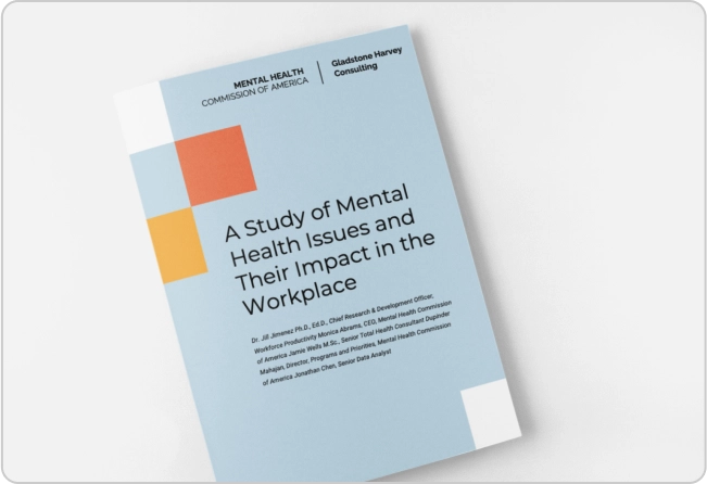
Here’s an example of an accessible report:
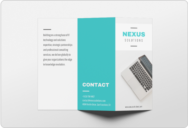
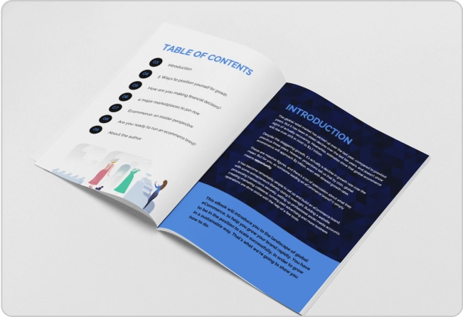
Accessible documents cover a wide variety of document types. Besides accessible reports, you can also create accessible brochures like in the example below.
Why are accessible documents important?
Accessible documents are important because they ensure information is available to everyone, including individuals with disabilities.
It also reflects positively on a company’s commitment to inclusive design.
How to determine if your document is accessible?
A digital document is deemed accessible if it follows Web Content Accessibility Guidelines (WCAG) version 2.2 set by the World Wide Web Consortium.
But that’s not the only body governing accessibility.
For example, the US also has the ADA guidelines for accessible design (Americans with Disability Act) in place which prohibits discrimination against individuals with disabilities in all areas of public life.
How to create accessible documents in 9 steps
Now that you know why accessible documents matter, I’ll show you how to create them using Venngage.
Venngage is the best graphic design software for accessibility.
Besides being the first graphic design tool to target accessibility from start to finish, it also adheres to WCAG standards.
And unlike Canva or Adobe Express, Venngage allows designs to be exported as PDF/UA.
Venngage also has a built-in accessibility checker to highlight areas in your documents that may be a barrier to accessibility, so there’s no need to export your designs for manual testing.
Step 1 – Write in simple language
When creating documents with accessibility in mind, avoid complex sentences and keep your text simple.
This improves the likelihood of your content being understood by a broader audience, including individuals with cognitive or language disabilities. To reach larger audiences, you can also translate your documents using best AI translation tools, providing maximum understandability for them in their native language.
Break down complex ideas into smaller, digestible chunks to enhance comprehension of your documents.
Step 2 – Use proper heading structures
Properly structured headings are crucial for accessible documents.
Just as how headings help normal readers quickly figure out where to pay attention, they also help people with visual impairments or disabilities navigate content and understand hierarchy.
To set a proper heading structure, use heading styles such as H1, H2, and H3s to create a logical structure for your content.
For example, let’s say I’m creating a job aid infographic.
Venngage adds heading tags to your content so you can see when something is out of place or missing.
How can you do this?
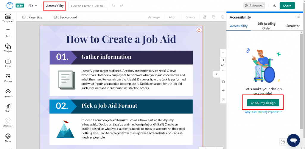
Click on “Accessibility” at the top of your design and run the test.
Venngage will highlight the heading structure of the text for you.
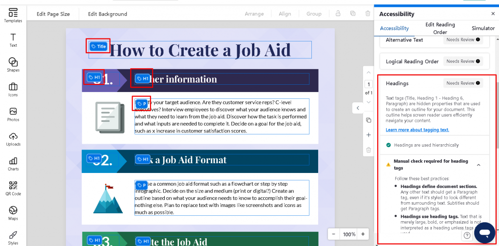
To make changes, select the text and click on the “Text Tag” option.
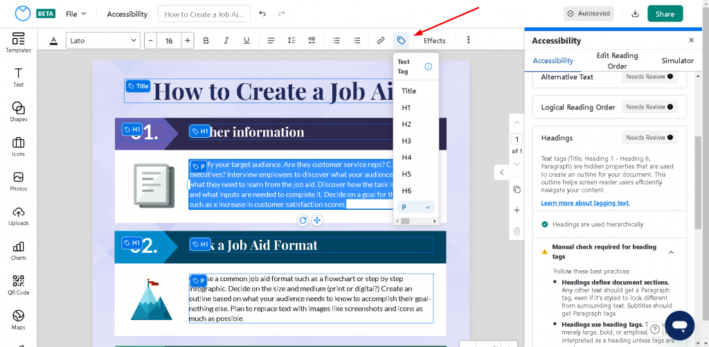
Also, don’t forget to set the document title.

Want more information on how to use headings in documents? Read our guide on how to create and tag headings and titles for accessibility.
Step 3 – Use bullet points or lists where possible
When possible, instead of using lengthy paragraphs, break up your text with bullet points or lists.
This ensures your document is scannable and helps readers grasp key points quickly.
When using a list, ensure that items are well-defined and logically grouped.
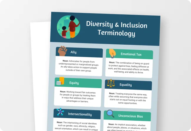
Here’s an example:
Step 4 – Ensure consistent formatting
Consistent formatting is a core principle of accessible document design.
Why?
Consistency enhances readability and reduces cognitive load for individuals with visual impairments or other disabilities.
Also, uniformity enables people to focus on the message rather than wasting time trying to figure out different formats.
Also, try testing out the white space between sentences and paragraphs to help people with dyslexia read.
Step 5 – Add alt text to images or charts
Alt text, or alternative text, is a text-based description that provides information about images, charts, and other non-text elements in your documents.
Alt text is crucial for individuals who cannot see images since screen readers read the alt text to convey the meaning of images.
With Venngage, you can add alt text to images with ease or mark images as decorative so that screen readers ignore them completely.
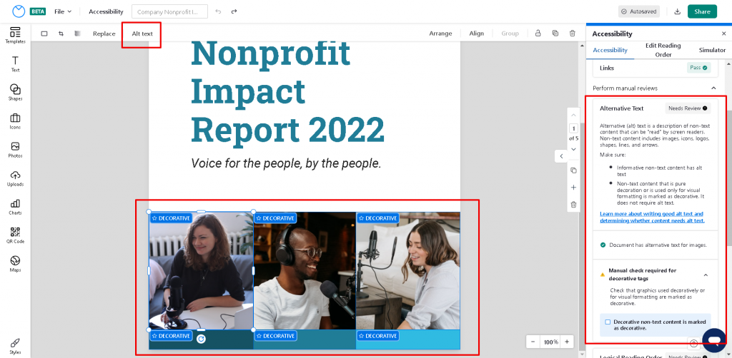
When adding alt text, be descriptive and concise to convey the purpose and content of the image accurately.
Want to know how to determine whether images need alt text or can be marked as decorative? Check out our guide on adding alt text to elements in your design.
Step 6 – Label your tables
It’s not uncommon to see documents use tables to present structured data.
Since tables are also content, they need to be marked properly for accessibility. To do this, you need to implicitly tell screen readers the structure of a table by marking its rows and columns.
This is not possible with many popular report-making tools like Canva or Adobe Express.
But Venngage makes creating accessible tables easy.
Let’s say I’m creating an annual payroll report to present to company management. The whole report is structured as a table.
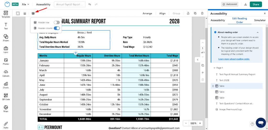
To mark the table, just select it and look for the “Headers” option on the top left.
Pick the appropriate tag and you’ve got an accessible table. It’s really that simple!
Step 7 – Set the correct reading order
Reading order refers to the sequential order in which content is presented to users on assistive technologies.
When preparing accessible documents, you need a way to set the reading order so that individuals with disabilities, especially those who are visually impaired or blind, can perceive and navigate the content in a logical and meaningful manner.
Most design tools on the market today don’t allow this or don’t make it intuitive.
But with Venngage, it’s easy to verify and edit the reading order to match the visual layout.
For example, let’s pretend you’re creating an annual report for a non-profit.
Here’s how you can test and adjust the reading order:
- Click on Accessibility at the top
- Click on “Editing Reading Order” on the right sidebar
- Select your page to get a view of the current reading order. You can adjust the order by dragging and dropping elements
Step 8 – Ensure adequate color contrast
For individuals with low vision or color vision deficiencies, a high color contrast ratio allows them to tell text and images apart more easily.
Thus, making sure text and graphical elements have sufficient contrast with the background should be a top priority.
Don’t pick a color scheme at random. Instead, use an accessible color scheme or color combinations that have a contrast ratio of at least 4.5.1 when creating accessible documents.
How can you do this?
Venngage has a Color Contrast Checker to help you test your document. Or if you need some help coming up with an accessible color scheme, you can use our Accessible color palette generator.
Here’s an example:
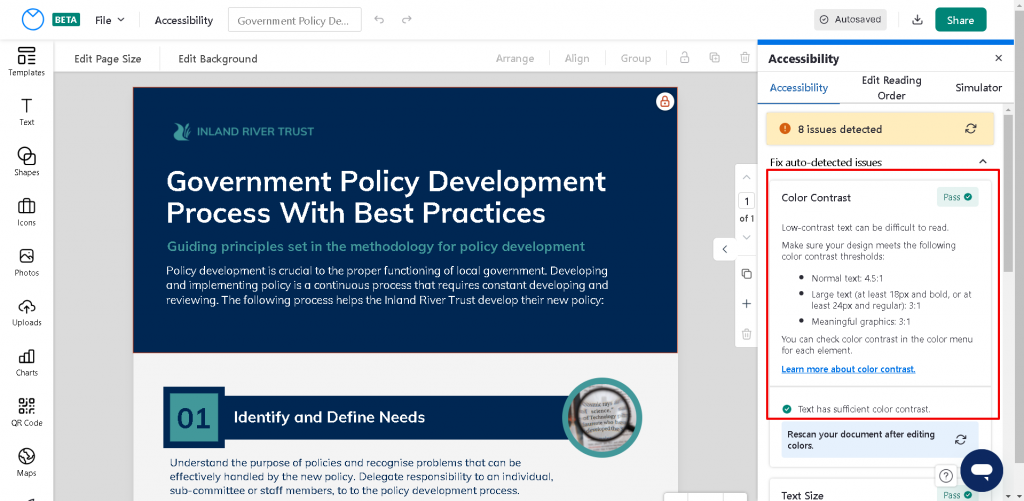
Check out our guides on use of color and color contrast for more information on how to make sure your documents use accessible colors.
Step 9 – Use an accessibility checker
With so much ground to cover, it’s easy to make a small mistake that makes your document inaccessible.
One method to prevent this is to use accessibility tools that scan your document for potential accessibility issues and provide solutions.
Generally, these are third-party tools.
So, if you create a document in Canva or Google Docs, you’ll need to export your document and then test it on a different tool.
And if you need to make changes, you’ll have to come back to your document.
But if you use Venngage to create accessible documents, you’ll get access to a built-in accessibility checker. No more exporting documents or manual testing.
Venngage’s accessibility checker tests your designs live and provides feedback instantly so you can apply fixes without having to leave the tool.
6 examples of accessible documents
In this section, I’ll share examples of real-world accessible documents you can customize to make your own in a few steps using our Accessible Tool.
Accessible reports
An accessible report is a written or digital document that presents information, data, findings, analysis, and conclusions on a specific topic or subject matter.
Accessible business plans
An accessible business plan is a document that outlines the goals, objectives, strategies, and financial projections of a business or startup.
It serves as a roadmap, providing an overview of how the company intends to achieve its objectives.
Here’s an example:
Accessible newsletters
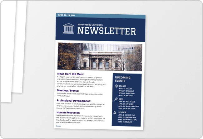
An accessible newsletter is a regular publication that provides updates, information, and news about a particular organization, company, group, or community to its intended audience.
Accessible brochures
An accessible brochure is a document that provides information about a product, service, event, or organization in a concise and visually appealing format.
Creating an accessible brochure allows businesses and individuals to reach a wider audience and demonstrate their commitment to inclusivity and equal access.
Accessible posters
An accessible poster is a document used to convey information, and messages, or promote events, products, services, or ideas.
It typically consists of a combination of text and visuals such as images, graphics, and illustrations, all presented on a single large sheet or board.
Accessible presentations
Accessible presentations are distinct from text-based documents like reports.
A presentation is a visual and interactive communication tool used to deliver information, ideas, or messages to an audience using slides that contain a combination of text, images, charts, graphs, and multimedia elements, such as videos or animations.
Want to learn how to create accessible documents shown in this section? Check out this post:
Frequently Asked Questions
How do I know if a document is accessible?
To determine whether a document is accessible, you need to use an accessibility checker such as Venngage’s Accessibility Tools if you’ve created documents elsewhere. However, it is suggested you use Venngage’s Accessible Tool to create your digital documents since it has a built-in accessibility checker that will tell you whether your design is accessible or not without the need to manually export and test it using a third-party tool.
Are Microsoft Word documents accessible?
No. Microsoft Word documents are not accessible by default, but they can be made accessible using third-party accessibility tools to ensure full compliance. Since this can be time-consuming and difficult, it’s recommended you use a fully-compliant accessible document creator like Venngage.
Does Google Docs have an accessibility checker?
Google Docs, like many other design tools, does not have a built-in accessibility checker like Venngage. If you are creating reports, brochures, newsletters, marketing materials, educational content, and more in Google Docs, you will need to rely on there are third-party accessibility tools and extensions to ensure your documents are more inclusive. To save you time, it’s better to use a tool that has a built-in accessibility checker like Venngage.
In Summary: Creating documents with accessibility in mind allows to you reach a wider audience
When creating documents, besides the content itself, think about how easy your content is to understand for someone with a disability.
Has alt text been set to images? Did you set the correct reading order? Are the colors chosen with all types of users in mind?
By taking some time to make documents accessible, you’ll gain a competitive advantage and be more inclusive.
And to help you achieve this, Venngage will be with you at every step of the way to make the process as seamless as possible.


