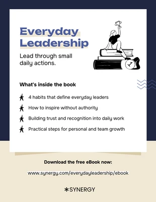
Product Flyer Templates
Keep your audience interested and intrigued with your own product flyer using our professionally-designed product flyer templates.
Filter by


Popular template categories
- Infographics
- Brochures
- Mind maps
- Posters
- Presentations
- Diagrams
- Reports
- White papers
- Charts
- Resumes
- Roadmaps
- Letterheads
- Proposals
- Plans
- Newsletters
- Checklist
- Business cards
- Schedules
- Education
- Human resources
- Ebooks
- Banners
- Certificates
- Collages
- Invitations
- Cards
- Postcards
- Coupons
- Social media
- Logos
- Menus
- Letters
- Planners
- Table of contents
- Magazine covers
- Catalogs
- Forms
- Price lists
- Invoices
- Estimates
- Contracts
- Album covers
- Book covers
- Labels
- One pagers
- See All Templates