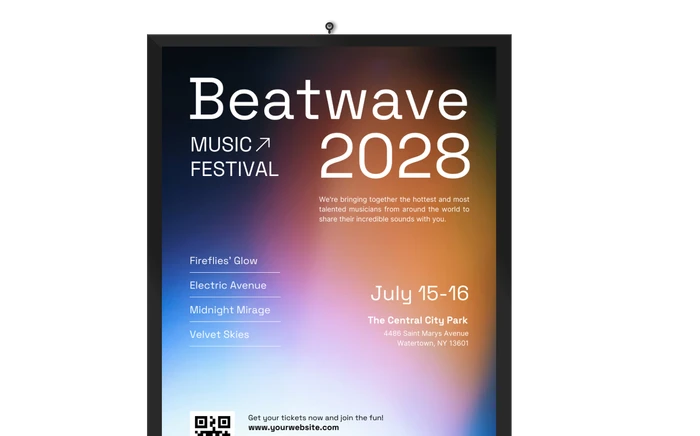
Poster Templates
Make the perfect poster for your next event, product, cause, or advertisement with our specially-designed poster templates. With a wide variety of editable templates, you can design professional-quality and creative posters for any occasion. Simply choose a poster template based on your event theme or product concept, go to our poster maker, and format the template to fit your style. You can change the background and typography, add an illustration or upload an artwork. Once the poster is ready, view the mockup and print the poster. It’s that simple!
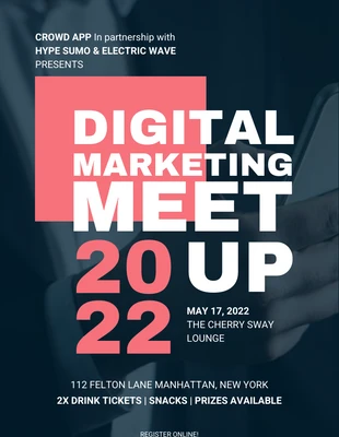
- Event poster
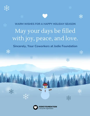
- Holiday poster
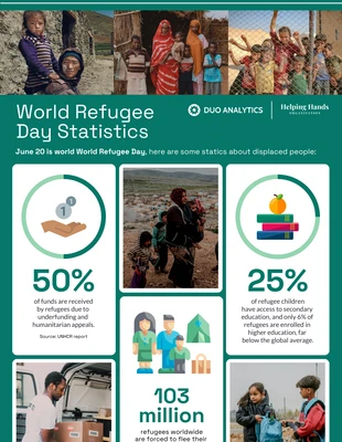
- Research poster
- Campaign poster
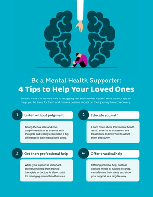
- Mental health poster
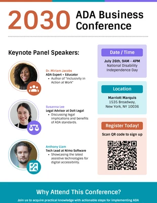
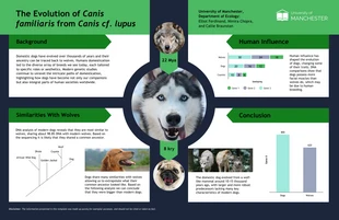
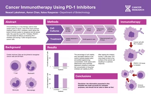
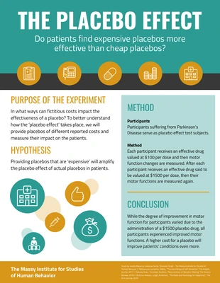
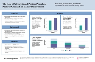
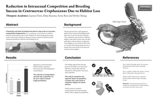
- Scientific poster
- Graduation poster
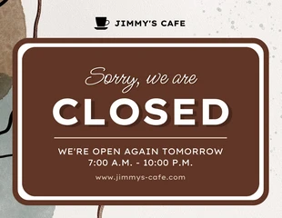
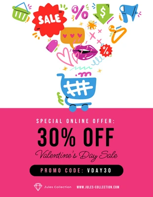
- Sale poster
- Lost dog poster
- Birthday poster
- Halloween poster
- Motivational poster
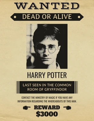
- Wanted poster
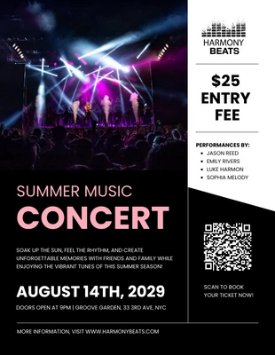
- Concert poster
- Photo poster
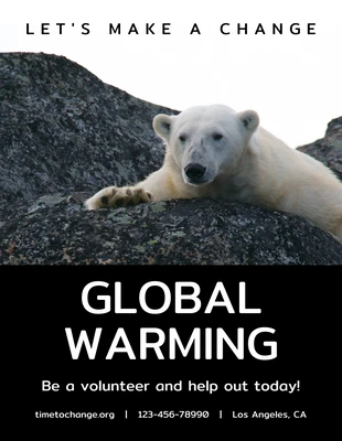
- Climate change poster
- Music poster
- Classroom rules poster
- Black and white poster
- Anti-bullying poster
- Fun poster
- Advertising poster
- Festival poster
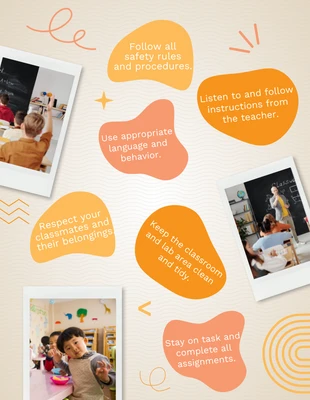
- School poster
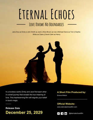
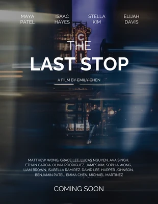
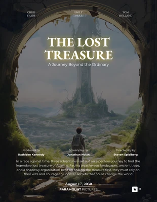
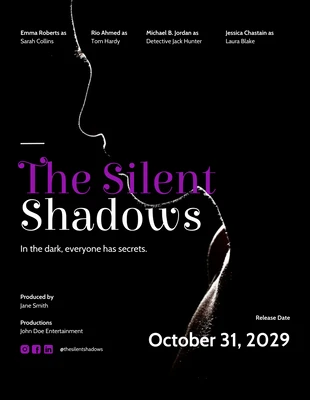
- Movie poster
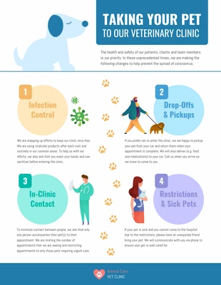
- Coronavirus poster
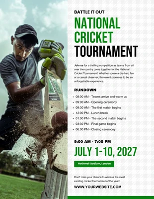
- Sports poster
- Car wash poster
- Gym poster
- Jazz poster
- Educational poster
- Domestic violence poster
- Abstract poster
- Dance poster
- Horse poster
- Medicine poster
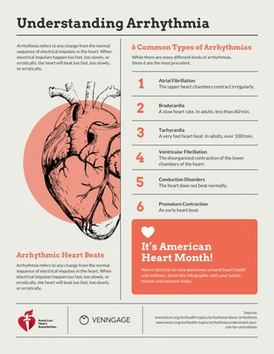
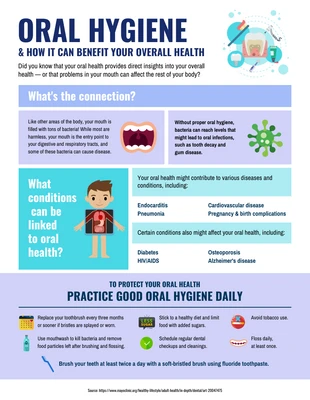
- Infographic poster
- Diwali poster
- Block party poster
- Church poster
- Construction poster
- Aesthetic poster
- Valentines day poster
- World malaria day poster
- Cute poster
- Recycling poster
- Soccer poster
- Typographic poster
- Cheerleading poster
- Cool poster
- Fundraising poster
- Easter poster
- Travel poster
- Gaming poster
- Thanksgiving poster
- Club poster
- Environment poster
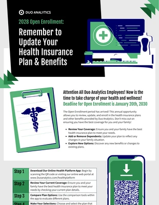
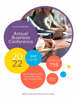
- Conference poster
- Math poster
- Friendship poster
- College poster
- Congratulations poster
- Basketball poster
- Golf poster
- Boxing poster
- Reading poster
- Vintage poster
- Technology poster
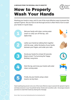
- Safety poster
- Black friday poster
- Art poster
- Floral poster
- Anti-war poster
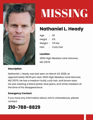
- Missing person poster
- Prom poster
- Business poster
- Volleyball poster
- Election poster
- Recruitment poster
- Drug awareness poster
- About me poster
- Breast cancer awareness poster
- Mothers day poster
- Photo collage poster
- Classroom welcome poster
- Science fair poster
- World blood donor day poster
- Human rights poster
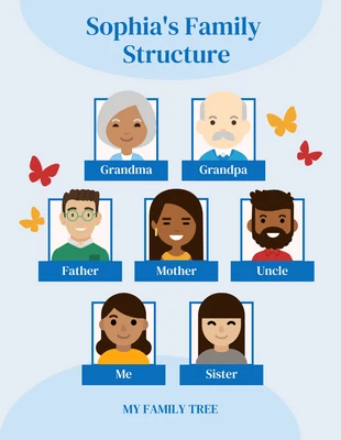
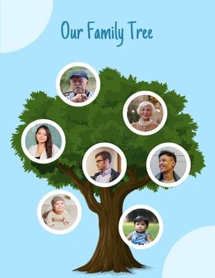
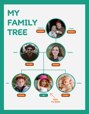
- Family tree poster
- Pro choice poster
- World no tobacco day poster
- Fathers day poster
- Food waste poster
- Chinese new year poster
- Gender equality poster
- Human trafficking poster
- Farmers market poster
- Women's rights poster
- Earth day poster
- Veterans day poster
- Geometric poster
- Homelessness poster
- Hiv-aids poster
- Hockey poster
- Poverty poster
- Kids poster
- Love poster
- Gay rights poster
infographic poster posters
event poster posters
event poster posters
conference poster posters
movie poster posters

movie poster posters
family tree poster posters
classroom rules poster posters

event poster posters
holiday poster posters

event poster posters

photo collage poster posters

movie poster posters
scientific poster posters
event poster posters

holiday poster posters

event poster posters

event poster posters
event poster posters

event poster posters
holiday poster posters
research poster posters
research poster posters
event poster posters
valentines day poster posters
event poster posters
concert poster posters
scientific poster posters

movie poster posters
event poster posters
research poster posters

valentines day poster posters
research poster posters
sale poster posters

fundraising poster posters

movie poster posters
research poster posters
event poster posters

event poster posters
breast cancer awareness poster posters
movie poster posters
event poster posters

conference poster posters
mental health poster posters
research poster posters
event poster posters
movie poster posters
family tree poster posters

movie poster posters
wanted poster posters
movie poster posters
holiday poster posters
educational poster posters
fun poster posters
research poster posters

holiday poster posters
movie poster posters
missing person poster posters

event poster posters

movie poster posters
educational poster posters
coronavirus poster posters
event poster posters
family tree poster posters
event poster posters
fun poster posters

valentines day poster posters
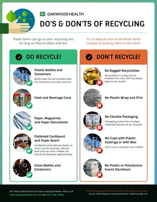
recycling poster posters
research poster posters
event poster posters
Popular template categories
- Infographics
- Brochures
- Mind maps
- Presentations
- Flyers
- Diagrams
- Reports
- White papers
- Charts
- Resumes
- Roadmaps
- Letterheads
- Proposals
- Plans
- Newsletters
- Checklist
- Business cards
- Schedules
- Education
- Human resources
- Ebooks
- Banners
- Certificates
- Collages
- Invitations
- Cards
- Postcards
- Coupons
- Social media
- Logos
- Menus
- Letters
- Planners
- Table of contents
- Magazine covers
- Catalogs
- Forms
- Price lists
- Invoices
- Estimates
- Contracts
- Album covers
- Book covers
- Labels
- One pagers
- See All Templates