
Oil Supply Demand Curve Graph Template
Customize a supply-demand curve graph template using Venngage's templates available now.

 100% customizable templates
 Millions of photos, icons, charts and graphics
 AI-powered editing features
 Effortlessly share, download, embed and publish
 Easily generate QR codes for your designs
- Design stylefun
- Colorsdark
- SizeLetter (11 x 8.5 in)
- File typePNG, PDF, PowerPoint
- Planfree
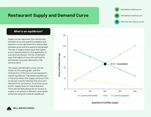
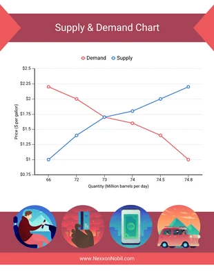
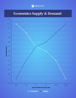
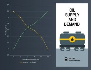
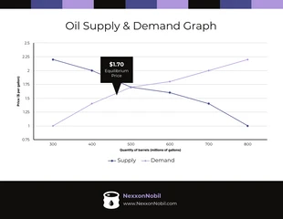
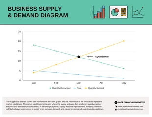
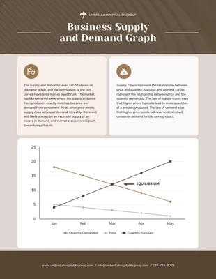
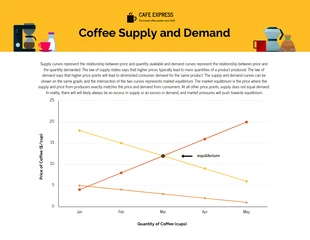
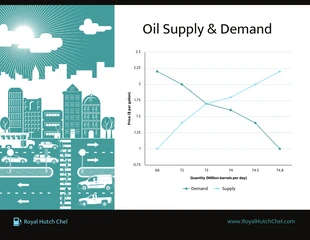
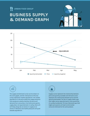
The supply-demand curve graph template illustrates how the law of supply and demand works in the market. It plots the quantity supplied against the quantity demanded at different prices. The result is a curved line that shows how these two factors interact to determine the price. This graph can help businesses decide what price to set for their products. It can also help consumers understand why prices change. For example, if the demand for a product increases, the graph will show that the price of the product will also increase. This is because suppliers will raise their prices to meet the higher demand. This template can be used to analyze any market situation. It is a valuable tool for understanding how the economy works. The supply-demand curve graph template is a visual representation of how the law of supply and demand affects price in the market. The curve shows the relationship between the quantity supplied and the quantity demanded at different prices. When graphed, the two factors interact to create a curved line. This line illustrates how changes in price impact
Related Chart Templates
line charts
line charts
line charts
line charts
line charts
line charts
line charts
line charts
line charts