
Market Equilibrium Graph Template
Design a market equilibrium graph today by editing this market equilibrium graph template from Venngage.

 100% customizable templates
 Millions of photos, icons, charts and graphics
 AI-powered editing features
 Effortlessly share, download, embed and publish
 Easily generate QR codes for your designs
- SizeLetter (8.5 x 11 in)
- File typePNG, PDF, PowerPoint
- Planbusiness
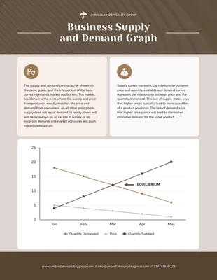
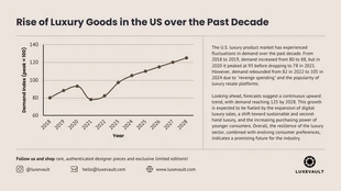
A market equilibrium graph template is used to show how the supply and demand of a product affect the price of that product. The graph shows how different levels of supply and demand will lead to different prices, and how these prices will ultimately reach an equilibrium point where the two lines intersect. The equilibrium point is the point at which the amount of a good that is being demanded (the blue line) is equal to the amount of a good that is being supplied (the green line). The graph can be used to help businesses understand how changes in supply and demand will affect prices, and how they can adjust their production levels to achieve the desired equilibrium. It can also help consumers understand why prices for some products vary from one store to the next, and how they can find the best deal by comparing prices at different equilibrium points. As you can see from the graph, the equilibrium point is not always the same. If the demand for a product increases, the equilibrium point will move to the right,
Related Chart Templates
line charts
bar charts
area charts
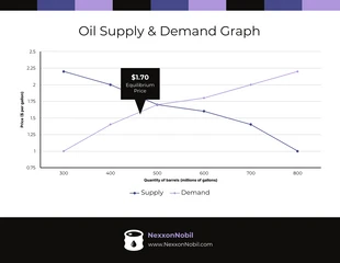
table charts
line charts
area charts
line charts
map charts