Typographic Poster Templates
Unlock the power of words with Venngage's Typographic Poster Templates. Let your message take center stage with stunning typographic designs. From inspirational quotes to event announcements, our collection offers endless creative possibilities. Customize effortlessly and make a bold statement with your words. Design impactful typographic posters now and captivate your audience with Venngage!
Filter by
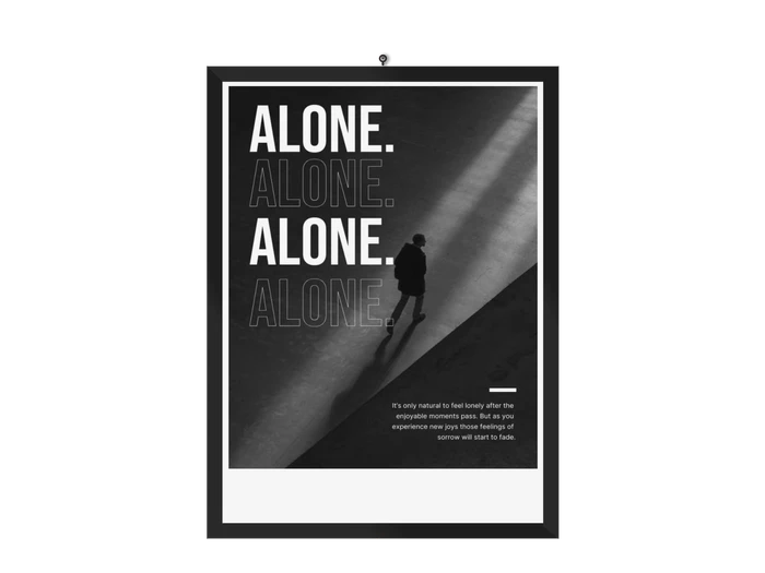
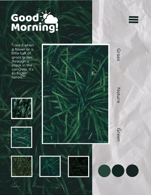
typographic posters

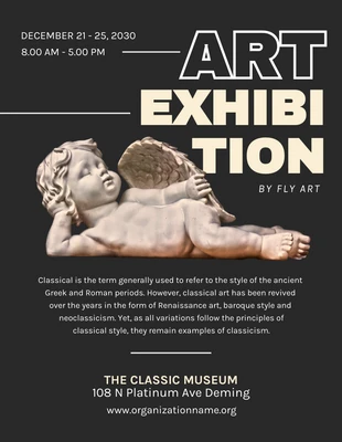
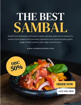
typographic posters
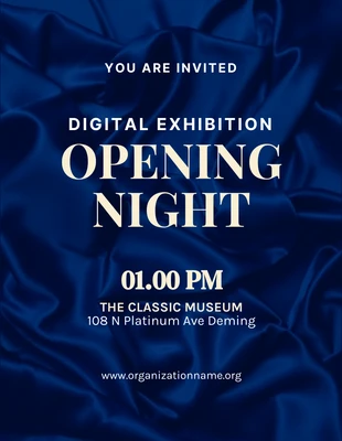
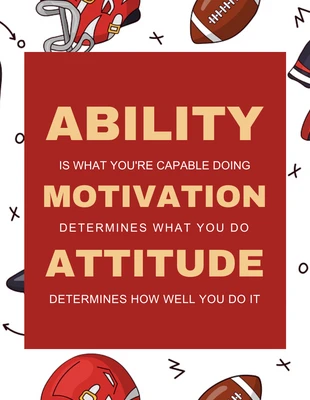
typographic posters
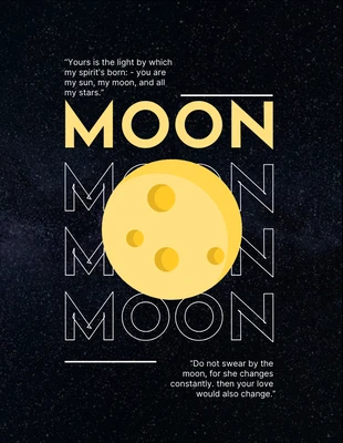
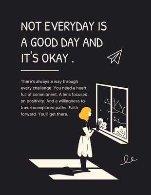
typographic posters
typographic posters
typographic posters
typographic posters

typographic posters
typographic posters
typographic posters
Popular template categories
- Infographics
- Brochures
- Mind maps
- Presentations
- Flyers
- Diagrams
- Reports
- White papers
- Charts
- Resumes
- Roadmaps
- Letterheads
- Proposals
- Plans
- Newsletters
- Checklist
- Business cards
- Schedules
- Education
- Human resources
- Ebooks
- Banners
- Certificates
- Collages
- Invitations
- Cards
- Postcards
- Coupons
- Social media
- Logos
- Menus
- Letters
- Planners
- Table of contents
- Magazine covers
- Catalogs
- Forms
- Price lists
- Invoices
- Estimates
- Contracts
- Album covers
- Book covers
- Labels
- See All Templates