08 Aug 13+ Minimalist Poster Examples & Templates – Daily Design Inspiration #2
Every hour there are thousands of projects published by many talented designers. But because those are shared across a collection of different social networks and sites, you often miss them.
That’s why I decided to put together this first edition of the Daily Design Inspiration. With this daily collection of poster examples, I want to give new designers a platform to show off their work.
To spread some inspiration to readers. To collect amazing design work on one platform. And to make it easy for anyone to create something beautiful.
In this edition of the Daily Design Inspiration, we are going to look at some minimalist poster examples from Wave Festival, Sarita Walsh, Type Hike, and a few from our own Venngage designers.
Now if you want to learn more about creating your own posters from scratch, start with this article:
40+ Best Creative Poster Ideas, Templates & Tips
1. Less Is More Minimalist Poster Example
Creator: Olena Metellia
Type: Simple Illustrated Minimalist Poster Example
The white space and the hint of color make the quote fit exceptionally into this minimalist poster design. A great example of making your poster design fit the needs of your content, and not the other way around.
No matter where the minimalist poster design is placed, it will always stand out and be appreciated by the audience. With the rule of thirds present, there is a great deal of balance all around the canvas and really promotes the use of white space.
Initially, the light bulb catches your eye and then leads you towards the quote with the wiring. The designer used the wiring to spell out the word “less”, which not only continues the image of the light bulb but also creates a sense of contrast between the two-page sections. In my opinion, the wiring of less is what made this minimalist poster design.
2. Modern Orange Pop Up Sales Poster Template
Creator: Venngage
Type: Modern Minimalist Sales Poster Example
Everything about this sales poster example catches your attention immediately. Each element is perfectly spaced out and has to be one of the most organized poster designs I’ve seen.
Digging a little deeper, the word Sale has a slightly larger font size than the rest of the text. It’s so subtle that you don’t notice it with a quick glance, but it still stands out to the eye. Take a look at the group of text; each one is different from the other. This shows how you can adjust minor details without losing the visual effect and appeal. Certain sizes and styles appeal to our eye without us even realizing, instead of using abrupt designs, try and trigger those points.
The soft color palette for this sales poster example tones down the large bold text and makes it easy to be placed in any setting.
3. Blue & Gray Designers United Minimalist Poster
Creator: Studio—JQ ∆
Type: Minimalist Typography Poster
It doesn’t matter if you use the same colors from your background into your title, you can easily make it stand out, all with the right use of effective typography. We are always so quick to criticize and judge, that it takes a while for us to appreciate even the smallest things. This is the era of using your voice and making bold statements that speak the truth.
A bold background atmosphere, or subtle office space, the minimalist typography poster above will get your attention. Whether it’s the statement itself, or the design, either way, it does the job.
4. Red Stranger Things Minimalist Poster
Creator: Amandine Clerc
Type: Icon Centric Minimalist TV Poster
Any Stranger Things fans can spot this walkie-talkie from miles away in this minimalist poster template. Using an illustration that instantly reminds the audience of your brand is the most effective way to design your advertisements. The beauty about branding is you can create simple designs and attract your audience with minimal effort!
This minimalist poster template has incorporated a vibrant background to magnify a simple illustration. The center placement of the walkie-talkie clearly makes it the focal point, and for those who don’t watch, they have the title as the reference in the bottom.
As someone who doesn’t watch this show, I automatically know this is Sci-Fi and possibly old school. I mean even look at the font style, even the title gives off a strange vibe! Amandine Clerc, the designer, has done an excellent job to give us a snapshot of the show with this minimalist poster template.
5. Colorful Wave Festival Event Poster
Creator: Wave Festival
Type: Futuristic Minimal Event Poster
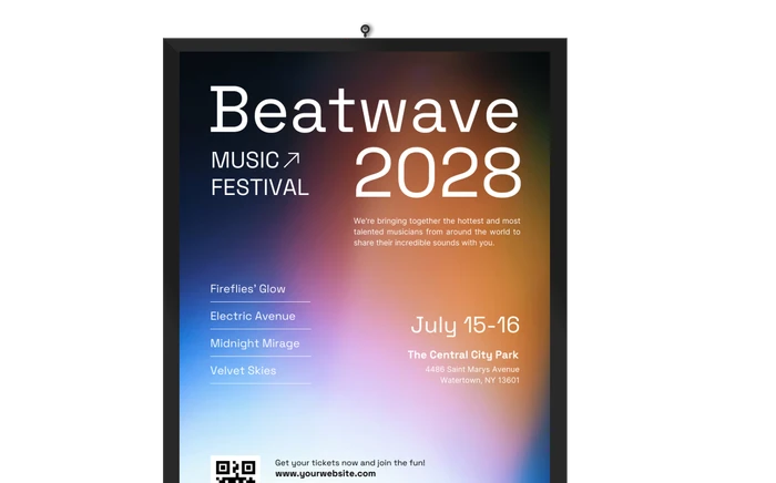
Just by looking at the waves I’m reminded of sound waves and know right away this has to do with a music event, without reading the title! Once I read the title, I know the waves can even apply to art with the gradient and colors.
My favorite aspect about this minimal event poster is what you see after a closer look; the word wave blended into the colors. With so much going on in the minimalist poster, it takes a while to notice, but much appreciated in the end.
This minimal event poster used bold white text to get the key information across. It can easily be seen from a distance, but in order to see the fine print, you have to come in for a closer look. A great way to suck your readers in closer to your minimal event poster is by using different text sizes.
6. Blue & Yellow Minimalist Pool Party Poster
Creator: Venngage
Type: Minimalist Event Poster
If this minimalist poster design doesn’t scream a Summer Party, I’m not sure what does! In the middle of winter, this poster template really brings us back to life.
Even with the two vibrant colors, the background image of this design divides the page naturally in a way that it doesn’t feel abrupt. Looking at this poster you feel both cool and hot. The warm yellow takes you to hot concrete in the summer, while the blue water and white text keep you cool. It’s effective to invoke a sense of feeling in the audience, but remember not to overwhelm them with too much.
All the text in this minimalist poster design has been strategically placed and sized to guide the user from one section to another. Sizing text from small to large, or vice versa, you can easily incorporate this into your designs.
7. Sing for Gough Photo Posters
Creator: Eric Chan
Type: Photo-Centric Minimalist Poster
I love seeing photos being using in minimalist poster ideas, but it’s not as easy as you think! You need to make sure they reflect what your message is about and don’t distract the audience elsewhere. In this case, with the history of the award-winning poster, it’s used just right. The poster was created in real life, and then photographed.
For those who aren’t in the same region and can’t see it in real life, this is where this minimalist poster idea comes in handy. You can experience the beauty on your own without having to go there.
In the midst of a concrete, populated jungle the vibrant colors catch your eye, whether close or far.
8. Modern Atari Rebranding Poster
Creator: Jesús Johan
Type: Modern Branding Minimalist Poster
For those who have had the privilege of playing Atari, can easily recognize this joystick almost anywhere. This branding minimalist poster brings life to a forgotten era of video games.
Back in the day we had limited graphics and colors available, but with this rebranding, it could literally change the entire company. The designer has been respectful of the original basics by using a solid colored background, the outline of the joystick, with a simple font. The joystick inside the letter “A” could possibly be the best logo for this game; it represents the name and the main tool associated with it. With the red solid colored background, it catches your attention and refreshes your memory right away, nothing complicated, just simple.
Use this branding minimalist poster as inspiration for your company, the simpler it is, the easier it is to remember.
9. Minimalist Romantic Movie Poster
Creator: Venngage
Type: Colorful Minimalist Movie Poster
The colors and icons in this minimalist movie poster, all show that love knows no bounds. It comes in different shades, and sizes, making it even more appealing to go check out what it’s all about. With very little words, the poster has told you exactly what the movie is about.
We are used to movies focusing on the certain type of people or love, but with this poster, it shows there are multiple stories to tell, all in one. I don’t know about you, but I definitely would want to check it out, especially if it’s a comedy!
The colored sections across the page create boundaries and tell you there is a clear difference between each story. However, with similar vibrant colors, the common theme is love, retrieved from the title directly.
10. Ultra Minimalist Black Bang & Olufsen Product Poster
Creator: Andrew Guscott
Type: Minimalist Product Poster
Using different shades of the same color for your color palette can really help bring out the details of your product and make them the focal point of your minimalist product poster. Take a look above as an exceptional example, you would think that dark colors will make it hard to see details, but it’s the opposite.
It’s not always essential to have a great deal of contrast; in this example, the text is light grey and blends in, yet still easily legible. The shading across the minimalist product poster creates depth in the poster with a clean, modern look, and the design feels balanced due to the center alignment of the product and text.
Consider what your brand is all about, and design your posters accordingly. Subtle and minimalist versus vibrant and busy, both are just as effective when used in the right way.
11. Data-Driven Minimalist Recycling Posters
Creator: Sarita Walsh
Type: Minimalist Information Poster
In today’s day and age, data-driven facts have the most influence on us, and as such, this minimalist information poster is extremely effective. When proving a point, or teaching something there is always a lot of information to present. You don’t want to drown out your audience and lose their attention. It’s key to hit the audience with few facts that they can personally relate to.
This minimalist information poster makes you learn new facts about recycling, that most probably never knew. Providing real-life scenarios has made it more relatable and even influential.
The unique illustration combining both the recycling product and the outcome catches the eye with the vibrant background. Once you are close enough, the minimalist text delivers the information, with the support of the icon on the side showing the amount of time. Even the glow from the illustration represents electricity!
12. White Minimalist Sneaker Product Poster
Creator: Josh Caudwell
Type: Minimalist Product Poster
Here is another example of a minimalist product poster that uses different shades from the same color to promote products. Doesn’t it give off an extra clean look? Just how you want your sneakers to be!
What’s neat about this minimalist product poster is that it doesn’t show a specific product; it’s a collection of products from different brands, which have a similar feature. Each one is carefully positioned around the title, creating a frame to make the title the focal point, and not the shoes itself. In addition, each letter represents a different texture from each of the shoes, all elements connecting to one another.
If anyone was confused as to the message of this minimalist product poster, the Collection is clearly stated. Placed directly in the center, in a shade darker than the rest, leaving no doubt about the intent of the message.
13. Creative Big Bend National Park Poster
Creator: Type Hike
Type: Simple Typographic Travel Poster
Instead of resorting to including photos of the location, try to design visual elements that represent key features and attract the audience. Trust me, it will make a much more memorable travel poster. It’s a great way to stand out from the rest.
The minimalist travel poster above has divided the page into two sections, each representing a different experience, but all under one roof; the park. Don’t want your text to blend into your background? Simple, use a contrasting fill color and apply some font weight to make it more legible!
Congrats, you made it to the end! Now if you want to learn more about creating your own poster I would recommend checking out these articles:
The Ultimate Poster Design Guide: 80+ Design Tips and Templates for Every Occasion