
Service Line Revenue Distribution Bar Chart Template
Easily compare data points and present data sets that include many values by customizing this blank column chart template.

 100% customizable templates
 Millions of photos, icons, charts and graphics
 AI-powered editing features
 Effortlessly share, download, embed and publish
 Easily generate QR codes for your designs
- Design stylemodern, fun
- Colorsvibrant, light
- SizeLetter (11 x 8.5 in)
- File typePNG, PDF, PowerPoint
- Planpremium
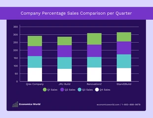
A column chart is a graphical representation of data that uses vertical bars to depict values. Each bar represents a value within a category, and the bar's height corresponds to that value's magnitude. Sometimes, a column chart may be referred to as a bar chart. Column charts are useful for visualizing data sets that include many values or for comparing the value of one category with another. When used in this manner, column charts can provide a quick and easy way to compare data points. There are a few things to keep in mind when creating a column chart. First, ensure the data is organized in a way that makes sense for the chart. Suppose you are trying to compare the values of two different categories. In that case, it might make sense to put the category with higher values on the left and lower ones on the right. Second, be sure to choose an appropriate scale for the vertical axis. If all of the values in your data set are relatively small, it might make sense to use a logarithmic scale. This
Related Chart Templates
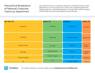
tree map charts

column charts
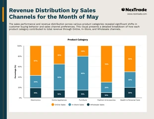
stacked charts
stacked charts

stacked charts

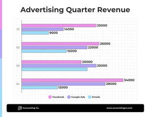
bar charts

column charts
column charts
table charts
stacked charts

tree map charts