
Most Hated Fruit Pie Chart Template
Create a pie chart in statistics with just a few clicks, no design skills are required. All you need is to signup for an account!

 100% customizable templates
 Millions of photos, icons, charts and graphics
 AI-powered editing features
 Effortlessly share, download, embed and publish
 Easily generate QR codes for your designs
- SizeLetter (11 x 8.5 in)
- File typePNG, PDF, PowerPoint
- Planbusiness
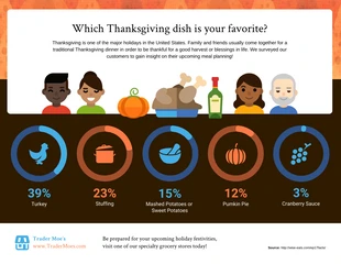
Pie chart in statistics is a kind of graph that is used to show categorical data. It is one of the most common ways to display data because it is easy to understand and interpret. The pie chart in statistics helps users with many things. It gives a quick overview of the distribution of data and shows clearly which group has the biggest share. It is also very flexible: you can use different types of pies for different kinds of data. Pie charts are also easy to create, so they are good for presentations or reports where you want to show your data quickly and easily. Users benefit from using pie chart in statistics because they can quickly see the relative size and importance of different categories or aspects of their data. This enables them to spot trends and make decisions based on those trends. Utilize Venngage's pre-made infographic to save time and effort while making your own. It is flexible enough to be adjusted to meet the demands of any user. This pie chart in statistics is
Related Chart Templates
tree map charts
table charts
table charts

column charts
tree map charts
tree map charts
tree map charts
pie charts
tree map charts
tree map charts
tree map charts