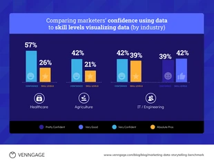
Healthcare Marketing Bar Chart Template
Edit this Data Storytelling Healthcare Marketing Bar Chart Template for an impressive marketing bar chart and more
100% customizable templates
Millions of photos, icons, charts and graphics
AI-powered editing features
Effortlessly share, download, embed and publish
Easily generate QR codes for your designs
- Design stylemodern
- Colorsdark
- SizeCustom (816 x 823 px)
- File typePNG, PDF, PowerPoint
- Planpremium
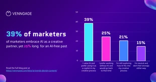
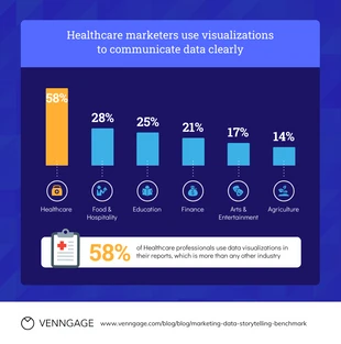
Develop a sophisticated data bar chart and more with this Data Storytelling Healthcare Marketing Bar Chart Template. The chart is fully customizable, including the icons, professional color palette, and shapes. For a creative data bar chart, consider adding icons that represent each category within your data. Search the Venngage gallery for icons that fit your marketing bar chart and insert them with one click. Another way to accent the icons in the bar chart and to make them pop is by utilizing shapes as frames. Venngage has a plethora of shapes you can pick from, including, but not limited to circles, diamonds, and rectangles. Next, choose a professional color palette that makes the bar chart really noticeable. You can easily craft your own professional color palette, or you can opt for an automated color scheme from Venngage that works for your bar chart. Do you have questions about the Data Storytelling Healthcare Marketing Bar Chart Template? Contact Venngage and we'll be glad to help answer your questions!

