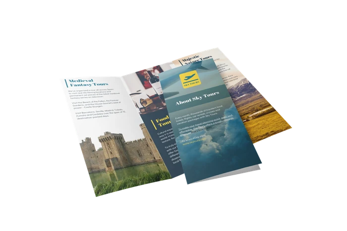
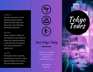
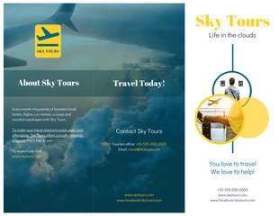
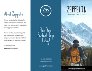
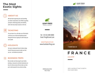
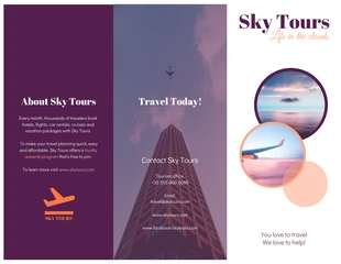
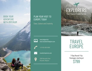
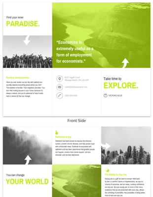
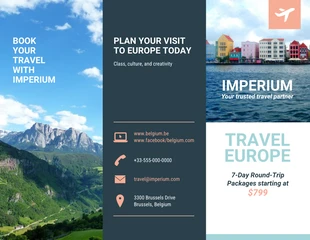
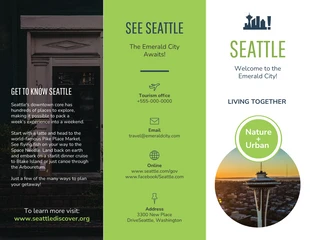
Whether traveling the globe or visiting a state, you can create an amazing travel brochure example! Use this brochure idea from Venngage as a guide when customizing any template. When people see your brochure they’ll be dying to take a vacation.
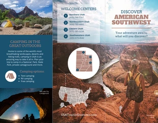
This creative brochure has everything you need to get started. For example, the designer chose to use real-life photos of Utah that are positively breathtaking. There are photos on each side and reflect the popular sites and activities tourists can enjoy during their stay. People are naturally drawn to pictures so be sure to use these wherever they fit.
Depending on the type of brochure or location you’re advertising, pick colors that mesh well. In this case, the designer went with an earthy color palette because it relates directly to Utah’s environment.
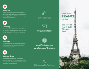
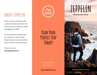
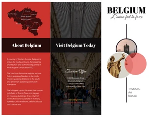
You can also use photos and text boxes to break the brochure into sections. This will make it easy to read and aesthetically pleasing.
Additionally, this template includes maps and icons to point out specific locations which make for a great visual aid. As for the text, the designer opted to use a professional and dramatic font for headings and a modern font for the body text. Don’t hesitate to mix up the font styles as long as your content is readable!
You can use numbered lists to name different locations and welcome centers with contact info. Whichever you decide, test out these tips for your next tri-fold brochure example!
#B2887D
#1B5270
#DC8F64
800 x 1321 px
Venngage
Coming up with a great design idea from scratch is hard work! That’s why we have collected over 1000 examples of infographics, flyers, brochures, posters and more, to inspire designers of all skill levels.